Any views expressed within media held on this service are those of the contributors, should not be taken as approved or endorsed by the University, and do not necessarily reflect the views of the University in respect of any particular issue.

Final Report Layout Reflection

This blog documents the layout process of our final report, focusing on how I organised a large amount of material into a coherent visual structure. Rather than treating the report as a collection of separate outcomes, I approached it as an extension of the installation itself — using layout, hierarchy, and pacing to communicate the project’s atmosphere, system logic, and sensory experience.

One of the main layout decisions was to organise the report by project logic rather than by team member contribution. I wanted the reader to move through the report in the same way they would move through the installation: first understanding the problem, then encountering the framework, then seeing how the device, interaction, video, and graphic systems work together.

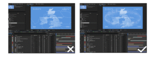
A key priority in the layout process was visual consistency. Because the project involved multiple outputs — installation, sensor testing, TouchDesigner, video, passport and poster design — the report could easily become fragmented. To avoid this, I used repeated layout structures, consistent header positioning, section title pages, and a restrained visual palette to make all parts feel like they belonged to the same project world.

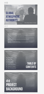
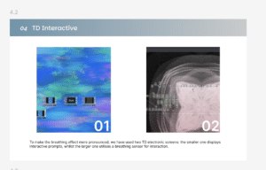
Another important challenge was hierarchy. The report contains conceptual writing, technical explanations, diagrams, process screenshots, and visual outputs. I had to decide what should be read first, what should function as support, and what should remain secondary. For this reason, I used different layout densities across the report: more spacious pages for concept and atmosphere, and more structured pages for technical systems and process documentation.

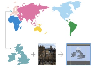
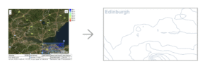
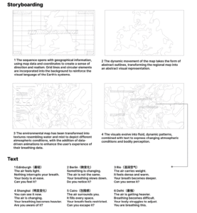
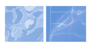
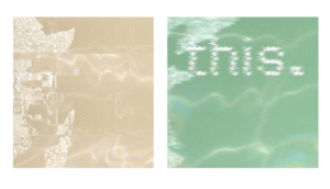
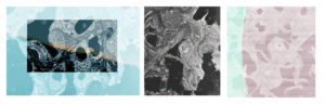
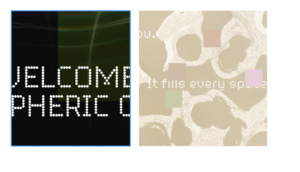
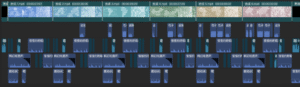
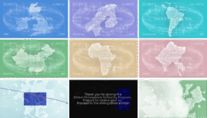
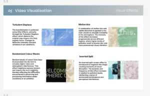
In the sections I was most involved in, especially video visualisation and graphic output, I tried to avoid presenting only final images. Instead, I structured these pages around process: from visual references, to pattern generation, storyboard development, text variation, effects testing, and final screenshots. This made the report feel more reflective and transparent, rather than simply outcome-based.

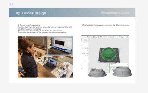
Through this process, I realised that report layout is not just about arranging content neatly. It is also a way of constructing meaning. In a team project especially, layout becomes the tool that turns separate outputs into one coherent narrative. Designing the final report helped me understand how graphic structure, pacing, and visual consistency can extend the experience of the project itself.

Video Development Process

This blog documents the production process of a video set across six countries, which aims to guide viewers through an exploration of the sensory experiences evoked by air and breathing.

The video unfolds across six distinct locations, each representing a different air quality environment. These locations are not presented as objective facts, but rather as part of a sequence depicting the perception of polluted environments.

The visual elements draw on geographical references and are transformed into abstract forms, whilst text and sound are used to guide the viewer’s experience.

The pattern-making process

Create vector maps for each region to provide a clear visual representation of geographical distribution, facilitating subsequent visualisation of data across different regions

Each selected location has been transformed into a simplified visual form; using Illustrator, cut-out masks were created from photographs of the city and its respective districts to produce the main visuals.

As air quality is influenced by environmental factors such as rainfall and terrain, contour lines are used to enhance the visual representation of atmospheric conditions.

Issue

One key issue identified in David’s feedback was that the entire process felt too monotonous; although the six countries were categorised by pollution levels, this was not reflected in the video.

Furthermore, some of the text was overly prescriptive, thereby undermining the sense of openness that is essential to an experiential video’s ability to engage the audience.

Consequently, the text has been reworked so that each section conveys a distinct tone and intensity. Rather than relying on repetitive, fixed structures, the language now evolves gradually, allowing the reader to experience a progressive journey rather than a static narrative.

To enhance the experimental nature of the video, disruptive visual elements have been incorporated into the work, including inverted split-screen effects.

This fragmented effect creates moments of instability and unease, shifting the work from ‘representation’ towards ‘perception’ and ‘experience’.

Visual Effects

1. Turbulent Displace: The transformation is achieved using After Effects, primarily through the Turbulent Displace effect, which distorts the original map shapes into fluid, organic forms. Changes in distortion intensity simulate variations in air conditions.

2. Motion blur: A combination of motion blur and subtle distortion is applied to the main visuals to simulate instability in the atmosphere. The intensity of the effect increases progressively across different regions, where higher levels of pollution result in heavier blur and more pronounced visual vibration.

3. Inverted Split: An inverted split-screen effect is introduced to fragment the image, creating moments of visual disruption. The duration and frequency of this effect increase in relation to pollution levels, reinforcing a sense of environmental imbalance and perceptual interference.

4. Randomised Colour Blocks: Random blocks of colour have been incorporated into the text to simulate digital noise and atmospheric interference. This effect heightens sensory tension and impairs the text’s legibility, thereby reflecting the difficulties encountered in perceiving and processing information under conditions of air pollution.

The After Effects video production process

Iterations focus on improving visual clarity, cohesion, and the perception of atmospheric density.

The visual system is realised through After Effects compositing and motion graphics, blending map data with atmospheric texture transitions.

Sound effects

Using sound design assets from CapCut, this piece blends breathing sounds, ambient effects and electronic noise to create an immersive auditory experience. These elements have been layered and modulated to reflect the ever-changing atmosphere whilst enhancing the audience’s physical perception of air.

Video screenshot

css.php

Report this page

To report inappropriate content on this page, please use the form below. Upon receiving your report, we will be in touch as per the Take Down Policy of the service.

Please note that personal data collected through this form is used and stored for the purposes of processing this report and communication with you.

If you are unable to report a concern about content via this form please contact the Service Owner.

Please enter an email address you wish to be contacted on. Please describe the unacceptable content in sufficient detail to allow us to locate it, and why you consider it to be unacceptable.
By submitting this report, you accept that it is accurate and that fraudulent or nuisance complaints may result in action by the University.

  Cancel