Any views expressed within media held on this service are those of the contributors, should not be taken as approved or endorsed by the University, and do not necessarily reflect the views of the University in respect of any particular issue.

Passport Interior Design

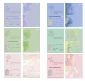
After finalizing the passport covers, I moved on to designing the inner pages, focusing on making them feel closer to real passports. I wanted the passports to function not only as visual props, but as believable objects participants could interact with. To achieve this, I referenced the layout and structure of actual passports, including personal information fields, issuing authority, and identification details.

One important decision was to leave the photo section blank so participants could attach their own portrait. Rather than using a generic placeholder, I designed a white bubble-like form inside the grey photo box. This was intended to mimic a human silhouette, but it also connects conceptually to the white balloons used in our installation. Since the balloons represent air and movement in the physical space, echoing them in the passport became a small design detail that ties the graphic and spatial elements together.

I also developed the fictional issuing authority for the passports — The Ministry of Atmospheric Affairs — which appears on each country’s information page. This helped reinforce the idea that these virtual nations are governed through atmospheric conditions rather than conventional political structures, making the passports feel part of a coherent fictional system.

Another interactive element was leaving the name field empty, allowing participants to write in their own names. Similar to signing a real passport, this gives the object a more personal and participatory quality, encouraging users to imagine themselves as citizens of these air-defined countries.

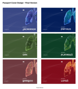
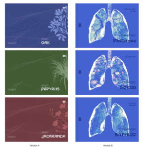
Originally, I also designed a second inner page for visa stamps, inspired by the stamp pages found in real passports. However, after considering how the passports would function within the final exhibition, this began to feel redundant. Following further refinement, I removed the separate stamp page and instead moved the stamping interaction onto the first information page. This simplified the design while keeping the travel metaphor intact, and made the interaction clearer during the exhibition.

Design Improvements to the Passport Cover

After presenting the two earlier passport concepts, we received feedback that both directions had valuable qualities worth preserving. Rather than choosing one over the other, we decided to combine elements from both and develop a final hybrid design.

The final passport covers integrate the official structure and atmospheric line patterns from Version A with the symbolic lung imagery from Version B. The flowing lines were retained to suggest air currents and movement, while the lungs became a central visual motif representing breath, environmental conditions, and the identity of each virtual nation. Each country was further distinguished through a unique colour palette and environmental imagery embedded within the lungs, linking national identity to different atmospheric ecologies.

This final design allowed the passports to function both as believable travel documents and as speculative artefacts, balancing realism with conceptual storytelling. By merging the strengths of both earlier versions, the final covers more fully reflected the core idea of the project: imagining citizenship and mobility through the lens of air.

Passport Cover Designs of the Two Versions

We developed two different design directions for the passports of our virtual nations.

Version A took inspiration from real-world passports, focusing on a more conventional and official aesthetic. Each passport used a distinct colour associated with its nation, combined with botanical motifs representing the country’s symbolic plant identity. Flowing line patterns across the cover were designed to suggest moving air currents, reinforcing the project’s connection to atmosphere and air mobility. This version aimed to feel believable and familiar, echoing the visual language of existing travel documents.

Version B, in contrast, moved towards a more speculative and symbolic approach. Instead of following traditional passport graphics, we placed illustrated lungs at the centre of the cover, treating breathing and air as the core identity of each nation. The lungs were filled with environmental imagery—such as forests, bamboo, and lotus ponds—to connect each country’s ecological qualities with respiratory metaphors. This version felt more experimental and concept-driven, foregrounding the project’s fictional narrative rather than mimicking reality.

By developing these two versions in parallel, we explored the tension between realism and speculation: one making the passports appear credible, the other pushing them closer to artistic artefacts. This comparison later helped us refine the final design by combining elements from both approaches.

Minutes of the Visual Group Discussion

On March 10, our group had a detailed discussion about how to divide the work. We clarified each person’s role and made sure that both the visual and technical parts of the project can move forward smoothly. The video will be one of the main outputs.

The very important part of our discussion was developing the concept of six virtual countries based on different air quality conditions. Instead of using real-world countries, we decided to create fictional ones.

Each country represents a different type of air environment. For example, some countries have clean, fresh air, while others are polluted, heavy, or artificial. We also started to connect these air qualities with emotions and lifestyles. For instance, a country with “living air” might feel open, natural, and healthy, while a country with polluted air might feel oppressive and industrial.

Based on these ideas, we began designing passports for each country. The passports are not just visual objects, but also part of the storytelling. Each one reflects the identity of its country through color, symbols, and typography. We aim to keep a consistent design system across all six passports, while still giving each country its own unique feeling.

We also plan to include a universal stamp system, similar to customs stamps, to strengthen the idea of “traveling” between different air conditions. This helps turn the project into an immersive experience rather than just a visual presentation.

Personal Contribution to the First Submission

In this project, I was mainly responsible for the research related to the target participant group. I took part in discussions about the overall theme at the early stage, especially how air, breathing, and environmental difference could become the core idea of our project. During these discussions, I helped connect the topic of air pollution to people’s daily experiences and body feelings, so that the theme would not stay abstract but relate to real life.

For the research part, I focused on analysing the participant group. I helped design and structure the interview questions, making sure they could guide participants to talk about their personal experiences, daily routines, and body sensations. I also worked on defining the selection criteria, deciding who would be suitable for our research and why. I explained why people who have experienced relocation are important for our topic, because they have lived in different environmental conditions and can compare changes in air quality and atmosphere.

In addition, I analysed how different backgrounds—such as country of origin, climate, and length of stay in Edinburgh—may influence how people feel about the air and their physical condition. I tried to understand how environmental changes can slowly affect breathing, comfort, and energy levels, even when people are not fully aware of it. I also helped link these research findings to the theme of air pollution and environmental inequality, so that the participant analysis could support the concept and direction of the final installation.

Through this work, I contributed to building a clearer connection between research and design, making sure that our project is based on real experiences rather than only theoretical ideas.

css.php

Report this page

To report inappropriate content on this page, please use the form below. Upon receiving your report, we will be in touch as per the Take Down Policy of the service.

Please note that personal data collected through this form is used and stored for the purposes of processing this report and communication with you.

If you are unable to report a concern about content via this form please contact the Service Owner.

Please enter an email address you wish to be contacted on. Please describe the unacceptable content in sufficient detail to allow us to locate it, and why you consider it to be unacceptable.
By submitting this report, you accept that it is accurate and that fraudulent or nuisance complaints may result in action by the University.

  Cancel