Any views expressed within media held on this service are those of the contributors, should not be taken as approved or endorsed by the University, and do not necessarily reflect the views of the University in respect of any particular issue.

Editing Breath: Reconstructing an Experience of Inequality

Before editing this video, I understood “circulation” mainly as a spatial problem—
where visitors enter, how they move, and how they are guided through an installation.

But during the editing process, I began to realise something else:

Circulation does not only exist in space.
It also exists in time.

And editing, in this sense, becomes a way of redesigning the experience.


Translating Space into Time

The video documents the full journey of our installation:

From receiving a passport, to watching the introduction film, passing through customs, entering the interactive installation, and finally arriving at the feedback area.

In the physical space, this unfolds as a continuous sequence of actions.
In video form, however, it must be compressed, reorganised, and narrated differently.

This raised an important question for me:

If the audience no longer walks through the experience, but watches it—does the experience still exist?

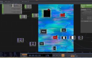
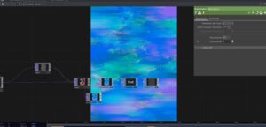
While editing, I constantly adjusted the rhythm:

  • What needs to be shown first?
  • What must remain?
  • What should be emphasised?

At some point, I realised that I was no longer documenting the journey—
I was reconstructing it.


From Concept to Sensation: Passport, Smell, and Body

When I reached the core installation section, I paused repeatedly to reflect:

Is the idea actually being communicated?

The mechanism of the installation is relatively simple:

  • Each visitor receives a passport representing a country
  • Each country corresponds to a different level of air pollution
  • The gas they smell is determined by this identity
  • Meanwhile, their breathing is recorded and visualised in real time

But the project is not really about this system itself.
It is about the question behind it:

If air quality is unequal, can breathing still be considered equal?

During editing, I deliberately broke the logic into short, direct sentences:

  • “The gas you smell is determined by your passport”
  • “Different countries, different pollution levels”
  • “Your breathing is being recorded”

These statements are simple, but they create a gradual shift—
from understanding information to sensing it physically.

Because ultimately, the work does not happen inside the installation.
It happens inside the body of the viewer.


Making the Invisible Perceptible

One of the fundamental challenges of air pollution is that it is difficult to perceive directly.

We may see smog, but not PM2.5.
We may smell something, but cannot measure its risk.
We breathe constantly, yet rarely question the quality of air.

In the installation, we used smell, devices, and data
to make air perceptible.

But in video editing, I faced a similar challenge:

How can someone “feel” air through a screen?

Instead of simulating air, I chose to emphasise difference:

  • Different passports
  • Different smells
  • Different breathing patterns

As these differences accumulate,
they begin to form a realisation:

Air is not a neutral background.
It is a condition that is unevenly distributed.


From Experience Design to System Awareness

Through editing, I also began to see the project differently.

It is not only about pollution itself.
It points toward a larger system:

  • Why are some regions exposed to higher levels of pollution?
  • How are air quality and inequality connected?
  • Why does something as basic as breathing become unevenly distributed?

These questions are implicit in the installation,
but in the video, I wanted them to surface more clearly.

That is why I chose to end with a direct statement:

Breathing is not equally shared.

It is not a conclusion.
It is an opening.


Editing as Re-Design

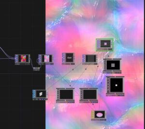
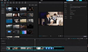
This process changed how I think about editing.

A video is not just documentation. It is an extension of the work.

In space, the audience moves through the installation.
In video, the audience moves through time.

Editing becomes the bridge between the two.

It translates, but it also reshapes.


Conclusion

When I placed the final subtitle on the timeline,
I realised something quite simple:

We cannot bring everyone into the installation.
But we can make more people aware of what it reveals.

Breathing has never been entirely free.

It is shaped by environment, infrastructure,
and the uneven conditions of the world we live in.

Design may not immediately solve these problems.
But it can make them visible, perceptible, and discussable.

And sometimes,
that is where change begins.


From Data Visualization to Perceptual Guidance

Rethinking Breathing Interaction through TouchDesigner


1. Introduction

This project began as an exploration of how breathing data can be visualized in real time using TouchDesigner. However, as the project developed, our focus gradually shifted from simple data representation to a more critical question:

Can visual systems guide perception, rather than just display information?

Instead of treating breathing as a dataset to be shown, we started to explore how visual feedback could influence how users perceive—and even regulate—their own breathing.


2. Initial Approach: Data as Representation

Image

Image

Image

Image

Image

At the beginning, we approached the project as a typical data visualization task.

  • Breathing data was captured and sent via OSC
  • TouchDesigner received the data and mapped it to visual parameters
  • The system was built using nodes such as Noise, Feedback, and Composite

Our logic was straightforward:

Data changes → visual parameters change

However, despite the system functioning technically, the outcome revealed a major issue:

  • The visual changes were subtle
  • The breathing rhythm was not clearly perceptible
  • The audience could not intuitively relate the visuals to their own breathing

3. A Shift in Thinking: From Showing Data to Guiding Perception

At this point, we began to question our initial assumption.

We realized that:

Visualization alone does not guarantee perception.

This led to a conceptual shift:

  • From “How do we display breathing?”
  • To “How do we make breathing feelable?”

This shift aligns with the work of Rafael Lozano-Hemmer, whose interactive installations often use biometric data (such as heart rate or breath) not simply as information, but as a way to create embodied interaction between the system and the participant.

In his work, data becomes a medium for experience, not just representation.


4. Iteration: Designing for Perceptual Impact

Image

Image

Image

Image

Image

Image

Following this shift, we redesigned our system with a focus on motion and perceptual clarity.

4.1 From Static Parameters to Motion

We stopped mapping data to:

  • color
  • brightness

and instead mapped it to:

  • motion speed
  • spatial distortion
  • temporal rhythm

This made changes in breathing immediately visible and intuitive.


4.2 Introducing Ripple Dynamics

To further enhance perception, we introduced a ripple-like visual layer:

  • Created using GLSL and displacement techniques
  • Layered onto the existing visual system

This ripple effect functions as a metaphor for breathing:

  • expansion and contraction
  • waves propagating through space

It transforms breathing into something that can be seen, tracked, and followed.


4.3 Layering and Composition

We combined multiple visual layers using compositing techniques:

  • base flow (atmospheric movement)
  • ripple layer (rhythmic structure)

This allowed us to maintain visual richness while emphasizing the breathing rhythm.


5. Key Insight: Data as Experience, Not Information

Through this process, we arrived at a key understanding:

The role of data in interactive design is not to inform, but to transform perception.

Breathing data is inherently subtle. Without proper translation, it remains invisible.

By mapping it to:

  • motion
  • distortion
  • rhythm

we were able to amplify its perceptual presence.


6. Reflection

This project represents a shift in our design thinking:


Initial mindset

Data → visualization


Final mindset

Data → perception → behavior


Rather than asking users to observe data, we created a system that encourages users to:

  • feel the rhythm
  • become aware of their own breathing
  • potentially adjust their breathing in response

7. Conclusion

This project demonstrates that:

Effective interaction design is not about accurately representing data, but about making it perceptually meaningful.

Inspired by artists like Rafael Lozano-Hemmer, we moved beyond visualization and towards embodied interaction.

Ultimately, the project is not just a visual system, but:

a perceptual interface that connects internal bodily rhythms with external visual experience.


Rethinking the Role of Math CHOP

In this project, we worked extensively with real-time breathing data and attempted to map it into a visual system using TouchDesigner.

While many nodes contributed to the final outcome, one node in particular became unexpectedly central:

Math CHOP

Initially, we treated it as a simple utility node. However, through iteration and debugging, we came to realize that it plays a critical role in translating raw data into perceptible visual behavior.

At the beginning of the project, our focus was mainly on:

  • visual nodes (Noise, Feedback, Composite)
  • dynamic effects (GLSL, Displace)

We assumed that:

As long as data is connected, the visuals will respond meaningfully.

As a result, we used Math CHOP in a very basic way—or sometimes ignored it entirely.

Even though:

  • the breathing data was updating correctly
  • the system was technically functioning

we encountered a major issue:

The visual changes were too subtle to perceive.

For example:

  • motion speed changes were inconsistent
  • visual response felt unstable
  • small data variations produced almost no visible difference

This led us to question not the visuals, but the data mapping process itself.

At this point, we began to re-examine Math CHOP more carefully.

We realized that it is not just a mathematical tool, but:

A crucial interface between data and perception


Key Functions We Used

1. Range Remapping

Math CHOP allowed us to transform data ranges: Original data: 0.01 – 0.2
Mapped to: 0 – 1

This made small breathing variations much more visible.


2. Scaling (Amplification)

By multiplying values:

  • subtle input became strong visual motion
  • weak signals became perceptible

This was essential for translating physiological data into visual impact.


3. Clamping and Stabilizing

Math CHOP also helped:

  • prevent extreme spikes
  • keep values within a controlled range

This made the system feel stable and intentional, rather than chaotic.

Through this process, we realized a fundamental principle:

Raw data is not meaningful until it is interpreted.

Math CHOP acts as this layer of interpretation.

It does not just change numbers—it defines:

  • how sensitive the system is
  • how responsive the visuals feel
  • how clearly users can perceive changes

After properly using Math CHOP:

  • motion speed became clearly linked to breathing
  • ripple effects became more pronounced
  • the system felt more responsive and alive

Most importantly:

Users could now feel the rhythm, not just see movement.

This experience changed how we understand node-based systems.

Previously, we focused on:

  • “interesting visuals”
  • “complex effects”

But now we recognize that:

The most critical nodes are often the simplest ones.

Math CHOP is not visually impressive, but it is conceptually powerful.

In this project, Math CHOP evolved from a background utility into a central component of our workflow.

It enabled us to:

  • bridge the gap between data and perception
  • amplify subtle signals into meaningful interaction
  • refine the responsiveness of the system


From Data to Breath: Translating Breathing into Visual Experience through TouchDesigner


从数据到呼吸:通过 TouchDesigner 将呼吸转化为视觉体验


1. 项目目标:让呼吸可见

该项目的核心目标始终很明确:

我们如何将呼吸——一种无形的生理节律——转化为可以感知甚至跟随的视觉体验?

我们的目标并非仅仅是数据可视化,而是创建一个这样的系统:

  • 呼吸变得可见
  • 节奏变得可以感知
  • 观众会被巧妙地引导,从而与自己的呼吸同步

这使得该项目不仅是一项技术探索,也是对感知设计和具身交互的研究。


2. 初始阶段:从数据输入到视觉反馈

项目初期,我们建立了一个基本流程:

数据输入

  • 呼吸传感器数据通过 Python 进行处理。
  • 通过 OSC 发送
  • 使用 TouchDesigner 接收OSC In CHOP

视觉系统

我们构建了一个典型的生成式结构:

noise → feedback → level → composite

在此刻:

  • 视觉效果动感十足。
  • 系统对数据作出了响应

然而,一个关键问题出现了:

观众们能看出“有些东西正在发生变化”,但他们感受不到呼吸的节奏。


3. 核心挑战:使数据易于理解

这成为项目中最为困难也是最重要的一步。

我们意识到:

数值变化并不等同于感知变化。

虽然:

  • 数据正在更新。
  • 参数在变化,

视觉效果依然微妙而模糊。


关键见解

问题在于:

数据仅影响表面参数,而不影响运动结构。

例如:

  • 颜色变化→几乎难以察觉
  • 调整亮度 → 不直观
  • 改变运动/速度 →有效

4. 迭代:将呼吸融入运动

在后期阶段,我们重组了系统,使其更注重运动而非外观


4.1 引入基于流程的视觉结构

我们公司成立了:

  • Displace TOP(空间扭曲)
  • GLSL(基于矢量的流场)
  • Slope / Blur(时间连续性)

这使得视觉效果变成了一个具有方向、深度和运动的流畅系统,而不是静态的颜色变化。


4.2 将数据映射到运动(关键突破)

我们不再控制视觉属性,而是开始利用呼吸数据来控制:

  • 运动速度
  • 位移强度
  • 流量频率

例如:

absTime.seconds * resp_data

这实际上意味着:

呼吸本身也成为了时间的一部分。


4.3 引入涟漪效应

我们还引入了类似涟漪的视觉层:

  • 通过GLSL + Displace
  • 结合原始视觉效果Composite TOP

这增添了一层重要的意义:

视觉分层

  • 底层:色彩流动(氛围/情感)
  • 叠加:涟漪(节奏/物理)

概念效应

  • 呼吸可以形象地理解为身体的扩张和收缩。
  • 涟漪象征着呼吸的波浪。

5. 最终系统结构

最终的流程可以概括为:

Sensor → Python → OSC → TouchDesigner

→ Data processing (Math / Filter)
→ Motion control (Speed / Displace / GLSL)
→ Visual system (Flow + Ripple)
→ Composite (layering)
→ Output

6. 反思:从数据展示到具身交互

该项目最重要的转变之一是概念上的转变:


初步方法

“我们如何将数据可视化?”


最后进近

“我们如何让人们感受到节奏并相应地调整呼吸?”


我们逐渐明白:

设计的成功不在于数据的准确性,而在于感知的有效性。


7. 结论:呼吸作为一种媒介

在这个项目中,呼吸不再仅仅是一个输入信号。它变成了:

  • 时间结构
  • 空间力
  • 连接身体与环境的桥梁

最终,我们创造的不仅仅是数据可视化,而是:

一种交互式视觉系统,鼓励用户感知并配合自己的呼吸节奏。


8. 个人反思

这个项目也与我更广泛的兴趣密切相关,例如:

  • 感官体验
  • 空间叙事
  • 生态和以人为本的设计

它反映了人们不断探索如何将呼吸、环境变化或身体节律等无形过程转化为可感知和有意义的视觉形式。


css.php

Report this page

To report inappropriate content on this page, please use the form below. Upon receiving your report, we will be in touch as per the Take Down Policy of the service.

Please note that personal data collected through this form is used and stored for the purposes of processing this report and communication with you.

If you are unable to report a concern about content via this form please contact the Service Owner.

Please enter an email address you wish to be contacted on. Please describe the unacceptable content in sufficient detail to allow us to locate it, and why you consider it to be unacceptable.
By submitting this report, you accept that it is accurate and that fraudulent or nuisance complaints may result in action by the University.

  Cancel