Any views expressed within media held on this service are those of the contributors, should not be taken as approved or endorsed by the University, and do not necessarily reflect the views of the University in respect of any particular issue.

From Data Visualization to Perceptual Guidance

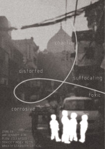
Rethinking Breathing Interaction through TouchDesigner


1. Introduction

This project began as an exploration of how breathing data can be visualized in real time using TouchDesigner. However, as the project developed, our focus gradually shifted from simple data representation to a more critical question:

Can visual systems guide perception, rather than just display information?

Instead of treating breathing as a dataset to be shown, we started to explore how visual feedback could influence how users perceive—and even regulate—their own breathing.


2. Initial Approach: Data as Representation

Image

Image

Image

Image

Image

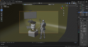
At the beginning, we approached the project as a typical data visualization task.

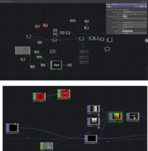
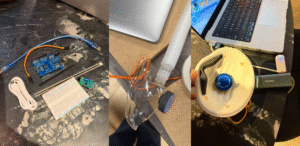
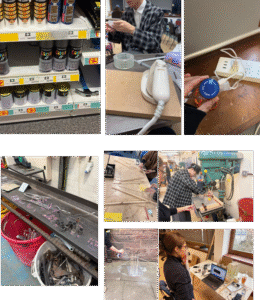
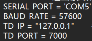
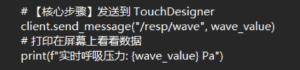
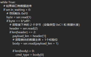
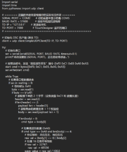
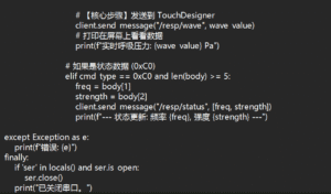
  • Breathing data was captured and sent via OSC
  • TouchDesigner received the data and mapped it to visual parameters
  • The system was built using nodes such as Noise, Feedback, and Composite

Our logic was straightforward:

Data changes → visual parameters change

However, despite the system functioning technically, the outcome revealed a major issue:

  • The visual changes were subtle
  • The breathing rhythm was not clearly perceptible
  • The audience could not intuitively relate the visuals to their own breathing

3. A Shift in Thinking: From Showing Data to Guiding Perception

At this point, we began to question our initial assumption.

We realized that:

Visualization alone does not guarantee perception.

This led to a conceptual shift:

  • From “How do we display breathing?”
  • To “How do we make breathing feelable?”

This shift aligns with the work of Rafael Lozano-Hemmer, whose interactive installations often use biometric data (such as heart rate or breath) not simply as information, but as a way to create embodied interaction between the system and the participant.

In his work, data becomes a medium for experience, not just representation.


4. Iteration: Designing for Perceptual Impact

Image

Image

Image

Image

Image

Image

Following this shift, we redesigned our system with a focus on motion and perceptual clarity.

4.1 From Static Parameters to Motion

We stopped mapping data to:

  • color
  • brightness

and instead mapped it to:

  • motion speed
  • spatial distortion
  • temporal rhythm

This made changes in breathing immediately visible and intuitive.


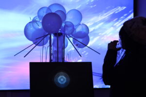
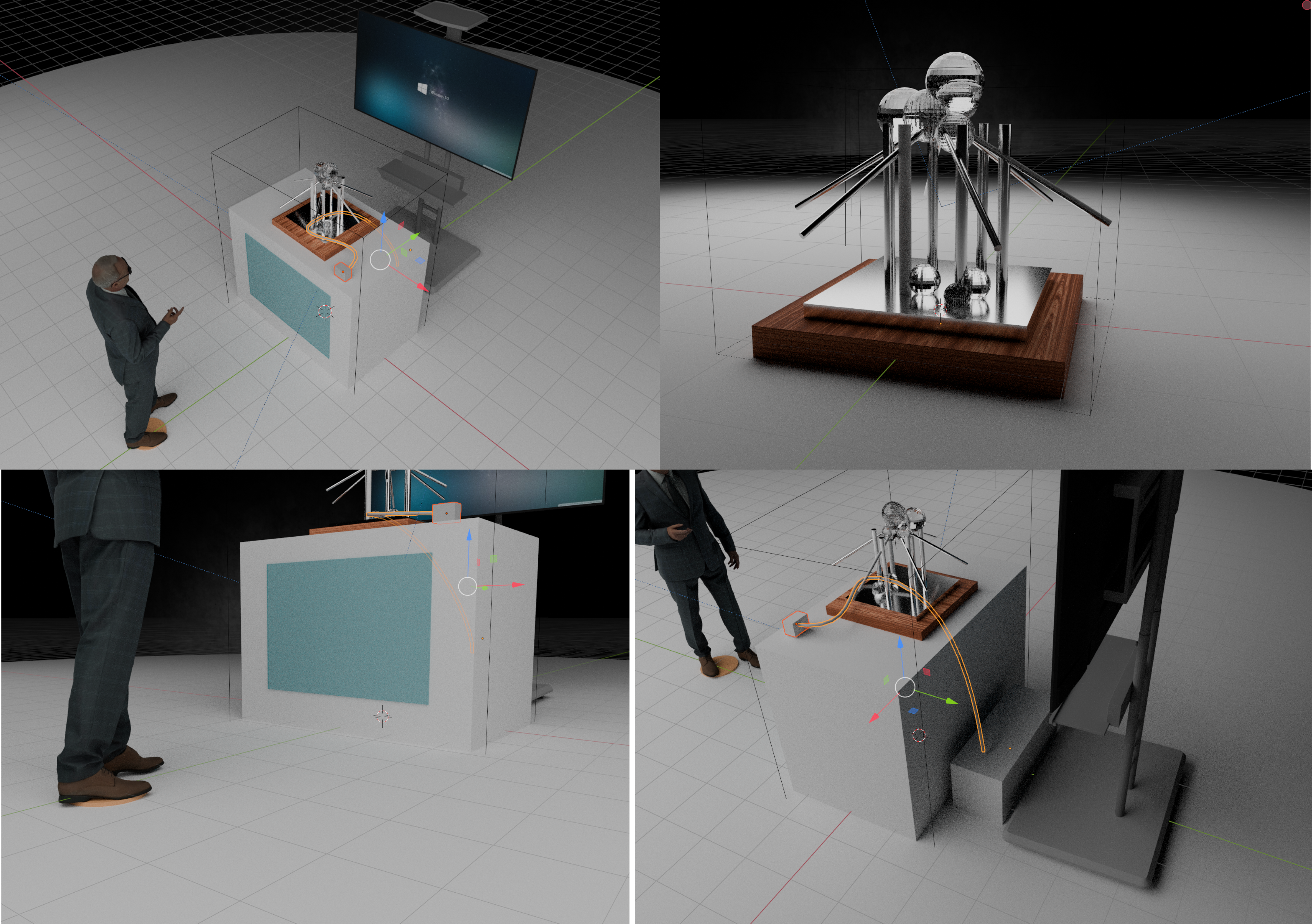
4.2 Introducing Ripple Dynamics

To further enhance perception, we introduced a ripple-like visual layer:

  • Created using GLSL and displacement techniques
  • Layered onto the existing visual system

This ripple effect functions as a metaphor for breathing:

  • expansion and contraction
  • waves propagating through space

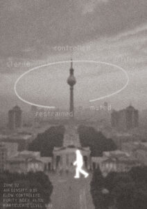
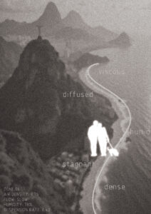
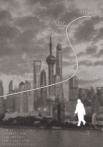
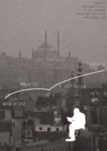
It transforms breathing into something that can be seen, tracked, and followed.


4.3 Layering and Composition

We combined multiple visual layers using compositing techniques:

  • base flow (atmospheric movement)
  • ripple layer (rhythmic structure)

This allowed us to maintain visual richness while emphasizing the breathing rhythm.


5. Key Insight: Data as Experience, Not Information

Through this process, we arrived at a key understanding:

The role of data in interactive design is not to inform, but to transform perception.

Breathing data is inherently subtle. Without proper translation, it remains invisible.

By mapping it to:

  • motion
  • distortion
  • rhythm

we were able to amplify its perceptual presence.


6. Reflection

This project represents a shift in our design thinking:


Initial mindset

Data → visualization


Final mindset

Data → perception → behavior


Rather than asking users to observe data, we created a system that encourages users to:

  • feel the rhythm
  • become aware of their own breathing
  • potentially adjust their breathing in response

7. Conclusion

This project demonstrates that:

Effective interaction design is not about accurately representing data, but about making it perceptually meaningful.

Inspired by artists like Rafael Lozano-Hemmer, we moved beyond visualization and towards embodied interaction.

Ultimately, the project is not just a visual system, but:

a perceptual interface that connects internal bodily rhythms with external visual experience.


Blog for Exhibition

DMSP Blog 09 — Exhibition Day

Our installation followed a strict flow: participants entered, drew a “passport,” watched an introductory video, passed through Customs, and finally entered the dark room for the TouchDesigner breathing experience.

Customs Officer

I served as the Customs Officer, which was easily my favorite part. It was the only segment of the project where I could improvise and interact directly with the participants. Giving them the “interrogation” and stamping their virtual passports felt like a piece of performance art in itself.

Humidifier Tech

Technically, I was also responsible for controlling the humidifiers to sync the air quality with each passport. This proved difficult due to equipment delay, which sometimes made it a little bit difficult to deliver the right “air” at the right time.

Moreover, since the humidifier wasn’t sealed very well, my station would get quite stinky at times—I wasn’t exactly a fan of that.


Blog Before Presentation

DMSP Blog 06 — Collaborative Development in TouchDesigner

I was assigned to the TD building group. As I had no prior experience with TD, my role was to support my teammates by using AI tools to troubleshoot logic errors and optimize data flows.

Effect Before Connecting the Sensor:

A key turning point in our project was moving from static data mapping (color/brightness) to motion-based mapping. We discovered that technical accuracy does not always guarantee a meaningful user experience. By utilizing GLSL ripples and Displace TOP, we successfully translated raw breathing waveforms into a fluid, temporal experience.

After Connecting with the Sensor:

Since the raw sensor data was processed via Python, we dedicated significant effort to establishing a stable bridge between the Python environment and TouchDesigner. And after observing the visual outcomes of other groups, we also refined our color palette.

Real-time TD Output With Breathing Mask Integration:

DMSP Blog 07 — Visualizing Air through Sound

Since I played a supporting role in the TouchDesigner setup, I also focused on developing the back ground sound track individually. I explore the ambient soundscapes I created for our six regional zones using AI.

Using prompts focused on breathing-like pulses and cinematic textures, I designed six distinct soundtracks. From the peaceful clarity of Edinburgh (Oak) to the suffocating, glitch-heavy distortion of Delhi (Lotus), these soundscapes move from “clean air privilege” to “toxic atmospheric inequality.”

1. Edinburgh — Oak (The Privilege of Clarity)
2. Berlin — Platanus (The Controlled Environment)
  • Prompt Key: Light industrial tone, low-frequency hum, stable, less natural.

  • The Narrative: While the air is breathable, it feels artificial. I introduced a subtle mechanical hum to evoke a sense of a “controlled” urban environment—breathable but detached from nature.

3. Rio — Jacaranda (The Density of Humidity)
  • Prompt Key: Humid, dense, soft granular texture, slow fluctuation, sticky.

  • The Narrative: As moisture and pollution accumulate, the air becomes lingering and heavy. The sound uses granular textures to make breathing feel physically slower and less comfortable.

4. Shanghai — Bamboo (The Visible Haze)
  • Prompt Key: Polluted, noise layer, reduced clarity, subtle tension.

  • The Narrative: Here, pollution becomes a persistent presence. The introduction of noise layers reflects decreased visibility and begins to interrupt the natural rhythm of breathing.

5. Cairo — Papyrus (The Abrasive Aridity)
  • Prompt Key: Dry, rough texture, low-frequency pressure, harsh.

  • The Narrative: The sound captures the particulate matter of the desert air. By incorporating a “leaking airflow” sound, I wanted to communicate the physical weight and resistance felt with every breath.

6. Delhi — Lotus (The Toxicity of Inequality)
  • Prompt Key: Toxic, distorted, chaotic, glitch noise, high tension, suffocating.

  • The Narrative: This represents the extreme of atmospheric inequality. Moving beyond “music,” the sound is a chaotic system of glitches and distortion, creating a fragmented and unsafe experience that mirrors a state of suffocation.

DMSP Blog 08 — Visualizing Poster

After using AI to complete the sound design for six zones, my next challenge was to transform these “sensory narratives” into intuitive visual posters.

I utilized desaturated and blurred architectural photos to prioritize atmospheric texture and mood over geographical recognition. Incorporating my AI-generated sound keywords like distorted and weightless as linear elements and complementing them with simulated real-time air data, I aimed to visualize the tangible feel of different air quality levels.

I intentionally omitted city names, challenging participants to identify the locations based on sensorial cues—guiding their imagination of who they would be under these differing atmospheric conditions. This transformed the posters from static displays into active tools for sensory perception and reflection on the right to breathe.


Blog For Submission 1

DMSP Blog 04 — Prototype and Experience Flow

For Submission 1, I focused on translating our group’s concepts into a concrete visual narrative and participant experience. My primary responsibilities included creating effect pictures, designing the experience flow, and developing key visual ideas.

I used Blender to build a 3D environment based on our initial sketches, including a fictionalized design for the core respiratory device.

Effect Picture:

Experience Flow:

To clarify the interaction, I developed a Participant Experience Flow using the rendered images. This step-by-step guide illustrates the journey from receiving a “passport” based on visual markers to engaging in a real-time, multisensory interaction where the device’s airbags provide physical feedback and digital displays show particle animations based on respiratory data.

DMSP Blog 05 — Reflection for Feedback

This post focuses on reflecting upon my specific contributions: visual effects, device design, and experience flow.

Regarding Aesthetics, I realized that my particle systems were more decorative than meaningful. Moving forward, I will ensure that the visual density and movement of particles directly represent the “invisible threat” of pollution.
For the Apparatus, I need to pivot away from over-complicated hardware designs toward a more functional, impactful visual representation that addresses safety and ethics.
Most importantly, I must refine the Experience Flow from a collection of “disjointed” ideas into a single, coherent time-based journey. My goal is to make sure every visual element I render reinforces the feeling we want the audience to walk away with.

Designing Through Critique: How Feedback Reshaped Our Breathing System

In the weeks leading up to the exhibition, our project evolved through a series of increasingly specific questions rather than clear solutions.As the person responsible for the TouchDesigner system, I initially approached the task as a technical challenge: how to visualise breathing on a large screen. However, the development process revealed that the real difficulty was not technical execution, but conceptual clarity.

We developed three distinct versions of the system. Each version was presented and discussed with David, whose feedback consistently pushed the project beyond its current level rather than simply validating progress.

Version 1: A Clear but Superficial Idea

The first version translated breathing into a simple expanding and contracting form. It was visually legible and technically stable. However, during feedback, a critical issue emerged: The system looked like breathing, but did not feel like breathing. This distinction forced us to confront a common problem in digital media design — the difference between representation and experience.

Version 2: Adding Interaction, Increasing Complexity

In response, we introduced real-time input, allowing the system to respond directly to human breath. While this made the system more interactive, it also introduced instability:

  • inconsistent sensor input
  • visual noise
  • lack of rhythm

During discussion, David shifted the focus again by asking: What is the audience supposed to understand or feel from this interaction?This question exposed a gap between system behaviour and audience interpretation.

Version 3: Designing for Perception

The final version emerged not from adding features, but from removing and refining them. We simplified the visual language and prioritised rhythm over responsiveness. Instead of directly mapping breath to movement, we shaped the output to feel more organic and continuous. This version was ultimately selected for the exhibition.

Reflection

What stands out in this process is not the progression of technology, but the role of critique. Each feedback session did not solve problems — it reframed them. Rather than asking:
“How do we make this work?” We began asking: “What is this actually doing?”

Insight

This experience highlights an important aspect of collaborative design: Good feedback does not confirm decisions. It destabilises them in productive ways. The final outcome was not the result of a single idea, but of sustained negotiation between intention, critique, and revision.

Blog Before Submission 1

DMSP Blog 01 — Initial Proposal Reflection

My initial proposal focused on visualizing the invisible social structures within public space. I was interested in how everyday environments such as streets, studios, or cafés contain constantly shifting patterns of interaction, which are difficult to perceive directly but strongly shape our experience of a place.

The project explored two possible directions:

one looking at collective relational patterns (how people gather, disperse, or form spatial configurations).

And the other focusing on individual “body grammar”, examining how emotions subtly influence movement, attention, and behavior while navigating the city.

This perspective was largely informed by my background in architecture, where spatial perception and human behavior are often considered together. Instead of treating space as static, I approached it as something continuously produced through movement and interaction.

Although this proposal was not selected for further development, it helped me identify an ongoing interest in how invisible dynamics shape spatial experience, which I aim to carry into future work.

DMSP Blog 02 — Research on “Breathing Rights”

Following the establishment of our theme “Breathing Rights”, our focus shifted from abstract ideas to grounding the project in real-world conditions. We aim to explore air not only as an environmental issue, but as something deeply connected to health, inequality, and lived experience. e also looked into the primary sources of pollution, including traffic emissions, industrial activity, and urban density, as well as historical trends showing how air quality has evolved in different regions.

Case Studies:

Air of the Anthropocene — Robin Price & Francis Pope

By using a custom-built LED “pollution painter” that links light density to real-time sensor data, this project translates invisible particulate matter into luminous patterns in long-exposure photography, making microscopic pollution tangible and visible.

https://stuffwhatidid.com/air-of-the-anthropocene

Pollution Pods — Michael Pinsky

A series of interconnected domes that simulate the distinct smells and temperatures of polluted cities worldwide, forcing visitors to physically experience the inequality of air quality.

https://www.michaelpinsky.com/portfolio/pollution-pods-2/

DMSP Blog 03 — Collaborative Ideation

Our team brainstormed how to address air pollution and the unequal distribution of clean air. We used mind mapping to break down themes then moved into rapid sketching to explore potential formats. Our ideas ranged from recording the sound of breathing to using physical objects (like filters) to make the invisible nature of air more tangible and interactive.


Small screen touch designer and video interaction

Small screen touch designer and video interaction

To make the breathing more noticeable, we used two electronic screens. The smaller screen is used to convey interaction prompts, and our small screen also uses a breathing sensor for interaction.


  • To enhance the overall experience, we provide users with guiding prompts. The real-time audio stream is deconstructed into geometric fluctuations, while the background patterns represent the physical form of sound within a digital field. This serves as a simplified, gamified expression, allowing users to perceive the meaning conveyed by the installation in a more multidimensional way as they follow the guidance.

This work features a TouchDesigner-based generative system driven by the music of six nations. It uses audio analysis algorithms to map rhythmic data onto dynamic geometric forms, resulting in a post-produced audiovisual narrative that explores cross-cultural themes through synchronized media.

video design

Keep breathing.

Now, place one hand on your chest.

Can you feel the movement?

Notice the air entering your body.

Notice the air leaving your body.

Move your hand to your throat.

Can you feel the air passing through?

Now slow down.

Take a deeper breath.

This is your breath.

Or is it?

What shapes your breathing
Can you control it?
Or are you following it?


Touchdesigner2  Note:Assistance from AI and professional td teachers

  • Data is transmitted through the main TouchDesigner (TD) file using port 7001, while another TD file receives the data on the same port (7001).

Node Logic Description

Ramp 1 & 2: Generate horizontal and vertical gradients respectively (commonly representing U and V coordinates).

Reorder 1: Combines the two gradients into a single RG image. From the preview, the horizontal gradient is mapped to the red channel (R), and the vertical gradient is mapped to the green channel (G).

Point Transform 1: A node used to process coordinate data. It takes the combined coordinate information from the Reorder node and applies transformations such as rotation, scaling, or translation.

Visual Post-Processing

Through nodes such as RGB Key, Bloom, and Transform, the original particle data undergoes color filtering and visual enhancement, improving the overall visual quality and lighting effects.

Input & Control Layer

Using Keyboard In and Slider components, real-time adjustments can be made to particle physical properties, such as gravity, velocity, and mass.

Simulation Engine

The core node is particles-Gpu , which performs large-scale particle position and behavior calculations on the GPU, enabling efficient and high-performance particle simulation.

REFERENCE

Reactive GPU Particles – TouchDesigner Tutorial 052

Audio-reactive psychedelic visuals | TouchDesigner Beginner Tutorial

Performance process and odor removal plan

  • Rapid Odor Removal and Disinfection Plan for Indoor Spaces -A Combined “Physical + Chemical” MethodImplementation Steps:
  • 1. Three-Step Method
    To achieve the best results, it is recommended to follow the order below:• Step 1:
  • Spray Alcohol on Surfaces (Eliminate the Source of Bacteria)
Fill a spray bottle with 75% alcohol and spray the surfaces of objects within the space.
• Principle: Odors often originate from bacterial decomposition. Alcohol cuts off the biological activity that produces odors at the source.• Step 2:
  • Air Freshener (Neutralize and Mask Odors)
About 1 minute after spraying alcohol, spray an air freshener into the air.
• Recommendation: Prefer products containing isopropyl methyl phenol or natural essential oil ingredients, rather than purely fragrance-based sprays, as these provide better chemical neutralization.• Step 3:
  • Strong Fan Airflow (Expel Odors)
Finally, turn on a fan at high speed, blowing toward the door or window.
    • Principle: The fan does more than just disperse air—it accelerates the evaporation of alcohol and freshener while creating negative pressure, forcing air containing odor molecules out of the room.
    Safety ReminderStrictly avoid open flames:
  • 
When spraying alcohol throughout a room, the alcohol concentration in the air can increase rapidly. Do not light fires or smoke, and ensure the fan is not old or producing electrical sparks.
    Do not rely excessively on alcohol misting:
Alcohol is mainly intended for surface disinfection. If the goal is only odor removal, avoid spraying large amounts of alcohol into the air for long periods (inhaling excessive alcohol vapor may cause dizziness). The focus should be on ventilation using the fan.


Performance process

Details of the device design process 1

Details of the device design process 1

“Since it had been the group that submitted the overall content before, there were sometimes parts that were duplicated.”

  • The model was submitted for 3D printing and then underwent painting treatment at the end.

  • Since the pressure sensor was located in the abdominal area, it disrupted the immersive experience of the project. Moreover, there were some issues with the sensitivity test of the pressure sensor, which did not meet the requirements of the project. Therefore, we decided to switch to a breathing sensor.

  • Cut the wooden board by hand and drill holes using the wood workshop.Collecting waste materials in the metal workshop

  • Regarding the airbags, we initially attempted to use TPU fabric, but the result was extremely unsatisfactory. Now we have switched to using transparent balloons instead.


  • For the pre-rendered effect images


The part that needs the most improvement is the issue of data communication for the sensors.

  • After collecting and testing a large amount of data, we decided to use a breathing sensor to capture the tiny “airflow fluctuations”.
    When the user wears the mask and breathes, the air pressure inside the mask and at the nasal cavity will undergo subtle fluctuations as they exhale. This sensor is equipped with a high-precision pressure sensing element inside, specifically designed to “sense” these changes.
    The data will be transmitted to the computer via BLE 4.0 (Low Energy Bluetooth). The device part requires that the data be transmitted to our touchdesigner in real time.
  • Annotation: Coding based on AI

  • First, the serial communication is initialized by setting the port to COM5 and the baud rate to 57600, which is used to receive data sent from the sensor. At the same time, the listening port of TouchDesigner is set to 7000 so that the parsed data can be transmitted later. Since the sensor outputs a continuous stream of bytes without explicit boundaries, a specific marker is required to divide the data into frames. In the program, the received byte is checked to determine whether it equals b'\xf0', which serves as the frame header. Once this marker is detected, a new data frame is considered to have started. The subsequent bytes are then read according to the predefined data format and further parsed and processed. In this way, complete data frames can be accurately extracted from the continuous data stream, ensuring the correctness of data transmission and processing.

  • The parsed data (such as wave_value) is sent out via client.send_message.

Core logic summary:Receive raw bytes → identify the 0xF0 frame header → calculate Pa (pressure value) according to the protocol → package and send it to TD.

The complete code is as follows: After the logical framework is completed, it is assisted by AI


Rethinking the Role of Math CHOP

In this project, we worked extensively with real-time breathing data and attempted to map it into a visual system using TouchDesigner.

While many nodes contributed to the final outcome, one node in particular became unexpectedly central:

Math CHOP

Initially, we treated it as a simple utility node. However, through iteration and debugging, we came to realize that it plays a critical role in translating raw data into perceptible visual behavior.

At the beginning of the project, our focus was mainly on:

  • visual nodes (Noise, Feedback, Composite)
  • dynamic effects (GLSL, Displace)

We assumed that:

As long as data is connected, the visuals will respond meaningfully.

As a result, we used Math CHOP in a very basic way—or sometimes ignored it entirely.

Even though:

  • the breathing data was updating correctly
  • the system was technically functioning

we encountered a major issue:

The visual changes were too subtle to perceive.

For example:

  • motion speed changes were inconsistent
  • visual response felt unstable
  • small data variations produced almost no visible difference

This led us to question not the visuals, but the data mapping process itself.

At this point, we began to re-examine Math CHOP more carefully.

We realized that it is not just a mathematical tool, but:

A crucial interface between data and perception


Key Functions We Used

1. Range Remapping

Math CHOP allowed us to transform data ranges: Original data: 0.01 – 0.2
Mapped to: 0 – 1

This made small breathing variations much more visible.


2. Scaling (Amplification)

By multiplying values:

  • subtle input became strong visual motion
  • weak signals became perceptible

This was essential for translating physiological data into visual impact.


3. Clamping and Stabilizing

Math CHOP also helped:

  • prevent extreme spikes
  • keep values within a controlled range

This made the system feel stable and intentional, rather than chaotic.

Through this process, we realized a fundamental principle:

Raw data is not meaningful until it is interpreted.

Math CHOP acts as this layer of interpretation.

It does not just change numbers—it defines:

  • how sensitive the system is
  • how responsive the visuals feel
  • how clearly users can perceive changes

After properly using Math CHOP:

  • motion speed became clearly linked to breathing
  • ripple effects became more pronounced
  • the system felt more responsive and alive

Most importantly:

Users could now feel the rhythm, not just see movement.

This experience changed how we understand node-based systems.

Previously, we focused on:

  • “interesting visuals”
  • “complex effects”

But now we recognize that:

The most critical nodes are often the simplest ones.

Math CHOP is not visually impressive, but it is conceptually powerful.

In this project, Math CHOP evolved from a background utility into a central component of our workflow.

It enabled us to:

  • bridge the gap between data and perception
  • amplify subtle signals into meaningful interaction
  • refine the responsiveness of the system


css.php

Report this page

To report inappropriate content on this page, please use the form below. Upon receiving your report, we will be in touch as per the Take Down Policy of the service.

Please note that personal data collected through this form is used and stored for the purposes of processing this report and communication with you.

If you are unable to report a concern about content via this form please contact the Service Owner.

Please enter an email address you wish to be contacted on. Please describe the unacceptable content in sufficient detail to allow us to locate it, and why you consider it to be unacceptable.
By submitting this report, you accept that it is accurate and that fraudulent or nuisance complaints may result in action by the University.

  Cancel