Any views expressed within media held on this service are those of the contributors, should not be taken as approved or endorsed by the University, and do not necessarily reflect the views of the University in respect of any particular issue.
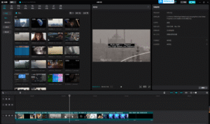
For our final documentation, we produced a video that captures “the actual thing in action” alongside the key resources used to create it. Our team divided the workload into specific modules: while one member handled the overall editing and structure, the rest of us provided content based on our areas of expertise.
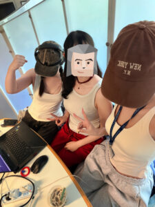
It was a funny coincidence that the three of us editing the video all showed up wearing white tank tops that day, without planning it.
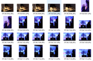
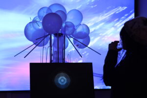
I was responsible for documenting the fabrication and sound segments. This included the construction of the breathing apparatus, the modification of the masks, and the intricate process of connecting our sensors to TouchDesigner. By combining footage of our work-in-progress experiments with clips from the actual exhibition day—showing the setup and real-time interaction—we created a comprehensive record of the project’s development. These materials effectively demonstrate how our technical resources, from 3D models to processed audio, converged into a singular, immersive experience.
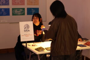
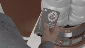
Our installation followed a strict flow: participants entered, drew a “passport,” watched an introductory video, passed through Customs, and finally entered the dark room for the TouchDesigner breathing experience.
Customs Officer
I served as the Customs Officer, which was easily my favorite part. It was the only segment of the project where I could improvise and interact directly with the participants. Giving them the “interrogation” and stamping their virtual passports felt like a piece of performance art in itself.
Humidifier Tech
Technically, I was also responsible for controlling the humidifiers to sync the air quality with each passport. This proved difficult due to equipment delay, which sometimes made it a little bit difficult to deliver the right “air” at the right time.
Moreover, since the humidifier wasn’t sealed very well, my station would get quite stinky at times—I wasn’t exactly a fan of that.
DMSP Blog 06 — Collaborative Development in TouchDesigner
I was assigned to the TD building group. As I had no prior experience with TD, my role was to support my teammates by using AI tools to troubleshoot logic errors and optimize data flows.
Effect Before Connecting the Sensor:
A key turning point in our project was moving from static data mapping (color/brightness) to motion-based mapping. We discovered that technical accuracy does not always guarantee a meaningful user experience. By utilizing GLSL ripples and Displace TOP, we successfully translated raw breathing waveforms into a fluid, temporal experience.
After Connecting with the Sensor:
Since the raw sensor data was processed via Python, we dedicated significant effort to establishing a stable bridge between the Python environment and TouchDesigner. And after observing the visual outcomes of other groups, we also refined our color palette.
Real-time TD Output With Breathing Mask Integration:
DMSP Blog 07 — Visualizing Air through Sound
Since I played a supporting role in the TouchDesigner setup, I also focused on developing the back ground sound track individually. I explore the ambient soundscapes I created for our six regional zones using AI.
Using prompts focused on breathing-like pulses and cinematic textures, I designed six distinct soundtracks. From the peaceful clarity of Edinburgh (Oak) to the suffocating, glitch-heavy distortion of Delhi (Lotus), these soundscapes move from “clean air privilege” to “toxic atmospheric inequality.”
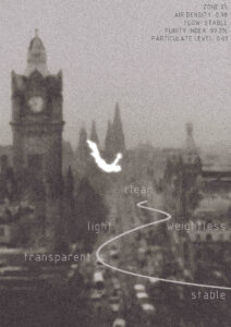
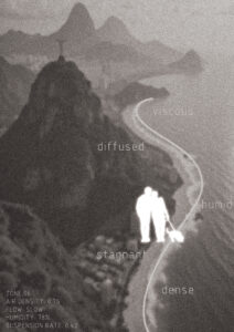
1. Edinburgh — Oak (The Privilege of Clarity)
Prompt Key:Clean air, soft, high clarity, minimal noise, peaceful.
The Narrative: This represents the highest level of air privilege. The sound is nearly empty and stable, creating an atmosphere that encourages slow, effortless, and deep breathing.
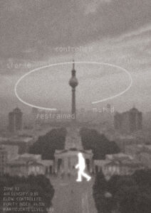
2. Berlin — Platanus (The Controlled Environment)
Prompt Key:Light industrial tone, low-frequency hum, stable, less natural.
The Narrative: While the air is breathable, it feels artificial. I introduced a subtle mechanical hum to evoke a sense of a “controlled” urban environment—breathable but detached from nature.
The Narrative: As moisture and pollution accumulate, the air becomes lingering and heavy. The sound uses granular textures to make breathing feel physically slower and less comfortable.
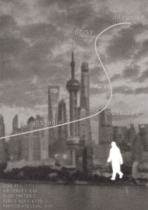
The Narrative: Here, pollution becomes a persistent presence. The introduction of noise layers reflects decreased visibility and begins to interrupt the natural rhythm of breathing.
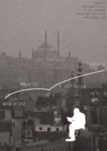
The Narrative: The sound captures the particulate matter of the desert air. By incorporating a “leaking airflow” sound, I wanted to communicate the physical weight and resistance felt with every breath.
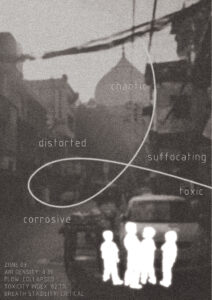
6. Delhi — Lotus (The Toxicity of Inequality)
Prompt Key:Toxic, distorted, chaotic, glitch noise, high tension, suffocating.
The Narrative: This represents the extreme of atmospheric inequality. Moving beyond “music,” the sound is a chaotic system of glitches and distortion, creating a fragmented and unsafe experience that mirrors a state of suffocation.
DMSP Blog 08 — Visualizing Poster
After using AI to complete the sound design for six zones, my next challenge was to transform these “sensory narratives” into intuitive visual posters.
I utilized desaturated and blurred architectural photos to prioritize atmospheric texture and mood over geographical recognition. Incorporating my AI-generated sound keywords like distorted and weightless as linear elements and complementing them with simulated real-time air data, I aimed to visualize the tangible feel of different air quality levels.
I intentionally omitted city names, challenging participants to identify the locations based on sensorial cues—guiding their imagination of who they would be under these differing atmospheric conditions. This transformed the posters from static displays into active tools for sensory perception and reflection on the right to breathe.
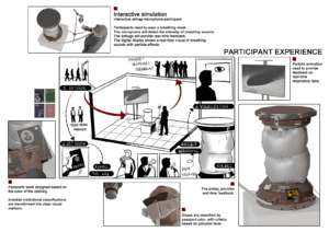
For Submission 1, I focused on translating our group’s concepts into a concrete visual narrative and participant experience. My primary responsibilities included creating effect pictures, designing the experience flow, and developing key visual ideas.
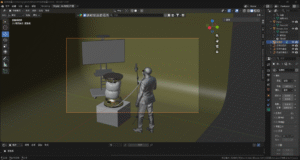
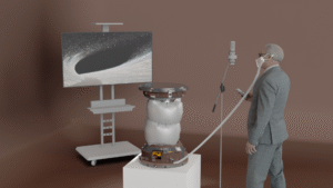
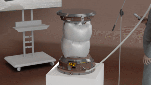
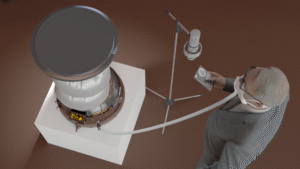
I used Blender to build a 3D environment based on our initial sketches, including a fictionalized design for the core respiratory device.
Effect Picture:
Experience Flow:
To clarify the interaction, I developed a Participant Experience Flow using the rendered images. This step-by-step guide illustrates the journey from receiving a “passport” based on visual markers to engaging in a real-time, multisensory interaction where the device’s airbags provide physical feedback and digital displays show particle animations based on respiratory data.
DMSP Blog 05 — Reflection for Feedback
This post focuses on reflecting upon my specific contributions: visual effects, device design, and experience flow.
Regarding Aesthetics, I realized that my particle systems were more decorative than meaningful. Moving forward, I will ensure that the visual density and movement of particles directly represent the “invisible threat” of pollution.
For the Apparatus, I need to pivot away from over-complicated hardware designs toward a more functional, impactful visual representation that addresses safety and ethics.
Most importantly, I must refine the Experience Flow from a collection of “disjointed” ideas into a single, coherent time-based journey. My goal is to make sure every visual element I render reinforces the feeling we want the audience to walk away with.
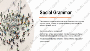
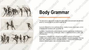
My initial proposal focused on visualizing the invisible social structures within public space. I was interested in how everyday environments such as streets, studios, or cafés contain constantly shifting patterns of interaction, which are difficult to perceive directly but strongly shape our experience of a place.
The project explored two possible directions:
one looking at collective relational patterns (how people gather, disperse, or form spatial configurations).
And the other focusing on individual “body grammar”, examining how emotions subtly influence movement, attention, and behavior while navigating the city.
This perspective was largely informed by my background in architecture, where spatial perception and human behavior are often considered together. Instead of treating space as static, I approached it as something continuously produced through movement and interaction.
Although this proposal was not selected for further development, it helped me identify an ongoing interest in how invisible dynamics shape spatial experience, which I aim to carry into future work.
DMSP Blog 02 — Research on “Breathing Rights”
Following the establishment of our theme “Breathing Rights”, our focus shifted from abstract ideas to grounding the project in real-world conditions. We aim to explore air not only as an environmental issue, but as something deeply connected to health, inequality, and lived experience. e also looked into the primary sources of pollution, including traffic emissions, industrial activity, and urban density, as well as historical trends showing how air quality has evolved in different regions.
Case Studies:
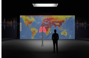
Air of the Anthropocene — Robin Price & Francis Pope
By using a custom-built LED “pollution painter” that links light density to real-time sensor data, this project translates invisible particulate matter into luminous patterns in long-exposure photography, making microscopic pollution tangible and visible.
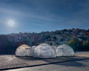
A series of interconnected domes that simulate the distinct smells and temperatures of polluted cities worldwide, forcing visitors to physically experience the inequality of air quality.
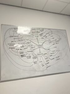
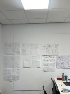
Our team brainstormed how to address air pollution and the unequal distribution of clean air. We used mind mapping to break down themes then moved into rapid sketching to explore potential formats. Our ideas ranged from recording the sound of breathing to using physical objects (like filters) to make the invisible nature of air more tangible and interactive.