Any views expressed within media held on this service are those of the contributors, should not be taken as approved or endorsed by the University, and do not necessarily reflect the views of the University in respect of any particular issue.

Breathing Space in Fog

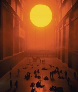
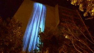
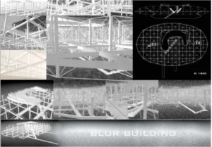
Unlike traditional architecture, which depends on form and structure, Blur Building by Diller Scofidio + Renfro replaces solidity with atmosphere. Built for the Swiss Expo on Lake Neuchâtel, the structure exists as a cloud of artificial fog, continuously forming and dissolving in response to environmental conditions.

From a distance, the building appears as a vague mass. As visitors enter, visibility rapidly collapses. Edges disappear, depth becomes uncertain, and spatial orientation is no longer reliable. Movement through the space depends on partial and constantly shifting information.

This instability forces a change in how the body navigates. Vision, typically the dominant sense in spatial understanding, becomes insufficient. Instead, perception is distributed across multiple sensory inputs: humidity on the skin, resistance in the air, sound of water pressure, and the presence of nearby bodies.

Proximity becomes the only reliable indicator of space. Objects and people emerge suddenly at close range, often without clear boundaries. This creates a continuous state of anticipation, where each step is exploratory rather than confirmatory.

Sound plays a subtle but important role. Mechanical noise, wind, and distant movement replace visual clarity as orientation cues. These elements do not provide precise information, but they contribute to a shifting sense of location.

Another key aspect is the absence of fixed form. The building does not maintain a stable outline; its shape depends on wind, temperature, and water pressure. As a result, the architecture feels less like an object and more like a condition—something experienced moment by moment rather than observed as a whole.

What makes this work particularly compelling is how it redistributes attention. Without clear visual structure, awareness shifts toward micro-level sensations: slight changes in temperature, density, and sound. The body becomes more active in constructing meaning from incomplete information.

For design practice, this project suggests that clarity is not always necessary for engagement. By removing stability and predictability, it is possible to create experiences that require active participation. Instead of presenting a fixed environment, the design can invite people to continuously negotiate their relationship with space.

In relation to my own work, this reinforces the idea that interaction can emerge through uncertainty. Rather than guiding users toward a clear interpretation, the experience can remain open, allowing meaning to form through movement, hesitation, and sensory adjustment.

Reference work:
Blur Building (2002), Diller Scofidio + Renfro, Lake Neuchâtel

Subtle Control Through Environment

It is often assumed that perception is a direct response to what we see. This assumption is subtly challenged in The Weather Project by Olafur Eliasson, installed at Tate Modern.

At a formal level, the work is minimal: a glowing semicircle, reflected by a mirrored ceiling, completes the illusion of a full sun. Mist fills the space, diffusing light and flattening contrast. However, the work does not end at what is seen. Its impact emerges gradually through how people begin to behave within it.

Over time, visitors slow down, lie on the floor, and gather in groups. Many look upward, not only at the artificial sun but also at their own reflections above. Without any explicit instruction, the installation reorganises behaviour. The space becomes less about observing an artwork and more about inhabiting a shared condition.

What is particularly interesting is that there is no direct interaction system—no sensors, no feedback loop in the conventional sense. Instead, the environment itself operates as a soft form of interaction. Light, scale, and atmosphere guide attention and movement without making this guidance visible.

The mirrored ceiling plays a crucial role. It introduces a secondary layer of awareness: people see themselves as part of the environment they are experiencing. This creates a subtle feedback loop between body and space, where observation shifts toward self-observation. The participant is no longer just looking, but also being seen within the same visual field.

The strength of the work lies in its restraint. Rather than overwhelming the audience with complex media, it relies on a limited set of elements to produce a gradual shift in awareness. This experience unfolds over time, making subtle behavioral changes become obvious.

For my own project, this reference suggests that interaction does not always need to be explicit or reactive. Instead of designing clear instructions or outcomes, it is possible to construct conditions that influence how people move, pause, and attend to their surroundings. In this sense, interaction can exist in atmosphere rather than interface.

Reference work:
The Weather Project (2003), Olafur Eliasson, Tate Modern

Sensor Data & Translation

During the development process, we worked with sensors to capture interaction data, particularly subtle changes related to breathing and pressure.

At an early stage, we expected the sensor data to be straightforward and easy to use. However, the actual output appeared as continuous, fluctuating waveforms rather than clear, discrete values. This made it difficult to directly integrate the data into our interaction system.

When connecting the sensors to TouchDesigner, this issue became more apparent. Our interaction logic required stable and readable inputs, but the raw data was too complex and inconsistent to be used effectively.

Instead of trying to preserve all the original data, we decided to simplify it. We translated the continuous signals into basic numerical values by defining thresholds. For example, certain ranges of data were converted into distinct states, such as different levels of intensity.

This process was not just a technical adjustment, but also a conceptual decision. By simplifying the data, we were effectively deciding what aspects of the interaction were important and what could be ignored.

Through this, I realized that data in interactive systems is not neutral. It is always shaped, filtered, and interpreted before becoming part of an experience. What the audience encounters is not raw data, but a designed version of it.

Throughout the project, my contributions focused on device design and assembly, user testing observation, data organisation, and on-site installation.

Working on the physical construction of the installation required translating abstract ideas into tangible structures. At the same time, dealing with sensors and data meant constantly negotiating between technical limitations and desired interaction outcomes.

During user testing and the exhibition, observing participants became an important part of the process. Rather than evaluating whether the system worked “correctly,” I focused on how people behaved within it—how they hesitated, explored, or adapted to uncertainty.

Looking back, the project was not only about building a functioning system, but also about shaping an experience through a combination of material, technical, and behavioural decisions. Each part of the process influenced how the final interaction was perceived.

Rethinking Perception Through the Body

Reference work: Blind Robot (2005), Louis-Philippe Demers & Bill Vorn

This installation presents an interaction between a robotic arm and a human participant, where the robot explores the participant’s face through touch.

What stands out in this work is the shift in roles. Instead of controlling or observing the machine, the participant becomes the subject being explored. This creates a sense of uncertainty, as the interaction is slow, physical, and not entirely predictable.

There is no visual interface or clear explanation of what is happening. As a result, the experience relies on bodily awareness rather than interpretation through instructions or screens.

This made me reconsider how interaction can be structured. In many digital systems, clarity and control are prioritised, but this work shows that removing these elements can create a more intense and memorable experience.

In relation to our project, this reference highlights the importance of hesitation and subtle interaction. Rather than guiding users towards a fixed outcome, interaction can remain open, allowing meaning to emerge through small actions and personal interpretation.

Exploring Materials and Building the Installation

At the beginning of the project, our group focused on developing a concept before deciding to build a physical installation. Once the direction became clear, we started exploring how to realise it materially.

Initially, we tried to find discarded metal rods as a way to reduce cost and reuse materials. We visited three different places, hoping to source scrap metal, but found that these locations only accepted materials rather than selling them. This forced us to reconsider our approach.

We then looked into purchasing metal rods, but quickly realised that they were difficult to cut and work with using the tools available to us. This introduced a practical limitation that directly affected the feasibility of our design.

n response, we made a compromise: instead of using real metal, we chose wooden rods and spray-painted them with metallic paint. This allowed us to achieve a similar visual effect while making the structure much easier to build and adjust.

After selecting the materials, we moved on to assembly and installation. We cut, arranged, and fixed the wooden rods into the desired structure, and carefully set up the space to support the overall experience.

This process highlighted how material decisions are often shaped by constraints rather than initial intention. The final outcome was not a direct execution of our original idea, but a result of adapting to available resources, tools, and time. The installation became a negotiation between concept and practicality.

Exhibition Role: Immigration Checkpoint

During the exhibition, I was positioned at the “customs” checkpoint of our installation, where the interaction between participants and the system first began.

There were two of us managing this stage. My partner was responsible for communicating with visitors and stamping their passports, guiding them into the experience. My role was more observational and responsive. I monitored the colour of each participant’s passport and adjusted the type of “air” they would receive accordingly, which directly influenced their breathing experience in the next stage.

This role required constant attention rather than direct instruction. Instead of guiding participants verbally, I had to interpret small visual cues and translate them into system responses. This created a subtle layer of control that was mostly invisible to the participants.

What became interesting during this process was how differently people behaved when entering the space. Some participants tried to speak or ask questions, while others remained silent and simply followed the situation. Without clear instructions, people began to rely on their own assumptions, which shaped how they experienced the installation.

This made me realise that interaction does not always need to be explicitly guided. By reducing instructions, the system created space for uncertainty, where participants became more aware of their own actions and decisions. My role, although simple on the surface, was part of maintaining this balance between structure and ambiguity.

Mid-Project Contribution and Reflection

At the mid-point of the project, I was mainly responsible for developing the user flow of the installation. I mapped out how visitors would enter the space, receive a passport, be classified, and then move into different breathing environments. The overall structure of the journey is now clear, but I realised that some transitions between stages still need to be smoother and more convincing.

I also took part in the early discussions about the main idea of the project. We talked about how air, breathing, and environmental differences could become the core theme, and how to turn these abstract ideas into something people can physically feel. During this process, I helped clarify the purpose of the passport system, making sure it represents structural inequality rather than judging individual behaviour.

Through this stage, I learned that building a clear experiential flow is not only about arranging steps, but also about making sure each moment supports the concept. Although the flow is not fully final yet, the main direction is clear, and we will continue refining it through testing and discussion.

Making Invisible Pollution Visible: Particle Falls – Andrea Polli

One project that I find particularly compelling is Particle Falls by media artist Andrea Polli. Installed on the façade of a public building, the work uses real-time air quality sensors to detect particulate pollution (PM2.5 and PM10) and translates this data into dynamic LED light patterns visible at night.

What interests me most about this installation is how it makes something normally invisible part of everyday visual experience. Air pollution usually exists as numbers in reports or as abstract warnings in the news. It is rarely something we can directly see. By turning particulate data into shifting intensities of light, Particle Falls brings environmental conditions into the shared space of the city.

Rather than presenting raw statistics, the work operates through translation. Higher pollution levels result in denser and more intense light “falls” across the building surface. In this way, scientific measurement becomes atmospheric and spatial. I find this shift important, because it reduces the gap between environmental monitoring systems and public awareness. The building itself becomes a kind of interface.

At the same time, the project makes me question the relationship between aesthetics and crisis. Does visualising pollution increase awareness in a meaningful way, or does it risk softening the severity of the issue through beautiful light effects? By embedding air quality data into the night-time cityscape, the installation reframes pollution as something present and continuous rather than distant or abstract.

For me, Particle Falls demonstrates how design can mediate between scientific systems and public understanding. It suggests that environmental data does not have to remain confined to expert discourse, but can become part of shared urban experience—something we encounter, notice, and reflect on together.

Reference
Polli, A. (2010). Particle Falls.
Science History Institute.
https://www.sciencehistory.org/sensing-change-particle-falls/

css.php

Report this page

To report inappropriate content on this page, please use the form below. Upon receiving your report, we will be in touch as per the Take Down Policy of the service.

Please note that personal data collected through this form is used and stored for the purposes of processing this report and communication with you.

If you are unable to report a concern about content via this form please contact the Service Owner.

Please enter an email address you wish to be contacted on. Please describe the unacceptable content in sufficient detail to allow us to locate it, and why you consider it to be unacceptable.
By submitting this report, you accept that it is accurate and that fraudulent or nuisance complaints may result in action by the University.

  Cancel