
Glimmer of hope XI
Testing, testing, testing
Part XI of Glimmer of hope. (19-April-2020)
Summary
There are serious calls for over a thousand million tests to be made in the USA alone during the COVID-19 epidemic. The aim would be to restore the USA to some normality as quickly as possible. More labs, machines, technicians and health workers would all be needed. Is testing on such a massive scale a satisfactory, realistic plan?
Opening up America again.
Recent reports suggest the USA is actively planning to reopen the economy. They’re scary plans. At the same time there are many, many calls for more extensive testing. Could more widespread testing accelerate economic recovery?
The USA is publishing extensive, detailed data about COVID-19 from its current testing programme. The database is updated daily (16:00 ETS) and easily accessible. It is a fantastic resource.
Big countries like the US show vast geographical differences in COVID-19 response. Currently two states, New York (NY) and New Jersey (NJ) dominate the dataset as COVID-19 hot-spots. Differences result possibly according to the timeliness of the implementation of ‘tracing’ and ‘distancing’ measures. A few days of delay can make a big difference.
Four plots (below) summarize the infection and death rates for New York and New Jersey. Much of the data is very scattered (especially New Jersey deaths, top right), making trends difficult to determine and trust. Different states monitor, process and report COVID-19 data in different ways. New Jersey seems to have had trouble in maintaining a consistent procedure over the last 16 days.
The daily death rate in New York looks to have started to slowly decline. Otherwise it is not obvious why one would plan to reopen the US economy at such an early stage.
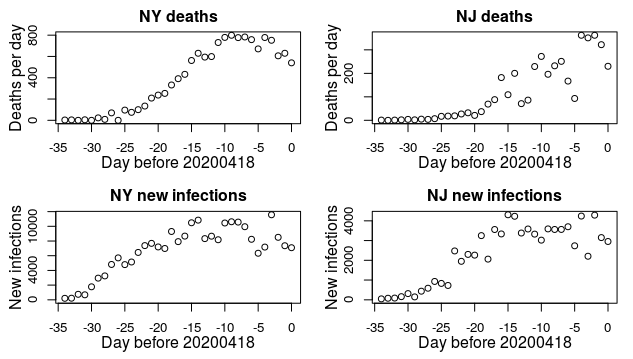
Historical time-series of deaths and new infections in New York State and New Jersey over the last 35 days.
An improved statistic
Is there a way of correcting the scatter in the above graphs? The new infection time-series (bottom two panels) really need correcting for the ever-increasing testing that is being undertaken in the USA. [Testing is free, in many states, as long as you have medical insurance.]
In theory the correction is easy. Simply divide the number of new cases by the number of new tests to give the percentage of people tested on any one day that have been found to be positive. Through an epidemic this percentage starts off at zero, rises and returns to zero as the epidemic ends. The graph below shows the outcome of applying the correction procedure based on results for all 56 states combined. It turns out that the procedure does a good job at reducing the day-to-day noise.
Initially (for three days) there were few measurements made each day. Everyone tested positive, so the percentage was exactly 100%. Over the next week the percentage stabilised as monitoring improved. The percentage drops slightly erratically, to around 20%. And then, for the last 38 days, more or less nothing happened. Nothing! The graph is basically dead flat.
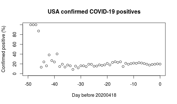
Historical time-series of positive test results in the USA expressed as a percentage of total daily tests. To date the number of specimens tested in the USA (in comparison to the UK) is quite staggering. For SARS CoV-2 by CDC labs it stands at (N= 5,091) and for US public health laboratories at (N= 359,890).
Is more and more testing a good step forwards along the road of reopening economies? Some high-powered economists certainly think so. Paul Romer certainly does. Romer recently shared a Nobel prize with Bill Nordhaus – I am a big fan of Nordhaus for his pioneering work on climate change, but that’s another story). Romer’s proposal is for the USA to deploy 22 million tests every day for many months, such that the entire country would be tested every two weeks. Positive testers could then be quickly quarantined and hence the virus could be contained.
After perusing the above diagram with its totally flat trajectory, I am not so sure that vast amounts of testing will necessarily help in allowing economies to reopen. The alternative route forwards is mass surveillance, for example by embedding contact tracing functionality into mobile phones (on a voluntary basis).


So when do most people get tested? Is it only when they have symptoms? If so, does the 20% simply measure the proportion of people displaying Covid-like symptoms who actually have the disease?
Good question. I wish I knew the answer. The 2o% figure is disquietingly high. It implies that US doctors are only testing subjects with a very high probability of having the infection. The proportion of COVID-19 cases in the American population as a whole (technically the prevalence) is almost certainly lower. For testing methodology South Korea provides the gold standard. Their COVID-19 testing gave positive results of closer to 2%. An area/country with a lower positivity rate is much better off than one with a high rate.
Scotland’s current testing gives a 28% positive figure and hadn’t really been above 30% even with a testing regime that only tests once you are hospitalised. NHS frontline nursing staff report a background worry about the accuracy of current testing. ( this is anecdotal based only on my own limited life experience)
Donald, Many thanks. Very useful statistic. 30% positives when testing only hospitalised patients. I think that Scottish example confirms the US 20% figure is derived from procedures far from the random sampling needed to generate really worthwhile data. I’ll follow up on the links you provide. Many thanks again.