
Glimmer of hope X
When will we know the coronavirus battle is over?
Part X of Glimmer of hope. (16-April-2020)
Summary
Planning a road map to reopening economies is not going to be easy. Lives have to be weighed against livelihoods. Hubbert’s peak-oil mathematics can offer a helping hand. It can help distinguish an emerging 2nd peak (requiring a re-tightening of restrictions) from minor, short-term fluctuations in infections and death rates (allowing a continued easing of restrictions on movement, travel and work).
Australia and Singapore
A fascinating article in the Guardian examines the Covid-19 exit strategy for Australia and Singapore. Two snippets caught my eye. First
“The risk of relaxing too early. There is danger in complacency. Singapore, for weeks the darling of international comparison, the exemplar of how best to suppress the Covid-19 pandemic, has since seen a dramatic spike in the number of infections...”
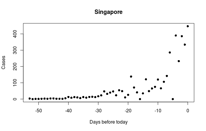
The newspaper article did not show the data for Singapore. A plot of the infection rate data for Singapore (below) does not really support the idea of a ‘surge’ or ‘spike’. To me the plot looks like the start of a classic exponential rise towards Singapore’s first peak. Currently there is too little data to estimate the height and likely timing of the peak. It will be interesting to see how Singapore will cope.
Calibration Secondly, policy makers and health officers are fond of the word “calibrate” in connection with Covid-19. Two quotes from the same Australian Guardian article give us
“policymakers … need to determine a … calibrated, step-wise approach” and
“the only way … is to watch what’s happening and calibrate the response according to what’s happening“
But what does calibration actually mean? And how can it be achieved?
Italy
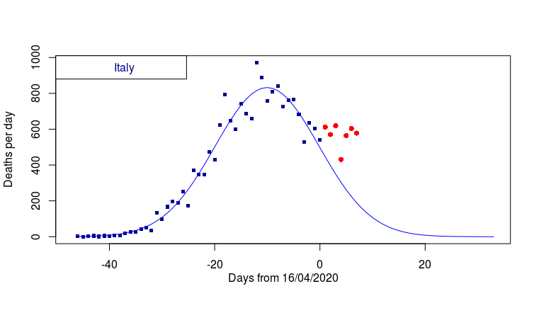
The time series of Italian deaths, up to today is plotted below. I hope to use it to illustrate how peak-oil maths can help ‘calibrate’, or at least distinguish between various Covid-19 scenarios. Italian deaths over the last week are plotted in red. Do these seven data points reveal the start of a second peak? Or do they ‘just’ represent a slowing of the rate of decline? Or are they merely part of a short term fluctuation that will soon pass?
Imagine you are the Italian health minister. Some 30,000 additional lives will depend on your ‘calibration’ of the current Covid-19 situation. In short, are those seven red dots a blip, a slowing trend, or the first dreadful indications of a 2nd peak. You need to decide quickly! There is precious little other data to help you calibrate. In fact you need to decide right now. So before scrolling down any further, what is your decision? I wonder if it will be the same as mine.
Ok, let’s try some geostatistics. Our first model attempt (above) showed an empirical fit using data up to one week ago (ie the time period representing the first peak). At first sight the misfit with last week’s data (the red dots) looks rather worrying.
Now (see model 2, below) let’s move on and fit all the death rate data right through to today. Model_2 looks slightly more hopeful. However, the high death rates over the last three days suggest extreme caution should still be exercised. But is the blue curve of model_2 truly a good fit? To be honest I’ve seen better fits in my life.
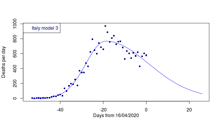
Can we do better? Let’s try adding one final model parameter. Let’s allow the third model (final graph) to select a different rate of decline compared to the rate of increase.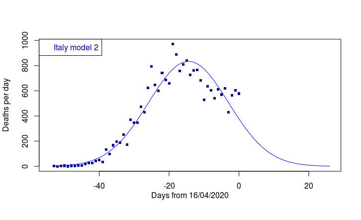
And so, at last, we arrive at model_3. To me this looks like a very acceptable fit. The Italian health minister has an easy task. Her calibration exercise is over. There is no need to re-close the Italian economy. She can even advise hospitals on an updated estimate of how many deaths (per day) can be expected over the next thee weeks.
In brief, my assessment is that the Italian data is starting to display a slower rate of decline than rise. There is no need to further close the Italian economy. Deaths of over 200 people per day will continue in Italy for a further fortnight. The total number of expected Italian deaths during the phase 1 (the area under the blue curve in model_3) is 23,947.


You really make it seem so easy with your presentation but I
find this matter to be really something that I think I would never understand.
It seems too complicated and very broad for me.
I’m looking forward for your next post, I’ll try to get the hang of it!
Following the COVID-19 pandemic isn’t rocket science. The main thing is to look at the raw data, sit back, take your time and decide for yourself what the data is showing. Modelling epidemics is tricky because epidemics grow exponentially.
If you allow asymmetric rise and fall in Scotland, does the first wave look set to last longer than your earlier predictions?
Its really a question of whether an analysis of variance will support a skew-normal (4-parameter) model rather than a symmetric (3-parameter) normal. It’s exactly the same problem as modelling the decline phase of UKCS oil reserves (see blog page about Hubbert). Chinese curves are extremely symmetric. Both in Wuhan (see graph in earlier blog post) and 29 other Chinese provinces. these 29 provinces escaped largely unscathed (because of early, firm distancing measures). The 29 had an average rise time (up to peak) of about 14 days, and about 16 days (down from the peak).
Western economies and politics won’t allow the sharp, effective remedies that saved the Chinese populations. So the best analogy, until the analysis of variance gives me the go ahead to fit a more complex model to the Scottish data, is Italy and Spain. My feeling is that recent Italian and Spanish data are pointing to more and more asymmetry in the trajectory of their peaks.
The start date for your Singapore graph is about the end of February. I wonder if that was when the Authorities there first published their statistics, as on a flight from Brisbane to Singapore on 6th January an announcement was made on the aircraft to the effect that anyone suffering from flu-type symptoms should report to the Authorities on arrival. This begs the question that they were aware of this virus in early January.
Jane, Very interesting. 6th Jan is an early date. The authorities were well aware by Jan 6th, as temperature checking began on 2 Jan for air travellers from China. The first recorded case in Singapore was 24 Jan, while the first recorded death occurred a month later on 22 Feb.
Wikipedia provides a detailed timeline of recorded deaths and of the introduction of preventative measures in Singapore.
https://en.wikipedia.org/wiki/2020_coronavirus_pandemic_in_Singapore#Timeline
Thanks, Roy. I’ve had a look at Wikipedia. While Singapore has a similar population to Scotland, but of course is much more densely populated, I find it interesting that, as of today’s figures, we have an almost similar number of cases (9125 in Singapore against 8672 in Scotland), yet deaths in Scotland number 985 as opposed to 11 in Singapore. Also, it appears that Singapore’s deaths are mainly among immigrant workers sharing dormitory accommodation rather than in the general population, whilst Scotland’s are in the general population. Just an observation.
The reason for the large discrepancy between Singapore and Scotland in their deaths to cases ratio, that you point out, is almost certainly due to major differences in the approach the two countries have taken to assessing the prevalence of infections. In the UK the vast majority of subjects being tested are in hospital (either as patients or as staff). Inevitably many of the patients die and this is the reason why Scotland has such a high ratio of deaths to cases. Scotland’s ratio is almost as high as anywhere else in the world. In Singapore I anticipate deaths will rise sharply in the coming days once COVID-19 takes hold. A similar sharp rise can be expected to follow in the favela of Rio, the slums of Lagos and the 800 million souls in poverty in India. Many, many, more people are still to die from COVID-19.
Sorry, made a mistake! Read “cases” for “deaths” in my last sentence.