
Glimmer of hope IX
Good news. Scotland is ahead of, not behind, the UK!
Part IX of Glimmer of hope. (15-April-2020)
Summary
My modelling places Scotland 4 days ahead of the UK along its COVID-19 trajectory, despite yesterday being the 2nd worst day ever in Scotland for new COVID-19 cases.
Scotland vs. United Kingdom
A total of 93,855 cases of COVID-19 have been reported in the UK, with 5,252 being added yesterday. Scotland saw its 2nd worst day with 390 new cases, bringing today’s Scottish total up to 6,748. Most reports I have read have placed Scotland as trailing the UK along their epidemic trajectories. And yet, and yet, my modelling indicates that both have peaked, with Scotland being 4 days ahead of the UK. How can that be?
For the UK vs. Scotland comparison I prefer to analyse new case data. I take the data at face value.The Scottish data derives from the excellent (totally unofficial) Travelling Tabby‘s Coronavirus Tracker for Scotland. The UK data is scraped from the user friendly European ECDC’s worldwide update. In complete contrast I find local, official databases and briefings totally inadequate and frankly unhelpful.
The diagram below shows my modelling. As everyday passes, in both geographical regions, my model becomes better and better constrained (narrower swathes of greens and blues). In particular, note how the Scottish (green/orange) trajectories lead the UK (blue/cyan) trajectories. The difference in timing can be seen both during the rising phase of the epidemic and the declining (projected) phase. The vertical coloured lines to the left of the white bar (which represents today) emphasise that the peak has passed in both Scotland and the UK.
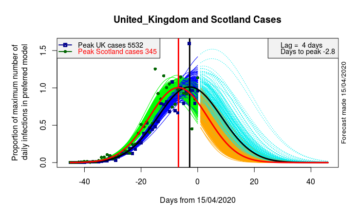
Comparison of daily infection rates in Scotland and UK. Data and model fits at left, forecasts at right. UK infections (Blue / Cyan / Black). Scotland infections (Green / Orange / Red). Cyan illustrates projected new daily cases in the UK. Orange illustrates projected new cases in Scotland. My best estimate places the UK (black curve) at 2.8 days past peak, with Scotland (red curve) a further 4 days before that. In order to compare different countries COVID-19 data needs scaling. Here everything is plotted as a proportion of daily infections at the maximum of my preferred model. Peak (modelled) values are given for UK (black) and Scotland (red) in the left hand legend.
Travelling Tabby
If I understand Travelling Tabby’s incredibly helpful spreadsheet correctly he notes how the percentage rise of infections (since yesterday and from 3 days ago) have increased by 6 % and 14% respectively.
Interestingly my model appears relatively unconcerned by such recent changes. Instead it continues to predict that we are already through peak and headed on a long-term downward trend.
Of course, one has to assume that the reporting of the data is reliable, and there have not been too many changes in measurement protocol. Time will tell…
Previous COVID-19 blog pages


Recent comments