
Glimmer of hope XXI
Can predictive curve-fitting models pass that most pragmatic ‘litmus test’, namely usefulness?
In recent days I have been posting blog pages about a geostatistical technique popularized by Marion King-Hubbert for analysing oil reserves, but instead applied here to curve-fitting COVID-19 epidemics. In particular I have tried to forecast the future trajectory and magnitude of the epidemic in a range of countries. Below I plot an example of a Hubbert graph, with its straight-line projections of the ultimate number of deaths (per capita).

(larger image)
Hubbert predictions of final (per capita) death tolls. Countries ranked (see legend) by total numbers of per capita deaths (as of 9th May). Scottish deaths added as brown dots and line. All data points are daily. For example the black square in the extreme lower right corner represents the most recent day for which data was available at the time the diagram was drawn (9th May) in Belgium, the black square above the day before. Hubbert showed that a plot of Q vs P/Q can be used in a straight-line extrapolation (dashed lines) to determine recoverable oil-reserves, or in this example, ultimate deaths. Some of the data sets (especially USA, UK & Scotland) are rather scattered. Nevertheless reasonable projections forward can still be made.
One reader was intrigued as to why, on the Hubbert graph, linear declines should occur at all, why there should be so many different intersections (where the downward-sloping lines meet the horizontal axis) and why so many different gradients. A good, discerning three-part query.
To answer the first part of the question: an analogy can be drawn with an ecological model. Imagine a piece of newly derelict ground starting to fill up with weeds. In the beginning the weeds are so far apart they are not competing with each other and so the number of plants can grow rapidly. Then as the weeds become more numerous the rate at which new plants appear starts to be constrained and to depend on the area of unoccupied space remaining. Eventually the previously open ground is fully occupied. In the oil-energy analogy the rate of new discoveries primarily depends on the geology. Specifically it is mainly controlled by the volume of rock remaining to be explored. Oil production follows discovery, but typically with a ten-year development gap. What rates of oil discovery, weed increase, and daily deaths during viral infections, have in common is their dependence on the fractions of the ultimate totals (barrels of oil, gaps between weeds, susceptibles) which remain untouched.
Secondly: concerning the great variety of intercepts, this is more straight forward. The variety can be explained by distinct Governmental actions. The stringency of the social distancing that countries chose to adopt, the firmness and rapidity with which travel restrictions were put in place, and the effectiveness of temperature testing at major airports were all key. Governments who chose to take no, or tardy, actions have ended up with a high numbers of deaths on their hands. Countries that acted swiftly have had far fewer deaths and are already returning to free internal movement and to rebounding economies.
The third, and final, part of the query concerns the different slopes on the Hubbert plot. That part of the question particularly intrigued me. I have to admit I didn’t immediately know the reason for the variety. Consequently I decided to try to find the answer by mathematically simulating diverse epidemic trajectories, by plotting the resulting time-series and by drawing their Hubbert slopes. To do this I simulated an extremely broad range of scenarios in order to detect any unusual effects more clearly. (Three images below).
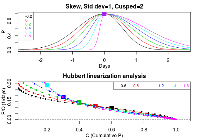
Top panel – Ensemble of time-series of synthetic epidemics for different skewness parameters (see colour coded legend). The fixed values of the other two parameters appear in the title. Lower panel – Hubbert diagram of daily deaths (cumulative) vs. ratio (daily death rate to daily number of cumulative deaths). Each coloured line in the lower panel corresponds to the same coloured trajectory in the upper panel. Note the similarity of all the slopes and intercepts in the lower panel, once the peak (squares) has been passed. See my previous blogs for more details.
I need to briefly go into a little detail at this point. Out of the five parameters that I have been using to model epidemic trajectories there are basically just three that control the shape of the epidemic. These are the “skewness”, “broad-shoulderedness” and “width”. The other two parameters don’t really change the shape. Instead they control the timing and peak height of an epidemic. In each of the three graphs I vary just one of the three shape-controlling parameters at a time.
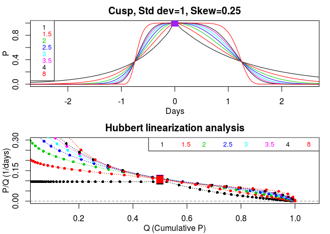
Caption as previous diagram, but for changes in the cusped/broad-shouldered nature of the trajectory. Note the interesting cusp shape of the black curve. Also note the broad similarity of all the slopes and intercepts in the lower panel, once passed the peak, despite the wide range of trajectory shapes being synthesized.
In all the bell-shaped epidemic curves, or slightly skewed or somewhat broad shouldered (cusped) trajectories, I find the Hubbert slopes are reasonably close to a straight line (quasi linear) with very similar gradients (above two diagrams). However, in contrast, I find the slopes differ appreciably when the width parameter (standard deviation), which controls the duration of the epidemic, is altered (see third figure, below). QED.
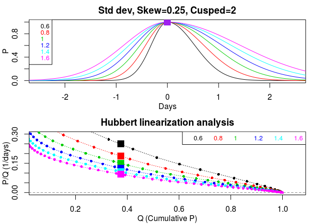
Caption as previous diagrams, but for changes in duration (std dev) of the epidemic. Note the wide variety of post-peak slopes. The narrower the trajectory – the steeper the slope.
Interestingly if one peers very closely at the far right-hand tips of the Hubbert slopes in all three diagrams many curl fractionally downwards. This suggests to me that oil-reserve estimates, made using Hubbert’s method, are likely to have been slightly overestimated. That is, the world has even less oil remaining than we modellers previously thought. It also suggests that out of the two geostatistical approaches that I have been surveying ‘peak oil’ and ‘flowering curves’ that the latter is the more preferable.
OK, I hear you asking – what possible use is there for all this rather esoteric maths in our present desperate COVID-19 situation? I’ll set that question aside for the moment but promise to return to it, and try to answer it, at the end of this blog page.
Moving on – countries are starting to unlock, their daily death rates are declining – what we now need to know is how well the unlocking process is working. Is it over enthusiastic and causing the epidemic to spiral back out of control towards a second peak? Or is it following the highly desirable downward course of negative exponential growth which will cause the epidemic to diminish and peter out?
In order to address these pressing questions good up-to-date data will be vital. Analysis of daily death rates proved to be quite prescient at forecasting the epidemic peak. However analysis of deaths is unlikely to be particularly useful for helping with policy decisions during the unlocking phase. The reason for this is that deaths strongly lag behind infections. For deaths data, the gold standard is excess mortality. But in the UK mortality data are only reported once a week. So, on average, the data are a week and a half (10.5 days) out of date. Worse still COVID-19 deaths typically occur around 20 days after infection. So the best death data is roughly 30.5 days behind the times.
What else is there? Case data, to my mind, are far too contaminated and too complicated. They conceal too many unanswerable questions. Who exactly has been tested? How many times has an individual been tested? How many false negatives? Also in the UK testing, although essential, has to my mind become over politicized.
Another possibility is big databases built around cell-phone location data, CCTV cameras, and tracking of debit, ATM, and credit cards in order to identify people infected with coronavirus. A further approach is to establish data banks of self-assessment reporting of COVID-19 symptoms. The excellent, and potentially extremely useful, Zoe self-assessment app. has been up and running since lockdown to achieve exactly this aim. We should all join and report our symptoms every day to Zoe, whether ill or not. The more people who participate in Zoe the better our local data becomes and the more soundly the tricky unlocking process can be monitored regionally and adjusted accordingly.
Zoe is already producing excellent insights. To take just one example consider the screenshot below. The form of the graph is fascinating. It plots the Zoe estimate of the proportion of the population infected, and its evolution with time. Slightly counter-intuitively the estimated number of people with COVID-19 continued to rise after lockdown. But once the pre-lockdown infections dissipated it soon peaked sharply and started to fall away. It is a shame that the early part of the epidemic was not captured by Zoe. Also when the curve will reach, or approach, zero remains unclear.
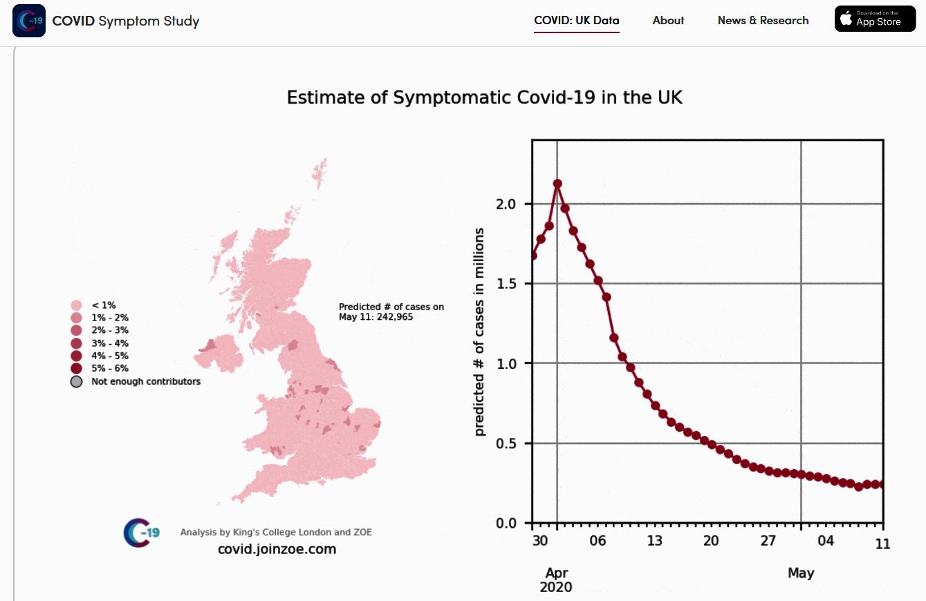
This Zoe graphic shows the number of people calculated to have COVID symptoms on each day since the 29th March. The map shows the level of infection on each day in each part of the country. The chart on the right shows the total number of people actively infectious and showing symptoms each day.
But hang on a minute! That chart, in the Zoe screenshot, is very reminiscent of one of the more extreme curves in my simulations – specifically the cusp-shaped curve in the second diagram (black curve). So maybe the maths behind the rather exotic death-rate scenarios I have been looking at could have a practical, useful, application after all. That would be satisfying. Maybe I could use my improved Hubbert curve-fitting (flowering curve approach) to figure out the missing parts of the Zoe curve, particularly the early (unknown) component of the epidemic.
I plan to give that idea a whirl over the next few days. If I don’t report back then either I couldn’t get hold of the Zoe data (quite likely), or the Hubbert maths failed (even more likely), or COVID-19 got to me first (worryingly likely).


Recent comments