
Glimmer of hope XIII
UK COVID-19 model consistently forecasts a rapid decline in daily deaths
Part XIII of Glimmer of hope. (21-April-2020)
In hindsight
My first COVID-19 prediction was posted 15 days ago, on April 6th. The time has come to look back and see how good (or bad) my predictions have been.
United Kingdom
My first forecast of the UK peak correctly identified the suitability of a three-parameter model. It placed peak as being poorly determined and some 12 to 18 days away. In hindsight the gap to peak was shorter than I calculated. On April 9th I anticipated peak deaths as occurring 8 days on from the last measurement day. Very few other groups were willing to forecast such an early peak at that time. In fact once again the peak came sooner than my forecast. The next day (April 10th), and from that day onward, I claim to have had the peak more or less correct (14th April, max daily recorded deaths 880) leading to a forecast of the total number of recorded deaths rising to over 20,000. Even today I notice that some news outlets still appear to be unsure if the UK really is over the peak.
In my view we are well and truly past peak and instead attention should now be focused on the rapidly declining UK mortality. The model has been very consistent as to the form of the decline, despite daily fluctuations in reported deaths. I consistently forecast a rapid decline. As yet I find no evidence for anticipating the the type of painfully slow decline being suffered by southern European countries. More specifically I expect daily deaths to fall off at a a rate equivalent to their rise (red curves below). More specifically I forecast daily deaths (assuming consistency in the reporting procedure and no hasty lifting of containment measures) of below 100 by 11 days time (2nd May). One caveat would be that a couple of days with a higher number of deaths could ‘tip’ the model into its asymmetric mode and so considerably delay the 100 deaths per day benchmark.
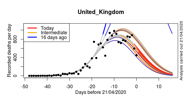
Reanalysis of forecasts of recorded daily deaths. Each coloured curve is a forecast made on a different day. The thick blue curve is the forecast from 16 days ago (before my first blog posting). The short, thick red curve is today’s forecast. Forecasts made at intermediate dates are shown by progressively redder coloured curves. The first two forecasts (uppermost blue curves) were made at a time before the COVID-19 trajectory could be projected forwards with any skill. On the third day of forecasting (lower blue line) the model is already getting the general characteristics of the future epidemic quite well. This analysis corresponds to the time of my first posting (April 6th). Moving on to 14-11 days ago (still before peak) the model was already close to forecasting the date, height and shape of the peak quite well (brown curves). From ten days ago to the present day the model has shown even better uniformity by consistently finding the same symmetric and rapid post-peak fall (red curves) along with a consistent date for peak ( April), and consistent estimates of the peak number of recorded deaths (just over 800 per day) and finally a consistent total number of deaths (areas under the red curves).
The next posting will aim to look at Scotland. I suspect my predictions will turn out to have performed less well there.


Recent comments