Glimmer of hope II
Part II of Glimmer of hope. (7-April-2020) Part I
Results
China:
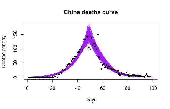
China provides an example of the death rate through a full cycle of the first wave of the COVID-19 pandemic. Purple lines are generalised-skew-normal response curves to outlier adjusted death data. Notice how the spread of model fits (purple band) demonstrates a sharp peak in the daily death rate of the epidemic in China (ie. a peak more pointed than in a classical bell-shaped curve). This effect has not been particularly noted previously by other analysts.
Also notice the very symmetrical response. This should prove useful for predicting decline rate in other geographical regions that chose to implement similarly effective isolation measures as in China.

China’s epidemic can be seen to run from about day 20 to day 80. So I expect our event will last about 60 days, longer if the UK government doesn’t bring in stricter isolation laws soon.
World:
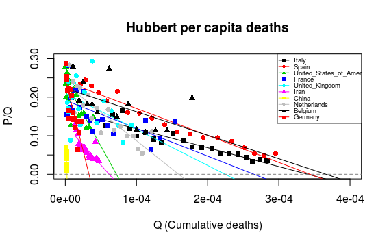
Step 1: Using a geostatistical approach the first step in estimating world deaths during the first wave of the global COVID-19 pandemic is to apply Hubbert’s peak oil methodology. Here data from individual countries is processed to determine the most likely number of deaths (expressed on a per capita basis, Q) when the first wave has passed. Hubbert’s quotient, P/Q, is the ratio of daily deaths to cumulative deaths.

The key point of interest is where individual country projections (coloured sloping lines) cut the lower axis (dotted horizontal line). The worst prognosis is for countries with intercepts to the right of the diagram (Spain, Italy and possibly Belgium). Best prognosis (China, Iran) is for countries with intercepts to the left. NB. There are no error bars on this diagram. It is still too early to determine where most countries will end up. Nevertheless…
Step 2
A typical intercept looks as though it might average around 2E-04 (or in plain English 200 deaths per million people). With a world population (as of 7/April/2020) of 7,776,174,440 the first wave of COVID-19 could well claim 1.5 million lives.
Spanish flu
To set the 1.5 million figure in perspective it is worth noting that the full death toll from Spanish flu is estimated to have been anywhere from 17 million to 50 million, and possibly as high as 100 million. World War II resulted in the deaths of some 75 million people, including about 20 million military personnel and 40 million civilians.
References to generalised-skew-normal response curve modelling and peak-oil estimation
Robert M. Clark & Roy Thompson, 2011, Estimation and comparison of flowering curves, Plant Ecology & Diversity, Volume 4, Issue 2-3, pages 189-200. PDF
Thompson, Roy (2017) Can fracking, for gas and oil, power the Scottish economy?, The Edinburgh Geologist, 62, 20-27. Edinburgh Geologist


Very interesting Roy – I look forward to the next installment.