Month: October 2020

Scottish National Gallery 29/10/2020

Sir Henry Raeburn, Major William Clunes, died 1830

Found it humorous that the first painting that greeted me/caught my eye upon entering the gallery was this huge horse’s rump. Funny to me that this was ever commissioned. Something weirdly provocative/domineering about it – big MASCULINE I AM A MAN energy. Animals in oil paintings represent wealth & status – Major William Clunes had a phatty? Poor horse.

John Singleton Copley, The Surrender of the Dutch Admiral de Winter to Admiral Duncan at the Battle of Camperdown (The Victory of Lord Duncan)

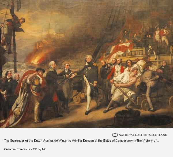
This painting represents the majority of pieces shown in this gallery/the old tradition of oil painting to me. All male, heroic poses and some duke dressed in his finest spotless uniform illuminated from the background workers. Boats and disasters – wins and losses and war and losses. In the gallery this painting is huge – takes up an entire wall, (and the walls are very big) – intended to be impressive but from modern eyes just screams of male narcissism and privilege. Not a fan.

Sir David Wilkie, General Sir David Baird Discovering the Body of Sultan Tippoo Sahib after having Captured Seringapatam, on the 4th May, 1799

A sign about reviewing gallery collections after recent events (BLM implied) accompanies this work in the gallery. It talks about colonialism and there’s some attempt at acknowledging British involvement/crimes. Not much of an effort tbh. I liked this painting much more in the gallery than online as it’s so big it takes up an entire wall, and as such the body of the sultan lays at eye level with the viewer, while the general is hidden by light reflections. I thought the lower part of the painting was quite beautiful, feeling very soft and intimate, almost romantic. I like that the display of the piece in such a way, intentional or not, changed the narrative and meaning of it, for me at least.

Thomas Gainsborough, The Honourable Mrs Graham (1757 - 1792)

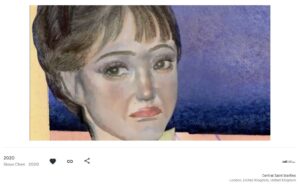
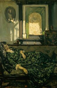
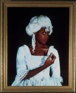
I liked her dress, the fabric and trim detail looks absolutely beautiful, and she has gorgeous diamond shoes. I need a dress with that neckline and bust shape, and the pearls and central red jewel are beautiful. Noted in the gallery how pale this woman is painted – white like porcelain. Also thought that the display caption was rather romantic and mysterious.

Giovanni Battista Tiepolo, The Meeting of Anthony and Cleopatra

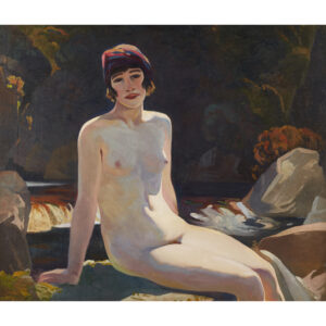
Funny pose – Cleopatra gives no fucks, I wish more women in these paintings had the attitude of staring over men’s heads like they pay them no second thoughts other than as servants.

Rembrandt (Rembrandt van Rijn), A Woman in Bed

Caught my eye because of the nude /naked debate (John Berger, Ways of Seeing) at first I thought it might be a genuine (semi)naked piece, the lady seems off guard and the posing is somewhat natural, however after having thought about it a bit more I’ve concluded that this is indeed more of the (semi) nude, as the women is clearly posed. The piece is also linked to a story from the Old Testament, of Sarah and Tobias, therefore making it a posed, staged, fake scene. The golden jewellery worn in the hair also points to this conclusion – what woman willingly sleeps in jewellery of her own accord.

Jan Lievens, Portrait of a Young Man

Probably my favourite piece seen today. Love it. Beautiful painting, light/colour/darkness/contrast is compelling, inviting, mysterious, antiquated, seductive, secretive. Robes painted to create a fine and supple texture. Compelling, intriguing and handsome face. The caption only adds to the intrigue “Once thought to be a self-portrait, the pose and costume of the sitter were probably significant in some way that is now unclear.” Lovely stuff.

Sir Henry Raeburn, Reverend Robert Walker (1755 - 1808) Skating on Duddingston Loch

This painting stands out from its surroundings because it looks almost surrealist in comparison to its neighbours. I think its a combination of subject, pose and background – but most notably the pose. Kinda weird and I think I liked it.

Pieter Jansz. Saenredam, The Interior of St Bavo's Church, Haarlem (the 'Grote Kerk')

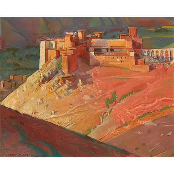
Gorgeous, detailed, sense of place just from looking at it. My only critique is that while the artist has clearly tried to accentuate and dramatize the architecture to the utmost degree, in a manner that is mostly convincing, the figures on the left side of the piece don’t quite match the scale of the piece at all. They look like dwarves or mythical creatures because they are the same height as the pews. When I noticed this it distracted me from the grandeur and beauty of the painting, but also adds some charm and interest to the piece. The chandelier is particularly beautiful.

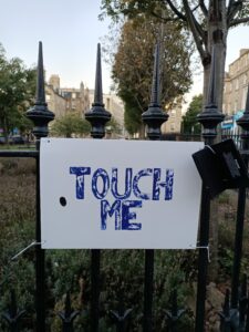
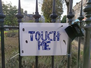
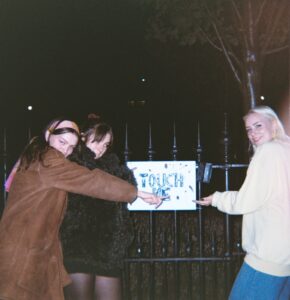
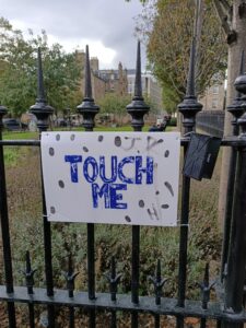
Not sure if meant to be an artwork or not – probably as it is cordoned off but I could not find a plaque for it. Would love to touch/lay on it. Inviting & seductive.

Cariani (Giovanni Busi), Portrait of a Young Woman as Saint Agatha

One of my favourite pieces at the gallery. Firstly I was caught by the face of the girl depicted, which seemed to me somewhat different from the typical oil-painted female face – she has more character and is therefore more realistic, I feel as though I’d like to get to know this woman. Secondly, the story behind the piece (and why she has a pair of breasts on a plate), a woman who was punished for refusing the advances of a man, but her expression in this piece is unbothered, she doesn’t look like someone to be pitied – a bad bitch from ancient times. Poss lesbian??

Paolo Caliari, Venus, Cupid and Mars

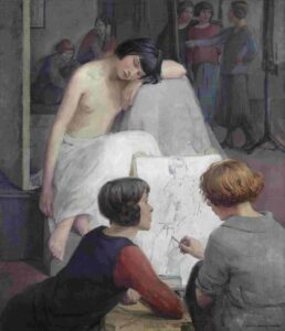
Kinda cool painting. Very big in the gallery, definitely a nude for the enjoyment of rich men, but I like that the man in this image is shrouded in shadow, a second thought as the artist didn’t include him in drawings or prepare his spot with white paint. Free the nipple. Also look at his weird ass FOOT. WHAT THE FUCK MAN HE WS DEFFO AN AFTERTHOUGHT HAHAHA

https://www.nationalgalleries.org/search?location%5B36063%5D=36063&sort=title&page=0

Night Walk For Edinburgh

‘Art Walk For Edinburgh’, Janet Cardiff and George Bures Miller. Participated in/viewed 28/10/2020 at 8pm with mum and mums boyfriend.

Night Walk for Edinburgh; 2019; Janet Cardiff and George Bures Miller - YouTube

“Following Janet Cardiff’s voice and walking in her footsteps, as you participate in Night Walk for Edinburgh you will be led through the backstreets of Edinburgh’s Old Town, unravelling a disjointed tale – part game-playing, part surrealistic poetry, perhaps even a murder mystery – layered with history, invention and memories. One of the biggest hits of last year’s Edinburgh International Festival, Cardiff and Miller’s Night Walk for Edinburgh is now a permanent part of The Fruitmarket Gallery’s collection. Commissioned for the city of Edinburgh by The Fruitmarket Gallery.

Night Walk for Edinburgh is a 50 minute walk through the Old Town of Edinburgh after dark. Following a film on your tablet or smart phone and a soundtrack on your headphones, you will walk up Advocate’s Close and along a route that weaves around the Royal Mile before returning to where you started. The route involves c.120 steps up and 30 down, and uneven ground, and is entirely in public, un-invigilated space. It is intended to be a solo experience, but as the walk is at night we suggest that you may want to enjoy it in pairs or small groups with a maximum of 6 allowed per slot. Although it is important that everyone has their own screen and headphones.”

^From the Fruitmarket Gallery website https://www.fruitmarket.co.uk/exhibitions/night-walk-for-edinburgh/#:~:text=The%20Fruitmarket%20Gallery.-,INFORMATION,returning%20to%20where%20you%20started.

“‘Walking is like the flow of history. One footstep after another,
one event after another. Every time we choose an action or
direction we change everything that might have been.’
Night Walk for Edinburgh
Janet Cardiff (b.1957, Brussels, Ontario, Canada) and George Bures
Miller (b.1960, Vegreville, Alberta, Canada) last showed their work in
Edinburgh in 2008, with their Fruitmarket Gallery exhibition The House
of Books Has No Windows. They return to Edinburgh to explore its
streets in a new video walk. Cardiff and Miller have been making audio
walks since 1991, and began making video walks in 2001, for locations
across the world including San Francisco Museum of Modern Art
(2001), dOCUMENTA (13) in Kassel, Germany (2012), and the
13th Sydney Biennale (2014). The only other walk they have made for
the UK is The Missing Voice (Case Study B) (1999), an audio walk that
takes you through the streets of the East End of London from the
Whitechapel Gallery.”

“In both the audio and video walks, Cardiff ’s voice leads the listener’s
footsteps, gently nudging you along the route, whilst also offering
disjointed observations and reflections that as a whole weave a
nonlinear, and often unsettling, narrative. Filmed and edited by Miller
using a Steadicam and binaural sound recording, the video walks
– called ‘physical cinema’ by the artists – add a second layer to the
sensation of moving through the city. Created using multidirectional
microphones in place of ears, binaural recording results in a sound
environment that is spatially logical, and can often be difficult to
distinguish from its real world equivalent. The effect can be uncanny,
as sounds and images double up, merging fiction and reality, in turn
intensified by the dreamlike quality of Cardiff ’s voice.”

“Through such well-trodden streets, this is neither history walk nor
ghost walk, though it evokes both. Staged at twilight, it not only sits on
the threshold of day and night, but also slips between the gaps of the
usual tourist trails and guided walks, as you navigate the city obliquely,
as if on another plane of reality. At one point Cardiff says: ‘Sometimes
I don’t know if my imagination is leaking into my reality, or if I’m
remembering something.’ Repetitions of signs and figures accentuate
this feeling, flitting between the incidental and the significant, like
clues in a detective novel. Edinburgh emerges as a city of doubles, of
Jekyll and Hyde, of the old and the new, of parallel realities, mingled
with uncanny sightings of Cardiff ’s red-coated doppelgangers. This
atmosphere is redoubled when the screen glitches and jump cuts to
another reality, in which a forensic team appears to be investigating a
crime that took place on the streets through which you move. Who has
been killed? And when did this take place? Like Cardiff ’s unfinished
book, that she tells us she left on the plane, the walk does not offer
answers, creating unease – what have these streets seen?”

^From official guide for NWFE  https://www.fruitmarket.co.uk/wp-content/uploads/2020/09/CM_GUIDE_APP20_FINAL.pdf

^Some screenshots taken from about halfway through the video. Unfortunately I didn’t twig that I could screenshot the video earlier, otherwise I would have very much liked to have recorded a few of my favourite moments, such as the scene in the window near the very beginning, the horse statue and creepy men in glasses coming towards you, as well as Kathryn Joseph and Adam Clifford’s performances.

A very enjoyable experience. I loved the medium and the idea, blending reality and experience with film and fiction – a treat for the senses. I particularly enjoyed the audio, as mentioned above audio was recorded using multidirectional mics, so with headphones on the sounds are so eerily realistic that I found myself constantly unable to tell if they were coming from the film or not. There was one particular moment around the second-to-last screenshot I’ve included, where there are a group of menacing looking dark figures above you on the path, and the audio captures their speaking and the heavy breathing of a ventilation system to your right, and the vent is also really loud in real life, so the effect is really disconcerting and overwhelming and makes you feel incredibly paranoid – the narration also reaches a critical point here as she talks about the plot of a book which seems to match the films events and you really question the reality/narrative of the piece.

Takeaways:

  • Guided walks as a medium to experiment/work with myself
  • Look into other Janet Cardiff and George Bures Miller works and other walking tour works
  •  Love love love Kathryn Joseph’s performance – very unsettling and strange – been listening to her other songs https://kathrynjoseph.co.uk/#UB7Q_R4iwKQ 
  • Look into other performers
  • Wasn’t a fan of the more cliché fantastical elements – the poem notes and murder mystery/forensic team were a bit cheesy. Maybe I like less literal narratives for video work
  • Liked narrators passion for unusual vents – small details in the city that show craftsmanship
  • Would really like to do the tour again by myself but not sure I would feel safe
  • Like that you have to book tickets & turn up at a certain timeslot to allow the video to play – feels like more of an event/performance than if you could just do it whenever and view it on YouTube – more like an art piece? –does art to me have to have some element of exclusivity/removal??
  • Love relationship between film and viewer-entangling the viewer as participant – like the point where you go under the bridge where the violinist plays and you think a man may come up behind you because you’ve already seen it happen once – but you hadn’t seen the outcome
  • Liked that some of it almost felt like trespassing as it took me to places I didn’t know existed and didn’t know I was allowed to go – new places and details pointed out, new appreciation for the city but not in a too historical way
  • Audio audio audio audio

Afternoon Tea – Used Objects

I thought it was important to record the objects in their used state, after the Afternoon Tea event.

The same display set up as I had photographed before the pieces had been used.

The cutlery came out fairly unaffected. You can clearly see the knives were the most useful/used pieces. The forks went virtually unused, as they simply weren’t strong enough and therefore not fit for purpose. The spoons had mixed results. Here they have had time to dry off, however once dipped in hot tea two of them had completely collapsed, possibly releasing glue into the drinks (oops) and losing all use for the remainder of the meal. The cutlery isn’t really able to be used again as it stays greasy and dirty and has been in peoples mouths. I also don’t think they are able to be recycled due to the grease.

Plates held up well and performed just like a plate. They could have been smaller, daintier and prettier.

Good news! Three out of four cups remained water-proof to the end, and even the one which leaked was still useable. I think therefore I may be able to remove the plastic and Sellotape, putting that in the bin and recycling most of the cardboard, as it was protected from food. Most of the placemats are also unblemished.

These jars were possibly the cutest part of the whole set in practice. The waterproofing worked very well, the size was great, both cute and practical, and I think if I remove the plastic the cardboard should be able to be recycled.

https://youtu.be/6c-Q-d1RwKY

Ah, the teapot. I still think she’s cute, even in this compromised state. I linked the video to the teapot failing in my last post, but I have included it here too so you can see the disaster unfold in front of your own eyes. To be fair, I enjoyed making her, she was a cute addition to the table before I tried to use her, and even now I like these photos which show how impractical my design was. I think the spout was either on the wrong angle or just too high up to be used properly. The freezer bag I used to waterproof the inside is intact, I think, so the fault was probably that the Sellotape I used to secure everything just wasn’t strong enough when liquid was added to the equation. The handle was also ridiculously weak for the weight of the liquid, making it unusable in practice, and it eventually came unstuck when the leaked orange juice got to the Sellotape. A failure, but a fun one.

 https://youtu.be/2gh3St3QtgA

Finally, the ever-dramatic cake stand. After toppling under the weight of a few scones and having to be propped up with tiles (despite me already adding a support to the feet), when it came to photographing the cake stand she was in a bit of a state. All three tiers were covered in grease and crumbs, and the structural integrity of the piece was rapidly deteriorating. I stood the stand upright to begin with, and caught the gradual falling of it onto one side on video (linked above). I actually really liked the new form it took when in its most natural and comfortable state, toppled to one side.

Overall, the Cardboard Afternoon Tea project and event was a lot of fun, but I will not be making large amounts of finicky objects from cardboard again for a while.

Afternoon Tea Event

13/10/20.

Preparations for the meal took all day. I wanted to make all of the food myself, putting the maximum amount of effort in (within one day) to make two savouries, scones and two cakes. The baking was fun, I had to whizz around the kitchen under the time pressure of the ‘Afternoon’ part of Afternoon Tea, and I served up at least an hour later than what I had originally estimated, but it was good.

^A fully set table – very cute.

Disaster Strikes! It soon became apparent that my cake stand lacked the structural stability needed to perform the task of supporting all of my creations. The scones took a tumble, but luckily the effects weren’t too devastating. The cake stand had to be propped up with tiles.

The gang gathered. They look pretty awkward in these pictures, and I guess it was pretty weird at the start, its not everyday your flatmate makes you afternoon tea and asks you to dress fancily on a Tuesday afternoon.

The finished set up. Quite pretty if I do say so myself. I couldn’t fit both cakes on the stand without it toppling over, so they had to be added after the scones had been eaten – if I do this again I would need to revise my cake stand design.

The food was delicious!! Proud of the posh beans on toast and the scones in particular. Natalia said I ‘had the scone genes’ (from grandma). Cups also held up for the most part, 3/4 of them were effectively waterproof.

The saga of Anna trying her cucumber sandwich.

 https://youtu.be/6c-Q-d1RwKY

The teapot was a bit of an L, the spout didn’t really pour, and as soon as I tried it began to leak from the bottom. Live action video of the attempt linked above.

Molly using her cup with water. Hers was actually the only one to leak in the end, despite Anna managing to put hot tea in hers!

A fork in use. They were so blunt they could only pierce the softest cake (the carrot cake).

In the end, it was fun, a little silly, but we all came together which was the goal. We were there for around an hour and a half, and it was a nice break from the monotony of lockdown, where we had mostly been working separately in our rooms.

A list of the topics we discussed, that I could remember. Discussion and togetherness was what I wanted, and it’s what I got 🙂 Felt closer as a group afterwards.

The aftermath to be tidied up.

A pretty shot of the aftermath – cardboard and crumbs.

https://youtu.be/5vNptQAZ72o

Public opinion of my piece – two opposing reactions to video linked above. ‘That is soo sickkk I love it’ – Lucia Sheppard, ‘You good bro’ – Amaia Johnson.

My finished plate.

Aftermath evidence 🙂 used objects and space. Thinking about making these into prints themselves. Would be good as postcards?  Evidence of a good time.

Packing away, I liked how most of the pieces fit into the one big piece.

‘Room With a View’ – Google Arts & Culture

Films exhibited in Googles ‘Room With a View’, a collection of student work created during the coronavirus lockdown, curated by Amira Gad. https://artsandculture.google.com/project/room-with-a-view 

‘Comprovate necessità’, Saladin Faroudi. Accademia di Belle Arti di Bologna. ‘It’s a personal response to crisis, uncertainty, and altered states of being.’ Sense of unease, pretty Spanish landscape eerily deserted + inclining noise, repetitive thuds. Liked use of audio.

‘Virus’, Sara Guerinoni. Accademia di Belle Arti di Bologna. Again lol ‘It’s a personal response to crisis, uncertainty, and altered states of being.’ Felt very accurate to young persons experience in covid times. Liked simple animation style – not too gaudy. Use of sound very effective – news reports closing in, v accurate. SpongeBob/fantasy is our break.

‘Viola’, Daniele Fugarese. Accademia di Belle Arti di Bologna. ‘The work wants to showcase the importance of personal priorities’. Pretty colours and set. Narrative of co-dependence/romantic relations/love/living in a bubble. Very nice, my favourite. Feels wistful for older romantic times, nostalgic. Echoes of history. Time. Time spent together, collecting, nesting, comfort. Idealist. Youth and old age.

‘Indoors’, Lorenzo Natuzzi. Accademia di Belle Arti di Bologna. ‘Indoor is a short video about a feeling, I always thought that my house was a safe place, but the quarantine took the safeness to another place, far from that walls, leaving the rooms empty like the streets during that time.’ Pretty shots, must’ve used a nice camera. Like that the scenes feel genuinely lived in. Nice clock editing to show time – sound v nice. Feels ghostly.

‘Memes’/Untitled, Sizuo Chen. Central Saint Martens. Deliberately weirdly animated fashion illustrations. Video as whole meh but liked the facial animation and combination with speech – really disconcerting, creepy, cool way of exhibiting otherwise average/boring drawings.

‘Bathroom’, Leonardo Lomurno. Accademia di Belle Arti di Bologna. Again ‘It’s a personal response to crisis, uncertainty, and altered states of being.’ Like this guys chin/lower lip piercing. Transitions between locations/moods/people v nice, emotive, confusing and agitated feel suited to corona experience. Like vaguely cyclical structure, house feels claustrophobic, maze-like or piled on top of each other. Some acting pretty cringe – reminder to myself to never grab my knees and contemplate life on a toilet (on film).

‘Karma’, Daphne Jiyeon Jang. The University of Edinburgh, Edinburgh College of Art. ‘Jang’s ‘moving sculptures’, are designed to unravel the frozen time of antiquity and hint at hidden narrative meanings in the past, that still reverberates in the present.’ Like the idea of using a sites architecture in video projection – fucking with the fabric of a place. Chatter funny and makes you curious about the lives of the sculpture women – humanises them. Patterned overlay on dresses also humanises. Audio and filming could be better.

Making a Cardboard Afternoon Tea Set

Shown above are some photos which give you an inclination of the carnage that took over my room while I worked on this project. Carboard is not a friendly material, as my carpet and irritated palms can attest to, and it takes some wrestling to get it to behave in any useful or attractive way. The making of these pieces therefore took much longer than I had anticipated/planned for.

I ended up basing my set on this image found on Google, from an eBay sale of a vintage tea-set. It felt like a good amount to tackle.

The centrepiece, a three tiered cake stand, was the first piece I made. Measuring each piece was a challenge, as you can see she turned out rather wonky, but I think she’s pretty cute nonetheless. “Rustic charm” springs to mind.

I actually debated for some time over which style of cake stand to emulate – so much so that I delayed the project from starting by at least half a day as I ruminated on which I preferred (the first) and which was feasible (the second). I inevitably gave in to practicality :/.

I decided to make a tea set as my first foray into cardboard because I knew it was something the whole flat would enjoy using, something which we wouldn’t otherwise have access to and it would test the limits and uses of the material. I had recently attended afternoon tea at the gorgeous (very expensive!!) Prestonfield House Hotel, which we had discussed wistfully as a flat, knowing that we could never afford a trip there together without our parents as financial sponsors, so I think this is what inspired the idea.

The juxtaposition of the typically high-class activity with the low-class materials interested me, and I thought added a level of humour to the event. Why dine from fine china when you can reuse your food packaging, adding Sellotape and glue here and there…

A tricky part of the process was the fact that I have 3 flatmates, therefore four sets of crockery were required. I used paper patterns and the natural lengths and creases of the cardboard to try and make them as uniform as possible, but of course the pieces are incredibly crude in their design and execution. I’m an ideas woman, not an artisan.

I used a combination of plastic folders, Sellotape and a freezer bag to waterproof my creations. The cups, jars and the teapot all received this treatment in an effort to make them at least partially functional. This was very time consuming, much Louis Theroux and 60 Day’s In was consumed during this process.

The teapot was probably the most aesthetically gratifying piece to make – it’s just so goddamned cute. Adorable one might say. This was made in four pieces; square based pyramid body, handle, V-shape spout and a folded lid. It took me a long time to make, and I knew it was highly unlikely I would even use it to pour tea, but I think it really brought the set together.

Overall, not the most enjoyable process, very time consuming, at times mind-numbingly boring, and irritating on the hands. However, I was very happy with the results, possibly because I was acutely aware of the effort that went into them, and once I found my rhythm I did come to enjoy making the pieces, the cups being particularly fun to make. Making took me three days in total.

Raw Material

On the 7th of October 2020, my flat, occupation five students, went into self-imposed isolation after one of my flatmates, Molly, tested positive for Coronavirus. Over the next two days we received a total of 11 cardboard boxes, each filled to the brim with snacks, cooking materials and ingredients. While well-appreciated, after we had put all of our food goodies away we found we were now the proud owners of 11 large empty cardboard boxes, that piled up in the corner of our dining-room-cum-living-space began to block some of the light from the windows, and appeared quite unsightly.

Now of course, we could have simply flattened all 11 boxes and gifted them to the recycling bin on our road. This would have been a fast and practical resolution to our conundrum. However, I am nether a fast or a practical person, so I decided I would bestow upon the boxes a second chance at life, in the form of material for my ‘Extraordinary Object’ project – which I had previously been struggling with.

A twelfth cardboard box arrived at the flat a day later, on Friday the 9th of October, after I ordered a Coronavirus home testing kit from the Scottish Government. For some unknown reason, while the actual test package was quite small, it arrived encased in a much larger cardboard box, which I kept, alongside some of the materials from the test.

On the morning of Thursday the 15th of October, a further 6 boxes were delivered, their vacant corpses soon joining the growing pile in our living room.

Later that day, a 19th box was delivered, a gift from my parents to offset the pains of living in a predominantly vegan flat. The box came complete with two freezer bags and heavy ice packs. A 20th box, a meat package from the uni, arrived the next day, therefore completing the collection.

I decided upon some rules for my project, they are as follows:

  1. Every piece made as a part of this project must include material taken from these boxes.
  2. By the end of the project, all boxes must have been utilised in some capacity.
  3. I may use any other material in conjunction with the boxes.


20 Cardboard Boxes. All delivered within two weeks, and all to be used, every last piece, in my project- or so help me god.

TOUCH ME (update)

27/09/20 07:09am

27/09/20 14:51pm

28/09/20 00:37am

30/09/20 13:24pm

05/10/20 17:55pm


Upon my last check of TOUCH ME, pictured above, I discovered that the rain had washed away my original print, leaving only faint black fingerprints on the board. The ink pad was gone, along with the tags that had kept it in place, and blue and white sediment from the ink was visible on the railings directly below the piece. The piece has therefore been stripped of its original purpose, both by the elements removal of the instruction, and human removal of the mark making material. However, I believe that through this, the piece has also somewhat achieved its goal of connecting with the public of Nicholson Street, and leaving a physical imprint of the public who frequent it. The piece now looks as though it belongs in its surroundings more than ever, having gone through sunshine, wind, rain and time on the street. To me this is a great achievement, I have made a small landmark of the public of the street, and even if it is taken away soon, for now it is at home in its place, it belongs to the street.

Bright Shadows: Scottish Art in the 1920s (City Art Centre)

Visited 06/10/20.

One room exhibition in the basement of City Art Centre. Varied collection (although almost all 2D work) and I enjoyed looking around. One annoying attendee playing a loud game on her phone. Family of gingers also in attendance.

https://www.edinburghmuseums.org.uk/whats-on/bright-shadows-scottish-art-1920s

‘Cecile Walton at Crianlarich’, Eric Harold Macbeth Robertson. Oil on canvas, 1920.

This piece is new to the gallery and as such was made the “face” of its ‘Bright Shadows’ exhibition. The hair, hat and build of the lady pictured certainly do scream 1920s so you can see why they chose it. In the gallery the accompanying information describes how this piece was scandalous and revolutionary for its time as the lady is painted nude in a relaxed, outdoor environment, she seems comfortable and in control, staring towards us, and indeed the sitter was the wife of the artist. I’m personally in two minds about the piece. While it is refreshing to see a nude where the lady seems relaxed and real, to me this still feels nude rather than naked. The sitter is deliberately posed, and even if the pose is relaxed this jars in my mind with the idea of her having more control. It also got me thinking about the exhibition of the piece and its use in promotional materials, particularly posters hung up around the city. To me, this doesn’t seem like a moment that was intended to be put on display to the public. Her body centres the piece, your eyes drawn to her flesh before even her face. It feels like a holiday snap, a moment shared between lovers, with the woman’s body admired under the males gaze. I wonder if she thought, while she was modelling for this painting, that her body would be used to advertise a City Art Centre exhibition 100 years later. The pair also divorced 7 years after the creation of this painting, with both of their careers falling apart shortly after and Eric turning to alcoholism. This piece perhaps then represents the bitter sweet happiness of the past, its resurfacing a little sad.

‘The Ramparts, Carcassonne’, James Mcintosh Patrick. Lino print on paper, 1927.

Really liked this piece in person – less so when viewing online.

‘The Pink House’, 1928 and ‘Iona, Mull and Ben More in the Distance’, 1929. Samuel John Peploe.

Peploe was one of the four Scottish Colourists – along with Cadell, Fergussen and Hunter. My favourite of the two pieces was ‘The Pink House’ because I found it really evocative of the feeling of being in a warm foreign street, on holiday and feeling free.

“The Scottish Colourist S.J. Peploe was first introduced to Iona in 1920 by his friend and fellow artist F.C.B. Cadell. He proceeded to return to the island almost every year until his death in 1935. The peaceful atmosphere offered him a sense of freedom and mental rejuvenation, while the brilliant white beaches proved an enduring source of inspiration. Peploe’s paintings of Iona cemented his reputation during the 1920s, and still remain among his most iconic works.

Rather than depict the grassy southern end of the island, the artist favoured painting in the north, taking advantage of the views towards Mull. He often worked outdoors, sometimes in a single sitting.”

Artwork by Alexander Graham Munro, KASBAH TAGUENDAFT, HIGH ATLAS, MOROCCO, Made of pastel

‘Kasbah Taguendaft, Morocco’, Alexander Graham Munro. Pastel on paper, 1920s.

This was my personal favourite piece in the exhibition. It is very beautiful in real life, the colours are absolutely gorgeous and the landscape dreamy, foreign, hidden in hills, mysterious and like something from a story.

‘Rest Time in Life Class’, Dorothy Johnstone. Oil on canvas, 1923.

“Dorothy Johnstone was just 16 when she enrolled at Edinburgh College of Art. Having excelled as a student, she joined the college’s teaching staff in 1914.

This painting offers a glimpse into one of Johnstone’s classes. A life model is shown taking a break from posing, while students discuss and refine their compositions. Johnstone herself appears in the top right corner, working at an easel.

Rest Time in the Life Class was displayed in 1924, the same year that Johnstone married the artist D.M. Sutherland. She was subsequently obliged to resign from her teaching position, as married women were barred from holding full-time posts. Although opportunities for women artists slowly improved during the 1920s, discrimination remained common.”

I liked the accompanying study portraits, and was interested by the story of the young artist at ECA.

‘Spring Morning’, David Gauld. Oil on canvas, 1927.

I was really drawn to this piece in the gallery. I liked how washed out the colours were, which, combined with the outskirtsy subject, made the scene appear dreamy and forgotten. I also liked the large scale, and found the choice of frame interesting (large, antiquated and brown).

“David Gauld is one of the lesser-known artists associated with the Glasgow Boys. During the 1880s and 1890s he was one of the innovators of the group, creating illustrations, paintings and stained glass designs with a strong Symbolist aesthetic.

Spring Morning is characteristic of his later work. Gauld was drawn to semi-derelict buildings in rural locations, and painted many such scenes of farmhouses, barns and mills glimpsed through trees. The setting of this picture has not yet been identified; it could be somewhere in Scotland or France.

Gauld was elected as a full member of the Royal Scottish Academy in 1924. This canvas was exhibited at the Academy’s annual exhibition in 1927.”

‘Daydreams’, Francis (Fra) Henry Newbery. Oil on canvas, 1920.

“a painter and art educationist, best known as director of the Glasgow School of Art between 1885 and 1917. Under his leadership the School developed an international reputation and was associated with the flourishing of Glasgow Style and the work of Charles Rennie Mackintosh and his circle. Newbery helped commission Mackintosh as architect for the now famous School of Art building and was actively involved in its design.

Born in Devon to a shoemaker and his wife, Newbery went to school in Bridport, Dorset where he qualified as a teacher, and later as an art master. While working and studying in London he won an ‘Art Master in Training’ scholarship in 1881.

At the Glasgow School of Art he was a vigorous and innovative headmaster. He gave teaching posts to practising artists rather than relying on certificated art masters. He established an art club allowing students to branch out from the national art school course, and employed several women teachers, unlike most other UK art schools of the time. Newbery established craft workshops and introduced embroidery classes where his wife, Jessie Newbery, played an important part. Overall, he wanted students to have a strong training in traditional techniques, while developing their unique individual talent. His own painting was associated with the Glasgow Boys‘ and he was close to James Guthrie and John Lavery.”

https://en.wikipedia.org/wiki/Francis_Henry_Newbery

Fra just seemed like a cool dude. He advocated for greater gender equality in arts teaching, and the Newbery family are apparently interesting artists.

City Art Centre at 40: Highlights from the City’s Art Collection

Visited 06/10/30 at around 2pm.

Small exhibit (one room), not much relating to my interests but still enjoyed the visit.

https://www.edinburghmuseums.org.uk/whats-on/city-art-centre-40

‘Rocks, St Mary’s, Scilly Isles’, Wilhelmina Barns-Graham. Oil on board, 1953.

Artist a friend of Barbara Hepworth. Surrealist natural forms/abstraction. Like smoothness and weird landscape.

‘Poppies’, George Henry. Oil on canvas, 1891.

Oriental inspiration. 2D-ness makes garden seem denser and secrets.

‘The Flight of the Swallows’, John Henry Lorimer. Oil on canvas, 1906.

Artist painted a number of paintings set in surroundings inspired by the beautiful Kellie Castle, where him and his architect/furniture designing younger brother Robert Lorimer holidayed in their youth. This piece reminds me of Peter Pan. The flight of the swallows is said to be allegorical of growing up and leaving childhood, hence the weeping girl to the left. A very beautiful painting to see in person – soft and dappled brush strokes and large in scale. I liked the reflections in the mirrors.

‘Irish’, Sol Lewitt. Set of eight prints with book and box, 1997.

Ian Hamilton Finlay, bookmarks. ‘Leaf leaf leaf bark’, 1978 and ‘Arbre (Tree)’, 1979.

Leaf/Bark was on display and I found Tree online. I like the simplicity, reminds me of my own use of postcards with simple prints. Never thought of using bookmarks before but I like that they have a vaguely practical but outdated use, like a postcard. Discardable object made exhibited artwork.

‘Terpsichore’, Maud Sulter. Photograph, 1989.

“This photograph is from a series of portraits of creative black women by Maud Sulter, who is of Ghanaian and Scottish parentage. The series is called Zabat and shows each woman as one of the nine Greek muses. The word Zabat describes an ancient ritual dance performed by women on occasions of power, and her use of it signifies Maud Sulter’s call for a repositioning of black women in the history of photography

The model here is the performance artist Delta Streete who had created the costume she is pictured wearing as part of a dance performance and installation called The Quizzing Class, which explored relationships between women, particularly that between slave and mistress. Here Streete is presented as Terpsichore, the muse of dance.

Maud Sulter produced the Zabat series for Rochdale Art Gallery in 1989, the 150th anniversary of the invention of photography. It was a direct response to the lack of a black presence at other celebratory events and exhibitions.”

Found it quite powerful & commanding in the gallery. Makes you rethink the pieces you’ve already seen and their lack of black subjects.

https://collections.vam.ac.uk/item/O82948/terpsichore-delta-streete-photograph-sulter-maud/

Not Pictured:

‘The Patched Fool’. Poetry book.

‘Three Poems In Exchange For Haiku’, Lorine Niedecker.