
Glimmer of hope XV
Beware the sting in the tail…
Part XV of Glimmer of hope. (24-April-2020)
Summary
How will you first know when the COVID19 crisis is over and that it has become safe to abandon social distancing? Read this blog of course. Deaths must lag behind infections. Nevertheless, although it may seem counterintuitive, my current advice is to keep your eye on the number of recorded deaths and not on the number of new infections as your preferred ‘early warning’ indicator.
New infections
A typical headline in today’s (24/04/20) press (Mail online afternoon edition) is
“Britain’s daily coronavirus toll – the number of new infections plateaus”
But so what? What does that headline really tell us? At first sight the best early warning of the crisis reaching an end point should be falling numbers of infections. However, the diagram (below) suggests that is not the situation in Spain.
Spain
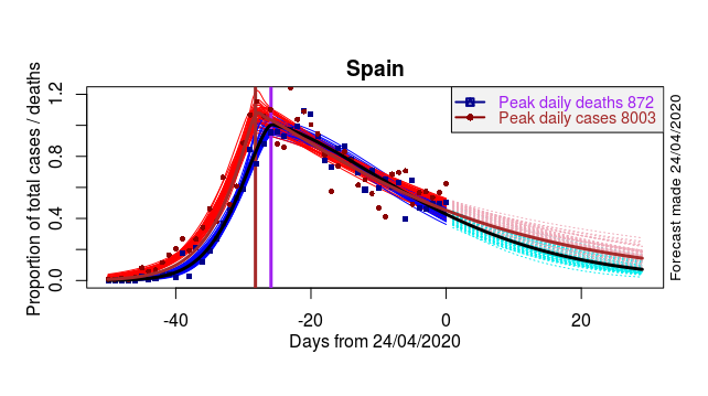
Data and model fits at left, forecasts at right. Red – Cases. Blue – Deaths. Brown – projected Cases. Black – projected Deaths. Pink – illustrates range of plausible Cases trajectories. Cyan – illustrates range of plausible Deaths trajectories. Vertical brown and purple lines – dates of peak. All data presented as proportion of peak (modelled peak values in legend).
What does this rather ‘busy’ diagram of the unfolding epidemic in Spain show? First look at the left-hand side. It confirms that cases (red curves) lead deaths (blue curves), just as one would expect. Indeed that is exactly what the original (notorious) ‘Oxford’ herd-immunity work anticipated “the current epidemic wave in the UK … should have an approximate duration of 2-3 months, with numbers of deaths lagging behind in time relative to overall infection”.
Towards the centre of the diagram we see cases peak before deaths (brown and purple vertical line). So far so good. But then, during the past 20 days the relationship switches so that deaths lead cases rather than vice versa.
Finally on the right my model projects that the phenomenon of deaths leading cases will continue.
United Kingdom
The UK data are worse (more scattered) than the Spanish, but nevertheless exactly the same reversal pattern can be discerned through my curve-fitting and modelling as having taken place over 10 days ago,around peak.
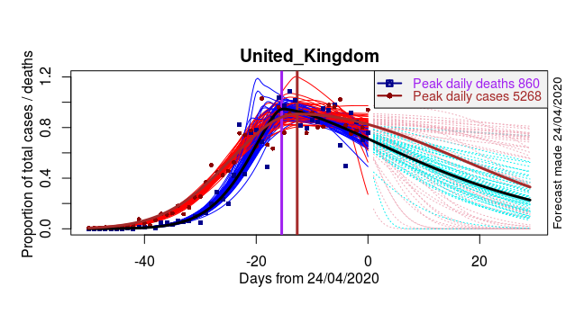
Data and model fits at left, forecasts at right. Red – Cases. Blue – Deaths. Brown – projected Cases. Black – projected Deaths. Pink – illustrates range of plausible Cases trajectories. Cyan – illustrates range of plausible Deaths trajectories. Vertical brown and purple lines data of peak. Data presented as proportion of peak (modelled peak given in legend). The UK peaks later than Spain. Our data are more scattered. Nevertheless my model is able to generate a sensible projection. The form of the tail of the epidemic is beginning to emerge much more clearly.
I suggest that the reversing effect, in both the Spanish and UK epidemics, arises because the case data, as reported in the media and as archived in global databases, are rather inadequate. While numbers of tests are available (Our World in Data) it is difficult to understand which different segments of society are being tested, at any one time, as the epidemic takes hold and progresses.
In brief, as there has been so little transparent information about testing it is difficult to see how new case data can ever be reliably adjusted sufficiently (without hugely expensive, scientifically based, random sampling programsme) to enable a long- or medium-range forecast of when it will be safe to abandon social distancing. Instead it is much better to keep a ‘weather eye’ on recorded deaths.


Recent comments