Glimmer of hope V
The UK COVID-19 peak is imminent
Part V of Glimmer of hope. (11-April-2020)
Summary
Time-series modelling consistently suggests peak COVID-19 is only days away. Based on the pattern of COVID-19 deaths from numerous countries around the world the decline phase can be expected to persist for around the same length of time as the rise. Thus here in Scotland we are about half-way through our social distancing activity.
United Kingdom
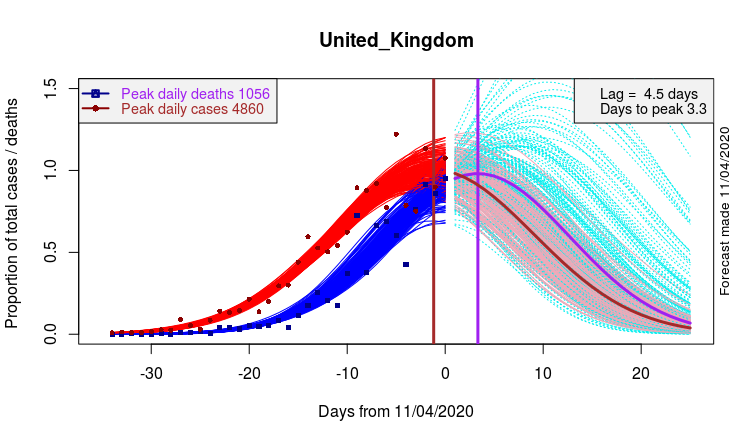
An additional day’s worth of data has sharpened up on the estimated arrival time of peak deaths in the UK. I estimate we are nearly there, with only 3.3 days to go. Furthermore I estimate we have already passed the date of peak new daily cases and I anticipate numbers to follow a declining trend from now on.

Data and model fits at left, forecasts at right. Red – Cases. Blue – Deaths. Brown – projected Cases. Purple – projected Deaths. Pink – illustrates range of plausible Cases trajectories. Cyan – illustrates range of plausible Deaths trajectories.
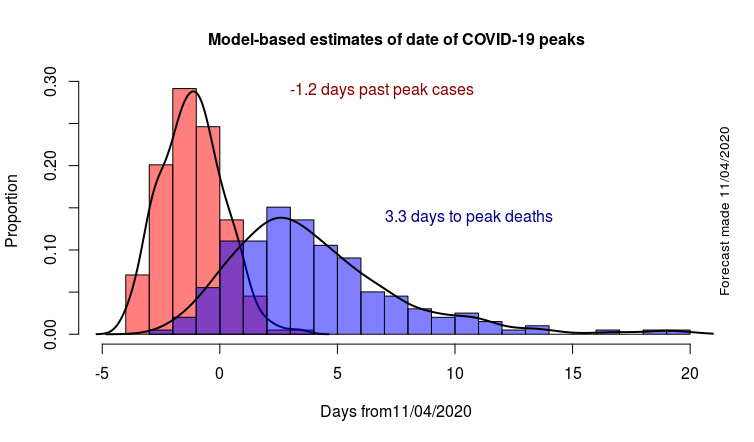
The mathematical model appears to be working so well that an analysis of the likely error bars can be made. The histograms below aim to visually show the uncertainties.

Histograms of estimated date of peak COVID-19 cases (red) and deaths (blue). Peak cases are as expected the better determined.
In Spain and Italy peak deaths closely followed the peak in cases with a lag of only 2 days. My analysis suggests that the UK is following a very similar pattern. Thus the long (right-hand) tail of the blue histogram can probably be largely discounted, reinforcing the suggestion that the time of peak deaths is only 3 days away. Post-peak decline in Spain and Italy was rapid, mirroring the rate of increase. There should soon be enough UK data to check if the same trajectory is likely in the UK. [In technical terms, I can formally check the symmetry of the peak. An epsilon value of zero, in my epsilon-skew-normal model, would indicate perfect symmetry and a likely rapid decline.]
Scotland
What can actually be gleaned about the spread of COVID-19 in Scotland?
Unfortunately Scottish data is rather inadequate. While daily data on deaths is updated and released every 24h (2pm GMT) by over 200 countries and indeed by many individual states and provinces, daily data is not released by gov.Scot. Or, if it is, it is kept incredibly well hidden.
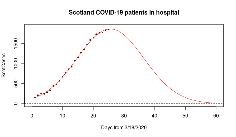
Trends in the number of people in hospital, with confirmed or suspected COVID-19, have however been made available. A slightly rushed, simple analysis (below) suggests that once again peak COVID-19 is very close.

Part IV , Part III , Part II, Part I


Reading your latest update V with great interest. The model looks quite consistent with the data – though I guess there must be some national differences related to the extent and success of lockdown/social distancing.
If peaks happen this week coming, it looks like +25 days (from 11/4/20) to reach levels of cases/deaths similar to those at lockdown (17/3/20). What would be the total deaths associated with the projected pink death curve at +25 days? Do you think they will wait that long to lift lockdown? What real circumstances could drive the more extreme death rate curves (light blue)?
John, Many thanks. That is a good suggestion I will make it my project for today.
Great work. Good to see the Clark-Thompson formula put to such good use. Cheers, Malcolm and Fiona Clark