A Mini Toolkit for Accessible Exhibitions

Reading Time: 3–5 minutes
This toolkit helps beginners understand exhibition accessibility through two practical tasks: writing alternative text and assessing visual clarity.
In exhibitions, accessibility means all visitors—including blind or low-vision visitors, visitors who cannot read labels, and anyone unsure about how to look at art—can access essential visual information.
Alt-text supports this by offering thin description: clear, objective statements of what is visible, without interpretation.
No physical tools needed—just a pen or digital device.
Before You Begin: What Kind of Description Do We Use?
When writing alt-text, the goal is to describe only what is visually present, without adding interpretation.
This is called thin description.
Thin description focuses on factual details such as:
objects, shapes, colours
positions and actions
what can be directly observed
In contrast, thick description adds meaning or interpretation, such as emotions, symbolism, or cultural associations.
Alt-text should avoid this, because interpretation may not be shared by all viewers.
To put it simply:
Thin description = what you see.
Thick description = what you think or interpret.
This idea also connects to art historian Erwin Panofsky’s system of looking at images. His first level, the “pre-iconographical” level, focuses only on visible facts—which is exactly what alt-text should describe.
Alt-text stays strictly at this first level.
Step 1 (2 minutes)
What is accessibility?
Think briefly:
Who might struggle to access visual information in exhibitions?
Now consider who might struggle to access visual information—this helps us understand the importance of alternative text.Alternative text serves as a practical solution for such users by clearly describing the content being presented.Next, try writing alternative text yourself.
Step 2 (4 minutes)
Alt-text Writing Challenge
example
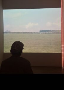
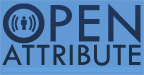
Image 0: Video Installation Scene
Photo © 2025 Wei Li. Used with permission.
Alt-text :
A person sits in a dim gallery room, watching a video projection of a green field with clouds. Text on the screen reads: “There’s a lot that gets lost in the in-between.”
Alt-text Writing Challenge
Write 1–3 sentences describing this image:
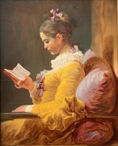
Image 1: A Young Girl Reading, c. 1770
Jean-Honoré Fragonard
National Gallery of Art, Washington
Public Domain / CC0
Alt-text :
Try again with image 2:
Image 2:One Hundred Horses (detail) — Lang Shining (Giuseppe Castiglione), Qing dynasty
Source: National Palace Museum, Taipei
Public Domain (CC0)
Alt-text :
Try again with image 3:
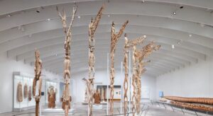
Gallery View of Arts of Oceania, 2025.
Michael C. Rockefeller Wing, The Metropolitan Museum of Art.
Source: The Met (metmuseum.org). Used for educational purposes under fair use.
Alt-text :
Step 3 (2 minutes)
Example Answers(Thin Descriptions)
Image 1:A young woman sits beside a sunlit window, holding an open book while looking down at the pages.
Image 2:Several horses stand and graze on an open grassland, surrounded by gentle hills in a calm natural scene.
Image 3:Tall carved wooden poles are arranged across a bright gallery space, with additional sculptures displayed behind glass cases.
Step 4 (3 minutes)
Alt-text Error Check: Where Did You Go Beyond the Image?
Read your alt-text again.
The goal here is not to tick boxes.
The goal is to catch yourself making the mistakes most people make.
Below are the most common and serious mistakes students make when writing alt-text.
If any of these apply to your writing, you need to revise it.
Ask Yourself
- Did I describe something I cannot actually see in the image?
Examples of invisible content:
- “She is lonely.”
- “He is thinking.”
- “It is a peaceful scene.”
These cannot be seen in the image.
This is thick description → not allowed in alt-text.
- Did I add emotion, atmosphere, or any “feeling” words?
Examples:
- “calm,” “lonely,” “peaceful,” “mysterious,” “lively”
- “a warm atmosphere,” “a lonely room,” “a quiet mood”
These are not visual facts.
They come from your interpretation, not the image.
- Did I explain symbolism, meaning, or cultural interpretation?
Examples:
- “The horse represents power.”
- “The window symbolises freedom.”
- “She is seeking knowledge.”
These belong to Panofsky’s Level 2 or Level 3,and must not appear in alt-text.
- Did I turn the description into a story?
Examples:
- “She is waiting for someone.”
- “He is thinking about his childhood.”
- “The horses are preparing to run.”
A viewer cannot see such stories in the image.
This is imagination, not description.
- If a blind person heard my alt-text, would they imagine a completely different picture?
If the answer is yes, then your alt-text is incorrect.
It means you wrote interpretation, not what is visually present.
If you answered “yes” to any question above, go back to Step 2 and rewrite your alt-text using only visible facts.
Step 5
Step 6 (3 minutes)
Before concluding the toolkit, here are a few simple ways alt-text can also be applied in physical exhibition spaces.
How Alt-text can be used in physical exhibitions
Alt-text is not only for digital platforms. In physical exhibitions, it can be presented in several simple and accessible ways:
-
Proximity-triggered audio: a short visual description plays when visitors approach the artwork.
-
Tactile buttons: visitors can press a button to hear the description.
-
QR codes: scanned with a phone to access text or audio versions.
-
Labels with a “visual description” section: placed before background or interpretive information.
These methods support blind and low-vision visitors, and also help anyone who may feel unsure about how to begin looking at an artwork.
Image 1
Young Woman Reading — Jean-Honoré Fragonard, c. 1770
Source: Wikimedia Commons
Public Domain (CC0)
Image 2
One Hundred Horses (detail) — Lang Shining (Giuseppe Castiglione), Qing Dynasty
Source: National Palace Museum, Taipei
Public Domain
Image 3
Gallery View of Arts of Oceania, 2025.
Michael C. Rockefeller Wing, The Metropolitan Museum of Art.
Source: The Met (metmuseum.org). Used for educational purposes under fair use.
This Open Toolkit is licensed under:
CC BY-NC-SA 4.0 — Attribution, NonCommercial, ShareAlike
This Toolkit does not use AI-generated images.
All images are sourced from Public Domain or Creative Commons–licensed archives.