
Induced seismicity in the UK – Part 1: Managing event rates
As a Senior Lecturer at Edinburgh University, one of my research specialties is statistical seismology. This is the study of the statistics of earthquakes. Whilst I really want to know about earthquake process – but it turns out that you need to understand the earthquake data well in order to infer anything that is likely true about how earthquakes actually work. The statistics of earthquakes turns out to be quite a challenging problem for two main reasons (i) there are far fewer large earthquakes than smaller ones and (ii) earthquakes cluster in space and time, for example aftershock sequences.. I will explore some of these challenges in later posts – but I thought I would try to give you some intuitive insight here by applying some of the key concepts to describe the induced seismicity. I will use the public domain data coming from the area around the ongoing fracking operation that is occurring at the moment (late Oct 2018) near Blackpool in the north of England.
Before I start, I want to be clear that I receive no funding from anyone involved in this industry. All the opinions expressed here are my own.
1. Recent UK earthquakes
The analysis below uses the recent earthquake catalogue derived from the British Geological Survey seismic network, which is available through their website (https://earthquakes.bgs.ac.uk/earthquakes/recent_uk_events.html). All of the figures in this post have been created using Python and are based on the BGS data. In particular the analyses focus on the rate of occurrence of earthquakes as well as their magnitudes and locations.
The first figure I want to introduce is commonly called a “comb plot” by seismologists. It has time running along the bottom axis and each earthquake event is shown as a black symbol to mark the magnitude ( ) of the event with a vertical stem to make it easier to read off the date and time. The points with red stems are for events which occurred naturally in the UK over the previous 100 days or so, and those events with green stems are those that have been labelled “BLACKPOOL,LANCASHIRE” in the BGS catalogue. These are candidate earthquakes induced by the fracking operation, specifically by injection of fluids under high pressure to deliberately fracture the rock.
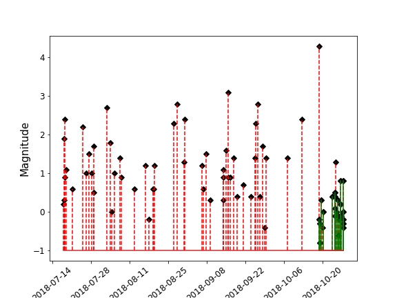
The candidate induced earthquakes have only occurred since the 18th October, not long after injection started. These events are relatively small in magnitude compared to the rest of the earthquakes that have occurred in the UK over the previous 100 days, and are much more closely spaced in time, forming a different population to the natural seismicity.
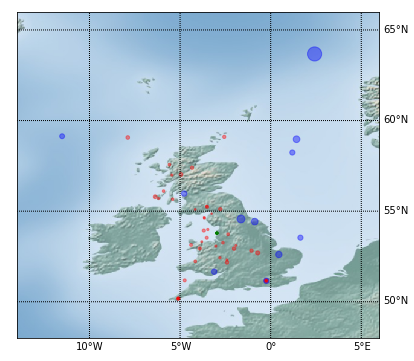
The map below shows where these events have occurred; the size of the circles indicates the magnitude of each earthquake. The induced events are coloured in green. They are difficult to distinguish on the map because they are all clustered very tightly together in Lancashire near the injection site. There are also 11 blue dots which show the events that had a magnitude greater than 2.0. The red dots show the location (epicentre) of all other UK earthquakes. At this stage we can be fairly sure the events coloured green on the comb plot and on the map are caused by the fracking operation – they really are different to the natural population.
For context, the largest earthquake on the map has a magnitude of 4.3. It occurred in the middle of the North Sea, so we won’t consider this further. Six of the eleven earthquakes above magnitude 2 occurred on-shore in the UK. It is not uncommon for earthquakes to occur in the UK with magnitudes greater than 2.0. In this context, the induced events are relatively small, and more clustered in space and time than the natural ones.
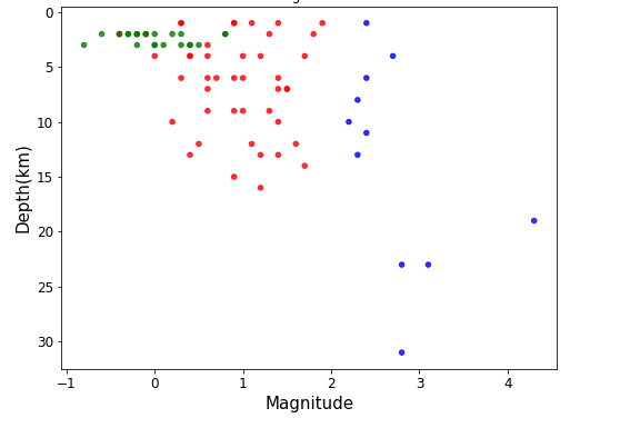
There are a range of factors that control how damaging an earthquake can be. One factor is the size of the earthquake (related to how much energy is radiated from the source). Another important factor is the depth of the earthquake. The depth relationship can be understood in the same way as being close to a light bulb makes it look brighter, an earthquake being shallower means that the potential ground shaking will be larger than for deep earthquakes of a similar magnitude.
The third graph shows the depth of all the UK earthquakes plotted against their magnitude. Again, the green events are the induced seismicity in Lancashire, the blue events are the UK earthquakes with  and the red ones are the rest. As the green events all lie in the top left of the diagram, it is clear that earthquakes induced to-date are both very shallow and of low magnitude. They also occur at or near the same depth as the shale unit that the fracking is being undertaken on (2-3km deep). This provides further evidence that these events are induced by the fracking operation.
Despite these being shallow earthquakes, they are so small in size that they would not be felt at the surface. It is only the sensitivity of the BGS monitoring network that allows them to be detected.
2. Induced Seismicity at Lancashire
Now that we understand something of the properties of the induced earthquakes let’s take a look at when they occurred in a bit more detail.
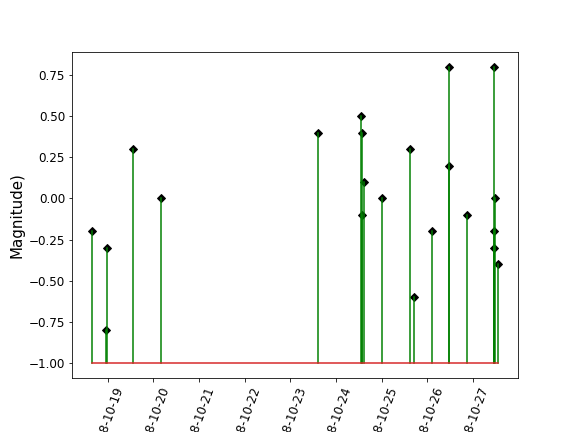
The comb plot below shows only the induced events. They started soon after the 18th of October. There was a hiatus from the 20th-23rd (denture-left of the following diagram) followed by an increase in event rate since the 23rd October. As far as I am aware from the press releases, operations on the well started on or soon after the 13th October – though this did not result in seismicity measurable by the BGS network. Similarly, the size of the largest induced earthquakes has also steadily increased (top-right of diagram). This increase is not surprising. Since far fewer large earthquakes occur than small ones, random chance means we will likely need to observe many earthquakes before the rarer ones occur. I am not going to address the question of the largest possible earthquake in this post because the answer is much more complicated than the event rate story.
The next graph plots the cumulative number of earthquakes (blue line) against time. The graph begins when when the induced earthquakes were large enough to be observed by the BGS network and recorded in the BGS catalogue. The rate of events was low for the first few days and then increased after the 23rd October. The vertical red lines show when the two  events occurred. Red is an appropriate colour because the traffic light management system as prescribed by the UK regulator dictates that injection must be temporarily stopped if earthquakes greater than
  occur. Injection of fracking fluids ceased and recommenced at the solid green line. The first halt in operations was for at least 18 hours – I have not been able to find a discussion of why an 18 hour duration was chosen, but it is likely to be the minimum required by the UK regulator. The dashed green line is Monday morning – which is when operations are scheduled to restart; this start time is because work is not allowed for most of the weekend.
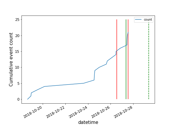 NB. Information about the timing of fracking operations at Preston Road come from press releases – so there is some uncertainty in the precise times of the vertical lines plotted on the graph above.
3. Is the traffic light system working as expected?
I thought I would finish this post by exploring one of the statements in a recent press release from Cuadrilla on the 26th October relating to one of the events:
It is reassuring that the monitoring and traffic light system is working as it should.
To understand whether the traffic light regulation is working as expected, we need to look back at where the traffic light system originated from and a bit more detail at what it was set up to achieve.
Back in the day of coal mining in the UK – there were frequent roof collapses of mines. This resulted in horrific and significant loss of life which often devastated mining communities. As a consequence, a pragmatic solution was to monitor the small earthquakes induced by the mining. If the rate of small earthquakes became significant, say by more than 100 per day, a mine would be evacuated until the rate of earthquakes had eased and then mining would restart in a conservative manner. This pragmatic solution undoubtably saved many lives. In order to formalise this risk management strategy – a traffic light system was devised to indicate when a mine should be evacuated and to guide the choice of intervention.
Consequently, when the fracking industry was faced with the challenge of managing induced seismicity related to the injection and withdrawal of fluids – a similar approach needed to be adopted.
It is important to understand that the traffic light systems is effective at managing the rate of induced earthquakes. However, in contrast, the public concern with regard to induced seismicity from hydro-fracking is not only the rate of earthquakes – but also their size. Managing magnitude is harder than managing the rate of induced earthquakes.
In the mining example – the interventions and recommencement of operations were guided by keeping the rate of small events very low. The equivalent for a fracking project is to modify the fluid injection/production strategy so that the rate of earthquakes induced remains low. In the cumulative event count graph above – this would correspond to a flattening off of the cumulative event count, rather than an acceleration in the event rate – like the once that occurred over the last few days. Given the amount of site specific uncertainty in the fracking industry, it is not unusual for an injection strategy that reduces the risk of induced events occuring to be found by a process of trial and error.
However, the UK government chose to frame the legislation on the magnitude rather than the rate of events. At first sight, the traffic light system appears to be working as intended for the fracking site. The largest magnitudes only rarely go into the red, and the event rate is also held low. But large earthquakes are rare anyway – so their relative absence is relatively weak evidence that the traffic light system that is managing that risk.
As more data comes in one the next few weeks, I will update the graphs in this post to see how well the event rate is being managed by this approach. I wanted to outline it here so that it gives a reference point to refer back to before more data is recorded by the BGS network.
Relating this information to understand the size of the largest earthquake that could occur is a complicated story – which I will save for a future post.


Recent comments