After two weeks back at work, we are back on strike for a week, as university staff get angrier and angrier, and senior management retire into their bunkers and pretend to each other that the problem will go away. So, I have time to revisit my previous post on how our pay has changed over the years. There are a lot of things I cannot address due to lack of data. But it occurred to me that one sort of data I could probably obtain was how the average pay in the UK has varied over the last few years. A quick search turned up exactly that data, published by the ONS. Although the data are available as a .csv file, there were sufficient awkward things about it that I downloaded the data as an excel spreadsheet and used libreoffice to re-format the dates from the horrid “Jan 08” format into ISO standard “2008-01-01” format and exported the result as .csv. With that done, I could divide the ONS’s weekly pay timeseries by its value in May 2008 and present it as a percentage, along with our pay, and the various price inflation indices. The new lines “Tot WP” and “Reg WP” are the total weekly pay and regular weekly pay across the UK.
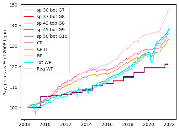
It is clear from this that between 2008 and 2015 we university employees were in the same boat as everyone else, with our pay failing to keep up with price inflation. Between 2015 and now, the average person’s wages in the UK kept up with inflation, but our pay did not. Following my previous post, I then treated the “Tot WP” and “Reg WP” time series as two further measures of the real-world value of money, adding two further lines to the plot showing how our pay has changed in real terms.
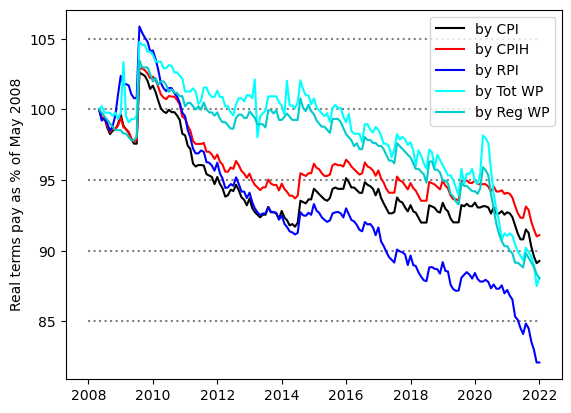
This figure makes it clearer that until 2015 we were doing as well as the rest of the UK, but that our pay has declined compared to everyone else’s between 2015 and now, and has done so particularly sharply during the last couple of years.
As an aside, it is worth noting that when you see figures stating that our pay has declined by 25% since some specified or unspecified date, this is either exaggeration or cherry-picking. To get such a large figure, you would need to measure the real value of things by RPI and also pick your starting date to be late in 2009, just after we had a very rare inflation-beating pay rise. It is nevertheless clear that our pay has gone down in real terms for any sane choice of inflation measure and starting date, and that since 2015, our pay has not kept pace with the UK average.
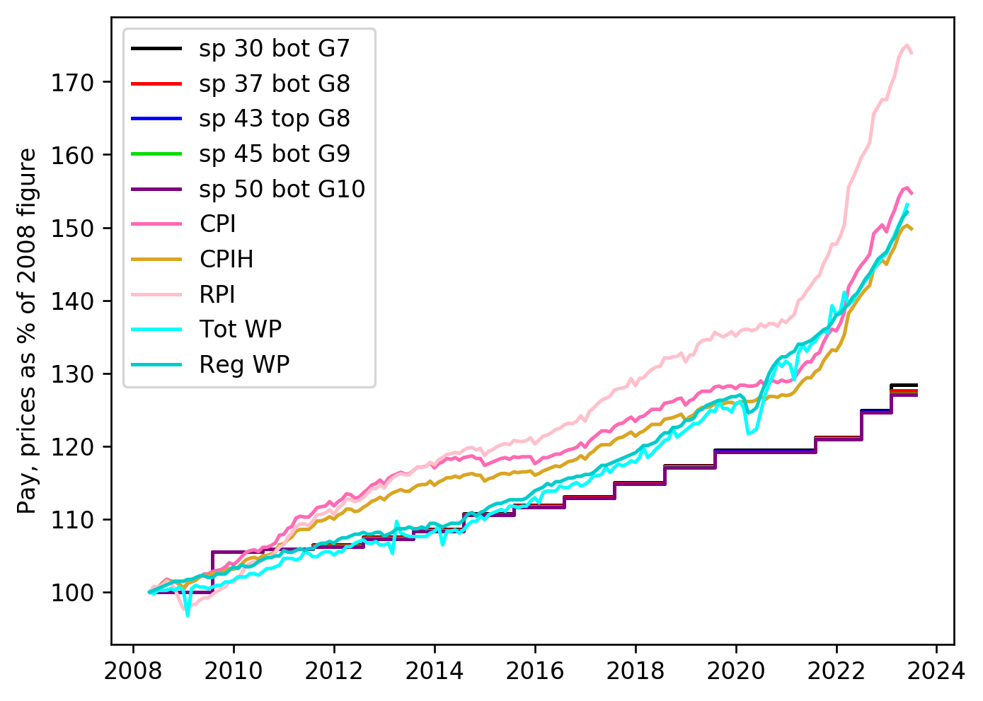
Postscript added March 2023: I am not going to keep doing new versions of this post. But I will update the plots from time to time. The latest version of the two plots may be found here:


Your calling out the 25% figure as exaggeration or cherry-picking is honest and helpful — but I wonder whether you haven’t provided another low-hanging cherry by including the RPI on your second graph, and tweeting just this graph? If I understand correctly it’s the Tot WP and Reg WP that you want to highlight; but particularly in the absence of a key to the abbreviations, some of those who see the graph and aren’t so data-literate as you may assume that the RPI line is the one which shows, as your tweet says, “how our pay has gone down with respect to the UK average”. You are not of course responsible for any such misreading, but it would help the cause of real information to specify clearly what’s what.