Well, we are on strike again (see previous posts passim ad nauseam: here, here, and here, among others). The current wave of strikes are in two parts: the ongoing dispute over our pension scheme (affecting the pre-1992 universities) and a dispute over pay and working conditions (affecting all UK universities). The pensions dispute is extremely hard to understand. Most academics and professional services staff are clever enough to understand that they are being misled and ripped off, but are puzzled by the details. We are grateful to the likes of Sam Marsh, Michael Otsuka, and Josephine Cumbo of the Financial Times for understanding it for us.
The “pay” part of the “pay and conditions” dispute is usually stated by saying that our salaries have gone down in real terms by X % over the past Y years, for a variety of values of X and Y. Given that I am not doing any work right now, I thought I should investigate the details of this. The data for my dear employers are readily available, both the current pay scale and an archive going back to May 2008. A quick inspection shows that the structure of the pay scale has not changed since 2008, and that it is very age-related. A new staff member starting at the bottom of a grade will move one step up the grade every year. This is understandable: older staff have more experience and responsibility. But it allows University management to award below-inflation pay rises to all points on the scale and then to make the weaselly claim that most staff will get an above-inflation pay rise each year.
Annoyingly, the data are not in a form that is immediately ingestible into a computer program, so I had to cut-and-paste the pay scales into a spreadsheet. I made sure that the spine points were aligned, and put each version of the pay scale into a separate column with the start date in the top row. In what was probably a mistake, I put the most recent column at the left.
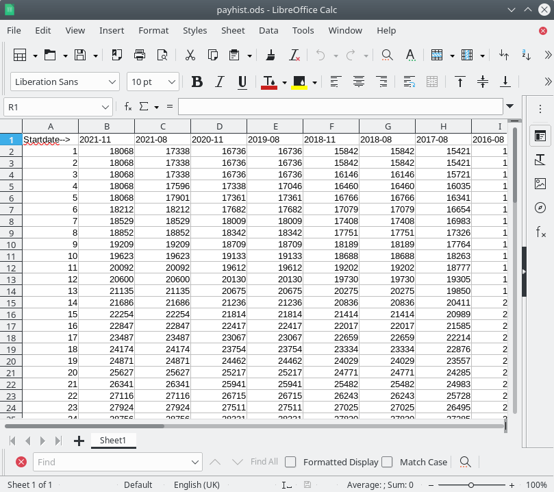
I then exported the spreadsheet as a .csv file so that I could read it onto python and make a plot of it. I chose spine points on the scale at the bottom and/or top of the grades on which UCU members are employed: point 30 is a very junior researcher and point 50 is a person who has just been promoted to a professorship.
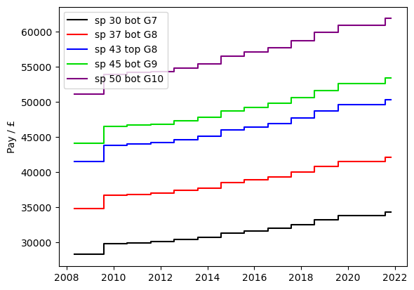
The main thing you can see here is that pay for all grades has increased in a similar manner, but that the pay scale is very age-related. Next, we plot the pay as a percentage of its value in May 2008.
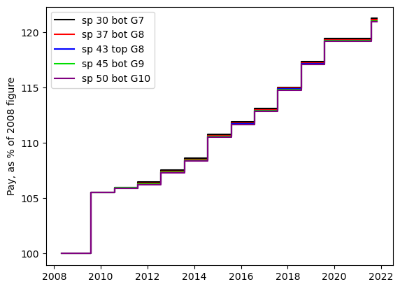
To a very good approximation, all grades have had the same percentage increase over the time since 2008. There appears to have been a very small tweak in 2010, in which the lower grades had a very slightly higher percentage increase. So, pay has increased in numbers of pounds, but to see how staff have been affected, we need to take inflation into account. And it gets a bit messy at this point because the UK government has three ways to quantify inflation: RPI, CPI and CPIH. (There is some explanation of these indices available.) My next step was to download the data for these indices. The spreadsheets as they arrive are a bit of a mess: they are full of un-needed quote symbols and the dates are in the form “2009 JAN”. I applied a bit of shell-script wizardry:
#!/bin/sh

cat $1 | sed -e"s/ JAN/-01/" -e"s/ FEB/-02/" \
			       -e"s/ MAR/-03/" -e"s/ APR/-04/" \
			       -e"s/ MAY/-05/" -e"s/ JUN/-06/" \
			       -e"s/ JUL/-07/" -e"s/ AUG/-08/" \
			       -e"s/ SEP/-09/" -e"s/ OCT/-10/" \
			       -e"s/ NOV/-11/" -e"s/ DEC/-12/" \
			       -e"s/\"//g" \
			       > fixed.csv
This removes the un-needed quotes and converts dates to the ISO standard form “2009-01” which can be directly converted to numpy’s datetime64 format. The spreadsheets are also messy in that they have many rows representing the yearly and quarterly data before you get to the monthly data: I hard-coded the row to start reading the data because I wanted to get the plot out:
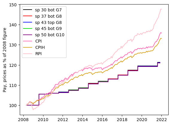
It is clear from this that between 2008 and 2011 pay more-or-less kept up with inflation, but that after that, it fell behind. It is also clear that between 2008 and 2015, the three inflation measures were not too different, but that after that, pay falls behind RPI a great deal faster than it falls behind the other two inflation measures. To see how value has decreased in real terms, we need to divide the pay data by the inflation data and present that as a percentage. This requires a bit more coding because the pay data are available at irregular times (usually annually on 1 August, but not always). But the inflation data are monthly. I made a monthly pay time series by duplicating the values for all the months between the date on the payscale from which I took them, and the month when pay was next increased. I could then do arithmetical operations on the two series:
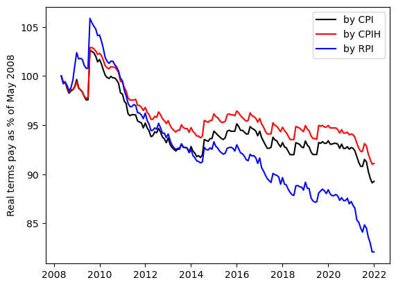
The result is a plot of our pay in real terms; there are three lines depending on which of RPI, CPI and CPIH you believe to represent the real cost of living for university staff. Our pay today is either 82% (by RPI), 89% (by CPI) or 91% (by CPIH) of what it was in 2008. So there are details to be argued about, but there is no doubt that our pay has decreased in real terms.
There are plenty of unanswered questions, though. Although the structure of the pay scales has not changed since 2008, the distribution of staff across the spine points may have done. It is certainly the case that professors (on grade 10) have gone from being rare and unusual creatures in 1992 to being a large fraction of academic staff nowadays. The system has to some extent responded to lower-than-inflation pay rises at any spine point by promoting people to higher spine points on average. I have no data to quantify this effect, but I suspect it is real, and that it increases the gap between better-paid (older, established) and worse-paid (younger, less secure) staff. And this is a good part of the cause of the widespread discontent in the university sector.
The other question I cannot answer is what happened before 2008. I do not have data, but my failing memory suggests that university staff have been grumbling about sub-inflation pay rises since I was first paid by a university in 1989.
As a postscript, here is the python code that made the plots:
## Read in University pay data and UKGOV inflation data
## Plot them out to see how pay has kept up with inflation
import numpy as np
import matplotlib.pyplot as plt

dat=np.genfromtxt("payhist.csv",skip_header=1,delimiter=",")

spinepoints=dat[:,0]
pay=dat[:,1:]

dates_str=np.genfromtxt("payhist.csv",skip_header=0,delimiter=",",
                    max_rows=1,dtype="str")

dates_str=dates_str[1:]

dates=np.array(dates_str,dtype="datetime64[M]")

cols=np.array(["black","red","blue","#00dd00","purple","orange"])
iplot=np.array([29,36,       42,       44,        49])
spnames=["bot G7","bot G8","top G8","bot G9","bot G10"]

plt.ion()
plt.figure(1)
plt.clf()
for ic in range(0,len(iplot)):
    i=iplot[ic]
    plt.step(dates,pay[i,:],where="pre",color=cols[ic],
             label="sp "+str(int(spinepoints[i]))+" "+spnames[ic]  )
#    plt.plot(dates,pay[i,:],color=cols[ic],marker="o",linestyle="none")
plt.ylabel("Pay / £")
plt.legend()


cpidat=np.genfromtxt("CPIfixed.csv",skip_header=178,delimiter=",",dtype="str")
cpi=np.array(cpidat[:,1],dtype="float64")
cpidate=np.array(cpidat[:,0],dtype="datetime64[M]")

cpihdat=np.genfromtxt("CPIHfixed.csv",skip_header=178,delimiter=",",dtype="str")
cpih=np.array(cpihdat[:,1],dtype="float64")
cpihdate=np.array(cpihdat[:,0],dtype="datetime64[M]")

rpidat=np.genfromtxt("RPIfixed.csv",skip_header=183,delimiter=",",dtype="str")
rpi=np.array(rpidat[:,1],dtype="float64")
rpidate=np.array(rpidat[:,0],dtype="datetime64[M]")


## Inflation data from https://www.ons.gov.uk/economy/inflationandpriceindices

## Inflation data are 100% on various dates. We want them to be 100%
## in May 2008 as that is the earliest date that we have pay data.  so
## we scale them
ixc=np.where(cpidate==np.datetime64('2008-05'))[0][0]
cpi08=cpi *100/cpi[ixc]
ixh=np.where(cpihdate==np.datetime64('2008-05'))[0][0]
cpih08=cpih *100/cpih[ixh]
ixr=np.where(rpidate==np.datetime64('2008-05'))[0][0]
rpi08=rpi *100/rpi[ixr]

plt.savefig("pay.png",bbox_inches="tight")

plt.figure(2)
plt.clf()

for ic in range(0,len(iplot)):
    i=iplot[ic]
    plt.step(dates,  100*pay[i,:]/pay[i,-1],where="pre",color=cols[ic],
             label="sp "+str(int(spinepoints[i]))+" "+spnames[ic]  )
plt.ylabel("Pay, as % of 2008 figure")
plt.legend()
plt.savefig("payperc.png",bbox_inches="tight")


plt.plot(cpidate[ixc:],cpi08[ixc:],color="hotpink",label="CPI")
plt.plot(cpihdate[ixh:],cpih08[ixh:],color="goldenrod",label="CPIH")
plt.plot(rpidate[ixr:],rpi08[ixr:],color="pink",label="RPI")


plt.ylabel("Pay, prices as % of 2008 figure")

## For the purposes of operating on the two time series, we need to
## interpolate the pay data onto every month. For this purpose we need
## to construct a pay time series that is monthly.

mpdate=cpidate[ixc:]
nm=len(mpdate)
mpay=np.zeros(nm)
for i in range(1,len(dates)):
    ix=np.where( (mpdate < dates[i-1]) * (mpdate >= dates[i]))
    mpay[ix]=pay[iplot[0],i]
ix=(mpay < 1)
mpay[ix]=pay[iplot[0],0]
## plt.plot(mpdate,100*mpay/mpay[0],color="yellow",label="check")
plt.legend()
plt.savefig("payandinflat.png",bbox_inches="tight")

plt.figure(3)
plt.clf()

plt.plot(mpdate, 100* (mpay/mpay[0])/(cpi08[ixc:]/100),"k-",label="by CPI")
plt.plot(mpdate, 100* (mpay/mpay[0])/(cpih08[ixh:]/100),"r-",label="by CPIH")
plt.plot(mpdate, 100* (mpay/mpay[0])/(rpi08[ixr:]/100),"b-",label="by RPI")
plt.ylabel("Real terms pay as % of May 2008")
plt.legend()
plt.savefig("rtpay.png",bbox_inches="tight")