I have written several posts here about my rain measurements (see here, here, here) but have always wondered whether the non-ideal location of my rain gauge made the results useless. I realised recently that SEPA publish data from rain gauges across Scotland so I could compare my data to their nearest gauge, which is only 1km away. SEPA provide monthly means going back many years; this seemed the easiest place to start, given that my own gauge gets read only erratically. I had to hack the downloaded spreadsheet a bit to remove dates before I took any of my own data and to convert dates like “Jan 2020” to the more easily-readable ISO format “2020-01”. With this done, it was easy to plot time series of the two data sets:
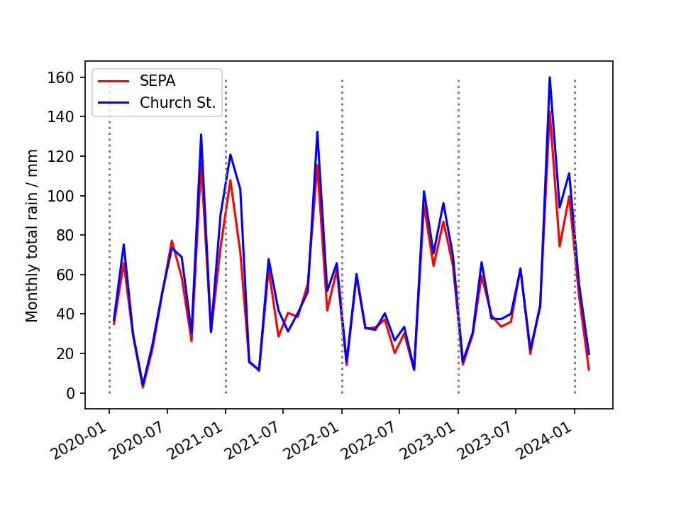
There is clearly a good correlation and only a small bias, with my own data appearing slightly greater than that from SEPA. This is easier to see in a scatter plot with the ideal 1-to-1 line superimposed:
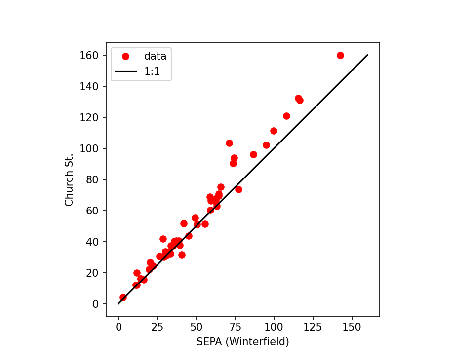 (Monthly totals are in mm, as on the first plot.) For months with more than about 80mm of rain my measurements are consistently wetter than SEPA’s. For the remaining months the scatter appears larger than any bias. I speculate that the difference is because my gauge is located in a far more sheltered location than SEPA’s is, and that heavy rain is likely to be associated with strong wind.