Category: Artists Ex.2

Museum Objects

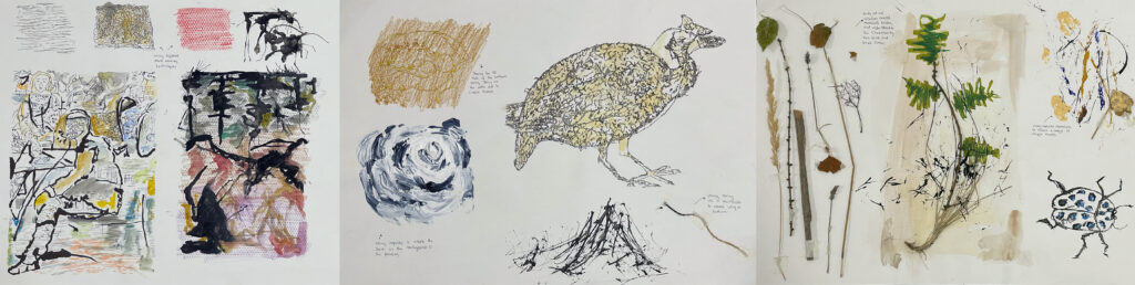
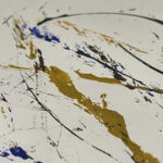
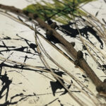
Following last week’s work, I took these objects and looked at the past, present and future. Looking at either their materials, history, and what they could be made into, I have created A2 pieces expressing these.

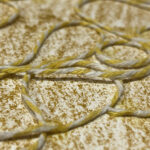
Tunic from “12 unwearable dresses” (1967) by Pace Rabanne, I was first bought to this piece by the shine of the metal material. I was interested by how they created shadows and highlights through the squares of the tunic. Following this I looked at how and where the materials were sourced from and what the dress could be recycled into.

‘Recycled dress’

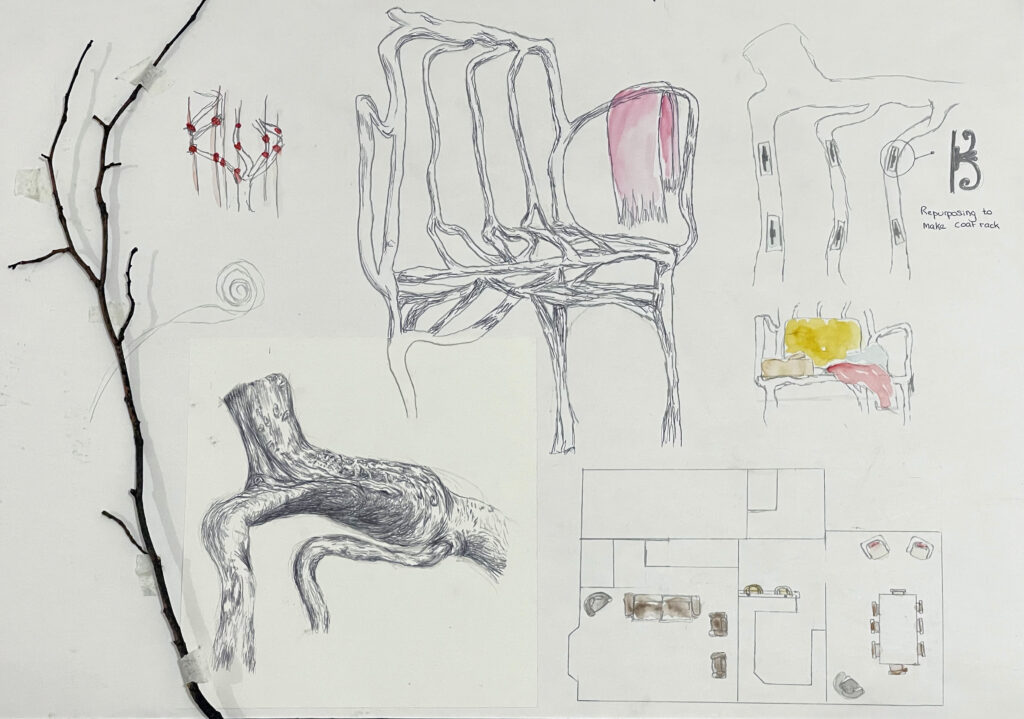
Full Grown Chair (2017) by Gavin Munro, after viewing this I researched how the chair was made which made me look at the details of the wood. I explored different limits of the chair throughout the A2 piece, looking at branches so where it came from. Then to its purpose using it for clothes, books and sitting. I drew a little sketch of my home with where the chairs are.

‘The chair that lives’

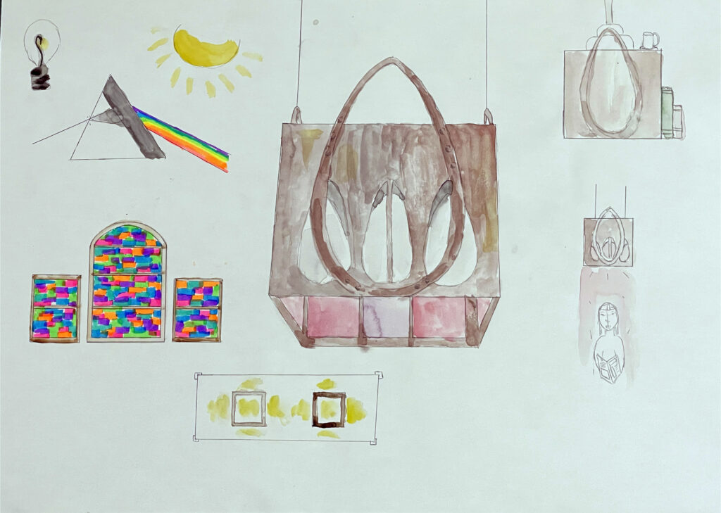
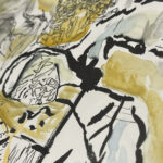
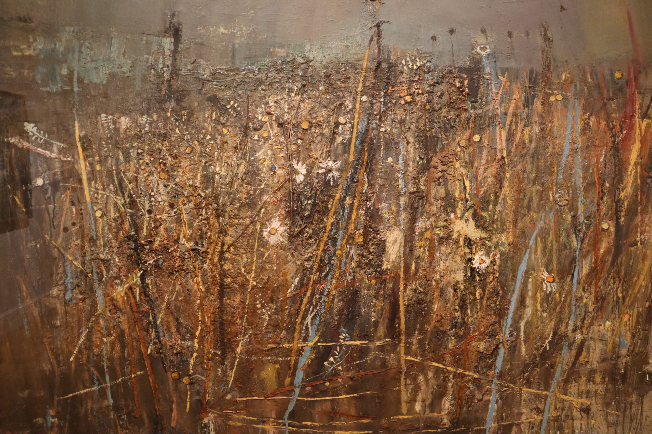
Light Fighting (1902) by Charles Rennie Mackintosh, this piece uses different materials for different light shadows across a room. I love the pink and purple glass panes, which reminded me of glass windows in a church and the coloured light coming down from them. I thought about where the light came through the different ideas of it and the use.

‘light makers’

Study of Art

Looking at three artists (Charles Sheeler, Robert Rauschenburg and Jayashree Chakravaarty)  I choose different pieces which I found interesting in the use of colour/texture and composition. I looking at them in great

detail noticing more texture and interesting facts about the artwork showing this through my thoughts of each piece above.


Looking at Charles Sheeler first, I looked at different mediums I could use to represent this work, I think acrylic worked the best as it gave me vibrant colours and perfect lines. I tested different light conditions and proportions to understand the colours that he used, the darker the colour showed the shadows against the structures. In Aerial Gyrations I

used photoshop to create different Pov’s of a building using vivid colours.


Left to right – Stacks in Celebration, Aerial Gyrations, Amoskeag Mills

Robert Rauschenburg interested me as he uses cyanotype which I have created in the past being influenced by his work. Unfortunately, I don’t have access to create large scale ones but I wanted to create a heavily contrasted piece using dark blues against a white background. I like the textures he creates so I wanted to show these off using different things I found in my bedroom with new media.


Left to right – Untitled, Scanning, Banco

Jayashree Chakravarty is an inspiration to me, she uses nature to produce her art. Using what she found to create natural objects, I used plants, leafs, branches to show her style off. I created my own textures using the materials I found and put paint/ink on these to show the textures off. This was her recent work, however, she used to be more detailed with textures filling the page up with different types of conventional paints. I tested different colours and textures to see what I would use to recreate her work. I love the use of colour in all of her work and I believe this will influence future work.

Left to right – Earth as Haven, Oil, Acrylic, Leaf Cotton Paper, Untitled


Seeded, Grass and Daisies September (1960) by Joan Eardley

‘Seeded, Grass and Daisies September’ by Joan Eardley, is a piece full of history even by looking at it, you can start to understand the process every detail has gone through. Firstly, Eardley picked every single grass stalk and that perfect daisy by hand, from her home village (Catterline) displaying personal meaning to this piece. Recreating her childhood of using newspaper and sweet wrappers to create art. Every natural element of Eardley’s work encountered the elements like wind and rain which has influenced this work, producing the swooshes of paint to show movement. Sticking them on roughly to reflect the texture, cutting, gluing, sowing every little detail into the canvas. Adding the process of colour was next, creating the vivid pops of oranges, reds, and blues to contrast with the now-dead stalks.

Eardley wants you to explore this piece in great depth, as you use more than one sense. I wonder how many hands have felt this painting, as you glide your hand across it your understanding grows. Eardley uses a variety of colours mainly those you would associate with autumn, which contrasts heavily with the white walls of a gallery showing that Eardley thinks about the space the painting is in and what atmosphere it may create. At first, it felt like a cold, wet day but then you look closer and see the intensity and richness of the colours she chooses, expressing the life of the daisies and grass.