Storyboard of Art & Design
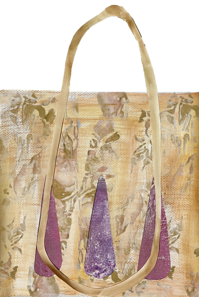
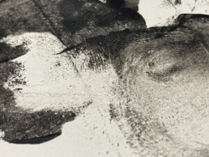
The Triptych discovers the main senses through the area of Chambers street to Greyfriars Bobby. With gold wire framing the triptych and different colours splitting the work up. The gold wire creates interesting shadows along the work and a mix of colour through the 16:9 images creates one piece coherently and work separately. Using a mix of physical photoshop work by overlaying the 3 artworks over the hand-drawn lines and shadows casted from the wire, creates my sensory triptych.
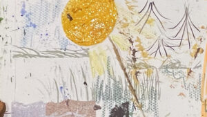
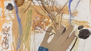
‘Sensory Triptych’
The Triptych discovers the main senses through the area of Chambers street to Greyfriars Bobby. With gold wire framing the triptych and different colours splitting the work up. The gold wire creates interesting shadows along the work and a mix of colour through the 16:9 images creates one piece coherently and work separately. Using a mix of physical photoshop work by overlaying the 3 artworks over the hand-drawn lines and shadows casted from the wire, creates my sensory triptych.
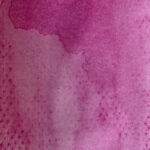
‘Sketch Triptych”
Taking my storyboard into a triptych style, I used the most known senses as the 3 different compositions using the other senses to link each composition together. Then adding the gold wire back in over the top of the images as the way to frame the triptych and erase these into the background. Using the colours of blue, red and yellow to really show the composition of the triptych and separate the senses.
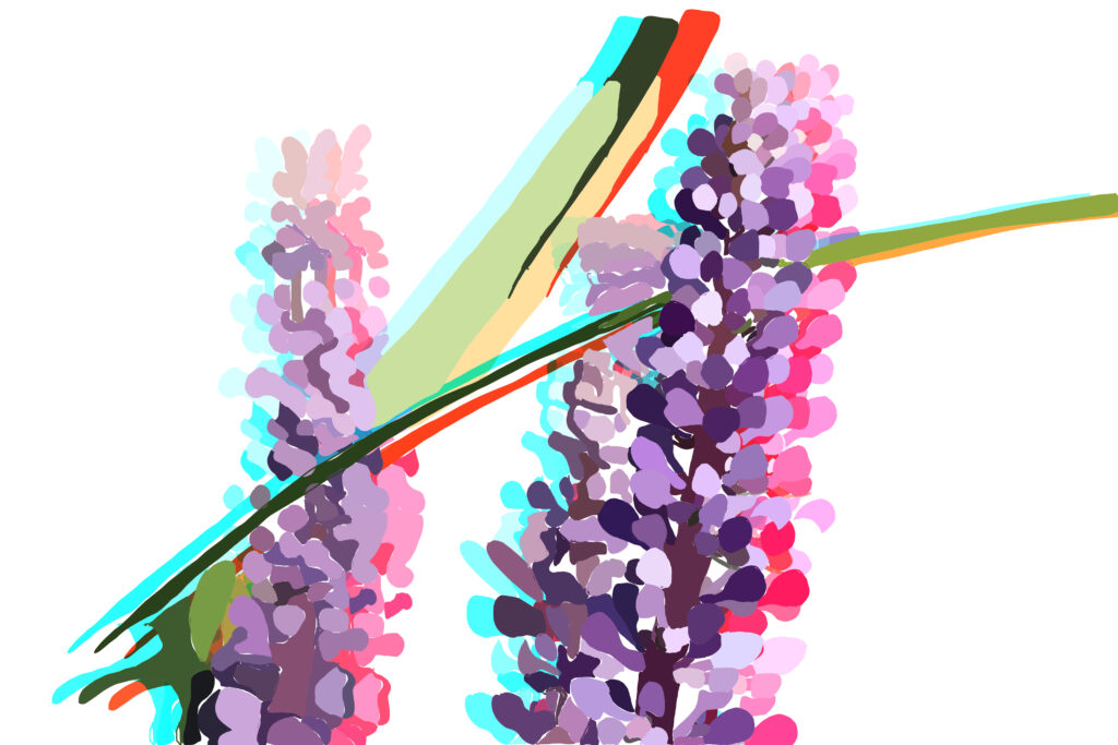
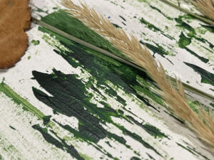
‘Botanical Flowers’
Taking inspiration from Charles Sheeler and creating different vivid colours. I wanted it to be quite illustrated so using Procreate and Photoshop to create this. Using the purple colours of the lavender and green leaves to produce the first picture, then added special effects to create this movement effect like Sheeler does. I like the different colours and how they contrast from the white background.
‘Museum Light’
I wanted to recreate Charles Rennie Mackintosh’s light using tracing paper with textures from watercolour and crayons overlayed on top. So both light and colour can come through the paper and create light through the space which you see below. I used textures and colours like Robert Rauschenburg to create the light shade made out of copper. I did this by taking some textures from Robert Rauschenburg artist research page and overlaying them on photoshop to create unusual textures.
‘Chair Techniques’
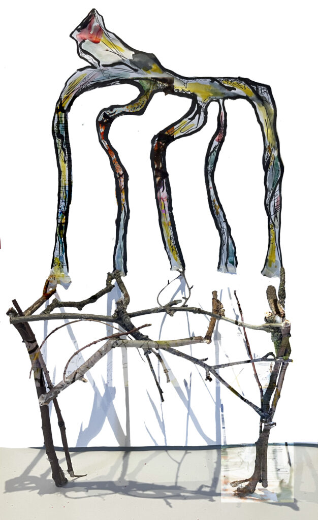
Following the style of Jayashree Chakravarty with the full-grown chair, I produced her two styles together. Using natural materials for the base of the chair and the textures and colour with ink on the back of the chair, creating a 3D effect with the shadows from the wood. I love the material of the chair so I wanted to show this through different ways of making texture on the page. I also used my artist research pages from Chakravarty with the textures overlayed on top of the textures I created by hand to emphasise the different techniques made by Chakravarty. I overlayed them on top of the wood too, so the whole piece linked with different styles of her work.
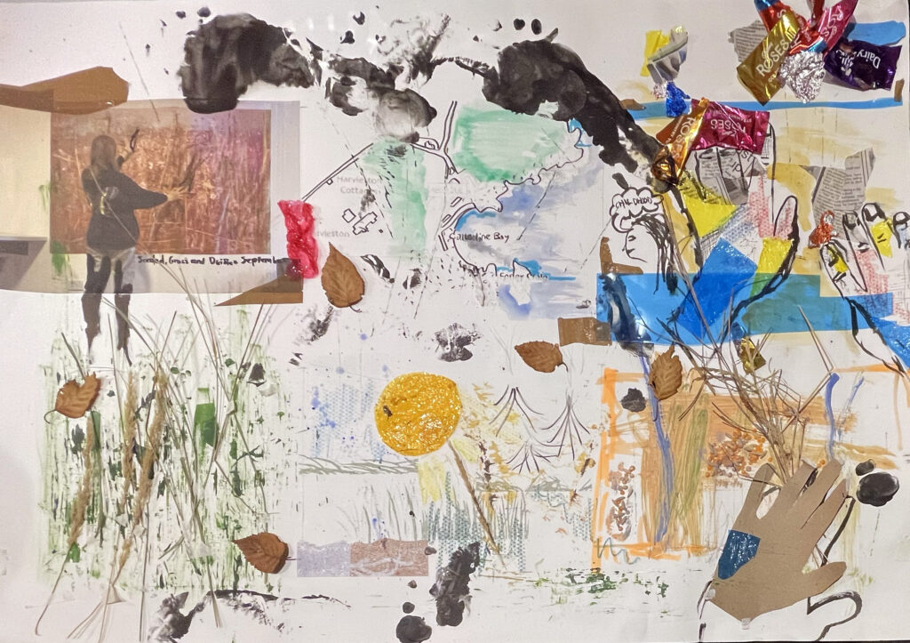
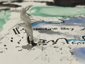
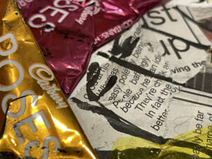
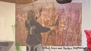
Using the style of Jayashree Chakravarty and my sketch storyboard I created a storyboard of Joan Eardley. I held grass and bailey up against the wall, then I photoshopped the artwork in to show the different textures in a 3D view. Like my sketch I created a path of where she went to pick the materials, using a map that is overlayed. Adding large footsteps over the top of the storyboard shows a sense of direction across my storyboard. Eardley reflects on her childhood using sweet wrappers and newspapers to create a composition. I changed the recycle sketch to a wildlife cycle, looking at different animals and plants that may live in this area. Then looking at different elements of the grass’s lives, what experiences it has been through such as rain, sun, water, or wind, and watch how it reacts. Finally, I produced Eardley’s piece however, in progress how she sticks things down and the different paint strokes she uses.
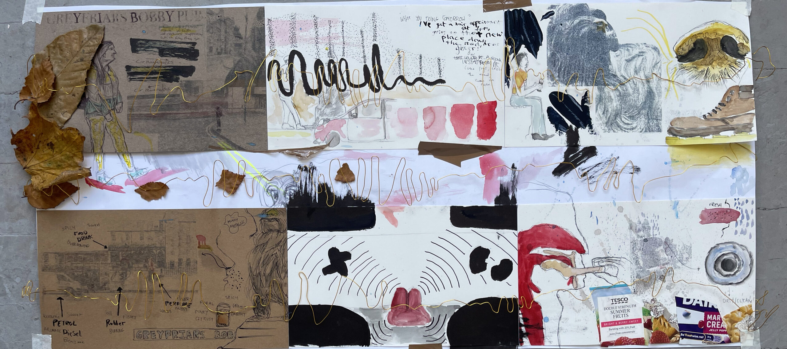
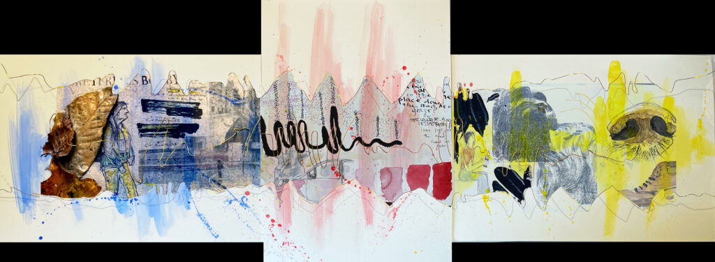
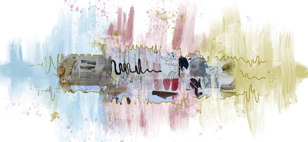
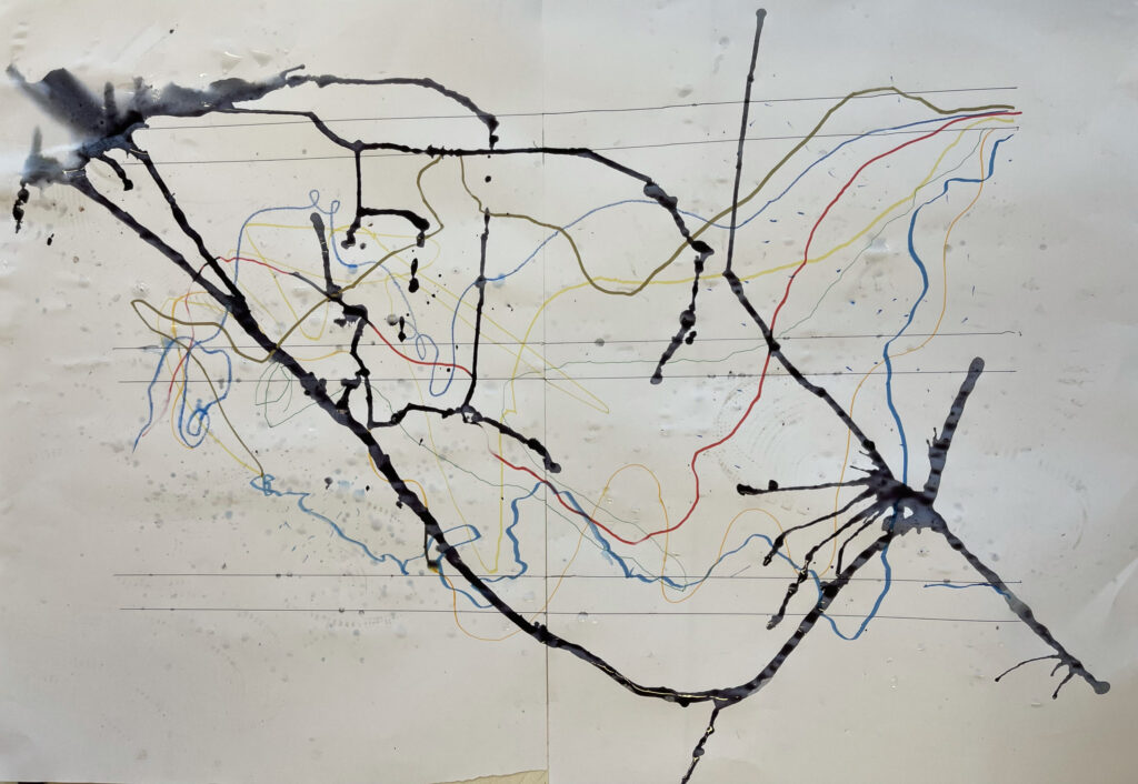
I created a storyboard of one of my scores, by which I sat opposite the Greyfriars Bobby and observed people traveling through the area and how they act/behaved. Using Robin Cracknell’s ideas for textures and overlayed different POV photos with drawings and colour. Then thinking about a performance drawing how people understand space by their senses, so I created each section as a different sense including vision, hearing, touch, smell, proprioception, and taste. Looking at the most important sense at the top left to then going to what I think is the least important sense (bottom right). I looked at different things I experienced and showed these in different sections of my storyboard. Adding a few lines of sound which is the main feature for my score, creates layers to my drawing.
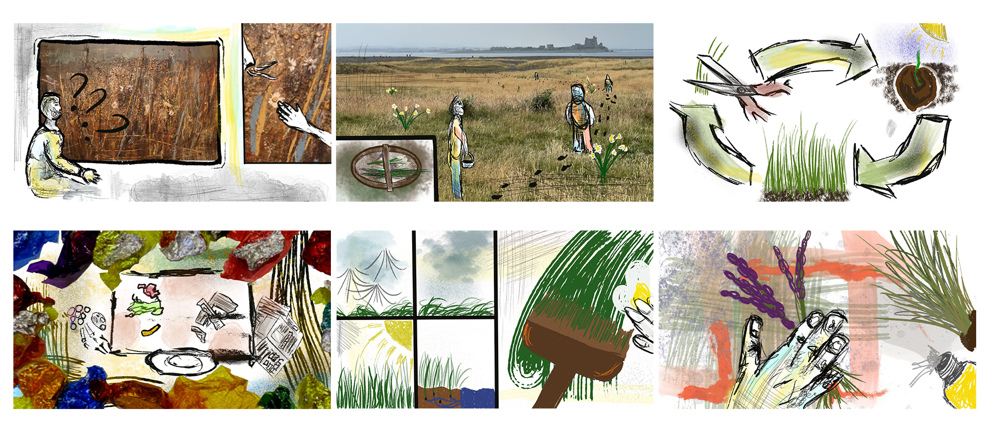
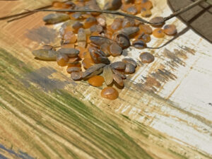
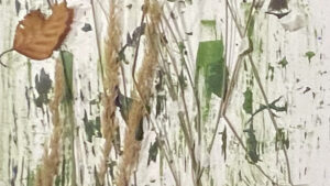
Using ‘Seeded, Grass and Daisies September’ by Joan Eardley, I have developed a sketch storyboard in the style of Jayashree Chakravarty who I looked at throughout week 2. I wanted to research how Eardley created this piece what memories and emotions she experienced whilst producing this piece. I want my viewers to have their own interpretations of my storyboard. I interpreted that people would start to wonder what happened to the painting, how Eardley added the textures/create them? Then exploring the textures, Eardley picked them at her home in Catterline, shown in different POV’s of her moving around. Next, I thought about her thinking behind the painting, exploring the life cycle of grass. I found it interesting that Eardley has taken this technique from when she was a child using sweet wrappers and newspaper to create compositions. I also thought about the different elements that the materials have been through, throughout their lives and how it has affected the painting marks. The last sketch is of Eardley placing the material down producing the piece. I wanted to create a POV of Eardley creating this and of what she experiences.
Creating my storyboard in the style of Jayashree Chakravarty made me look more at the textures and natural materials. I liked that Chakravarty used a messy technique due to the medium she used, I created marks and light colours to represent her work.
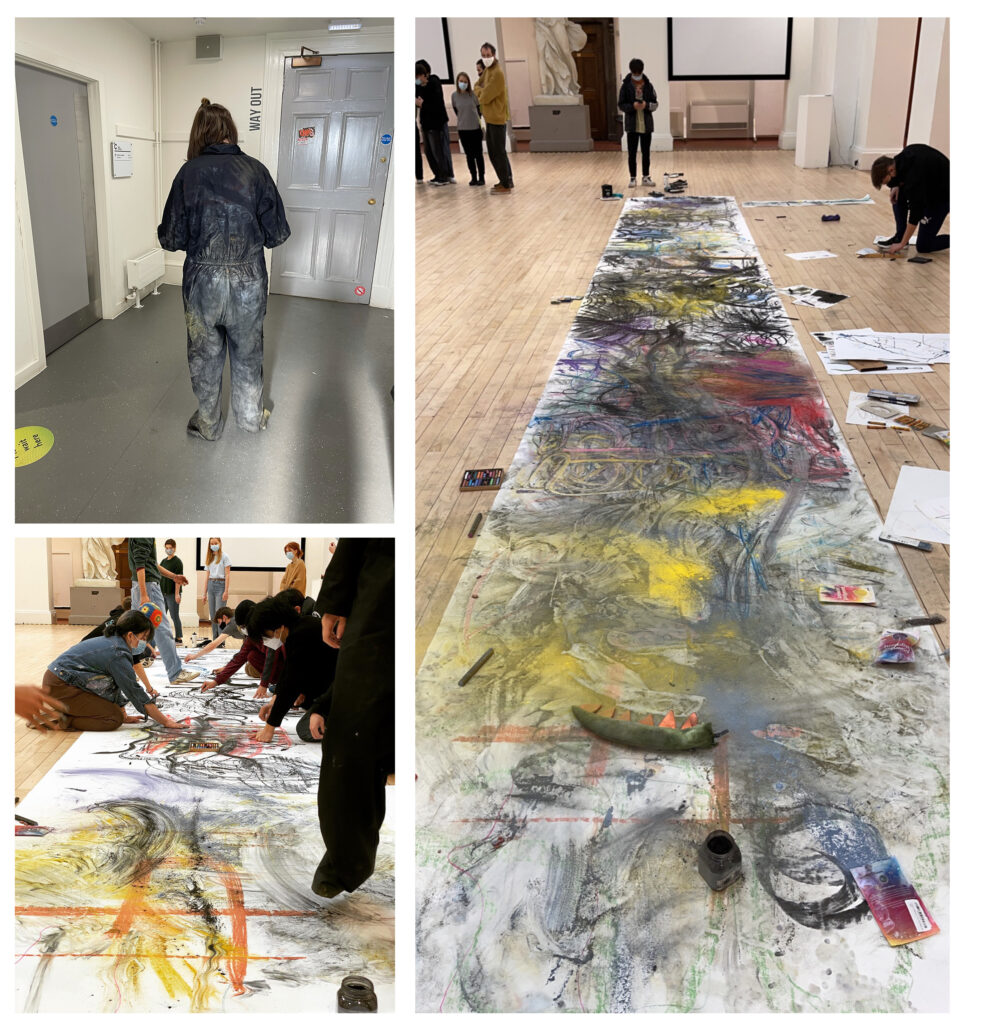
Bringing different ideas from the weeks and combining them together, group 4 created a score of all our personal experiences through the scores we created. I used different parts of my body to show the score I was given, I also did a snow angle within the powder paint. using swooshes with my foot created movement throughout the whole piece keeping everything inflow. This was a very fun experience however all the glitter from the powder paint still won’t come out of my boiler suit.
As a group of 6 we decided to go to Grassmarket, at this time it wasn’t to busy however we still interacted with the public. As a rubber band, they contract and then bounce of each other taking this idea we throught how we could move within each other. Some of us bounced of each other, some stayed well apart from each other. The black lines are the boundary of Grassmarket with the different colours being one of the team members. looking at the experiences we went though, we added water droplets to show rain which mixed with the media creating an abstract smudge.
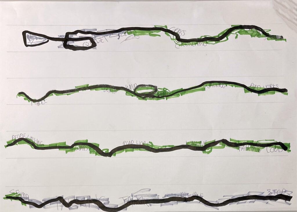
Using black ink line to show the route I took around Greyfriars Graveyard, with different colours to give an understanding of the ground I felt underneath. My thoughts were that if it’s soft and uneven it’s grass and the rough, louder noise is stones/pavement, however, I found both textures uneven due to ground levels. Being blindfolded enhances the senses more and I started to describe the senses to my partner which helped me display the sounds through words on my score.