When choosing a colour pallet I knew I wanted to look at emotion and colour association. As my project revolves around emotions I feel the best way to showcase this is through colour association using art therapy.
There is a huge range of information on colour association in which I just find completely fascinating. The article below goes into real depth about colour association which is worth a read:
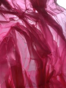
I wanted the viewer to have an emotional attachment to the textiles, I wanted them to evoke emotion:
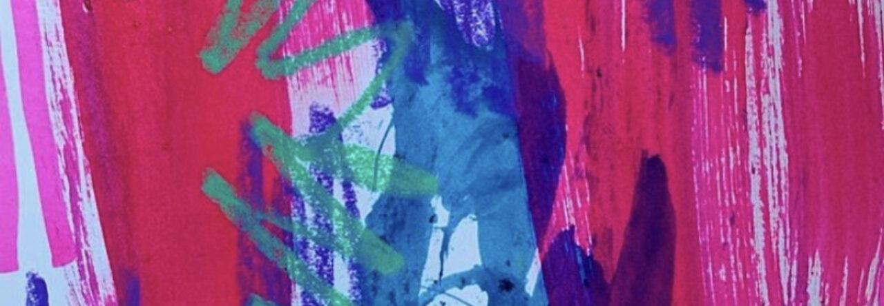
Pink- I choose the colour pink to represent happiness. For me the colour pink is evident in everything I do and also how I present myself so for me it’s an empowering and personal colour, showcasing this in my textiles allows me to portray a little bit of myself and my journey with anxiety.
Black- When you think of black you think of fear which plays a huge role in Corona virus and anxiety. As my studies highlighted a whopping 90% of the public has a newly found fear, so black was a really important colour to have in my pallet.

White- the shade white has uncertainty attached to it. The pandemic screams uncertainty and an anxiety sufferer is constantly worrying about the uncertainty of the everything, again linking to the data I collected 65% said they were anxious or worried at the prospect of another lockdown.
Blue- The colour blue has healing properties but its also commonly associated with sadness. Living alone in my studio isolated from my family sadness has been a huge part of my lockdown. I also found that my studies showed that 90% of the population have experienced “down days” since lockdown started so conveying this through the colour blue was perfect.

Lilac- lilac is the colour of optimism, for me this is extremely important. Being an anxiety sufferer i always think the worst but having optimism settles my mind as i reassure myself thats its temporary.

All of these colours link to the data I have collected and also have a personal link with me. This is the perfect way to incorporate my sense of self and the publics emotional reaction into my project.
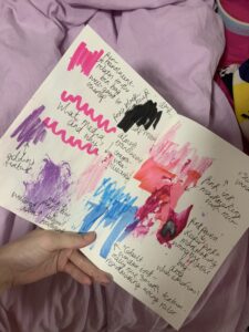
above is my print exploration sketchbook, exploring the colour association and also mixed media types.