Any views expressed within media held on this service are those of the contributors, should not be taken as approved or endorsed by the University, and do not necessarily reflect the views of the University in respect of any particular issue.
When looking at biomedical engineering using the plant cells I stumbled across this article, theres evidence to believe that a plant cell can actually help grow back tissue and bones in humans. this is through a process entitled tissue engineering and regenerative medicine. Biomedical engineering could open up a whole world os possibilities.
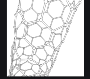
Scaffolds- scaffolds are used to treat cells in the body. It’s a material that works with the biological systems to look at everything from evaluating the problem to treating it effectivly. Scaffolds are templates when healing, they are almost like designers, they look at the problem and look at the most effective form of fixing it.
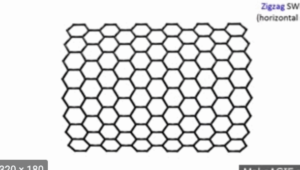
The structure of the scaffolds is really similar to the structure of the plant cells under the microscope. Theres a repetitive structure that really open and linear, its important to take this into textiles as its such a prominant structure. Relating to burn healing the wide open structure would allow the burn to heal, allowing oxygen to promote burn healing. taking this into textiles could I find a material thats really similar to this?
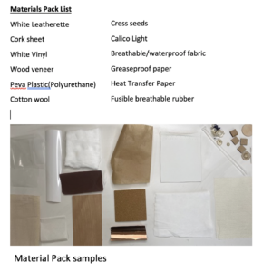
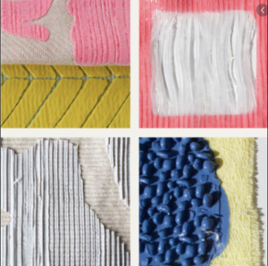
We were given a fabric pack in which had a lot of interesting fabric.
The fabric pack materials where very close textured and as i was looking at cell structures I wanted to introduce some loose textures more structured fabric. With this in mind I still wanted the fabric to be breathable and open. This contrast would work really well as the cells under the microscope are very chaotic and hurdled together were as if you look at the structures theres lots of lines and open spaces with a more structured pattern.
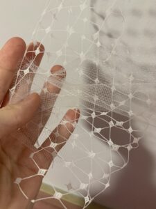
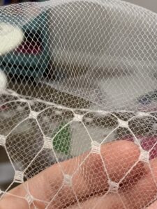
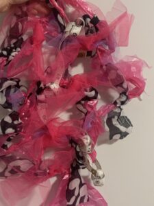
I found this incredible open fabric, i’m not even sure what the name is. Its delicate but open and extremely structured. I really love how open it is as you can layer it over different fabrics exposing colours and other patterns without the piece getting too clustered. I also really loved this white tulle. The tulle is really lightweight, its flexible and if you look closely its hundreds of little holes, linking really well to the microscopic cells.
These fabrics allow me to push my experimentation further by layering, trapping e.c.t How would they look on hard materials like the wood? could they provide a tactile element on the leatherette?
For this project I have been researching into Lucy Simpson, IIse Crawford and Thomas Widdershoven.
IIse Crawford and Thomas Widdershoven “touch base”
The way this collaboration approached design is really fascinating to me. “Touch Base” was focused around the idea of touch. They look in-depth that the actual sensation of touch being a human necessity, this combined with the idea of objectivity and technology made a fascinatingly interesting innovative world. “Touch base” was showcased during the Milan Design week and was inspired by students own approaches to design through innovative practices.
As you can see from above, the project is very tactile, its simplistic nature combined with the complex materials mixed patterns is truly fascinating. To me this these pieces almost resemble skin. This got me thinking about the project and how I could incorporate materials not just fabric based but silicone based or combining them all. These textiles could also act as plasters- the smooth flat surface area allows room to put cream on- its easily washable and will not stain either, ideal for burn treatment.
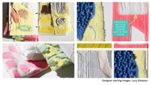
Lucy Simpson
Lucy Simpsons silicone designs really interested me. Not just the incorporation of silicone but how she was able to incorporate pattern and mark making. The small tactile elements really stand out against the linen backgrounds. Looking at this further I would love to create tactile elements within this project, looking at silicone but also other materials. How could you create a tactile surface using fabric alone? Although the tactile element has me thinking i also feel inspired by her use of pattern, especially in spaced out areas. Could i find interesting, breathable, waterproof fabric that would mimic this effect? Whilst still conveying this tactile element?
For this brief we are working with Smith and Nephew, Loop ph and researching medical burn coverings.
Smith+Nephew
Smith and Nephew are a British based company who specialises medical equiptment. Their ethos is “restoring peoples bodies and self belief” looking at how they can make living with certain thing easier and more bearable! The company wants to prolong life, looking at any approaches to do so.
Loop Ph
loop Ph is a London based company who specialises in innovative design and architecture using science. Their innovative thinking always keeps them looking ahead for new approached to design, looking at thew world through futuristic eyes. They probe into future using a combination of environmental, social and scientific research. They prize them selfs of emulating environmental structures but with a modern, technology approach
.
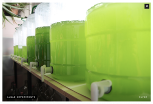
the picture above shows loop ph growing algae within a lab. The idea of the algae being an environmental process however growing this in a controlled environment in a lab allows them to look at the properties and really break down thew algae to use within scientific research.
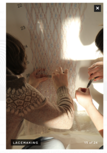
Another example above is loop ph creating Lace but with an advanced scientific approach.
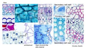
I have taken the theme “structured pattern” and started to look at breaking down and reconstructing microscopic plant cells. This topic to me was interesting, it looks at biomimicry in depth and allows me to really see how nature works and how I could use this information to create my textile. What I found fascinating was the texture of the layers, plant cells are well known but are the texture within well known?
In relation to the breakdown of plant cells I want to look at each layer, how its structured i.e what pattern does this create? and what the function is, in relation to the texture of i.e membrane, it’s jelly like what does this do and how can you communicate this through textiles? This should provide me with a lot of textures and pattern in which I can start looking for fabric types and which techniques I can use to mimic the structures.
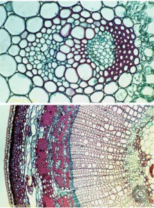
What drew me in to the plant cell structure was the amazing pattern it creates on a microscopic level. It becomes almost abstracted completely with a very psychedelic feel. The textures are highlighted faintly when their close-up, the contrast between the open loose structure compared to the chaotic and busy almost clusters.
In relation to the burn I really want to look at how a burn heals, after time the burn will start looking like a scar- how can we help this scar heal? After doing some research small thin silicone patches are used to help heal, the silicone provides a space for gel or cream meaning they can apply the gel easily and its also easily cleaned as silicone is a smooth and durable material, so for me the silicone is essential.
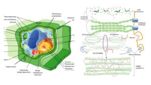
In the slide above I started to look at the basic plant cell structure. As i was looking at the cells on a microscopic level I knew it was important to look at the anatomy of the plant cell. The cell structure is the image on the right is the breakdown of the cell structure, I found this interesting as theres so many interesting structures to the cells could I incorporate them all? possibly contrasting?
In this slide I’m looking at the difference cellulose textures. Theres some really beautiful textures as well as lots of interesting structures, you have the tights compact structure which contrasts to the open jelly like structure. This will really help when looking at materials, especially incorporating something like silicone.
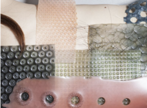
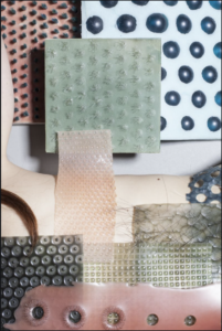
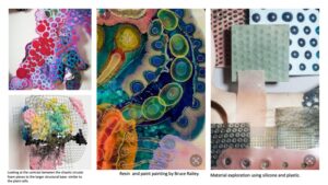
I have started collecting some images of things that could relate to the project. i really love the plastic and rubber material exploration above, using something like this would be amazing for the arm, its versatile, easy to clean and aesthetically interesting. Bruce Raily’s resin and paint paintings really resemble the microscopic cells, they create a really interesting psychedelic feel, the layers could be symbolism for different fabrics, the way they overlap on the body, even presented in an interesting way with small details of silicone.
similarly to the way that Lucy Simpson works so too does the cells, the way she clusters using silicone is really beautiful, i also really admire the way she mark makes with the silicone. its simplistic detail, possibly combining this with a contrasting more open structure would be really interesting.
When I first heard combination my brain screamed print!! As I had been working on a print collection I thought this would be the perfect time to start incorporating my prints into my work!
Looking back at my previous samples I started creating a list of things i found successful:
Machine embroidery- I really enjoyed the way the ruffles just made the piece flow. This also was enhanced by the irregular shape of the samples- could I look at cutting and ruffling my prints the same way?
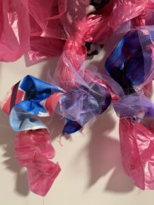
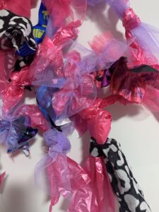
Knotting samples- I really loved the chaotic and fun energy of the knotting samples so I wanted to capture the mood in my combination. I also loved working on a much larger scale this paired with all the contrasting materials is a really fun tactile piece.
Knitting samples- I found that sewing my own yarns was very effective in capturing every one of the material qualities and sewing these together captured that.
Weave samples- I loved the exaggerated knots in the weave samples but i also really enjoyed the way each layer interacted with the other, it looks messy and chaotic but the contrast of materials is really playful and fun.
I started taking my print samples and ruffling these up using the machine. The prints soon became really irregular and abstracted but visually very interesting. I then took my tulle and started layering the print over as the contrasting materials was something i wanted to re-explore. I continued this process until i had lengths of my own yarn that were really interesting and eclectic.
Regarding data I used layers in relation to the yes votes so we have 5 layers in the first, 7 in the second and 4 in the last.
I started looking at how i could add these into samples- with knotting in mind i wondered if i could knot this around my large sample as the print could really make the large sample come to life.
I really love how this turned out, by adding in the print It really makes the viewer take a closer look at how the fabrics blend but also contrast with emotional marks.
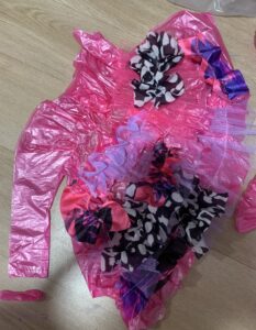
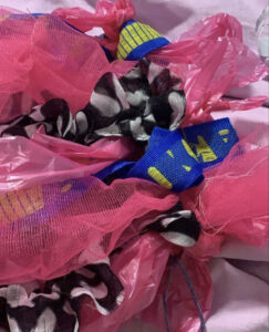
For my second sample I looked at the same idea however wanted to incorporate the manipulated ruffled bag.
This sample becomes a world of symptoms. The layers show how how anxiety symptoms and corona symptoms become one, as an anxiety sufferer would have trouble distinguishing if it was corona. The emotional marks are almost my emotional response to corona which is manipulated as if the media is telling me how I should feel. All together it’s an exciting world of eclectic symptoms.
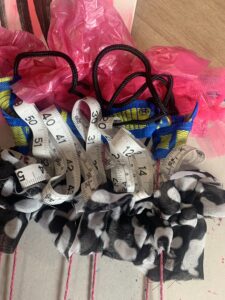
For my last sample I actually became inspired by my prints, I used the tape measures and sewed them to look like the crayon marks within my prints. The plastic bag is representation for the ink marks and the array of materials is the symptoms from corona and anxiety, this is a physical representation of my emotional response to covid 19 through my eyes as an anxiety sufferer.
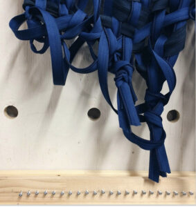
When I was given the brief for tying and knotting I instantly thought of macrame. I started looking and researching into macrame. I had done this technique before in college so I did have experience however looking at all the macrame pieces, I just felt they didn’t go with the feel of my project. I think the alternative materials could have worked however wouldn’t have achieved the same result. My second thought went directly to my previous weave samples where I looked at chunky knots. I thought could I replicate this? could I repeat this?
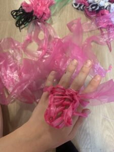
For my first sample I looked at the knots solely. I wanted this to be extremely chunky so I used a lot of material and just started tying them against a juxtaposing material, I really really loved the mad contrast of materials but felt almost they were too spaced apart.
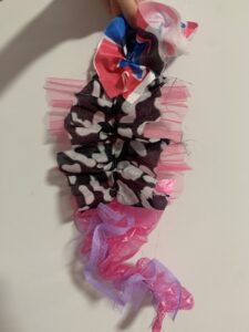
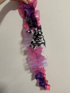
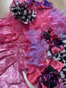
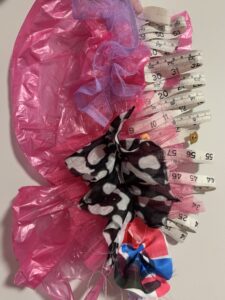
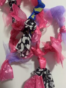
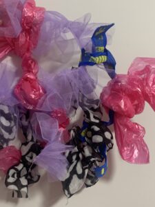
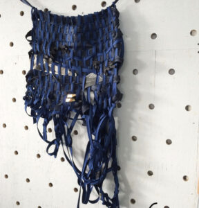
so going forward i wanted to tackle this in my next sample. My second sample I looked back to my embroidery samples which was all about ruffling with the sewing machine, as this was so successful I wanted to use this technique again. I started by cutting strips of each of the material and using my sewing machine to ruffle each of them. I also made sure to cut the fabric larger so the ruffles would be more exaggerated and it would fill more gaps, to create a loose world of tactile elements. I then in relation to my data looked at creating chunky knots, 80% = 8 knots. I wanted to look at the opacity of the materials, the purple tulle is regarding invisable symptoms, ones so transparent you wouldn’t know you had them i.e vertigo in relation to anxiety, the Patterned scarf fabric I thought really resembled fear using colour association and the pattern almost looks like spots of bacteria all over the scarf. knotting these together really helped convey how each symptom overlaps and becomes one much life the population now experiencing an anxiety patients mind.
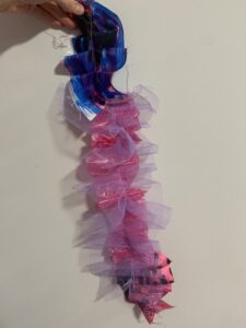
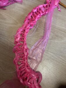
I then wanted to go the opposite way thinking how would this sample look on a smaller scale? I started creating one layer, looking at thin strips of the pink bin bag, I knotted these all together as a base. I then went in with purple tulle, knotting each strip onto the knotted base. I wanted layers to be important within this sample as I looked at having 5 layers to link into my data. I then used the black patterned fabric and continued this process, looking at filling some of the gaps. I then decided to double the amount of pink tulle as I wanted the sample to be mostly pink in order to relate to the rest of my samples, I used longer bits and attached. What I really loved about the knotting samples was the movement, when you hold them up they have a loose nature so they are very fluent, I feel this works really well as it links to the movement and flow of my first embroidery samples, I wanted this feeling to be evident throughout the process.
Knitting is a weak point foe me. as someone who struggles working in a repetitive manner its always been a struggle. I started however looking at easier methods of knitting. I came across a technique which was hand knitting using my fingers. I found this really interesting as ive always used knitting needles! I also wanted to incorporate my alternative materials as it was working really well with my project so far!
I started by cutting the plastic bags into strips, I wanted to recreate yarns so I used the sewing machine to sew the ends together. This gave me a really interesting yarn alternative. I also really enjoyed the opacity of the plastic bags, with knit being so structured it was nice to have a contrast with the material used. I stumbled across a page on youtube called Bean Creative, this page is all about knitting: https://www.youtube.com/watch?v=h3BEgP5s9Pg as a beginning knitter i found the instructions really easy to follow and was actually able to create a length!
After creating this length I wanted to challenge myself and try knitting on the knitting needles as someone with two left hands for knitting I knew I wanted a basic stitch, I didn’t want this too be too simple so I decided to keep going with the alternative materials however adding in more complex materials. In my previous samples I have been using pink tulle, bin bags, tape measures, shoe laces and also scarf material. However most of these materials werent flexible enough to knit with. I decided to cut strips of pink tulle, purple crispy tulle and bin bags and repeated the process of sewing the ends until I had a length long enough to knit with.
I think the sample is effective in the sense that its fun with a tactile element, the materials sucessfully link to the samples which strengthen my project. I also love the contrasting materials, it makes you just want to grab and play about with it!
My weave inspiration I looked at was Vanessa Van. Van uses alternative materials and waste fabric. My personal favourite was her weave using zips, she manipulated the end of the zips to create almost knots and it was this bulkiness that I really enjoyed. http://www.adropofwonderstudio.com/2016/01/weaving-with-alternative-materials/
The way the knotting sits at the bottom really stood out to me, it looks almost unintentional but at the same time really beautiful, I knew I wanted to include this within my weaves. I also really enjoyed the way she used heavy material in a way that it almost drapes effortlessly, I think combing this technique with alternative materials especially a contrast of materials would work really well.
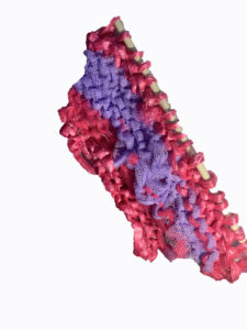
This weave is the first one I created, as I felt my embroidery samples were effective with the machine ruffling I added this technique to the weave. In relation to my inspiration I knotted the ends of the weave, I feel this was particularly effective with the Ikea labels as the knot really stands out but captures the effortless feel like Vans did also. I wanted to use a range of materials so I looked at layering and stacking whilst being conscious of the thickness of materials. Having the contrast of the alternative materials i.e pink bin bags and Ikea carrier handles mixed and put against the delicate tulle and thin scarf was really effective, it appears interesting at sight however with a tactile element.
My second weave I wanted to add in another material, trying to be as sustainable and resourceful as possible I noticed I had a lot of tape measured around, looking at my data I immediately started to manipulate and ruffle the tape measure, I used my data to look at how many ruffles I needed to do i.e 80% = 8 ruffles. I added this into the weave and everything started to look wackier and a lot more fun. By having the different layers interact with each other it conveys how the anxiety symptoms and corona symptoms both melt into each other as if the layers are masking each other, never knowing if it’s corona symptoms or anxiety.
I feel the weaves are really tactile but also embody me. They have a lot of emotional impact linking to colour association. The erratic and bold colours compliment each other whilst also drawing you to the samples. I want the viewer to feel the emotional connections to the samples as well as looking aesthetically at their bold and tactile nature.
As someone who loves print I feel it’s essential for me to involve this within this project. As my concept is emotional, I wanted to explore the art therapy concept further, as my colour palette evokes emotion based on colour association I wanted to take this forward with mark-making.
Looking at my previous prints I wanted to have the same expressiveness and fun feel. How could I involve mark-making and emotion?
I decided to physically start recording my emotions everyday. Looking at the colour association, I dedicated a colour to an emotion and everyday using mark making to record how I was feeling. This also was another way of gathering data especially since I do suffer from anxiety. By adding marks a day, it gives the print series a sense of mystery as you cant plan how it’s going to look. This relates heavily to the unpridictable nature of covid-19 and anxiety, anxiety suffers are constantly worrying about the future similarly to the public worrying about corona.
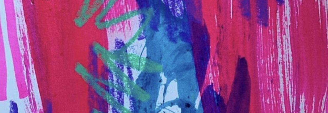
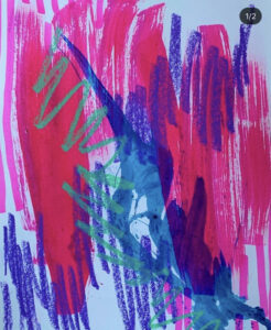
The example above was created during the mini lockdown of students. The blue evokes sadness, being alone in a flat for four days getting lonely, I decided to use windsor ink and a ruler, the ruler drags the blue almost as if Nicola is dragging out the lockdown and extending my sadness. I paired this with a crayon to give the piece some texture, the repetitive marks signify the sadness repeating itself over the course of the day. I decided to pair this with watered down lilac paint, this was covaying optimism, trying to stay hopeful with a mind full of negative thoughts. The paint being watered down creates a sense of worry, yes I’m optimistic but I’m still worrying for the future. I decided to have things overlapping to link to my samples, as the ruffles in the samples overlap so to does my emotions, constantly feeling the same emotions but also not quite knowing how to feel.
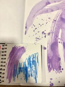
This in a visual recording of my emotions over a period of two days. You can see the difference of emotions I was feeling, The black being the stand out on day 1 meaning I had a lot of fear towards the rising number of covid patients. This again overlaps the pink and the purple as I was hopeful but above all fearful. I plan to everyday record how I’m feeling to create a stunning visual diary of an anxiety suffers mind.