Any views expressed within media held on this service are those of the contributors, should not be taken as approved or endorsed by the University, and do not necessarily reflect the views of the University in respect of any particular issue.
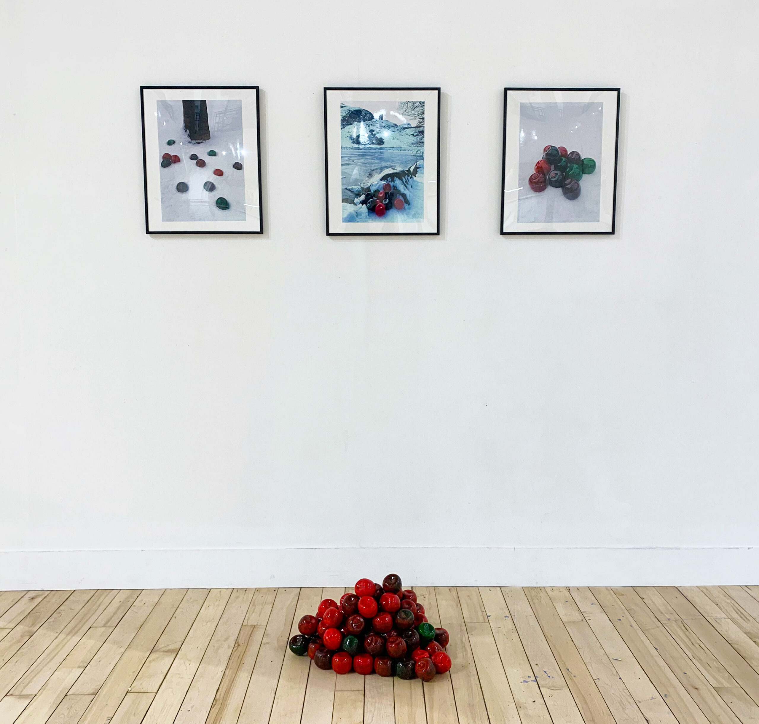
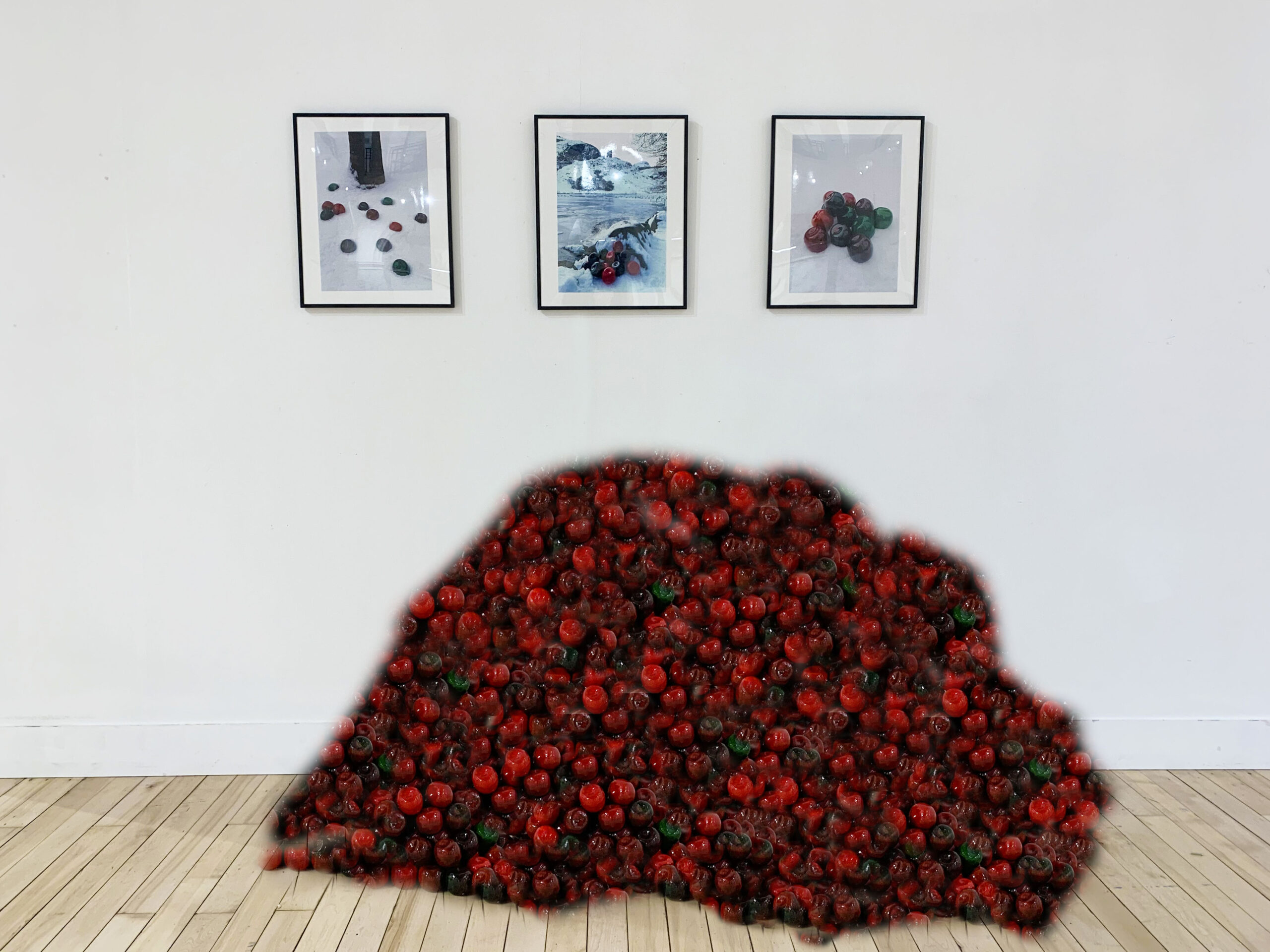
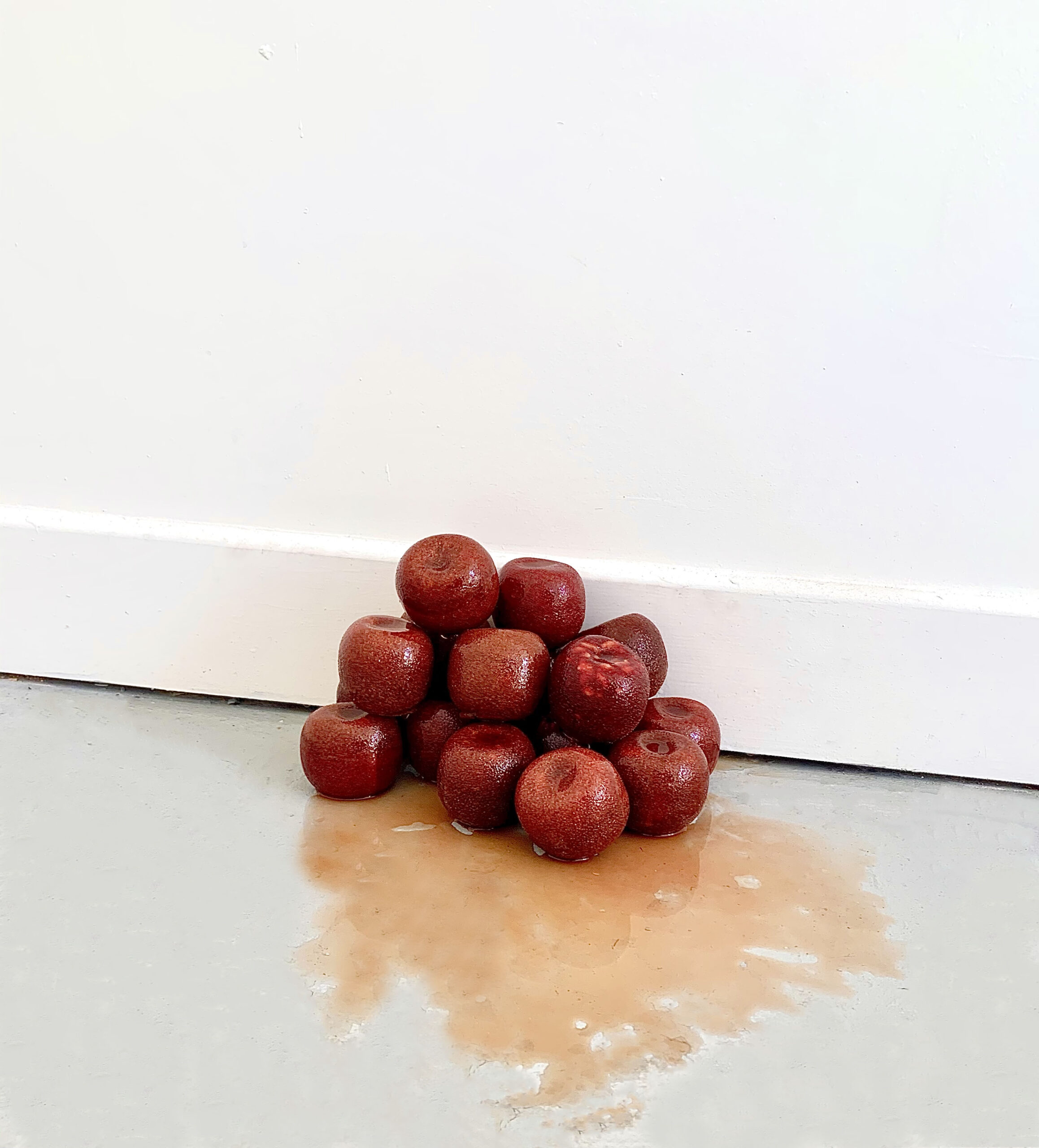
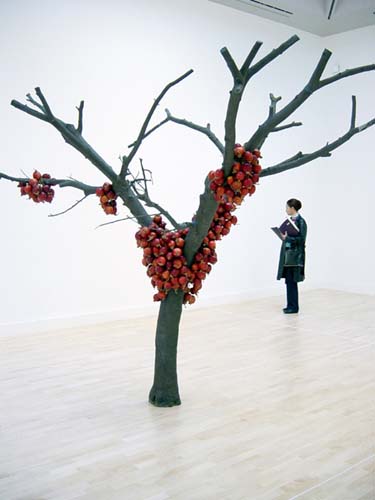
i am so so happy with the framed prints and love them alongside the apple pile. i think both of them together help to initiate a bigger narrative. they are super shiny and i am very happy with how it is in the space. i wonder if i could hide the diffuser within the pile?
i would’ve liked to have had more apples but it was pretty impossible as they took a while to make and i dont have the room in my bedroom to make or store them. it probably would’ve cost much more too.
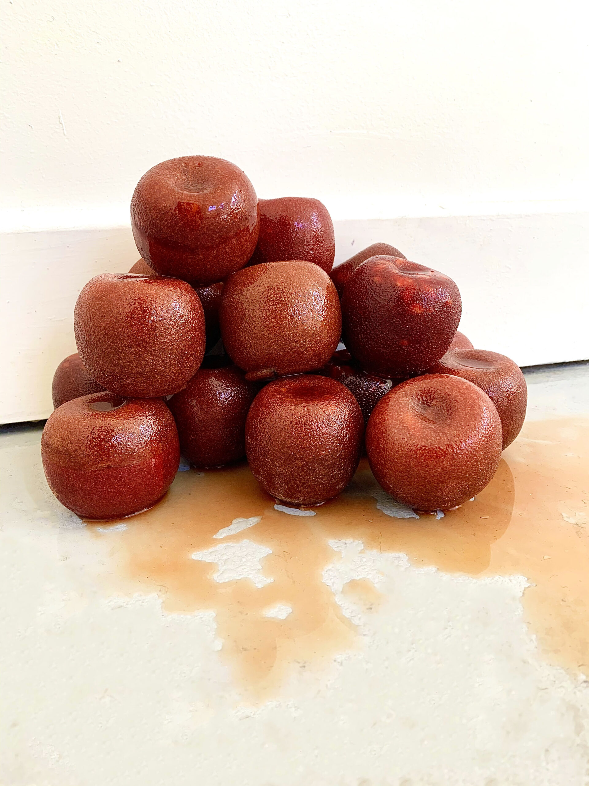
returning to check on sugar apples on Tuesday 27th – hopefully the mice haven’t found it..
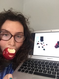
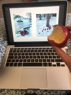
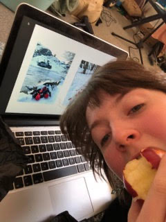
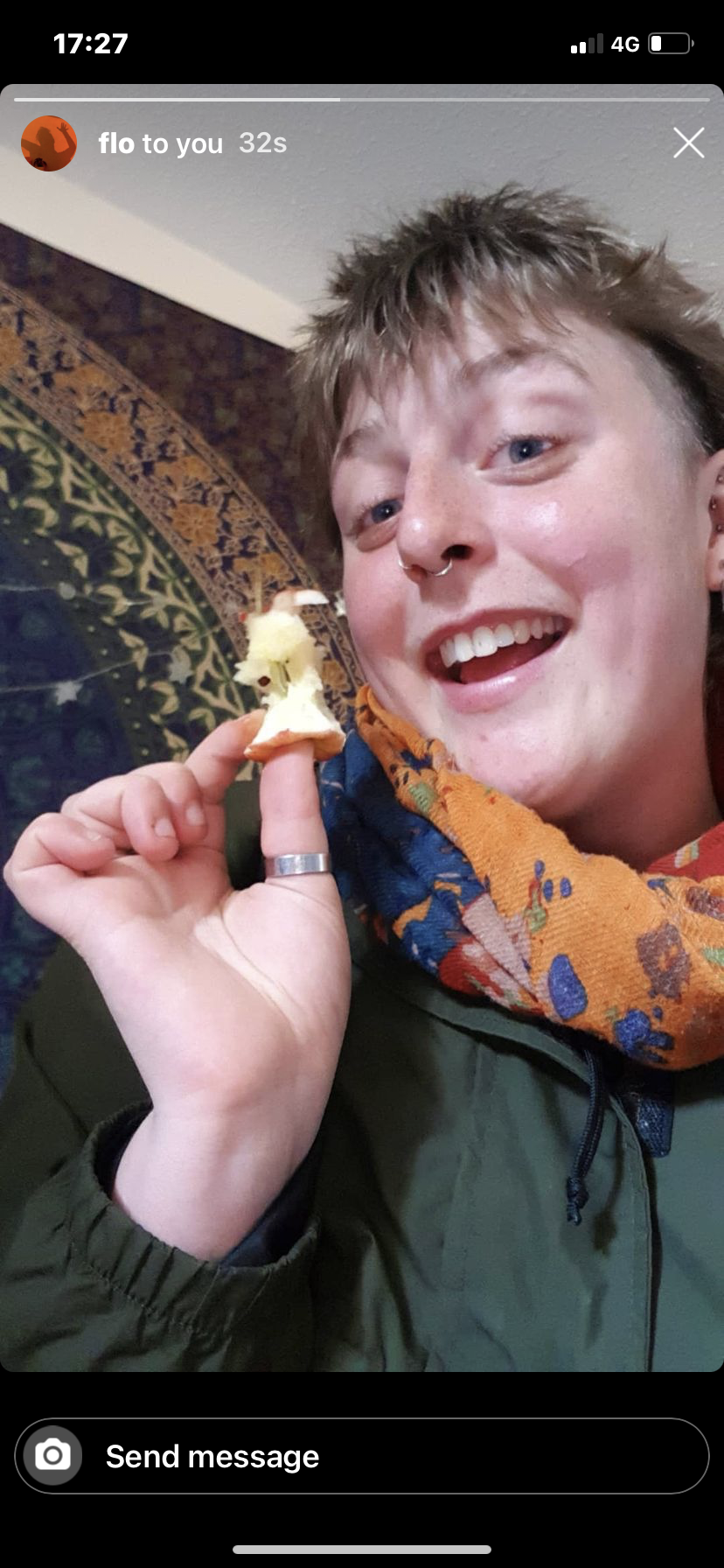
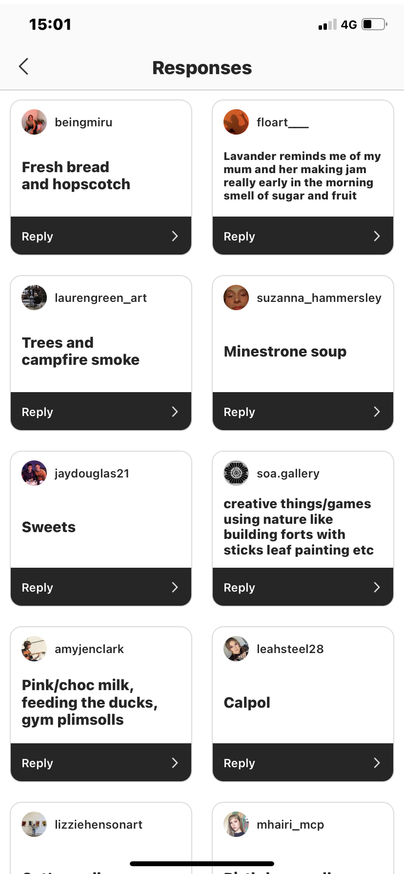
Originally when i sent these out i expected the smell additional element to be the most responsive. I found it very interesting that suzanna got the most out of the real apple. she seemed to find it very nostalgic. I also understand that the drawing probably did require too much attention from the viewer thus is probably the least affective.
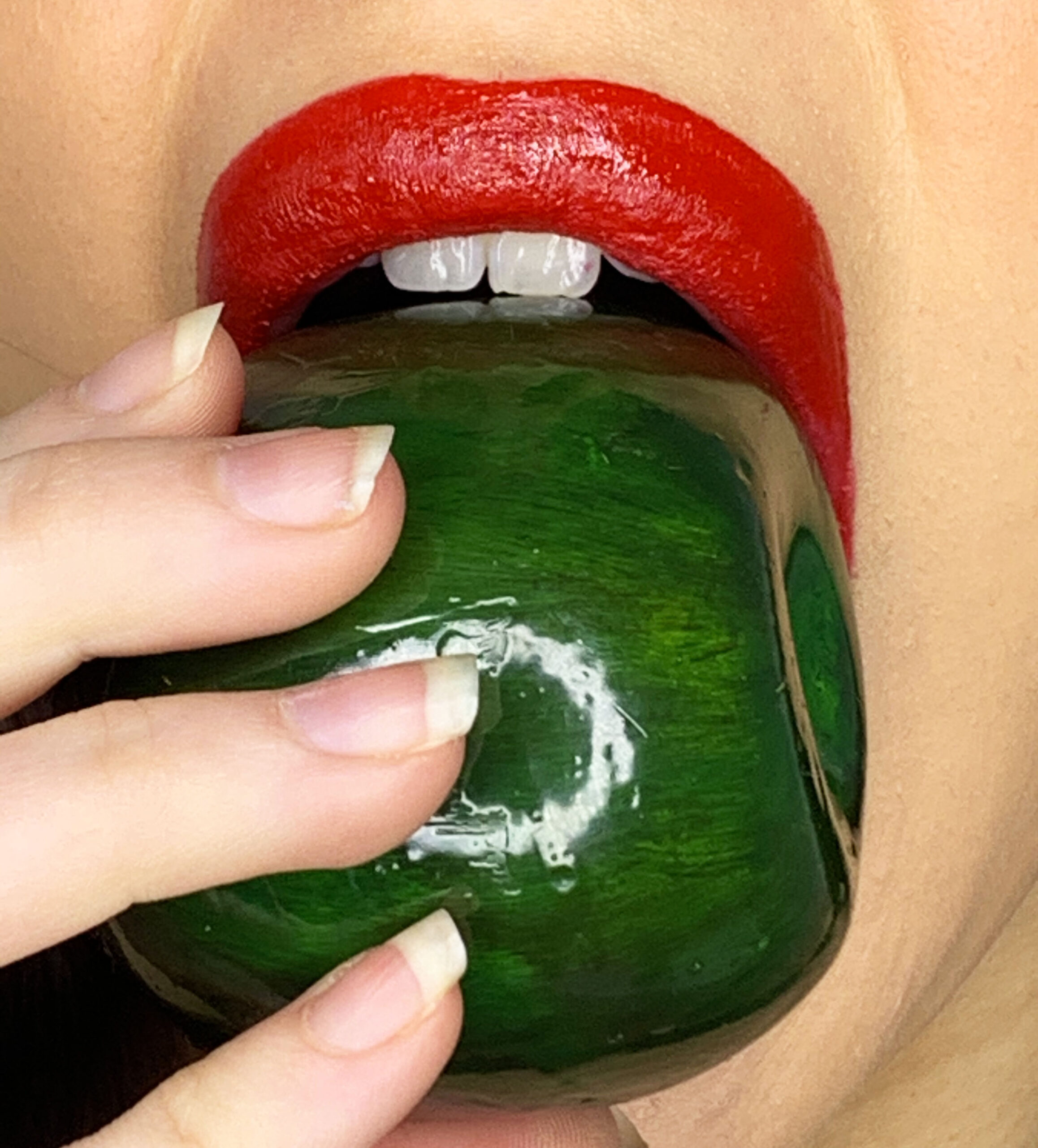
i think this sexualised my work. it was extremely weird and awkward but now i’ve done it. i know i probably wont ever do this again. i dont like being in the work and i am not a performance artist. licking the work totally changes the interpretation and it becomes sexualised.
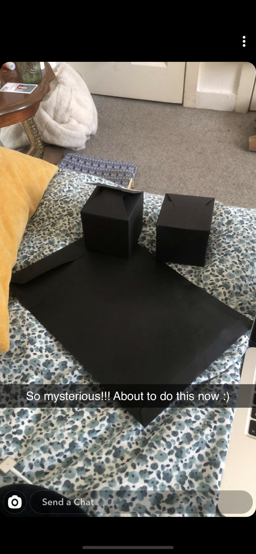
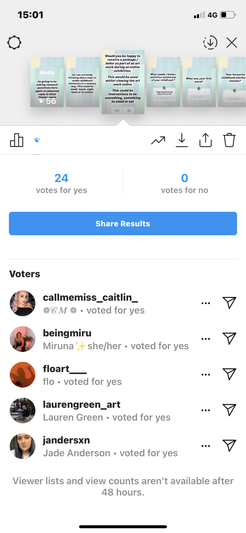
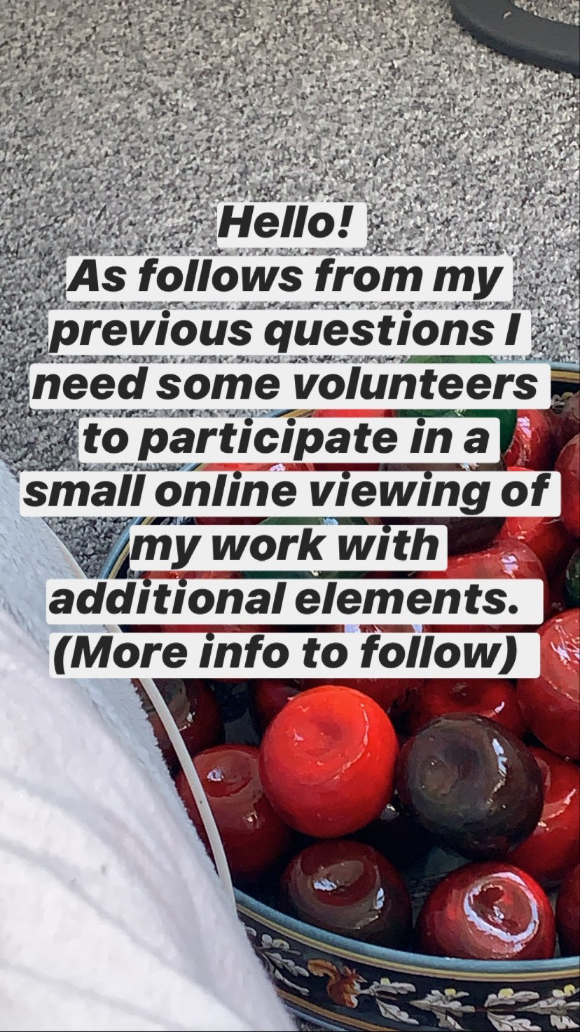
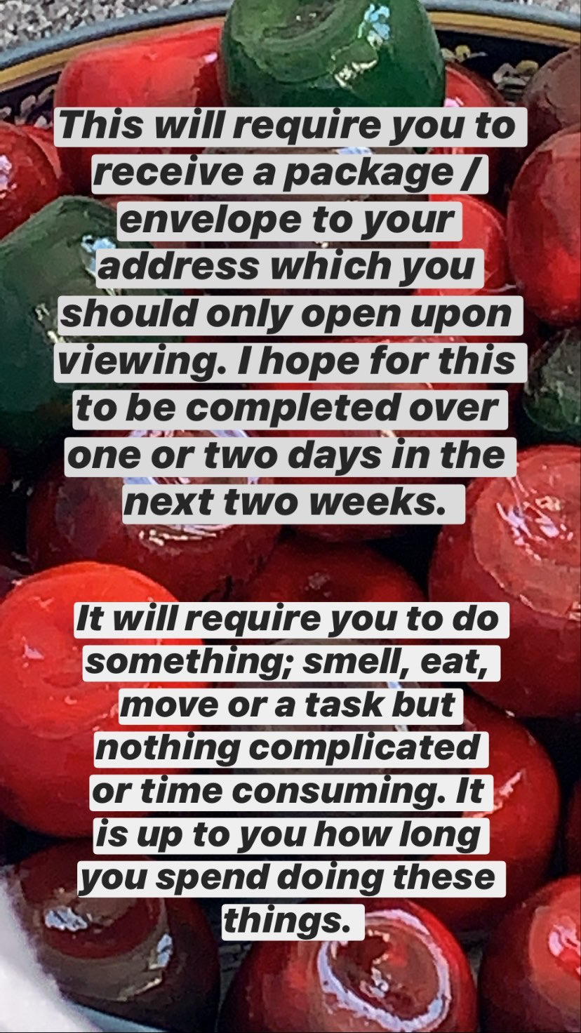
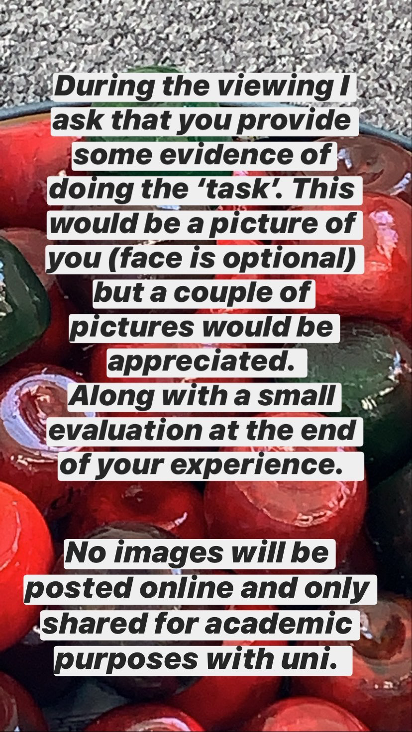
Send an additional element to the viewing of work online. With the limits of being able to view work online i hope to infiltrate the viewers home so that they can become more engaged and have a new experience of art. I want to challage the expectations of what sculpture is and the publics preconceptions of it.
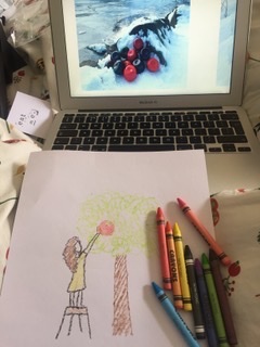
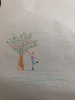
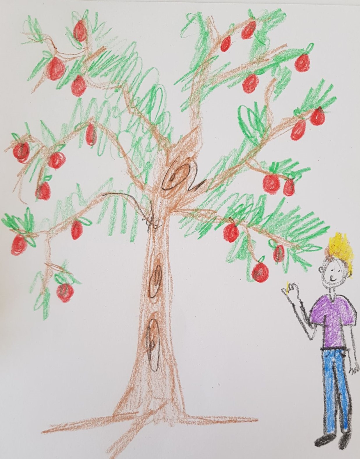
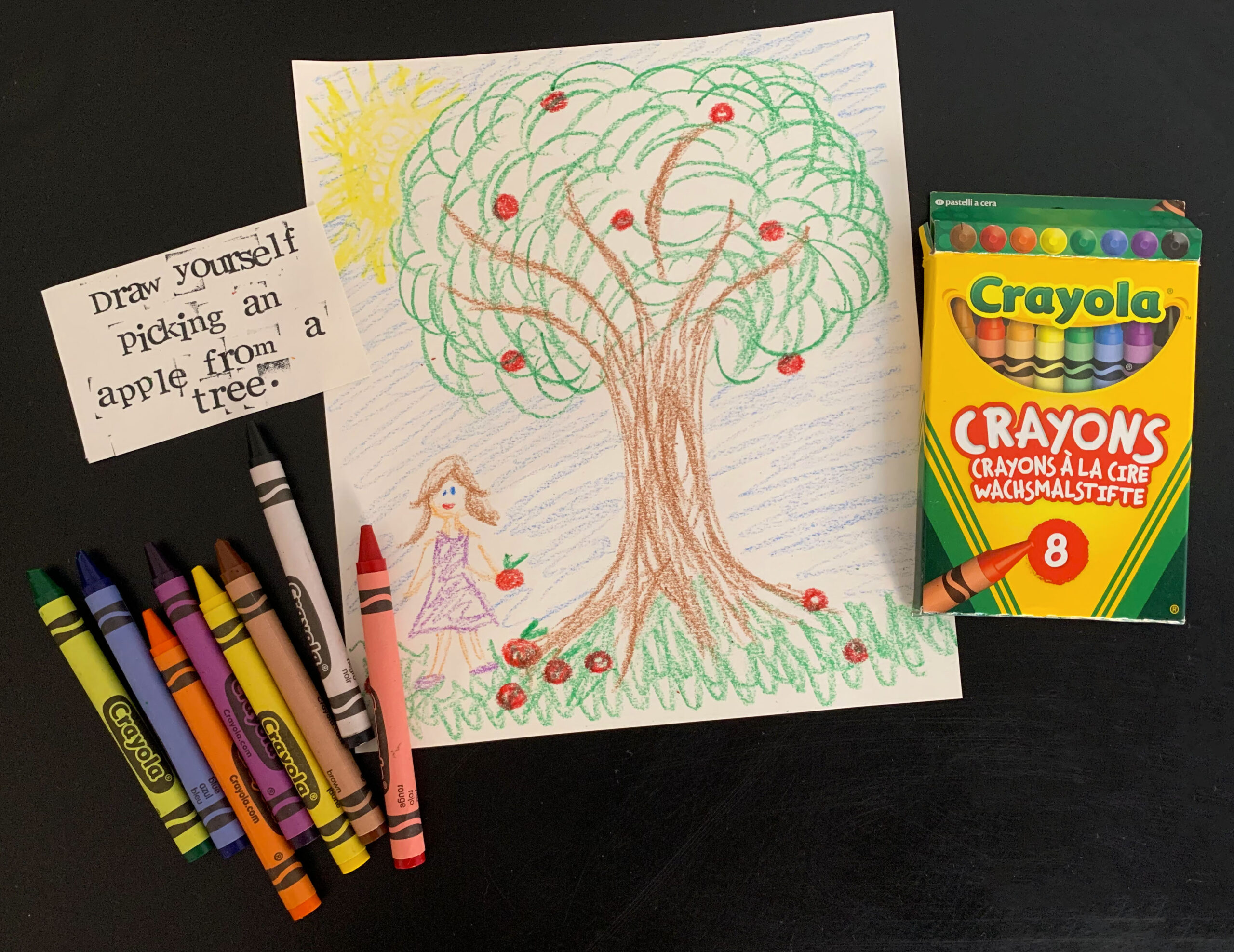
At the very start of my practice and research i got friends and family to ‘DRAW THEMSELVES PICKING AN APPLE FROM A TREE’. I found this a very insightful activity. Some people spent 40 mins plus concentrating on this one drawing which otherwise they probably wouldn’t have done anything like that. I like the idea of encouraging people and providing them with a space they can be creative. It might be using wax crayons, something which majority of us used during our early school years.
Smell is a huge element of my current practice. the only soloution is to send a scratch and sniff card of the scent or get the viewer to smell a physical object that they already have.
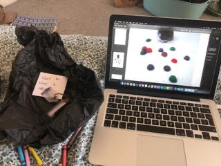
IDEA 1: a package with card, crayons and an instruction note. this should be done during the viewing of 3 online images of ‘Delicious Orbuculum’
IDEA 2: a scratch and sniff card to be smelled whilst viewing.
IDEA 3: direction note to get an apple and eat it whilst viewing work.
i used my art instagram account to try and engage with people and get opinions on how i can make my work interactive.
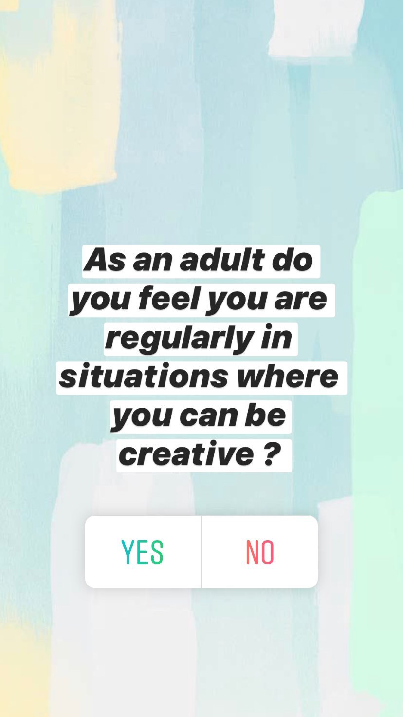
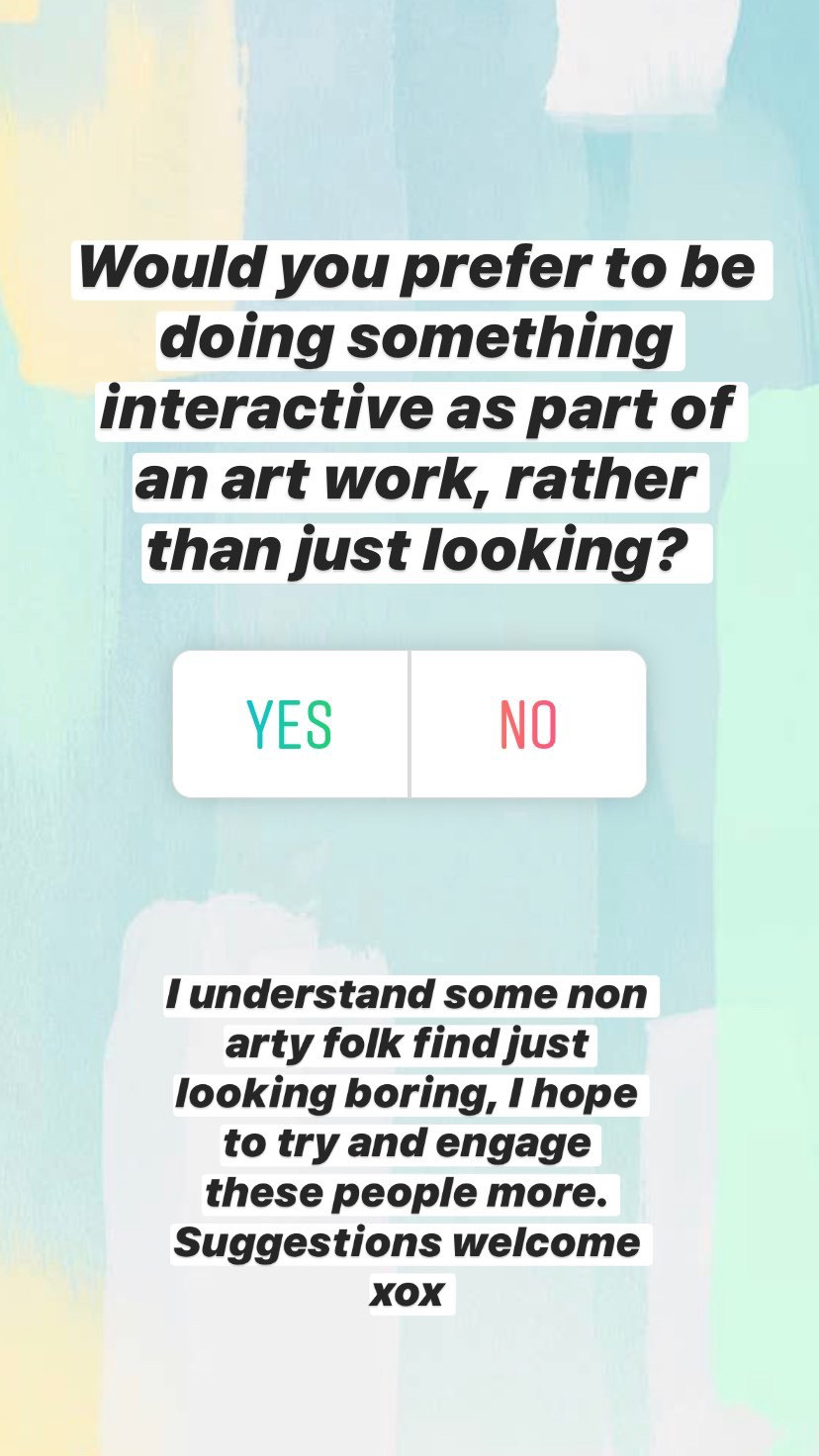
at the moment i am still thinking of how i can make my work interactive and engage people who can find ‘just looking’ boring. I want my work to add an extra sensory element that will engage people further. i like the idea of getting people to do something creative, just as i did at the very start with the drawing exercise. from the questions i asked, it seems that adults aren’t regularly put in situations where they can be creative, i think it would be engaging if my art work required this of its viewers.
send viewers a package with card, wax crayons and a note. this will instruct them to draw something from their childhood, a smell or sound.
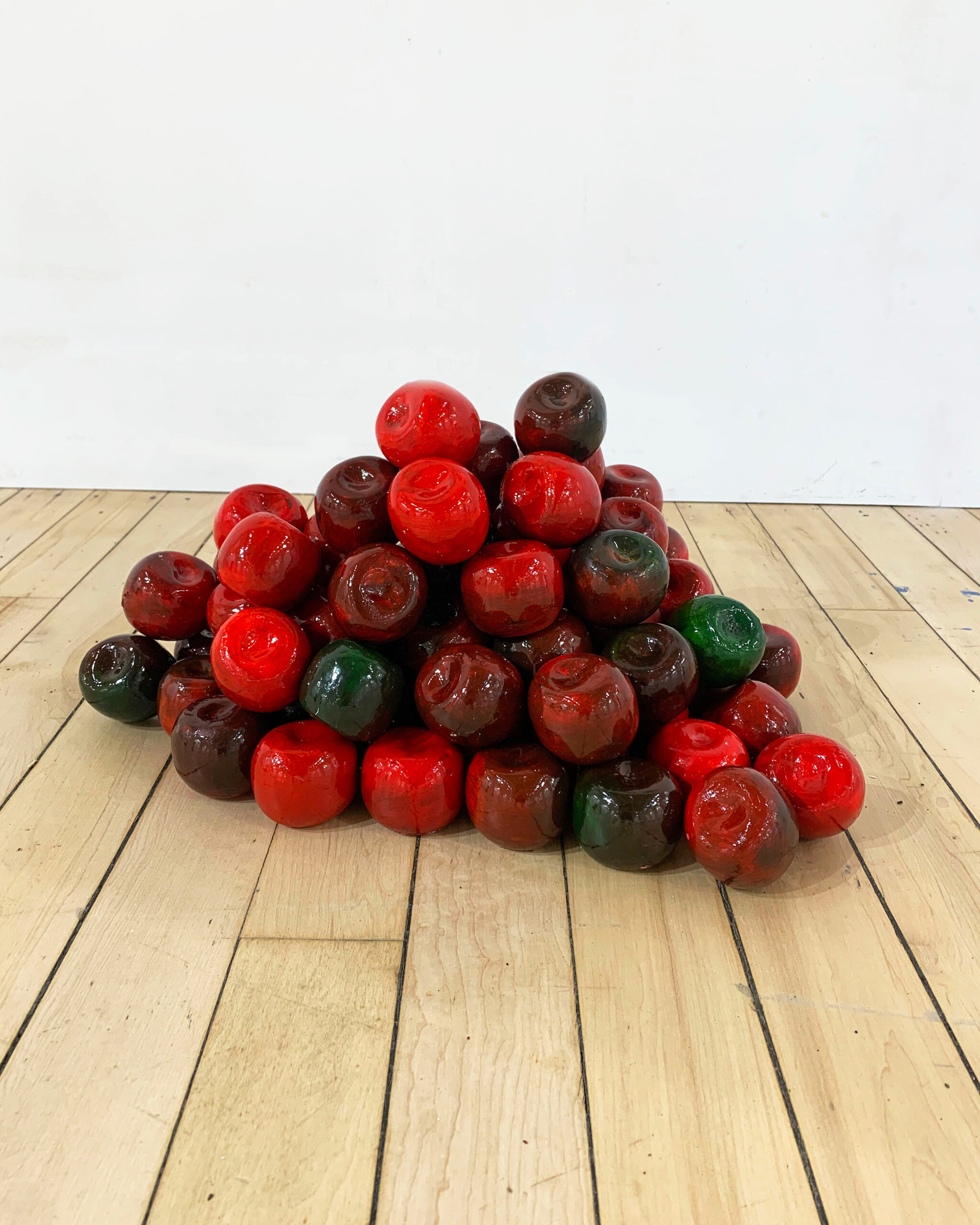
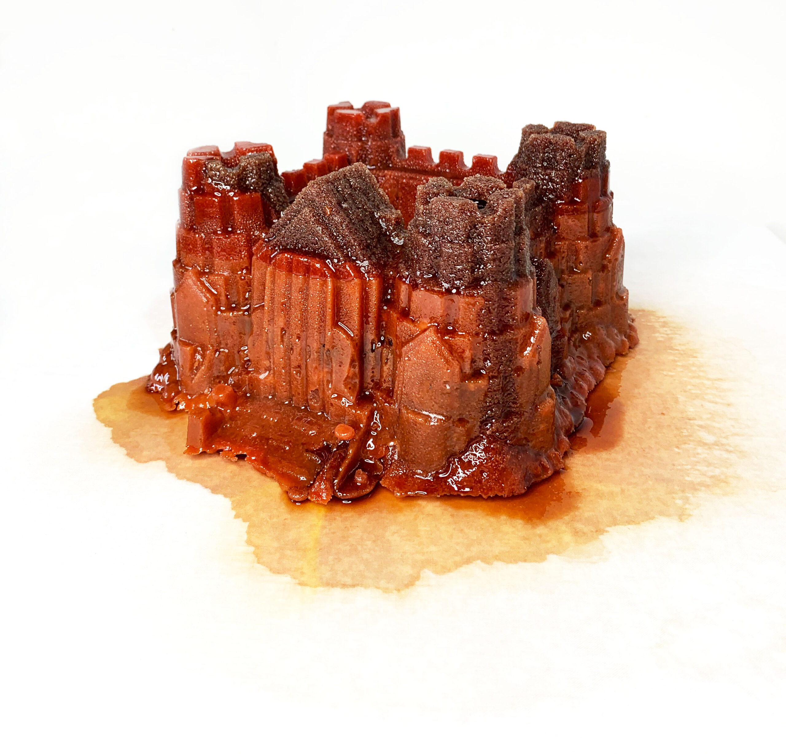
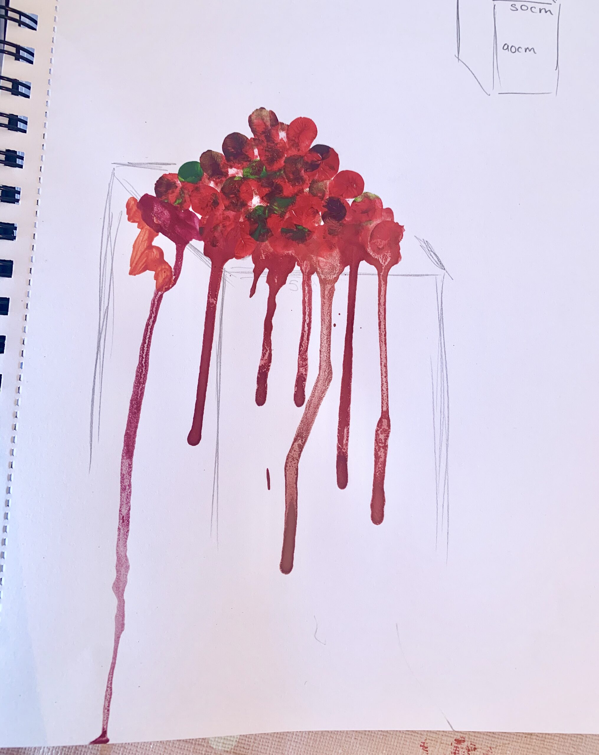
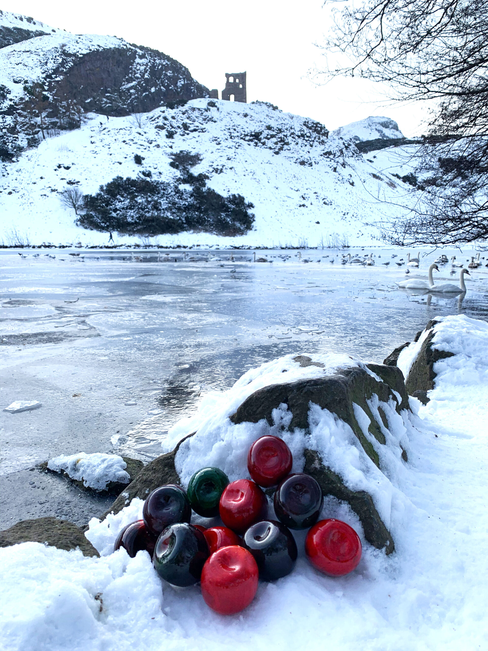
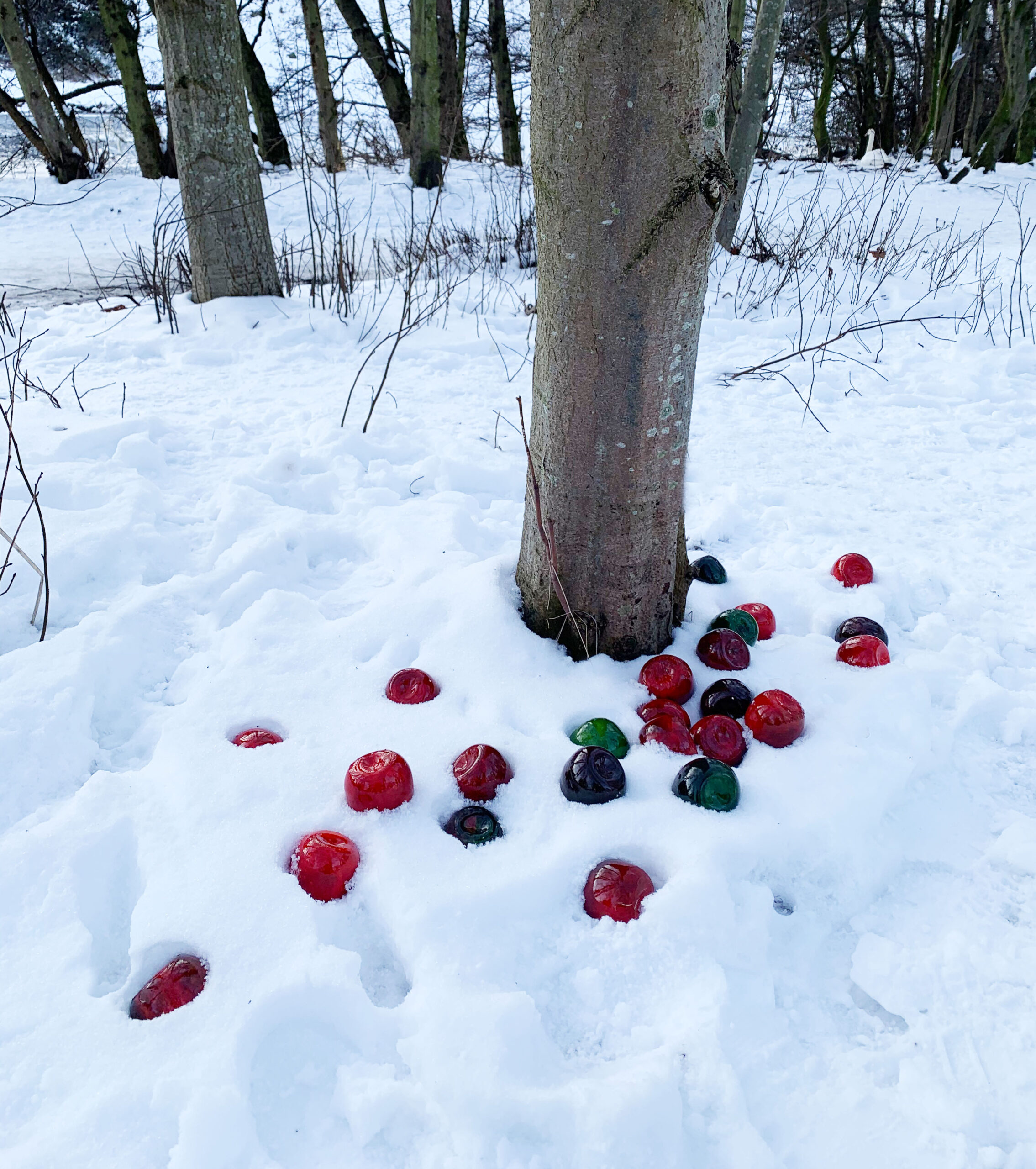
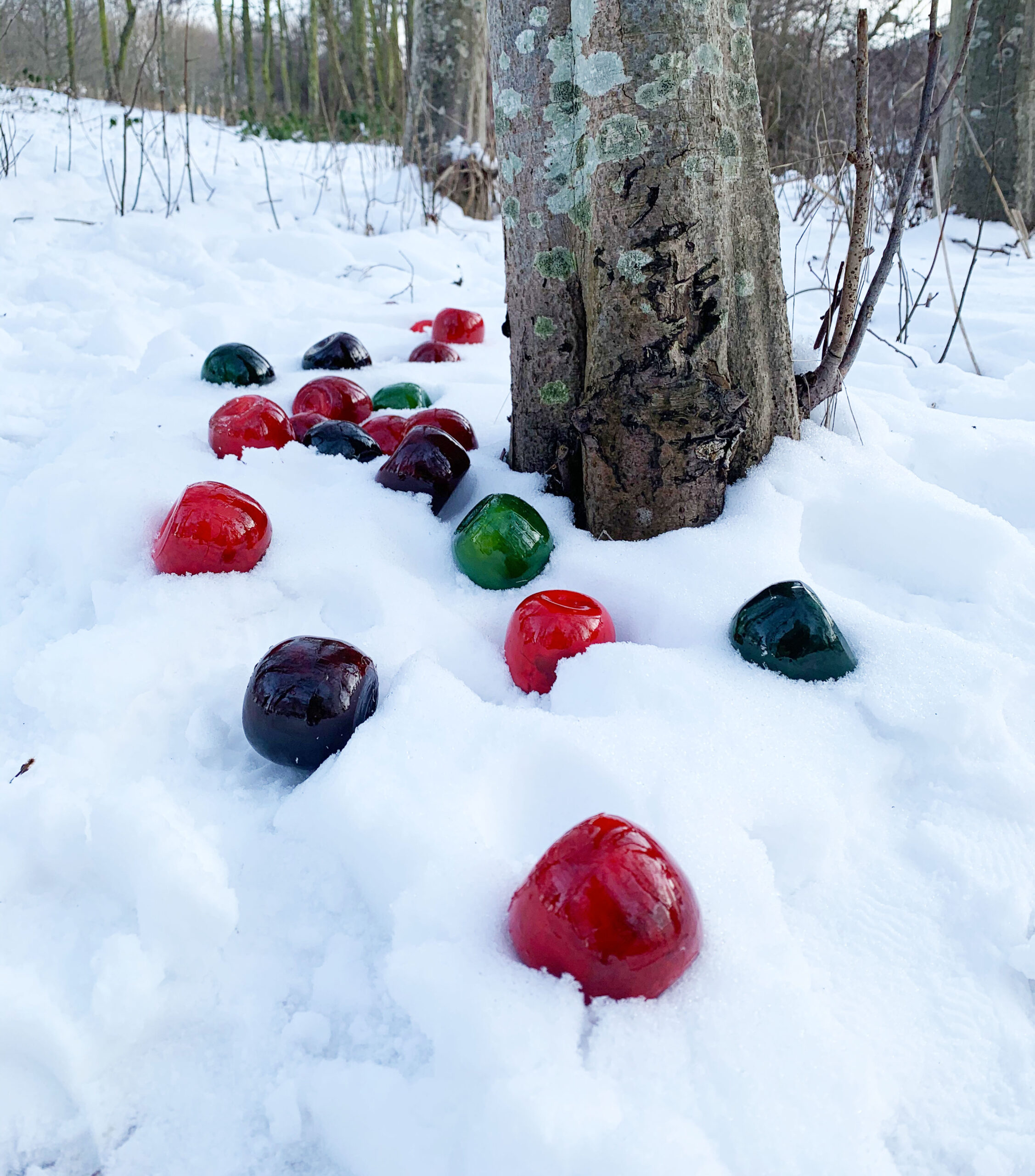
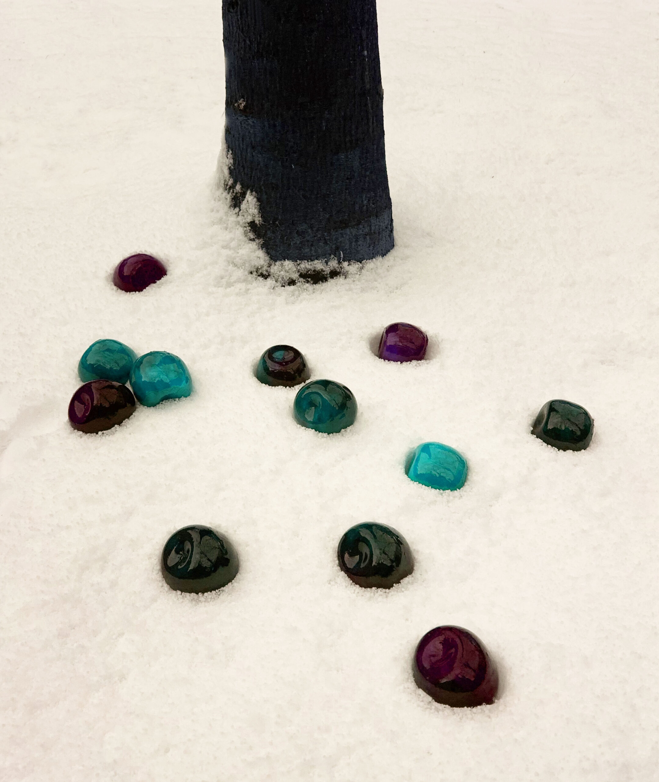
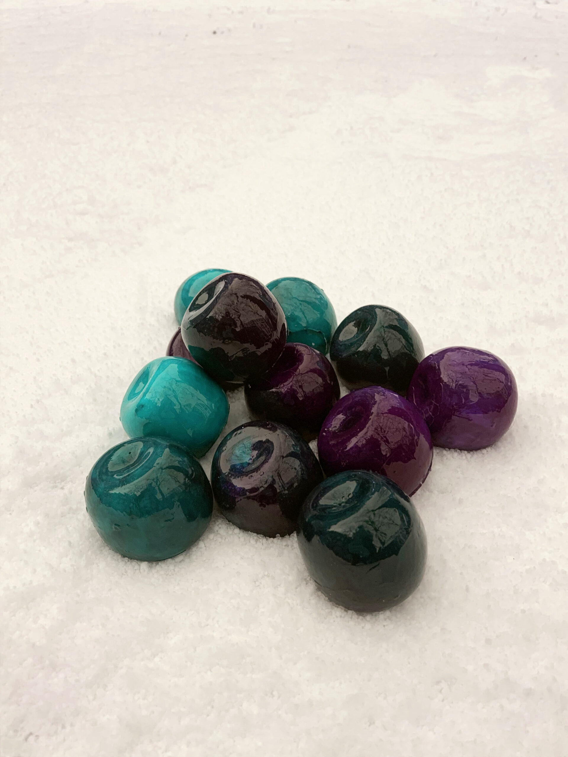
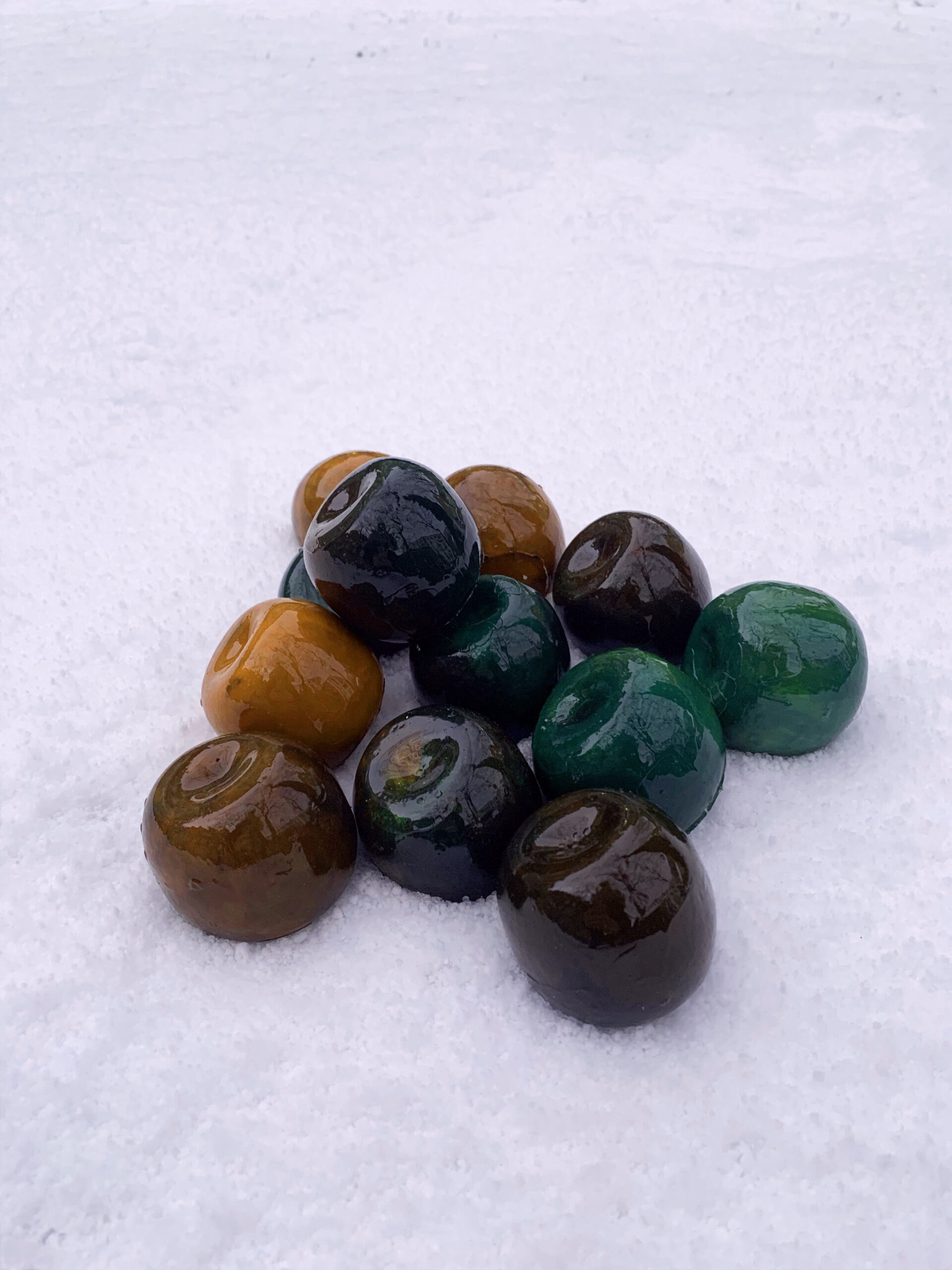
After experimenting i have decided i like using red. I dont feel the same about my work in other colours. it looses the reference to apples and fairy tale/magical atmosphere.
i like the red
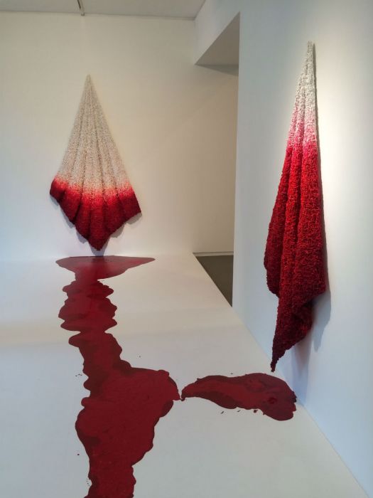
Because I could not stop – Anya Gallacio
Solid turn liquid – Jane lee
Thinking about the movement of red liquid- how can this change a gallery space.
how can I enhance the experience of my work when it is online?
contrasting smells? words can provoke smells and added visuals: smells, mental images, memories, sounds.
Can text enhance the experience of my work? provoke imagination and memories.
what would my apples sound like?
embrace the dyslexia? Show people how i see or what i find hard?
This gives me a headache. words give me a head ache. words and the colour combos are a big no. i dont want a headache or to dread developing my work because of this.
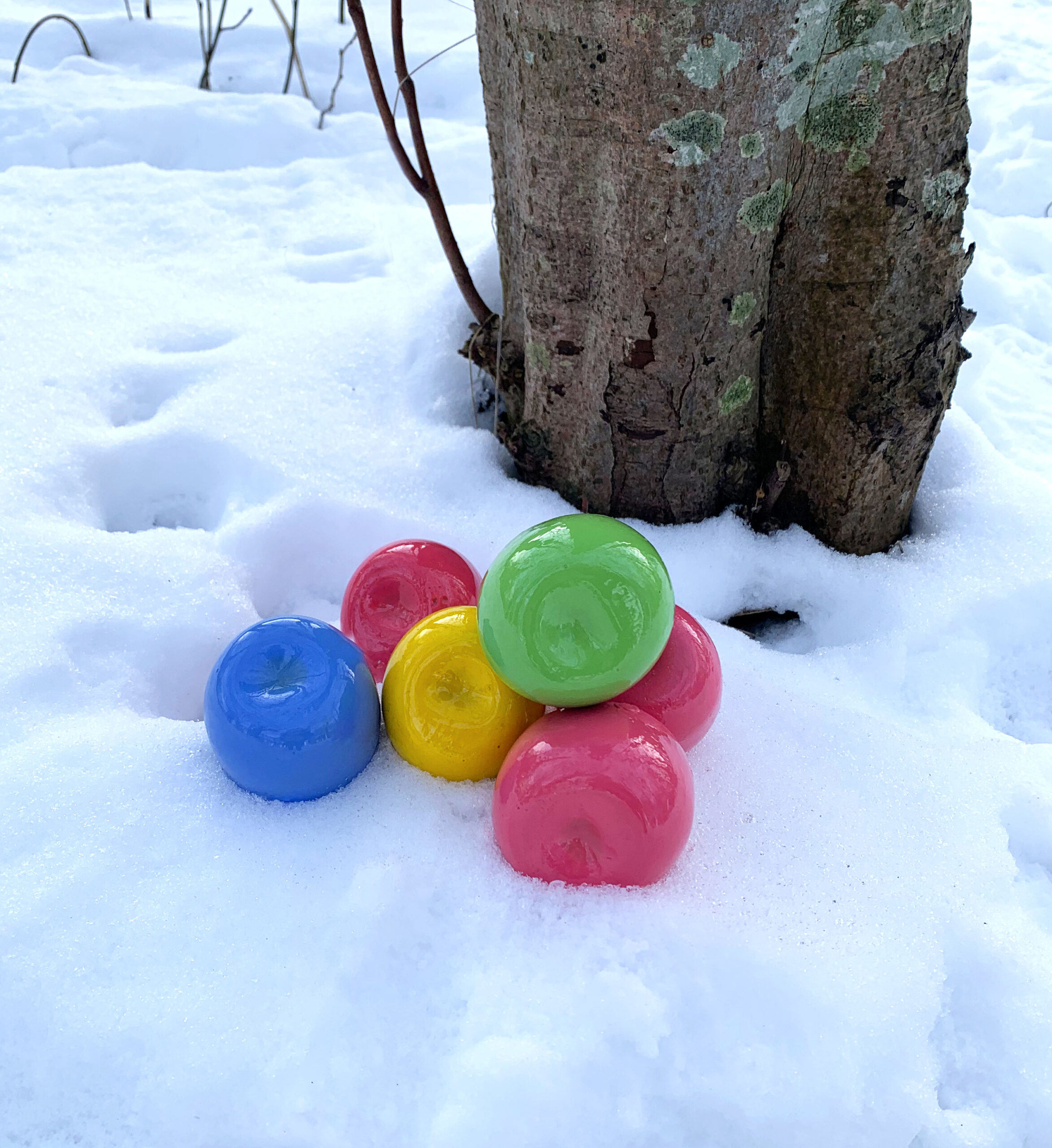
multi colour: artificial, bubble gum. not apples anymore.
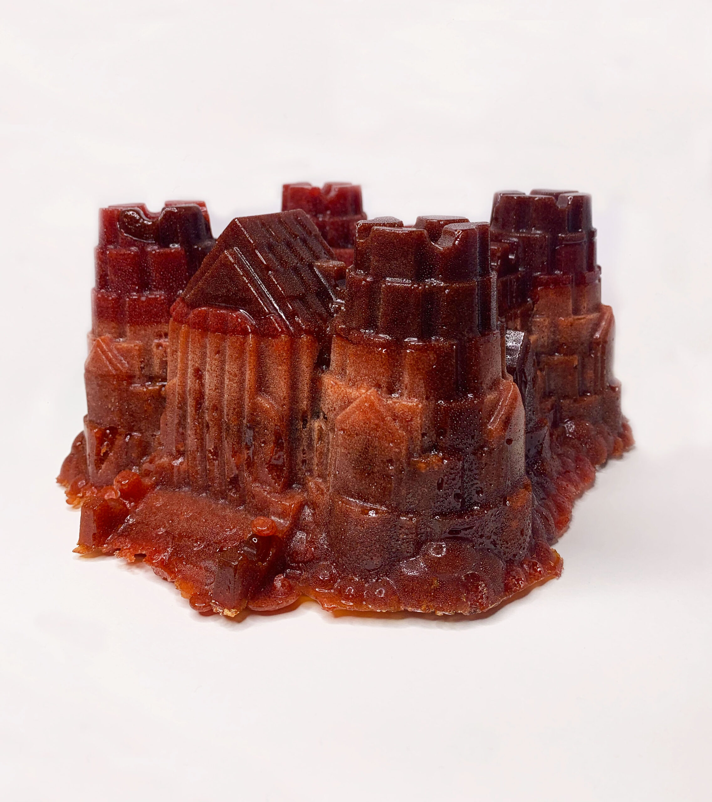
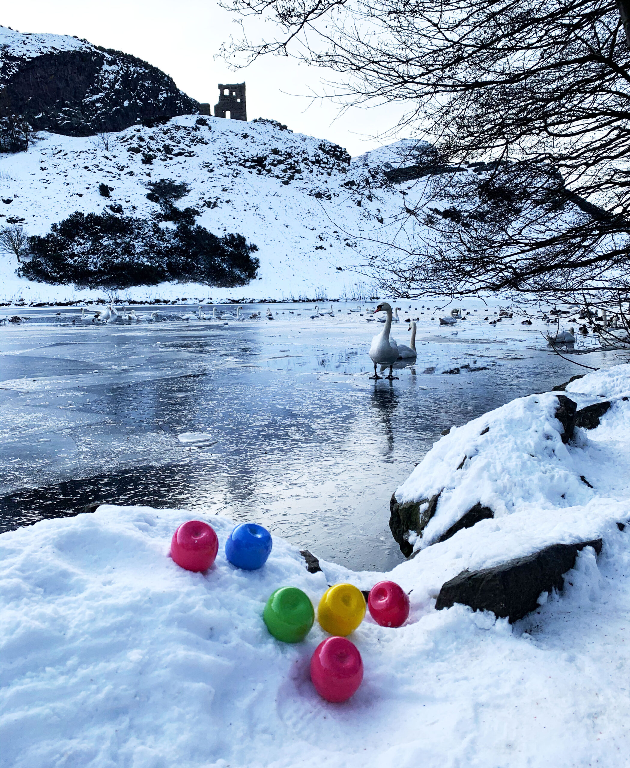
magical, a story, the ruin castle, why are they here? snow creates a blank background. this picture would be very different if it was in summer. snow creates less distractions. highlights the apples and the castle.
why are they here? did they fall from this tree? is the tree magical?
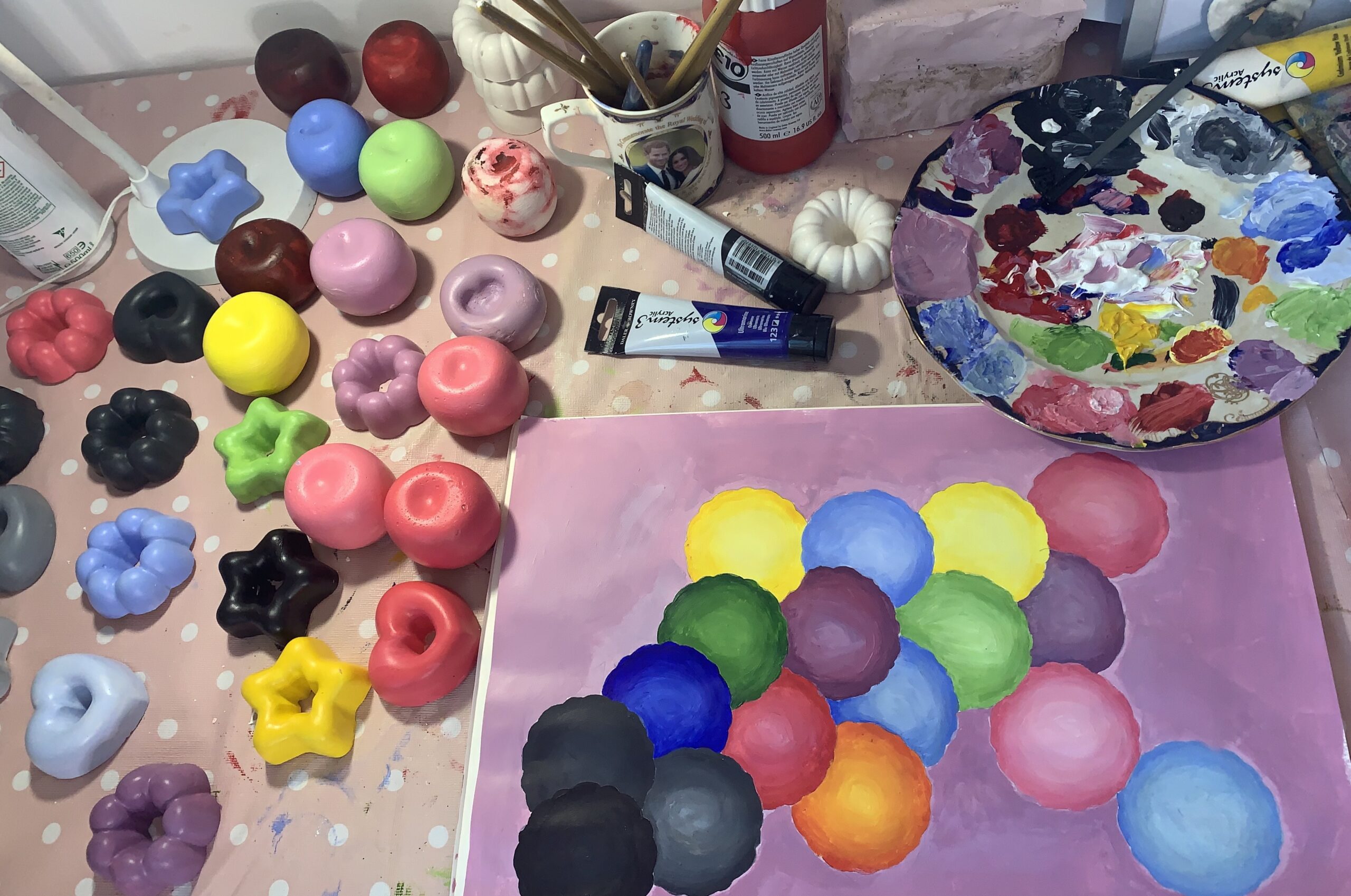
am i neglecting colour? out with my practice i love/use lots of colour but why not within my practice? How would the colours that i like change the work? am i limiting myself by using red. am i stuck in my ways due to a long affiliation with red/monochromatic colours? is this my safe space?
importance of colour and interaction – crucial to a Childs development. if this is neglected within the first year of life it could have a negative impact on development.
Practice usually focuses on minimal colour, often focusing on one (red and black). Why? outside of my work I love colour? why am I neglecting colour within my work? I don’t even really like red.
colour development
colour in gender
what role does colour play?
how do we see colour?
how do children see colour?
how do colour and shape impact each other?
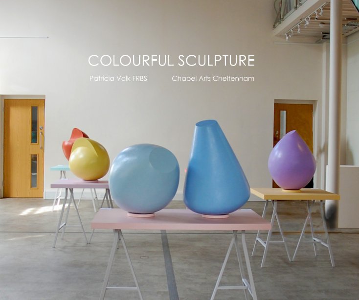
PMC4 Patricia Volk- Exhibition book. I like the use of pastel colours and the colour blocked arrangement with the tables. The spot lights give the smooth surface a shiny and appealing surface.
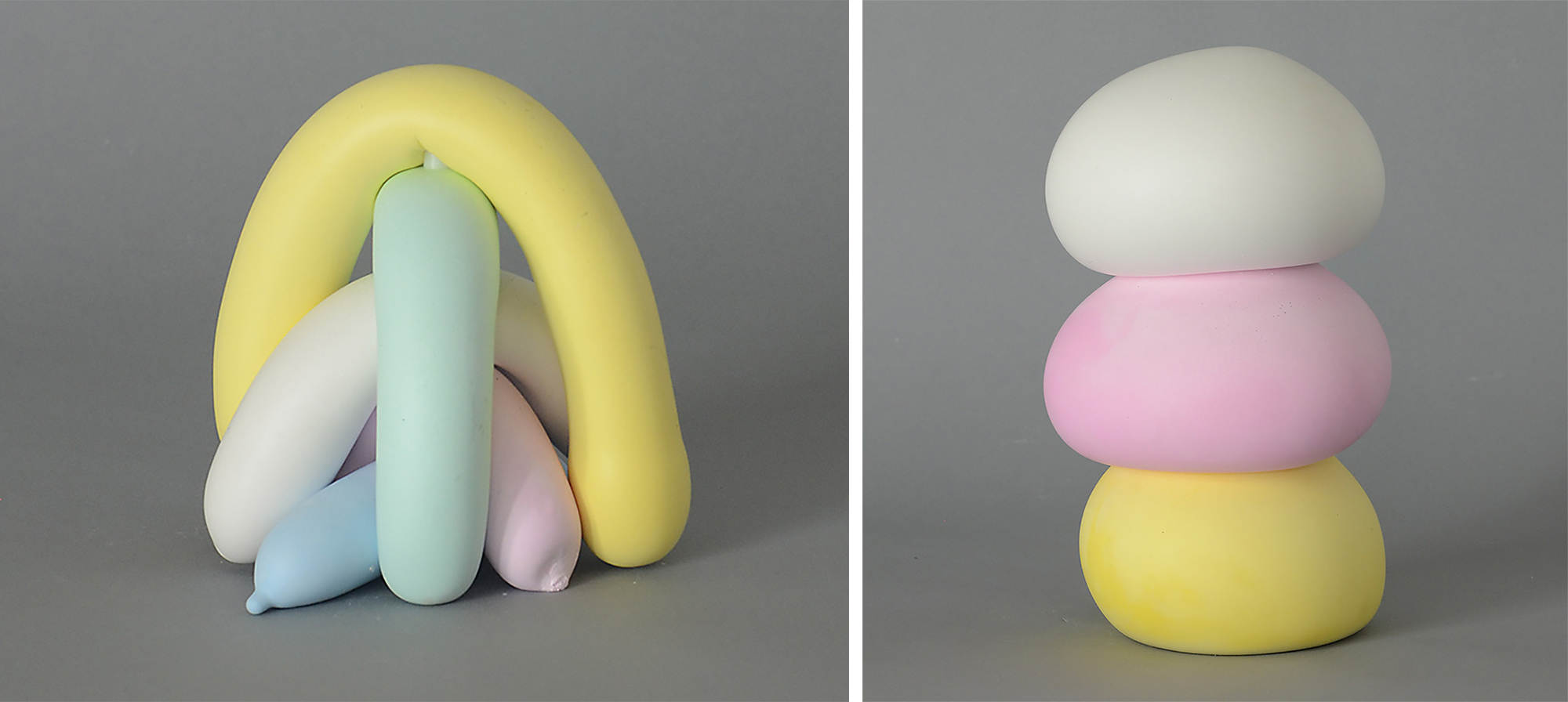
bellow: Joe Davidson Left: “Untitled” (2020), cast tinted hydrocal, 7 x 6 x 5 inches. right :“Untitled (Poufs)” (2020), cast tinted hydrocal, 14 x 8 x 8 inches
I like the colour combinations and the way each individual part plays with another through colour. soft appealing shapes. sweets or icing? childhood. I prefer them shiny!
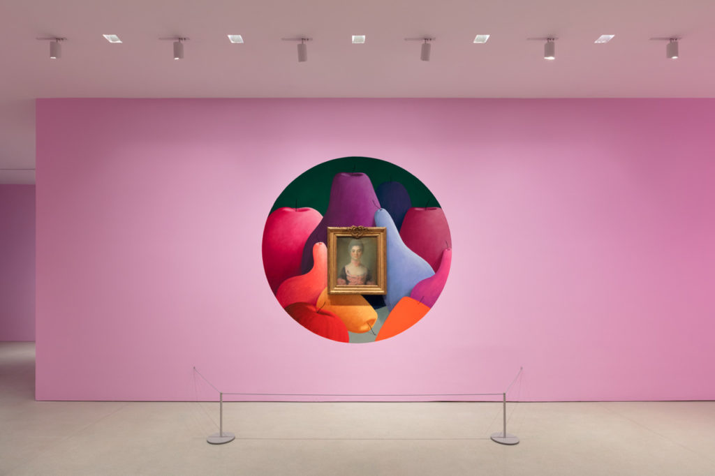
Installation view of “Nicolas Party: Pastel” at the FLAG Art Foundation, 2019.
changing the gallery space. This is fun. Why can’t art be fun? White walls are quite boring now I’m thinking about it… I like the painting around the painting; challenging which painting should we be viewing?
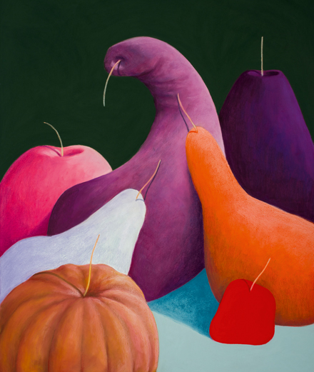
Nicolas Party, “Still Life” (2017), pastel on canvas, 140 x 110 cm.