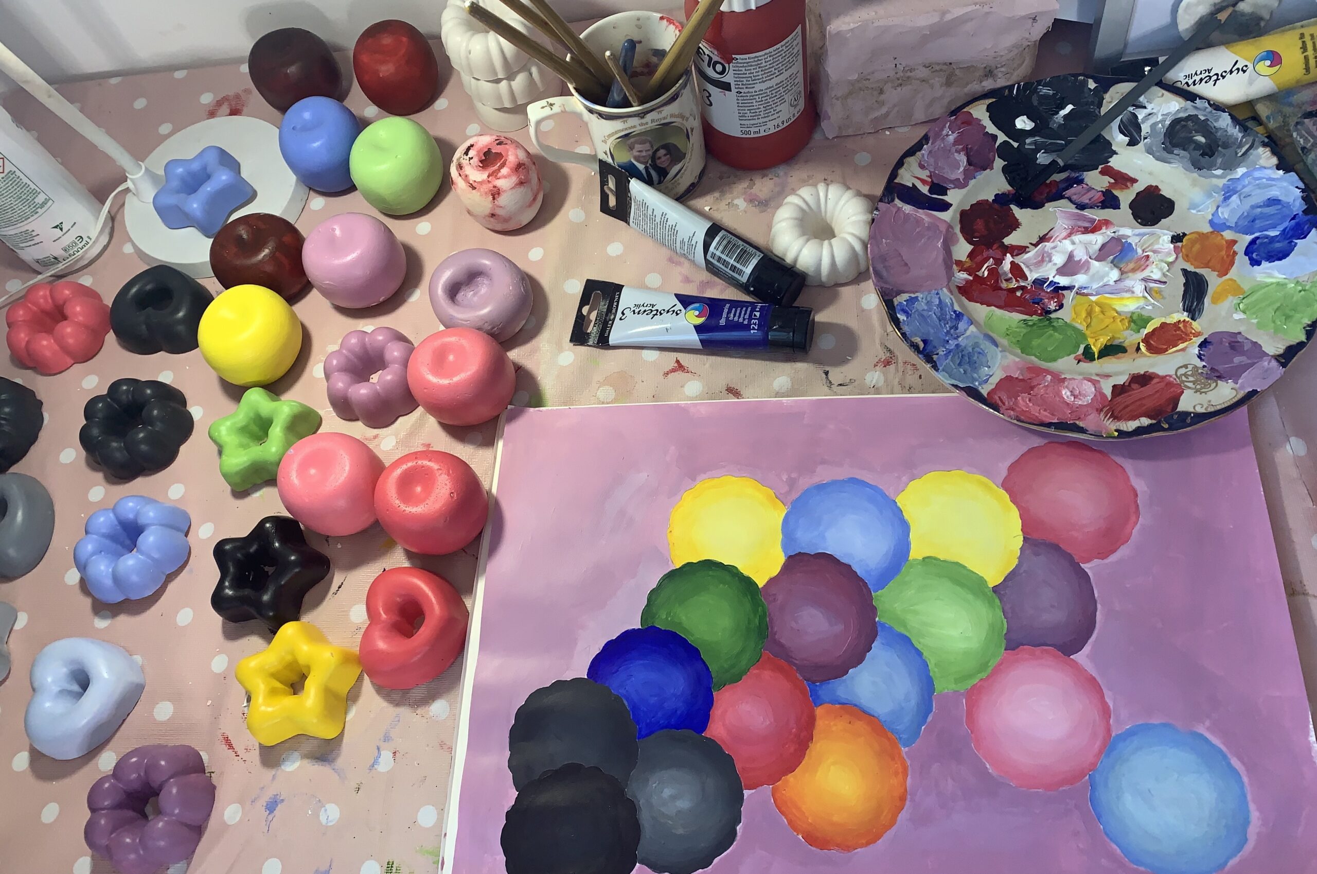
Colour in Development
am i neglecting colour? out with my practice i love/use lots of colour but why not within my practice? How would the colours that i like change the work? am i limiting myself by using red. am i stuck in my ways due to a long affiliation with red/monochromatic colours? is this my safe space?
https://www.theguardian.com/lifeandstyle/2017/apr/11/vision-thing-how-babies-colour-in-the-world video on vision in the 1st year of life
importance of colour and interaction – crucial to a Childs development. if this is neglected within the first year of life it could have a negative impact on development.
Practice usually focuses on minimal colour, often focusing on one (red and black). Why? outside of my work I love colour? why am I neglecting colour within my work? I don’t even really like red.
- colour development
- colour in gender
- what role does colour play?
- how do we see colour?
- how do children see colour?
- how do colour and shape impact each other?
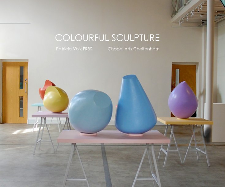
PMC4 Patricia Volk- Exhibition book. I like the use of pastel colours and the colour blocked arrangement with the tables. The spot lights give the smooth surface a shiny and appealing surface.

bellow: Joe Davidson Left: “Untitled” (2020), cast tinted hydrocal, 7 x 6 x 5 inches. right :“Untitled (Poufs)” (2020), cast tinted hydrocal, 14 x 8 x 8 inches
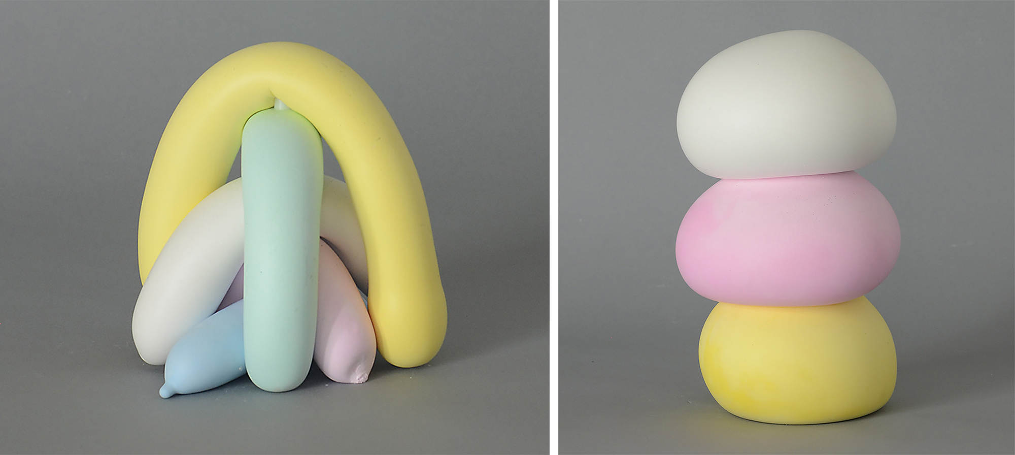
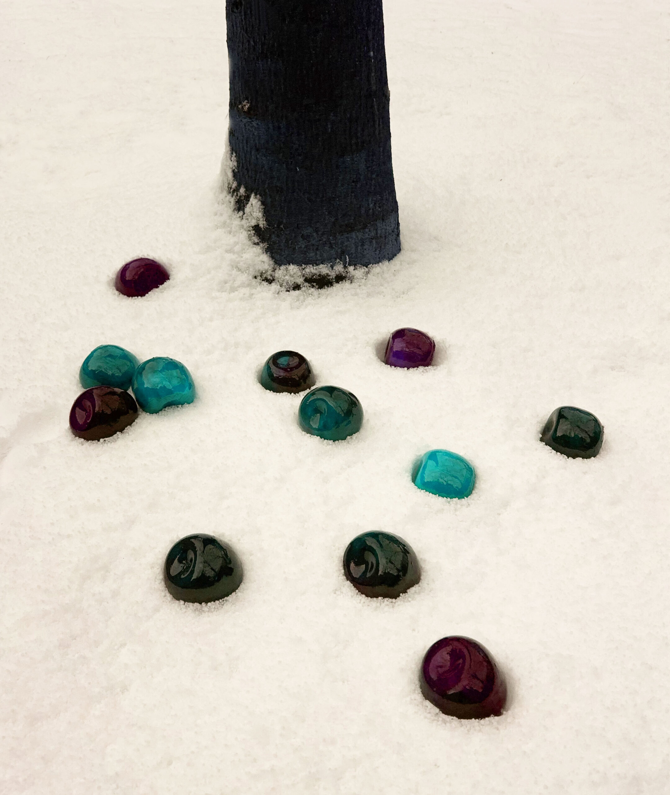
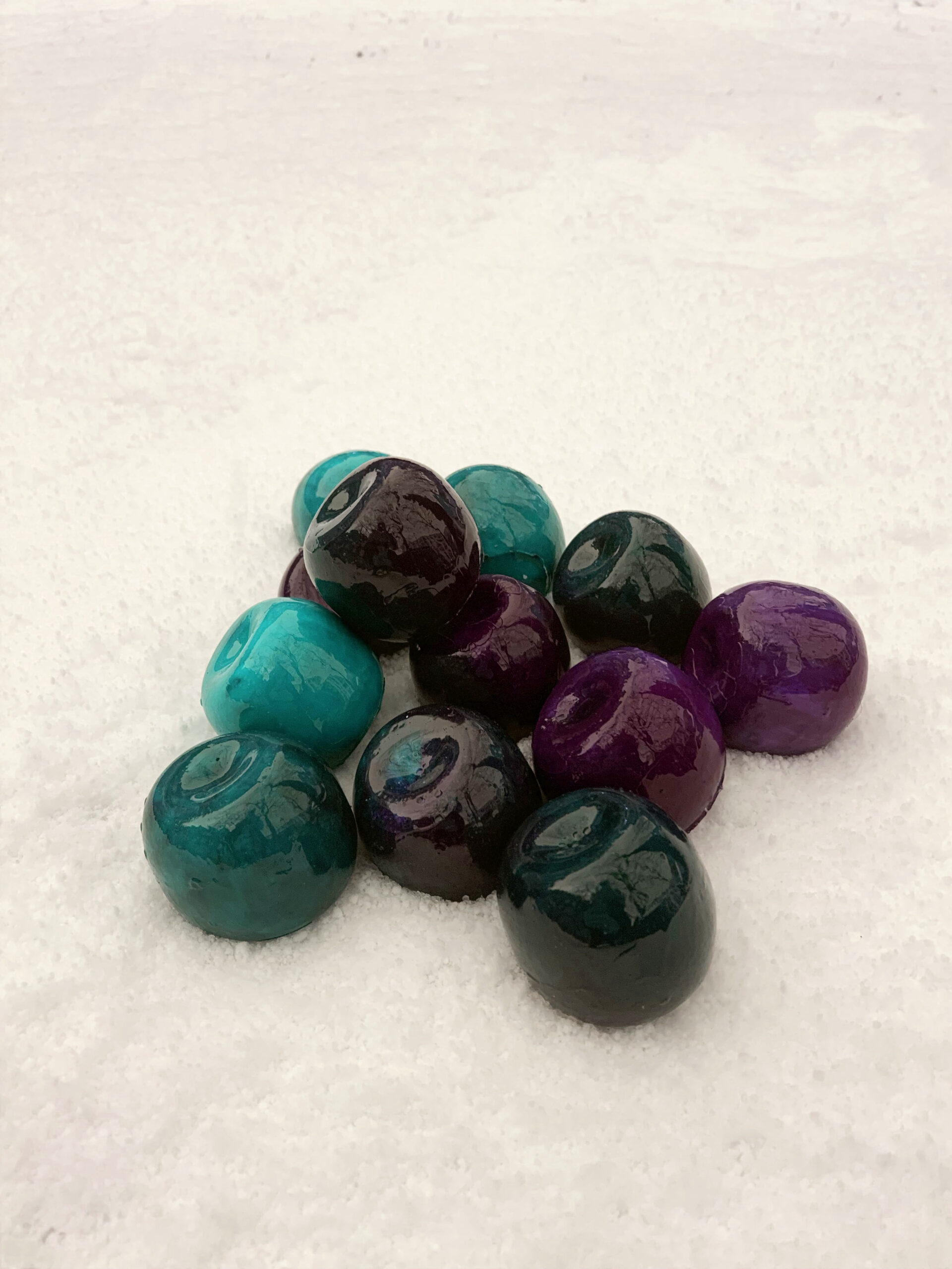
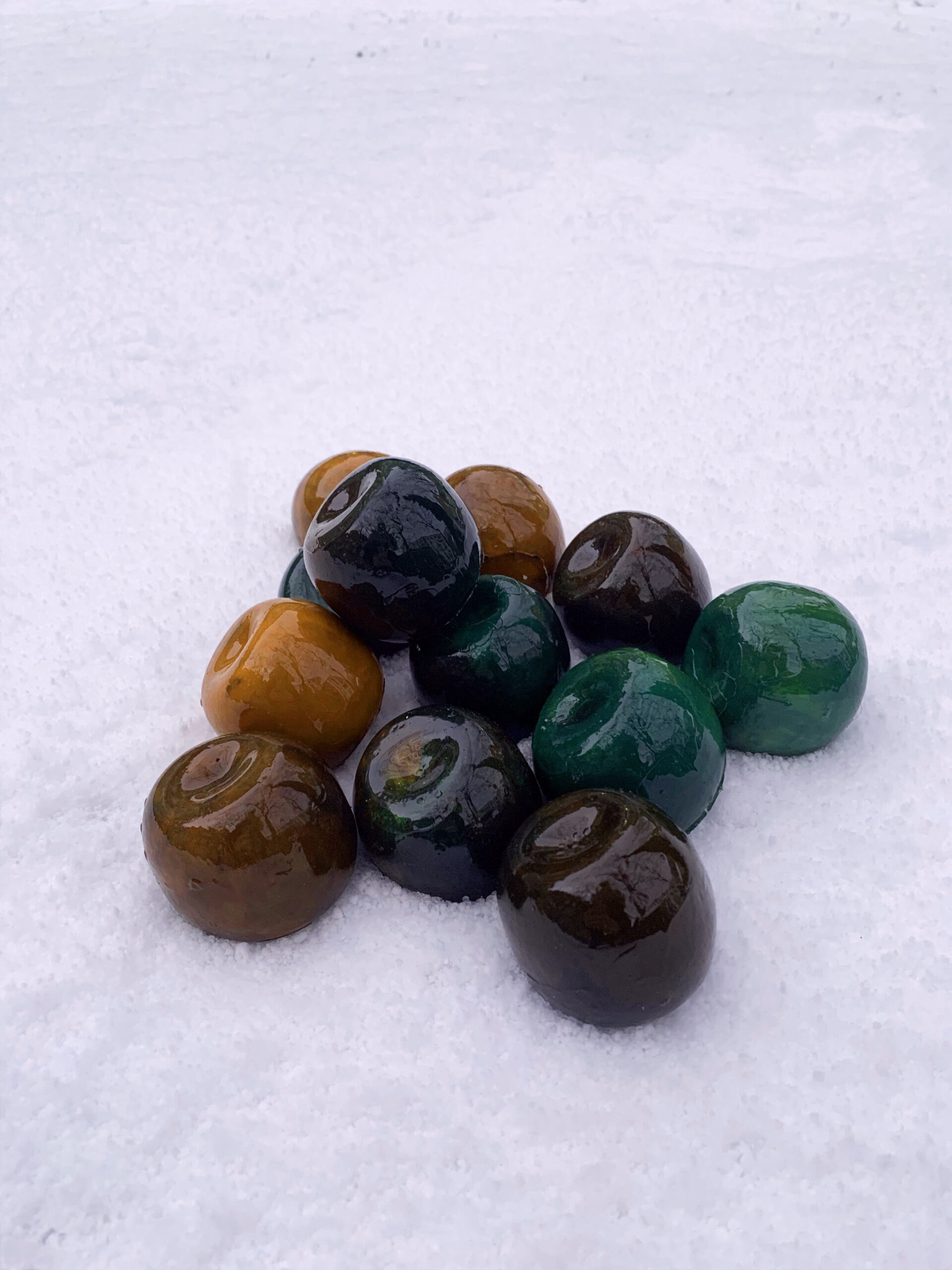
I like the colour combinations and the way each individual part plays with another through colour. soft appealing shapes. sweets or icing? childhood. I prefer them shiny!
Installation view of “Nicolas Party: Pastel” at the FLAG Art Foundation, 2019.
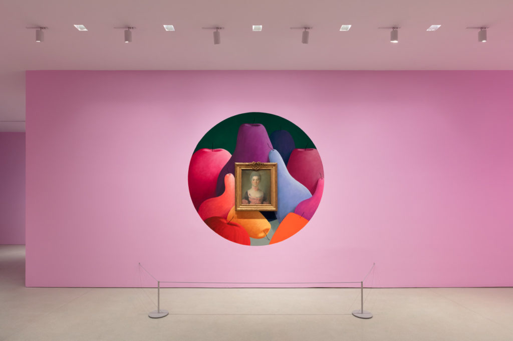
changing the gallery space. This is fun. Why can’t art be fun? White walls are quite boring now I’m thinking about it… I like the painting around the painting; challenging which painting should we be viewing?
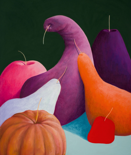
Nicolas Party, “Still Life” (2017), pastel on canvas, 140 x 110 cm.
studio