Data Art Classroom Toolkit

Summary
A beginner-friendly toolkit for creating visual art from personal data.
This toolkit guides learners to transform simple numerical data—such as daily mood scores, steps, or weather—into visually expressive artworks using p5.js. Students first collect and plan their dataset, then map values to visual features like size, color, and position. They create a basic animated artwork, experiment with color and motion, and finally reflect on the story or patterns their data conveys. Optional extensions include connecting data points, adding sliders for interaction, or visualizing multiple datasets. This step-by-step workflow encourages creativity, critical thinking, and an understanding of data as a medium for personal expression.
Data Art Classroom Toolkit
Data is everywhere—our emotions, daily routines, habits, environment, and choices all involve data. In this toolkit, you will learn how to transform simple numbers from your life into visually expressive artworks using p5.js. No prior coding experience is required—you only need curiosity and some personal data.
First, here are the key things you need to know.
Even if you have zero experience, you can absolutely do this.
Focus
Use p5.js to map everyday numerical data (e.g., mood scores, daily steps, weather temperature) into shapes, colors, motion, and composition — creating your own data art.
Learning Objectives
- Understand how data can function as creative material.
- Convert numerical values into visual elements (size, color, position, movement).
- Use p5.js to create a simple animated data artwork.
- Experiment with color mapping and subtle animation effects.
- Reflect on the stories, patterns, or emotions your data expresses.
SYG_Anime
Open Learning Resource
-
pp5.js Web Editor(free online coding)
-
Open licenses(CC0 / CC BY)
Okay, let’s begin using the toolkit!
Relax, you’re going to do great.
When modifying numbers and colors, imagine each data point as a tiny story from your life.
- What does size or position communicate?
- How do different color choices change mood or rhythm?
- Even if it looks chaotic at first, pay attention to how your data forms a visual pattern.
- Look for patterns: peaks, repetition, or surprises.

shape
I should like to begin by showing you some examples. Naturally, these examples were created using the same set of figures but with different templates I provided, demonstrating how the presentation can vary. Although the data we shall collect subsequently won’t be as extensive, you’ll still be able to effortlessly produce a simple data art.
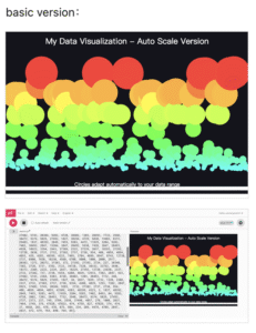
basic version with about 300 numbers
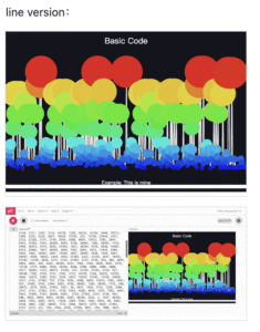
line version with about 300 numbers
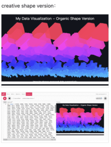
creative shape version with about 300 numbers
Step-by-step Guide
All you need to change is a string of numbers and two little labels — I’ve handled the rest for you.
Step 1 — Collect Your Data (3 minutes)
Decide what you want to express (mood, daily time use, steps, key indicators).
Choose 7 data points (short, clear, and personally relevant).
For example: 7 weekly steps [3000,7000,4500,9000,10000,4200,8000].
Format the data into an array for coding, or sketch it on paper. Short and meaningful datasets can be quickly mapped to visualization elements and instantly show results.
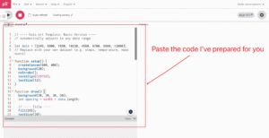
Step 2 — Get the Template (3 minutes)
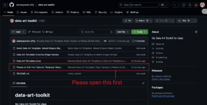
Visit the GitHub repository.
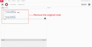
Paste the code into the p5.js Web Editor.
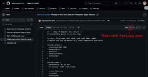
Please copy the base version code into the editor.
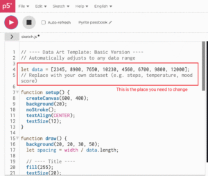
This is the simplest version; you can see that it consists of simple circles, and all data is represented using circles.
You may follow the instructions in the image; this will be simpler.👇
step1-1
step1-2
step1-3
step1-4
Step 3 — Replace the Data (1 minute)
Modify the array in the data code with your own numbers. You can see that the data requiring modification is on line 4.
Example: I use my weekly step count.
This template adds subtle random dynamic effects to each data point. Observe how the values change and generate a lively image.
change data
Step 4 — Add Labels (2 minutes)
Modify the title or description inside thetext(). This may require you to search through the code, but they are green characters, so they should be fairly easy to spot.
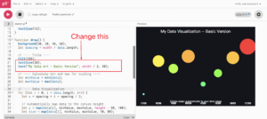
change the text
Step 5 — Build and Iterate (5 minutes)
After completing the basic code modifications and creating your foundation data artwork, you may want to try deeper modifications.
Below are the parts students can modify.
If you lack programming experience or encounter difficulties, you can choose the modification methods I provided.
Specific details have been posted in my GitHub repository along with the base version.
dataarray – replace with personal data (e.g., steps, temperature, mood, screen time)fill()– adjust color mapping or use random colorsellipse()– change torect(),triangle(), etc.(This step may be a bit challenging, as it requires you to modify part of the code above. If you have the ability or interest, feel free to check out my GitHub. I have provided versions in other shapes, you simply need to repeat steps 2 to 4 as before.)- Title – update to your own theme
- Footer description – explain your data
Step 5 — Reflection (3 minutes)
Answer the following three brief thinking questions:
- What data did I choose? Why?
- Which visual choices (color, size, layout) best expressed my idea?
- If I continue, what could I improve? (mapping, interactivity, animation)
Briefly share with your peers and get one piece of feedback.
Discussion:manfredsteger
Step 6 — Share and Extend (2 minutes)
Export a screenshot or share your project link (for example, GitHub Pages).
Optional extensions:
Add sliders to control color/size, smooth animations, add a second dataset for comparison.
Once you have selected and completed this data art piece comprising seven figures, you may proceed to advance it further. For instance, by copying and pasting these seven numbers dozens of times, you will obtain the image below—resembling both a forest and fish scales.(Of course, if you wish to achieve the same results as in the example I provided, you may using the 300 numbers I gave you. Rest assured, three hundred numbers will prove just as straightforward as seven. Similarly, I have also placed those figures on my GitHub.)
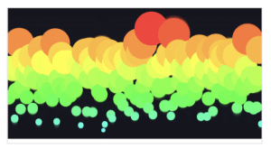
7 numbers cycle for 20 times(As the data fluctuates constantly, it may not appear to be cycles.)
Would it be more like a painting? Would it be more visually striking?
Data Art Classroom Toolkit by Yoram WU is marked CC0 1.0 Universal![]()
![]()
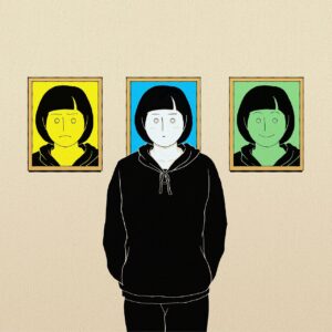
Cover image: Fantasy girl expression frame – Pixabay
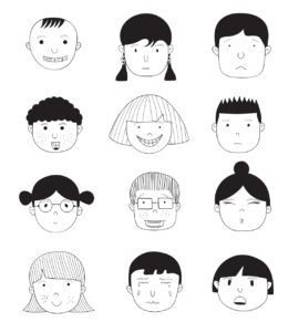
Image 2: Children faces and emotions – Pixabay
Image 3: Boho art hearts grunge – Pixabay
Image 4: Pixel cells group discussion – Pixabay
(7 numbers cycle for 20 times)