As a scientist, I can’t resist the itch to collect data (see e.g. this previous post). During the pandemic, my mid-life-crisis sports car reached the point where my garage told me that they could get it through the MOT, but they didn’t really advise it. So I had to go car shopping. Mrs. P was keen on a jeep, mostly, I think, because she has fond memories of watching Daisy Duke’s little white jeep on the Dukes of Hazzard. The renegade is the smallest current Jeep; we eventually found one which, perversely, had essentially the same colour scheme as the Duke boys’ “General Lee” . (Fortunately, given the times we live in, the roof is merely black and does not have a huge Confederate battle flag on it.) I did rather hope that it would not be quite as greedy on fuel as a ’69 Dodge Charger, or even as the ’02 Audi TT it replaced. But by how much? And could I really believe the little computer on the dash that claims to tell you how many miles to the gallon you are getting?
The only way to get an answer was to collect some data. So, every time I have filled up, I have noted the milometer reading, the fuel volume (in litres), the date and the miles-per-gallon reported by the trip computer since I last filled the car up. Once I had some data in the notebook I typed it into the computer and coded up a short script to plot it up. I initially adapted a script in R that I had already written for a previous car. But I was dissatisfied with the way the time axis was labelled, so I re-did it in python.
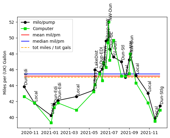
The time series shows that the car does at least the 42mpg that Jeep claim it does, and in some circumstances does a lot better. The better mileage tends to occur during the summer. Maybe cars are more efficient in warm air, but I suspect that most of the effect is due to some long steady drives while going on holiday; the poor mileage is associated with times when the car was only making local journeys. It is clear from watching the trip computer that this (or any internal-combustion engined) car is far less efficient when the engine is cold. In the cryptic labels on the points, “Dun” is Dunbar, “NW” is North Wales and “GL” is Gairloch.
The other thing that is clear from the plot is that the mileage calculated from the milometer and the pumps at petrol stations is rather well correlated with the mileage reported by the trip computer. To look at this in more detail I made a scatter plot of the two estimates, adding the ideal line of slope 1 and intercept zero for comparison. I also added a least-squares fit.
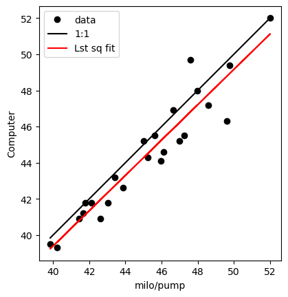 

It is clear from this that the trip computer is slightly pessimistic; the true mileage based on the milometer and fuel pumps is a little better than the computer reports. The difference between the two estimates has a mean value of 0.72 miles/gallon with a standard deviation of 1.03 miles / gallon. I have 25 data points, so the standard error on the estimate is 0.21 miles/gallon.
Of course, as a physicist, I abhor the use of such antiquated units as miles and gallons. But that is how cars made for the UK market report their own mileage. (For American readers, I should note that these are UK gallons which are larger than an American gallon.) Given that a fuel economy figure is a distance divided by a volume, the SI units for it are m-2. But I think it would mean little to most readers if I reported the car’s fuel consumption in those units.
Just for reference, here is the code that made the plots.
import numpy as np
import matplotlib.pyplot as plt
from scipy.stats import linregress

### Plot car's fuel comsumption. Data file be like:
## Miles   litres   date        estmpg    notes
## 10501   40.27    2020-09-25   NA       Dun-Edi
## 10859   37.11    2020-10-14   42.6     Dun-Edi
##
## estmpg is the value spat out by the car's computer

dat=np.genfromtxt("jeep.dat",skip_header=1,usecols=(0,1,3))
strdat=np.genfromtxt("jeep.dat",skip_header=1,usecols=(2,4),dtype="str")

gals=dat[:,1] / 4.54609
miles=dat[:,0]
dmiles=miles[1:] - miles[0:-1]
npts=len(gals)
mpg=dmiles / gals[1:]
estmpg=dat[1:,2]
names=strdat[1:,1]
datestr=strdat[1:,0]
dates=np.array(datestr,dtype=np.datetime64)

plt.ion()
plt.figure(1)
plt.clf()
plt.plot(dates,mpg,marker="o",linestyle="solid",color="black",label="milo/pump")
plt.plot(dates,estmpg,marker="s",linestyle="solid",color="#00dd00",
         label="Computer")
plt.ylabel("Miles per (UK) Gallon")

for i in range(0,npts-1):
    plt.text(dates[i],mpg[i],"  "+names[i],rotation=90)

plt.hlines(np.mean(mpg),dates[0],dates[-1],color="red",label="mean mil/pm")

plt.hlines(np.median(mpg),dates[0],dates[-1],color="blue",label="median mil/pm")
tgals=np.sum(gals[1:])
tmiles=miles[-1]-miles[0]
plt.hlines(tmiles/tgals, dates[0],dates[-1],linestyle="dashed",color="orange",
       label="tot miles / tot gals")

plt.legend()

plt.savefig("fuel_ts.png",bbox_inches="tight")

plt.figure(2)
plt.clf()
plt.plot(mpg,estmpg,"ko",label="data")
plt.xlabel("milo/pump")
plt.ylabel("Computer")
plt.plot((np.min(mpg),np.max(mpg)), (np.min(mpg),np.max(mpg)),"k-",
         label="1:1")
plt.gca().set_aspect("equal")

lrout=linregress(mpg,estmpg)

mline=lrout.intercept + mpg*lrout.slope

plt.plot(mpg,mline,"r-",label="Lst sq fit")

plt.legend()

plt.savefig("fuel_scatt.png",bbox_inches="tight")