We have had another round of strike days over the last few weeks. The dispute between university staff across the UK and their employers rumbles on, in a period of high inflation. I therefore felt that it was time to update the plots in my previous blog posts regarding how much we are paid. First, here is the plot of how pay and prices have changed since 2008.
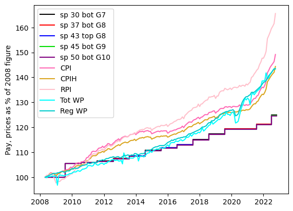
The stepped lines with names like “sp 43 top G8” are our pay, “Tot WP” and “Reg WP” are other people’s pay; CPI, RPI and CPIH are measures of the cost of living. The obvious conclusion is that the pay rises we have had recently are less than the galloping inflation that is happening, and the gap has widened between our own pay and that of the average wage-earner in the UK. Next, here is the plot of how our pay has changed in real terms, for various definitions of “real”.
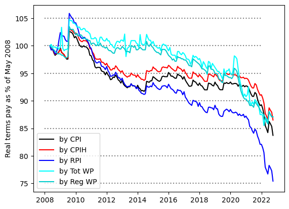
Squinting at the end of the graph it appears that the 3% pay rise we had earlier in the year has kept our pay at a similar level in real terms over the last few months against CPIH and other people’s pay. It is still down compared to the start of the year; the latest data I seem to have had for my previous blog post seems to have been for the start of 2022. Against CPI and RPI our pay continues to decline in real terms. Based on RPI it is now only 75% of what it was in 2008, and only 70% of what it was in late 2009. Is it any wonder that we are a bit fed up?
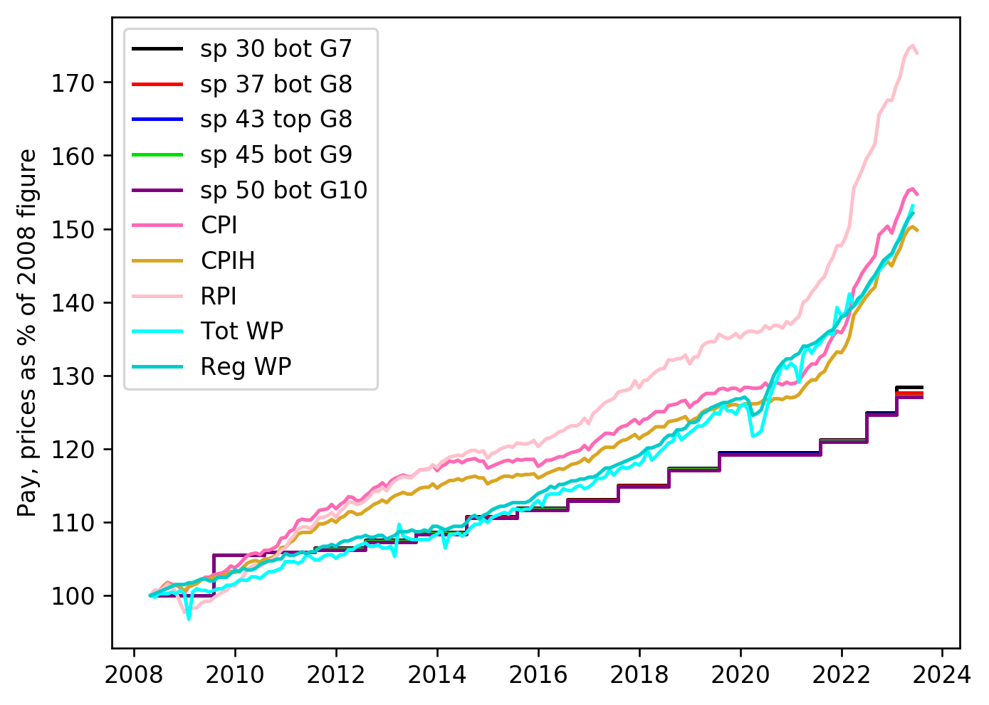
Postscript added March 2023: I am not going to keep doing new versions of this post. But I will update the plots from time to time. The latest version of the two plots may be found here:

