I have been reviewing someone else’s paper for a journal and preparing one of my own for submission. And both jobs have caused me to do a thing I do a lot: looking at a figure that uses a colour scale and asking myself whether the colour scale can be improved.
A dataset where the values are provided on a rectangular grid is often displayed as a false colour image, with a colour scale to show you which colours correspond to which value. Something like this:
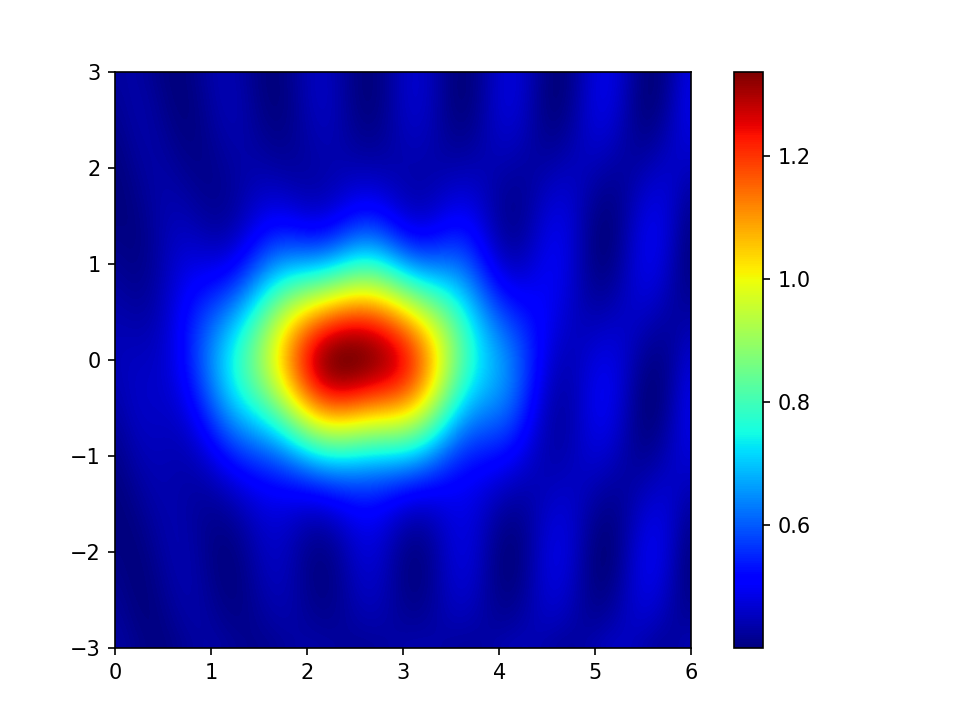
The horizontal and vertical co-ordinates might be distances east and north on the ground and the colours might represent height above sea level. They could equally be many other things; the figure in the data set is one I made up for the purposes of this post. (If it had been real data I would, of course, have labelled the axes.)
The colour scale used above is called “jet” and you see it a lot. This is not because it is a good colour scale, in fact, many experts in perception think it is a particularly bad one. There are many posts on the internet (e.g. this one), and even a serious journal paper (or two) railing against the use of “jet” and similar colour scales. The main reason that you see “jet” so much is that it is the default colour scale in MATLAB. Until recently it was also the default colour scale in matplotlib. (Recent versions of matplotlib have changed to a better default and include some documentation on choosing colour scales.)
The main problem with “jet”, and indeed many rainbow-like scales is that they are not perceptually uniform. They pick out particular values, making them appear important and different from their neighbours. This is particularly true of yellow, picking out the value of 1 in my example plot.
What we often want is a colour scale that increases in brightness from one end to the other so that low values are dark and high values are light The obvious example would be a gray scale:
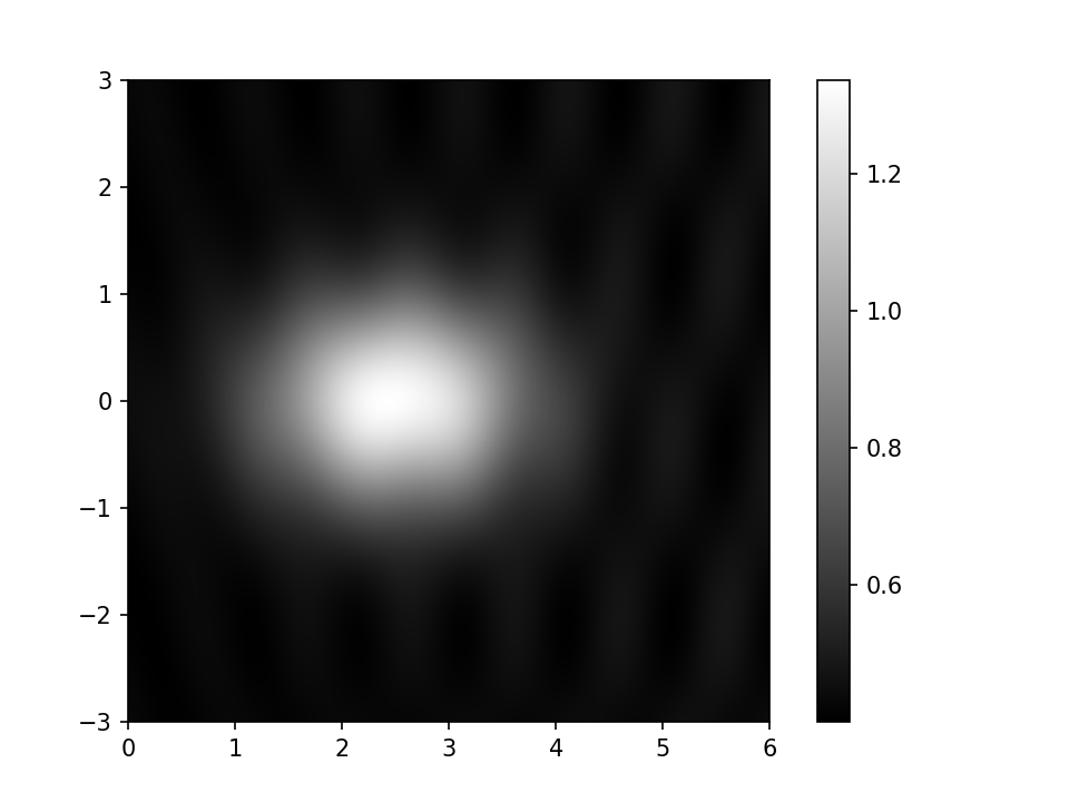
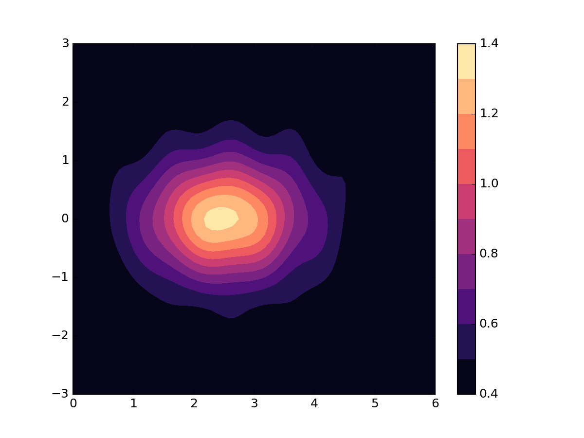
This does not have the disadvantages of “jet” and its friends, but is rather dull. The cognoscenti tend to recommend scales which have colour but are designed to be perceptually uniform in the way that jet is not. This example is a scale called “magma”.
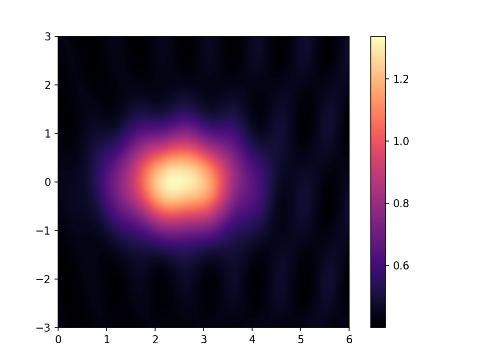
Magma is prettier than grey, but, like grey, in this case, is actually hiding features around the edge of the plot that you might want to make visible.
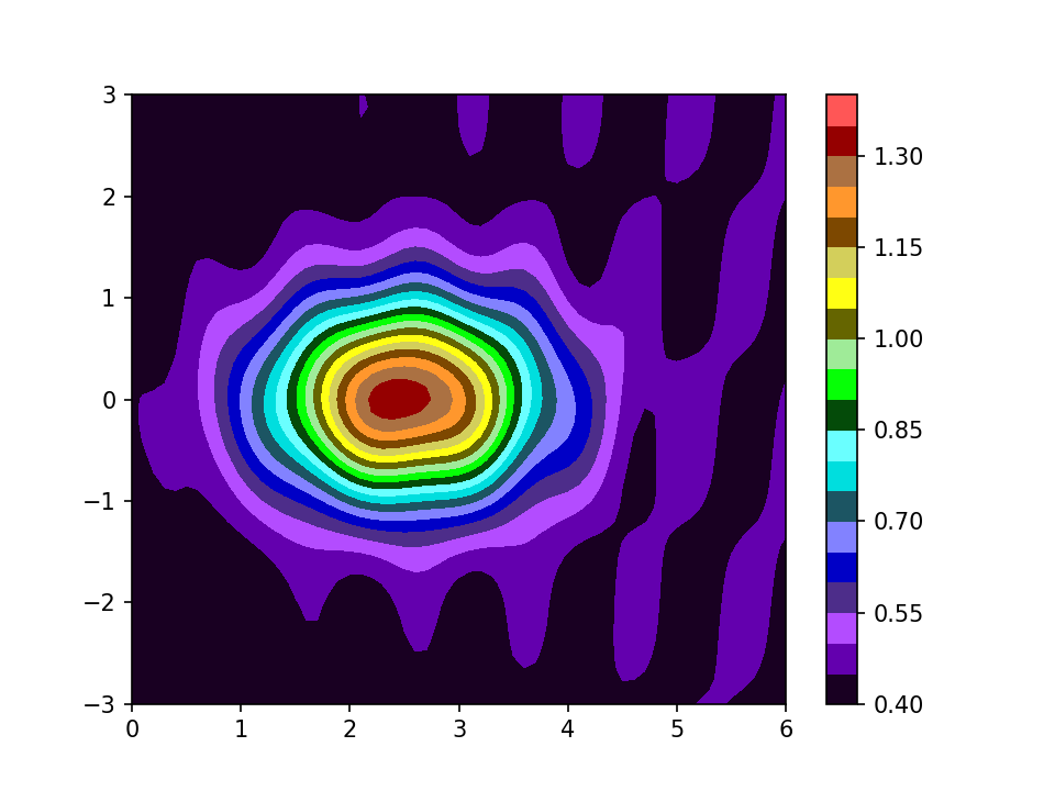
Although continuous colour scales have their uses, it is commoner in the fields I work in to see data presented as filled contour plots:
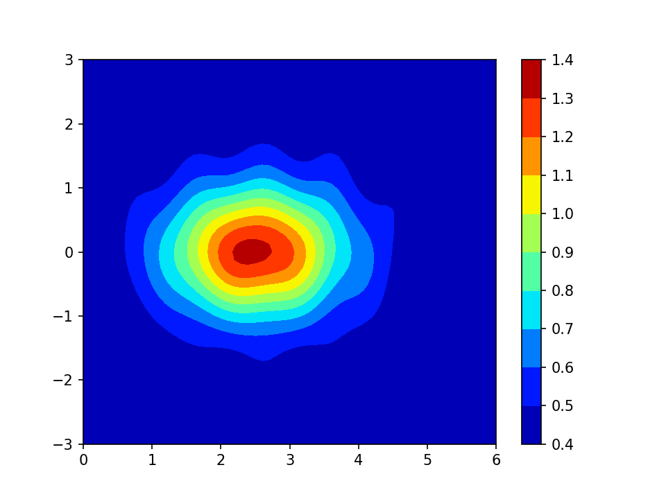
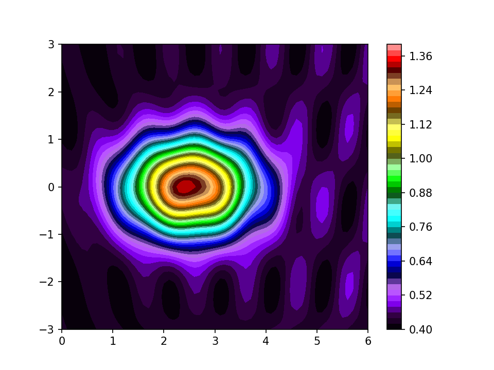
The jet colour scale is not entirely satisfactory for these plots either. In my opinion, the requirements for a filled contour plot are that the scale has an obvious direction from one end to the other, and that adjacent colours are distinct from each other. Jet sort of passes muster if you have few enough contours, but if there are more than in my example, you tend to find that you have several indistinguishable cyans, even though you will have a yellow that stands out clearly from its neighbours. A perceptually-uniform scale is better in some respects; here are the same contours using the “magma” scale:
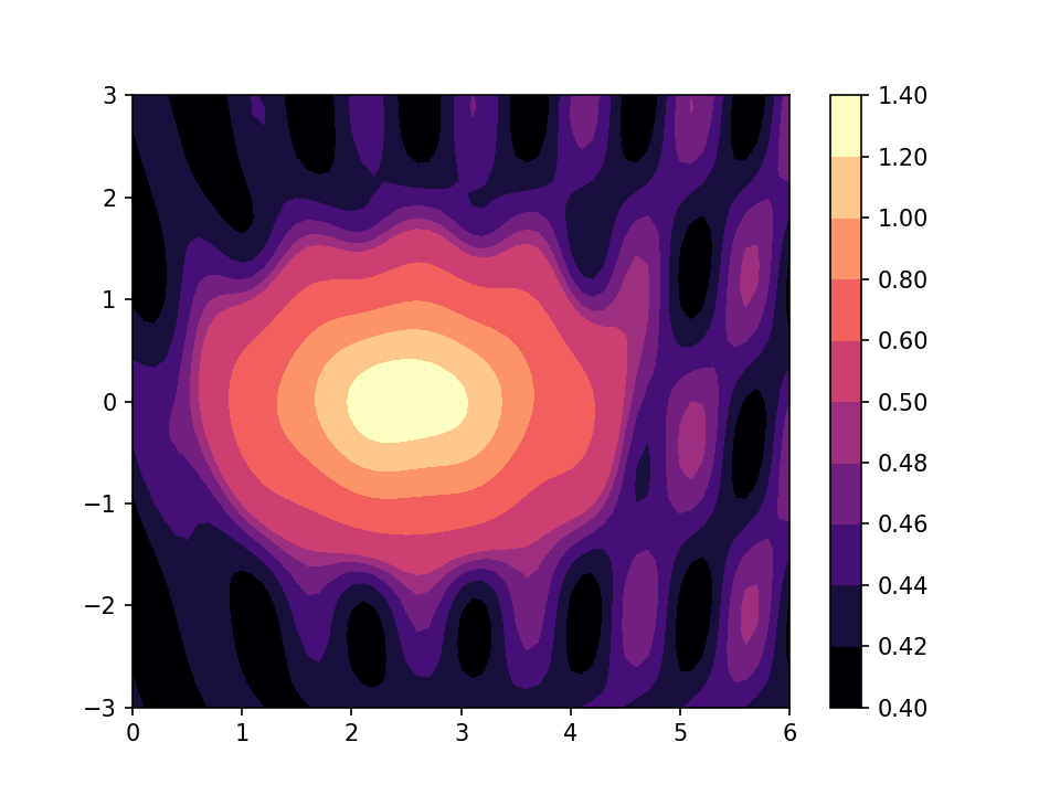
The downside here is that it is harder to pick out a particular band from the plot and relate it to the colour scale. The ColorBrewer website has a number of examples of scales that are close to being perceptually uniform and provides a nice online tool for you to experiment with them. It is notable, though, that it limits you to 9 or 11 colours. In the real world, your data may be like my invented example, with a large overall range, but with features of interest within a much smaller range, needing closely spaced contours.
Both “jet” and a perceptually uniform scale such as “magma” fall down when you have more contours:
The extra contours are starting to show up the ripples around the edge of the plot, but there are at least three cyan-ish colours (around 0.8 on the scale) which can not be distinguished from each other.
A council of desperation in this situation is to go for a scale that changes colour slowly along the scale, but changes more rapidly in brightness and saturation:
Perceptually uniform it is not, but the reader can at least interpret it quickly by noting that the blues and purples are low and the reds are high. And every colour is easily distinguished from its neighbour. Yellow does tend to stand out a bit, but the rest of the scale is busy enough that it does not stand out much. The scale will stand a fairly large number of contours before they start to merge together. This next plot has just a bit too many for my screen, but with any of the other scales there would be great swathes of neighbouring colours which looked identical.
Often, the best answer when you have small details in one part of the range, and a great big lump in another part, is to use contours which are not uniformly spaced:
Here, although I have chosen a perceptually uniform colour scale I have not applied it uniformly to the data. If you do this, it is vital to label the colour bar carefully, preferably labelling every colour change, so that the reader does not think that the small features you are accentuating are larger than they really are.
All my examples so far are scales you might use for plotting a physical quantity, such as surface height, air temperature, or concentration of a particular molecule. ColorBrewer calls this sequential data. But we often want to plot the difference of a quantity from some average value; ColorBrewer calls this diverging data. Papers on climate change are full of this sort of plot, showing which areas of the world are warmer or colder than they were during some reference decade. It is regarded as good practice to plot diverging data using a colour scale that clearly distinguishes positive and negative. Using red for positive and blue for negative is common.
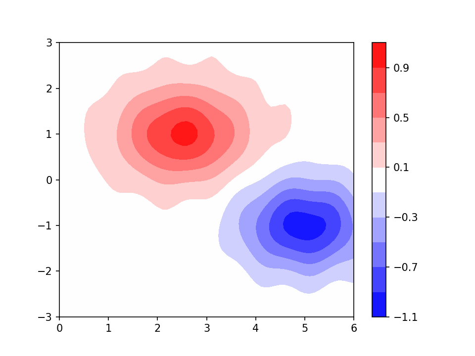
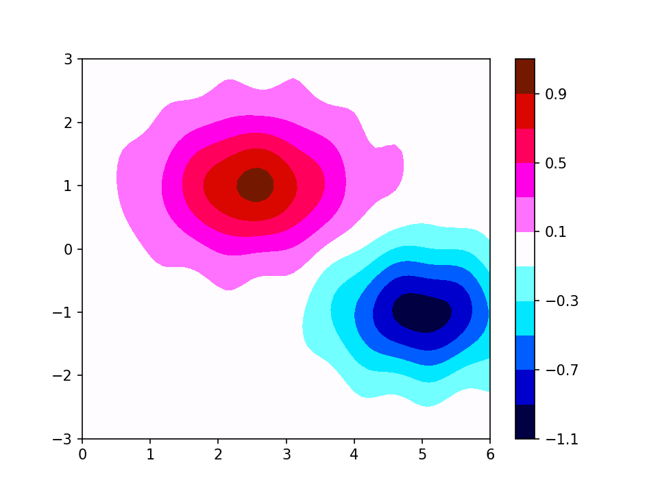
As an aside, I prefer in this sort of situation to have zero in the middle of a colour band; this often avoids a wandering, noisy zero contour. In this example the two halves of the scale are close to perceptually uniform; the downside is that the reds are quite similar to each other and hard to relate to the scale. An alternative that sacrifices perceptual uniformity for more easily-distinguishable colours might be something like this:
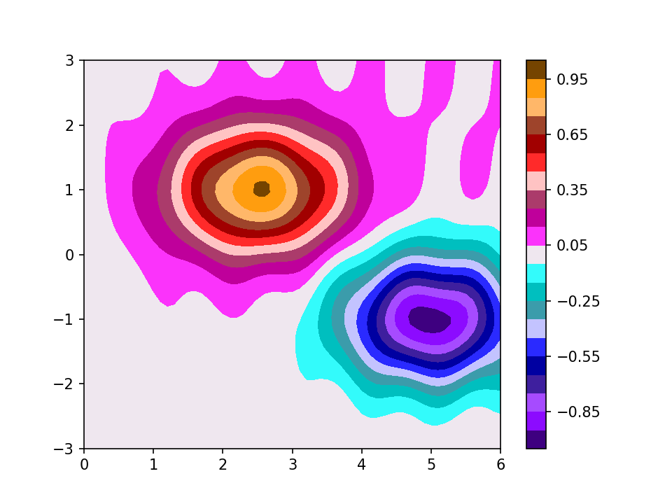
Even here, if you felt you needed more contours, you would quickly find you had neighbouring ones which were indistinguishable. Again, the council of desperation might be to go for something like this:
The bottom line, really is that there is no single colour scale which is the answer to every figure. And whichever one you settle on, someone is going to tell you why they think it was a bad choice.
EDIT added November 2020: The crusade against rainbow colour scales in general, and “jet” in particular has reached Nature: see https://doi.org/10.1038/s41467-020-19160-7
Another EDIT, added October 2024: there has been a bit of push-back from people who like rainbow-ish colour scales, see https://doi.org/10.1109/MCG.2023.3246111 Also, Google have produced a version of the jet colour scale which eliminates many of the bad features: see https://research.google/blog/turbo-an-improved-rainbow-colormap-for-visualization/


One Reply to “Colours for contours”