My bargain internet purchase (and the subject of the first post in this blog) has at last had its week in the Sun. (Well, in the wind, I suppose.) Together with its two stablemates (which we have had since time immemorial) it has been used for the pilot-balloon tracking experiment; itself a long-standing fixture of the University of Edinburgh’s meteorology teaching. (There is more information on pilot balloon tracking at this website.) This was the week beginning 10 March; I have delayed this post until I finished marking the students’ reports on the experiment.

In the photo you can see all three theodolites (the one I bought is in the centre) tracking a balloon as it heads out eastwards towards Duddingston. The edge of Arthur’s Seat is in the background. We are on the flat roof of the James Clerk Maxwell building; this experiment is the only reason that students are ever allowed up there. The view is splendid on a nice day.

This map shows where all of the week’s balloons went to. There is one dot for each recorded point; the data were recorded every 30 seconds. The Thursday launches (orange / yellow dots) were a nice textbook example, curving to the right in the first part of the flight due to friction. In the upper part of the flight a strong thermal wind (easily calculated from charts of thickness) made the balloon speed up considerably and turn a little to the left.
The other days (Monday and Tuesday) were harder to understand. The balloons curved a lot to the left, even in the first part of the flight; the Ekman spiral can’t explain that. And the thickness charts for these days imply that the thermal wind is not large, although it is hard to interpret from them how small it is, and in which direction. The Tuesday launches in particular are odd — these are the blue/purple/red dots heading towards the northwest. Although they all take the same general direction, they all wiggled about in different ways. I’m wondering if it is reasonable to explain this as waves or vortices caused by the air passing the end of the Pentland hills before it arrives at the launch point.
This sort of thing is why I like the experiment, though. It throws up something new every year. It is hard to mark, of course, because the “right” answers are different for every day (and, to some extent for every balloon). But is a lot more interesting than marking reports on an experiment that was exactly the same last year.
Having a third instrument gives us a better grasp on the measurement errors than you can get with two instruments. With two measurements of a thing, someone can always claim that one is almost perfect and the other is rubbish. It gets harder to do that if you have three measurements. I averaged the raw data from the three instruments and plotted the differences from the average for both of the two measured angles:
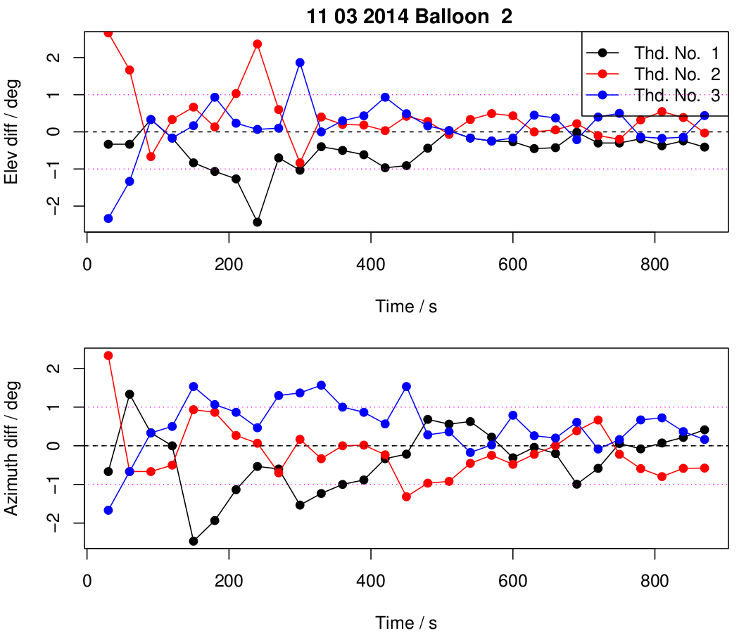
It appears that even people who have never used the instrument before can manage a precision of about a degree at the start of the flight, improving to about half a degree towards the end. It would be interesting to know whether a practised operator could do better than this. (The dials and scales should be readable to about 1/20 or 1/50 degrees.) The new instrument (in blue) appears to be neither better nor worse than the two older instruments.


Bravo — a very nice description of the experiment. Hope the students enjoyed it.