I mentioned a year or three ago that we are moving to the use of python, with the numpy and matplotlib packages, for teaching scientific computing. I also mentioned that I was having to do some learning myself as I have used R for this purpose over the last few years. A thing that happens when you move from one scientific language to another is that you have to figure out all over again how to do some obscure sort of plot which you happen to find useful.
The type of plot that I realised I didn’t know how to do in python/matplotlib was like this:
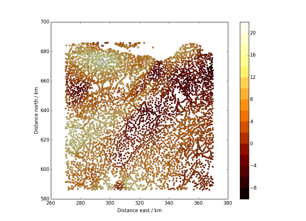
The data are points scattered over a plane, and there is a value associated with each point. (In this case, the plane is the area of Scotland around Edinburgh and the data are Bouguer gravity anomalies, in milligals. You can get the data from the BGS.)
My solution for producing this plot was as follows:
import numpy as np
import matplotlib.pyplot as plt

## Read in the data.
fn="../../inverse_theory/euler/landgrav_sup.csv"
dat=np.genfromtxt(fn,delimiter=",",skip_header=1,
                   usecols=(3,4,5,6,7,9,11,12,13,14,15,16,17))

## Extract the three quantities we need from the data we read in.
## You could replace east, north, boug with your own x,y,z values
east=dat[:,2]
north=dat[:,3]
boug=dat[:,12]

plt.ion()
fig=plt.figure(1)
plt.clf()

## Choose contour levels
levs=np.arange(-10,24,2)

nl=len(levs)
vals=(levs[0:(nl-1)]+levs[1:nl])/2
cmap=plt.cm.afmhot
cols=cmap(np.linspace(1.0/(nl+1),nl/(nl+1.0),nl-1))

## Plot the points
for i in range(0,len(levs)-1):
    ix=np.where((boug>levs[i]) * (boug <= levs[i+1]))
    plt.plot(east[ix]/1000,north[ix]/1000,"o",markersize=4,color=cols[i])

plt.xlabel("Distance east / km")
plt.ylabel("Distance north / km")

## This is just so that the map scale is the same in both E-W and N-S
plt.axes().set_aspect("equal")

## Add colour bar.
sm = plt.cm.ScalarMappable(cmap=cmap, norm=plt.Normalize(vmin=levs[0],
vmax=levs[nl-1]))
sm._A = []
plt.colorbar(sm,boundaries=levs,values=vals)
I eventually managed to produce this after a great deal of reading documentation and copying bits out of examples scattered across the internet. Some bits of it were highly non-obvious. Just to get the dots in colour took me a while because I didn’t understand that you could use any of the color maps as a function: you give them a number between 0 and 1, and they return a ready-to-use colour from a suitable distance along the colour scale.
Once I had the dots plotting OK, the next hard bit was to add the colour bar. The tricky thing here is that the colour bar expects that you have just made a filled contour plot or a pseudocolour image for the colour bar to apply to. But here, we have not done that. The plt.cm.ScalarMappable() function essentially produces a pretend invisible version of such a plot, allowing us to draw the colour bar. The line sm._A = [] is an example of cargo cult programming: I am not at all sure why you need it.
The final tweak was to ensure that you got exactly the same colours as if you did a filled contour plot with the same levels and the same colour scale. This is why the line
cols=cmap(np.linspace(1.0/(nl+1),nl/(nl+1.0),nl-1))is as it is, and not the simpler-looking
cols=cmap(np.linspace(0,1,nl-1))Postscript added in October 2021
It turns out that you can achieve this sort of plot far more simply by using the function plt.scatter(). Having set up the data and chosen the levels, you just need to do this:
cmi=plt.cm.colors.BoundaryNorm(levs, 256,extend="both")
plt.scatter(east,north,c=boug,cmap=cmap,norm=cmi)
plt.colorbar()
Simples. I don’t know whether this was added to matplotlib after 2016, or whether I simply failed to find it at the time. The bit involving cmi is purely to have a small set of colours — plt.scatter() gives you a smoothly-varying colourscale by default.