Following a number of odd hours of tinkering, spread out over the holidays, and interrupted by those piles of marking, I now have routine upper-air charts in production. The chart archive is at http://www.geos.ed.ac.uk/~hcp/chartarch/; it contains a separate folder for each day. It’s a rolling archive: old days get deleted as new ones get added.
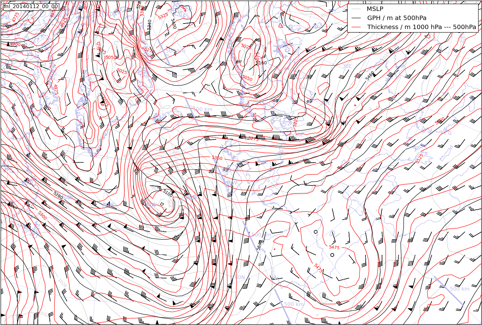
Here is a typical example: I have succeeded in getting contours of surface pressure, thickness and geopotential height, together with the traditional wind feathers for the upper-air wind. What is more, the projection and area covered is a close match to the Met Office forecast / analysis charts which you can get from NOAA as well as from the Met Office.
As noted in an earlier post, I was considering GrADS or NCL for this. I have actually ended up using python/matplotlib/basemap for a variety of reasons. One reason is that there is something of a move in the School of GeoSciences to use python/matplotlib for teaching programming to reluctant science students. It is free (unlike MATLAB and IDL, both of which are ugly as well as expensive), and it is more targeted at the physical sciences than is the otherwise-wonderful R. In addition, python is a transferable skill: something that we are supposed to be providing students with. So I thought it was useful to get some practice in.
Python/matplotlib clearly has all the bits and bobs I needed for this job. But it was also relatively easy to get going and to find out what was needed for the next bit. At a skin-deep level it looks a bit different from MATLAB or R. In particular, the grouping of statements using indentation ( rather than { … } as in R, or words like begin and end as in MATLAB and IDL ) is a bit odd. But it doesn’t take long to get used to it. The thing that causes real surprise is what happens when you make an array and set another array equal to it:
x = array([8,7,6,5,4,3,2])
y=x
y[3]= 99
If you did the equivalent in MATLAB, IDL, or R, then y would be a copy of x and you would have changed element number 3 of y to 99. But in python/matplotlib, y is not a copy of x; it is just another name for x. So, if you have changed an element of y, you have also changed the same element of x. As soon as you do a mathematical operation on the RHS of the assignment, then the result is a copy. So if you do
w=1.0*x
then w is a copy of x: changing an element of w does not change the equivalent element of x. This all makes sense once you are used to it, and helps python to use less memory. But you do have to be a bit careful to force a copy in cases where you want the original array as well as the copy that you have done stuff to.
My next project in this line is something that will have to go on the back burner now that the semester has started. It is charts with station plots on them. My spies in the Met Office tell me that these little summaries of the observations at a met station are still a routine tool of forecasters. But the only charts of this type available on the Met Office web site are rather thin and have observations from very few manned stations. I may have to use NCL for this as it has built-in code for producing station plots.


2 Replies to “Weather maps: the story continues”