I’ll be teaching simple atmospheric dynamics to a class of (mostly) second-years in the coming semester. For this, it is nice to have a good supply of weather charts of Britain and NW Europe. I’m getting my ducks in line because it is more fun than starting on the big pile of exam marking that I really ought to be doing.
Surface pressure charts are no problem: the Met Office does the best ones (although if you want them every 6 hours rather than every 12 you have to get them from NOAA, or weathercharts.org rather than direct from the Met Office). A bit of shell-script wizardry ensures that I have a rolling archive of charts for the last few weeks.
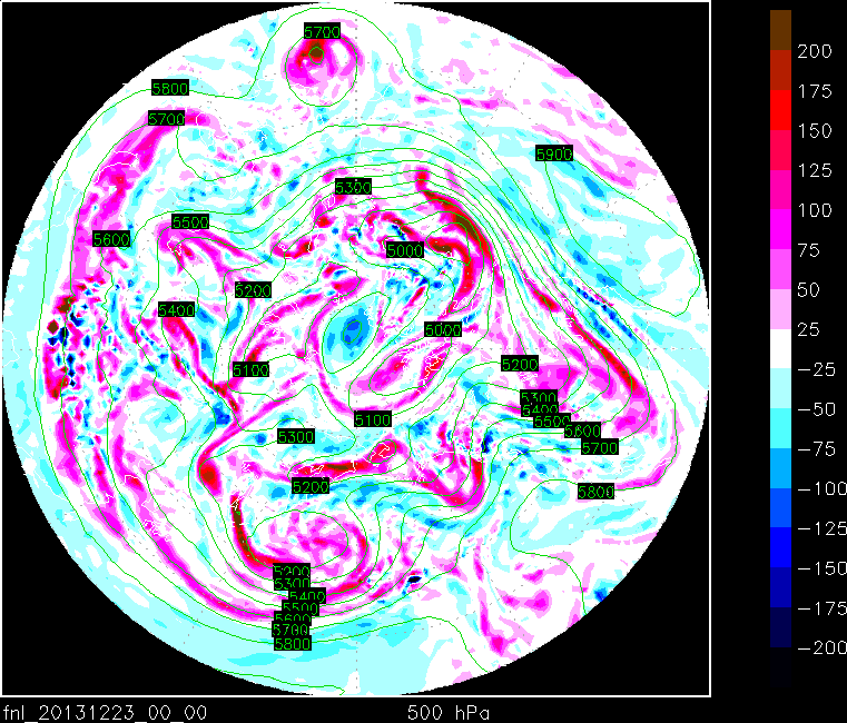
The difficulty is upper-air charts, so that you can see the jetstream etc. Until recently I got a good selection of these from the US Air Force’s 21st Operational Weather Squadron. Unfortunately, their web site has ceased to exist, so I am checking out the alternatives.
- A site in Germany has an extensive range of charts but they are rather low-res images and for some purposes they have too many things plotted on the same chart. (As an aside, I am beginning to be of the opinion that it is the Germans, and not the British, who are Europe’s most weather-obsessed nation.)
- The University of Wyoming is a good bet: they have Geopotential Height / Temperature charts at a variety of levels with wind observations superimposed. But they don’t have everything I want.
Really, this is one of those areas where, to get exactly what you want, you have to make it yourself. I took some steps in that direction a year or two ago by adding the data files from the GFS analysis to my rolling archive — you can get these from the research data archive at NCAR. But then you have to plot them up. And there is a whole load of choices to be made. The initial thing I needed was charts of thickness for 1000-900 hPa, 1000-850 hPa and 1000-700 hPa.
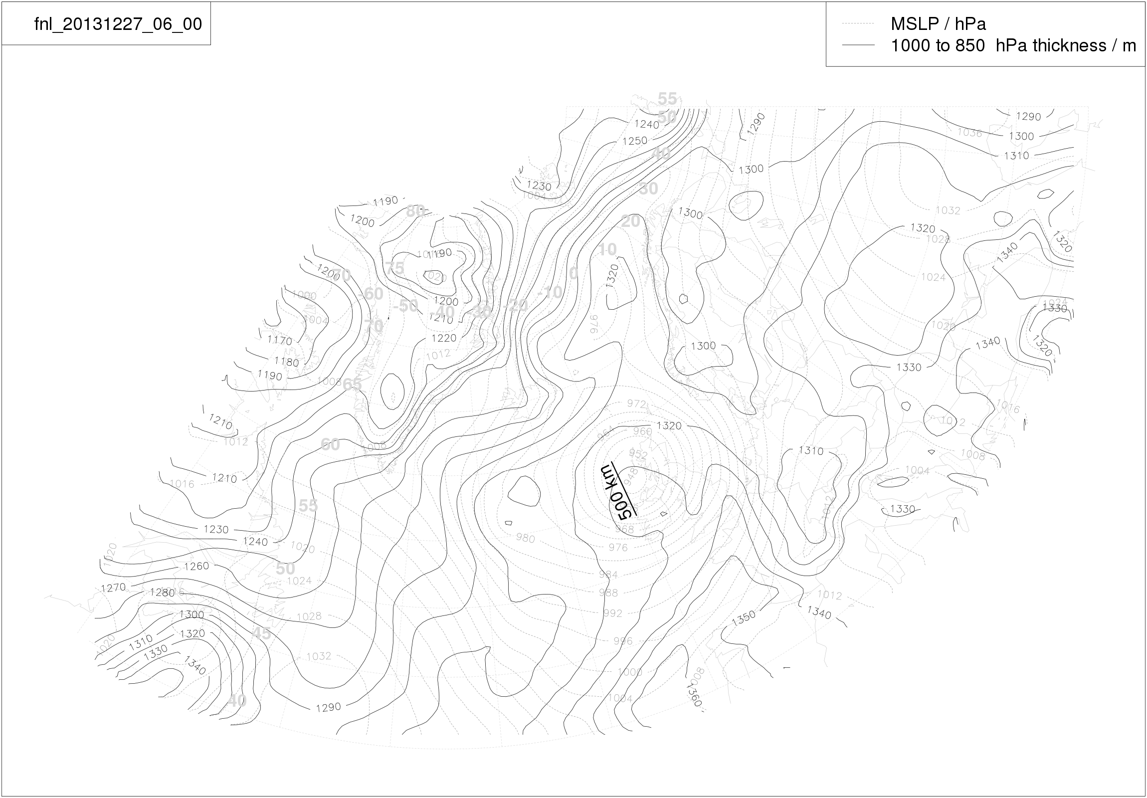
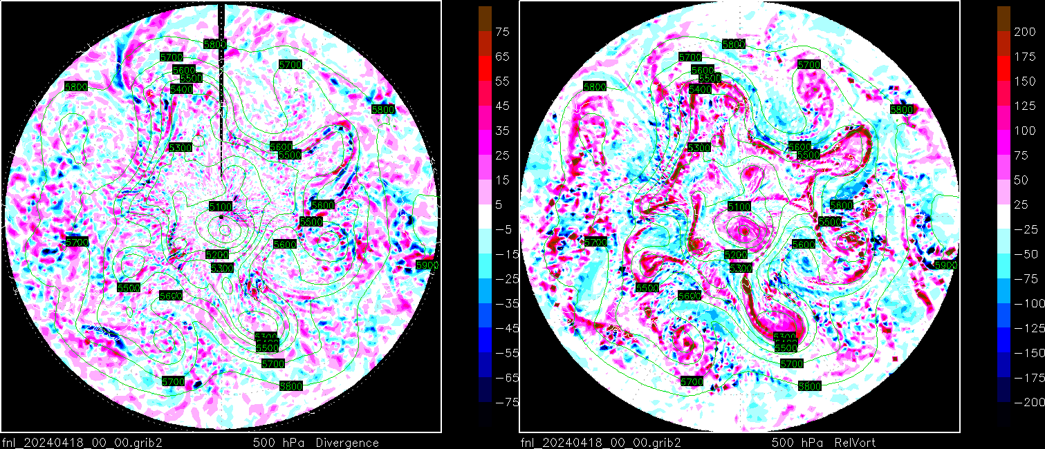
I made these using R, because I’m familiar with it. But R’s ability to put contours and stuff on maps is a bit limited. It will do a variety of projections, so I can get the maps cover the same region in the same projection as the Met Office surface charts. But you have to do some tiresome re-gridding to get this far. And R can’t do wind barbs; I want some charts with these on. R is also non-ideal in that it can not read the data files directly; they are in a tiresome format called grib2. The charts are made by converting the files to NetCDF before reading them into R.
I am therefore tinkering with some alternatives. I am restricting myself to freely-available software: I don’t want to invest any effort in something that the University is paying for this year but may well not pay for next year. The alternatives seem to be GrADS and NCL.
I looked at GrADS last year because the teaching notes that came to me from my predecessor had a vorticity map which had been reproduced very badly and which had clearly been originally made using GrADS. I fired GrADS up in order to make a clean replacement. Having done this it was a small step to automate the production of the chart and make up an animation. (I have not inlined the animation as WordPress only shows the first page.) If the system is still working you should be able to find the current version of this animation here. Unfortunately, GrADS does not have much ability to do different projections — it certainly won’t do the Met Office projection.
NCL is proving harder to get into (although, coincidentally, installing it gave me the only satisfactory tool for converting grib2 files to NetCDF; I used cdo for a while, but it lost half of the fields). NCL’s documentation says that it has the capacity to do whatever projections I want and to do a wide variety of contouring, not to mention wind arrows and barbs. However the learning process is not exactly rapid. Maybe I’ll have a nice new chart to post before the end of the holidays.


Hugh, saw this and thought of you: http://xkcd.com/1324/