Learn Ultra Base Navigation – Improving the Student Experience
I have recently been involved in the Learn Ultra Project that has been tasked to upgrade Learn Original, the University’s centrally supported virtual learning environment (VLE). Being part of a team that is focusing on the Ultra Base Navigation menu has given me some great insights into the student experience with Learn Ultra.
What is Ultra Base Navigation?
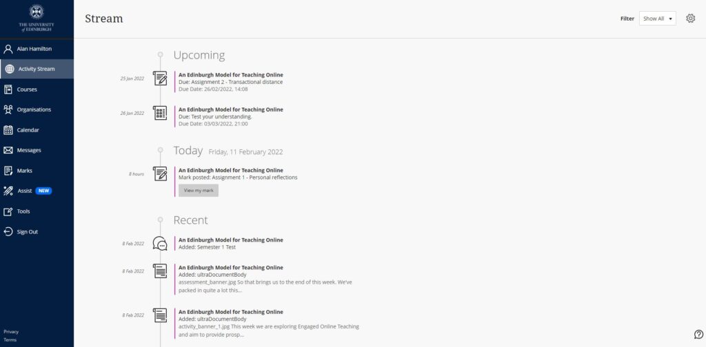
Ultra Base Navigation consists of a fixed left hand menu that allows users to access core aspects of Learn. A refined navigation menu allows users to quickly access course content, grades and feedback and review course updates and notifications.
As part of the User Experience (UX) stream, we conducted gap analysis of the original UX work undertaken on the Learn Foundations Project. We focused on the top tasks that were voted on by students and areas where students might have had a negative experience using Learn Original. After the analysis, we conducted UX sketching sessions with two groups of students and semi structured individual interviews, in which we were looking to see how Ultra Base Navigation could improve the student experience.
Sketching sessions:
We invited two groups of students to take part in two sketching sessions. In each session, we asked the students to do three sketches detailing what they thought the Activity Stream page would look like. The sketches and ideas were shared with the group. We then asked the students to create a refined sketch using at least one element from another sketch. Next, the students were paired to create a collaborative sketch, afterwards the group voted on the sketches and ideas that they thought were most useful and relevant. Each step was set to a timetable to keep the session moving.

Sketching session group 1

Sketching session group 2
After both sessions, we found that students mostly wanted to see announcements, assignment due dates, grades and recent posts (this coincided with the top tasks) in a list of items being added to their courses. Students agreed that this would be better than the constant email notifications that they receive via Learn Original.
We took the findings from the sketching sessions and shared our recommendations with the project team. This then guided the decision on implementing Learn Ultra Base Navigation tailored specifically to the University’s student needs.
Semi structured individual interviews:
Here we let the students see and interact with Ultra Base Navigation and asked them to complete several tasks based on the top tasks to get their thoughts and feedback.

Learn Ultra Base Navigation
In the research we carried out, All students liked the new look and layout of Ultra Base Navigation. They thought it was more intuitive and accessible than Learn Original for accessing grades, course content and notifications. Learn Original had these tools tucked away in the Global Navigation dropdown menu in the top right hand corner of the Learn page, where some students did not known about this menu or what was available within it. The Global Navigation menu has now been replaced with the Activity Stream, Calendar and Marks in the left hand menu of Ultra Base Navigation.
Most notably the students preferred the Activity Stream, they liked how you could filter assignments/ grades and feedback and that it showed their upcoming assignment due dates followed by the recent posts and announcements that had been added to a course.
The students liked how they could easily change the notification settings in the Activity Stream, enabling them to customise what is fed into the stream and also what notifications are emailed to them. None of the students used notifications in Learn Original and did not know how to change the settings or the customisation for the daily email digest. It was noted that the email digest was cluttered with information that the student did not want to see and they thought important information was getting lost. As a result, these emails were being ignored and students concentrated on checking course announcements for information.
Our UX sessions have shown that Learn Ultra Base Navigation will improve the student experience. The layout and design has solved the previous negative experiences on Learn Original, it hits the top tasks for accessibility and it delivers on the student expectations from our UX work.
Ultra Base Navigation will be enabled for all users in summer 2022. Training and online guidance will also be available.
You can find out more about the Learn Ultra project from our SharePoint
You can read more about the top tasks in a separate blog post by Emma Horrell:
A top tasks survey has shown what staff and students prioritise in hybrid teaching and learning


