Showcasing 80 online courses hosted on 3 platforms
We’ve been creating free short online courses since 2012, and have created more than 80 courses hosted on three partner platforms, Coursera, edX and FutureLearn. We’re fairly sure that we’re the only UK university to partner with all three of these major online course platforms! These partners and their websites are huge marketing machines, taking our courses to potential learners around the world. More than 3.7million learners have taken a free short online course with the University. Wow! Our University Strategy 2030 includes an objective to enable global participation in education – these totally free courses enable learners around the globe to study philosophy, astrobiology, data science, predictive analytics and more.


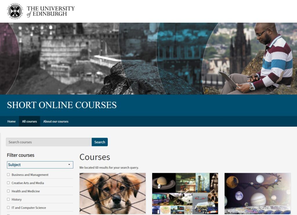
Our courses are hosted on these three different platforms but it’s also important that our own website does a good job at showcasing the full range of courses that we offer. Learners can be quite loyal to one particular platform that they’ve come to know and love, so we wanted our users to be able to filter by platform and other filters such as subject, language or difficulty level.
We wanted it to be as easy as possible for them to browse our catalogue of courses, despite the fact that the courses are run on different platforms or have different features. We talked to our colleagues in Website and Communications and decided to make something brand new and bespoke that would fit our needs. The resulting website, www.onlinecourses.ed.ac.uk, gives us a consistent way to present all of our live courses, as well as links to video and audio files from some courses that no longer run (hosted on our own media site, Media Hopper), while still fitting with the University brand.
The design work we undertook for the site has also given us a fresh identity for our portfolio, something that was lacking before and can be hard to do when partnering with three different brands.

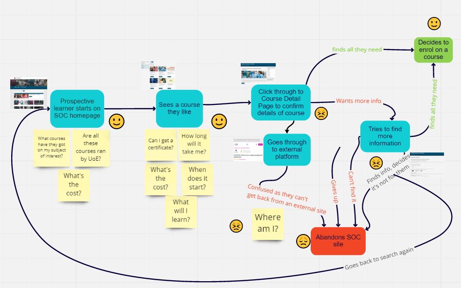
We’ve worked collaboratively with content editors, graphic designers and web developers to take the gem of an idea and turn it into something real and usable. We’ve conducted two sets of testing with users so far, and have more planned – their insight is valuable and has informed the decisions we make. We’ve discovered that users can, understandably, think that “edX” is a University of Edinburgh thing (it’s not) and that when they click on a link that takes them to another website, they like to know that that’s what will happen when they click on the link.
The website is live but we’re not done yet! We have more ideas on how to improve it so are continuing to make tweaks, both major and minor, until user testing tells us it’s as good as it possibly can be. 


Comments are closed
Comments to this thread have been closed by the post author or by an administrator.