Any views expressed within media held on this service are those of the contributors, should not be taken as approved or endorsed by the University, and do not necessarily reflect the views of the University in respect of any particular issue.

Week 5 – Design review 3

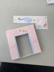
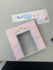
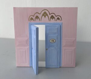
After having a closer look at my design, I wanted to further capture the spirit of The Grand Budapest with the integration of furniture showcased within the film. To further reinforce the bespoke nature of my design, I decided to recreate an integral piece of furniture featured within the film and have documented the process below.

(Screenshot taken from the film)


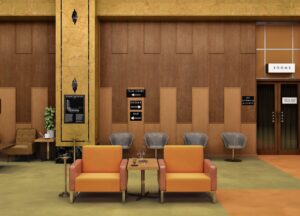
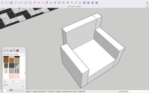
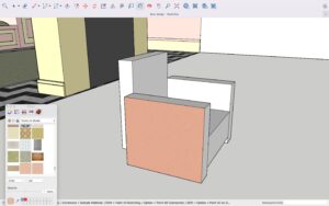
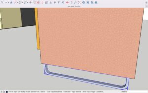
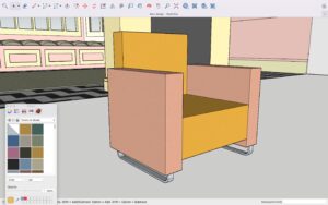
I began by sourcing an image of the arm chair to which I began constructing the shell, using the rectangle tool and the push and pull tool. Once I had the shape I desired, I used the colour picker to extract the original colours and then applied these to a leather texture which I sourced online. I then added the metal bars on the bottom which act as chair feet. In this way, I was able to replicate the arm chair successfully. I was struggling with furniture selection for the main space but I now feel as though this piece of furniture will really pull my design together and further reinforce the spirit of the film. I think that sometimes, although a useful tool, SketchUp sometimes limits me, as a designer by constricting me to the furniture selection available in the 3D warehouse. For this reason, I have found that designing some of my own furniture, I have been able to tailor the space and enhance its bespoke nature.

Since last review, I have made a couple of changes to the layout, one of which being switching the bedroom and bathroom to enhance the flow of the space and allow for the bedroom to have a view. I have tried to consider the user and their journey while making the space flexible. Additionally, I have changed some of the furniture and even the colour palette to suit the whimsical spirit of the film and embody its quirky nature. Although it has been a challenge, I think that I am finally beginning to find a balance between the integration of elements from the 30s and 60s to capture the spirit of the film.

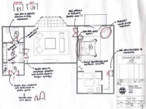
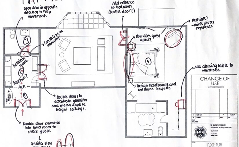
After review, I was given some feedback, so I decided to annotate my current floor plan with all the comments I had received to be able to read my drawing more visually and get my thoughts onto paper as can be seen below.

I have now reached a stage where I have a clear direction for advancing my design, and my next step is to refine my ideas. The main point I took away from the review was that my concept is strong and I now need to narrow my focus towards enhancing the functionality within the design of the hotel room, considering the user and their needs/activities.

Model construction

Initially, conceptualizing a single door, upon reflection, I have decided to elevate the design through the creation of a double door. This deliberate choice was significant as it embodies the grandeur and opulence showcased within the film. Channeling the distinct Wes Anderson aesthetic, I went for the typical Wes Anderson colour palette, integrating pastels such as pink and blue, predominant colours within the film, which capture its iconic and whimsical nature.

To amplify the allure, I wanted to add some intricate detailing to the entrance to spark a sense of curiosity within the guests, setting the stage for the immersive experience within while still preserving an element of surprise until they step into the hotel room itself. For these details, I used gold as this was

(Screenshot taken from the film)

Choosing gold for the detailing, was a nod to the film’s aesthetic, reinforcing the elegance and luxury which I aimed to channel in my design. I drew inspiration from the intricate pattern at the front entrance of the hotel, so I wanted to incorporate a similar pattern into my design, offering a subtle narrative that enhances the overall guest experience.

Overall, I am happy with the progression of my model and I think that this activity has really helped me bring my imagination to life and act as a visual aid to support my design and ideas.

I also wanted to showcase the view to the outdoors as the bay window is a key design element within the hotel room. Below, I documented the process of creating it which involved meticulous measuring and planning before cutting out each individual piece.

Leave a Reply

Your email address will not be published. Required fields are marked *

css.php

Report this page

To report inappropriate content on this page, please use the form below. Upon receiving your report, we will be in touch as per the Take Down Policy of the service.

Please note that personal data collected through this form is used and stored for the purposes of processing this report and communication with you.

If you are unable to report a concern about content via this form please contact the Service Owner.

Please enter an email address you wish to be contacted on. Please describe the unacceptable content in sufficient detail to allow us to locate it, and why you consider it to be unacceptable.
By submitting this report, you accept that it is accurate and that fraudulent or nuisance complaints may result in action by the University.

  Cancel