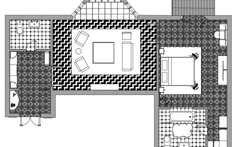
This week, I focused on my floor plan and getting my design ready for formative submission. To begin with, I needed to thicken the outer walls as they were the same size as the interior walls. In order to showcase my work as best as possible, I created a range of sections to maximise the display of information and highlight the intricate details within my design.
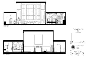
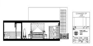
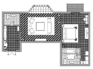
During formative review, I received a lot of valuable feedback, prompting me to make several changes to my drawings. Although not completely necessary, I decided to also add the floor patterns as seen in my SketchUp model, to further populate the floorplan, resulting in a rich drawing with lots of information.
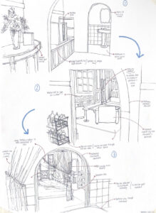
As my design is quite complex in nature and not a typical standard ‘box’ shape, it was difficult to describe the user journey. For this reason, I created a couple of perspective sketches into my design, drawn at eye level, with the addition of annotations and notes, to really showcase the guest experience as best as possible.
Survey
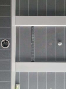
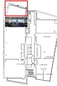
This week we also had an opportunity to visit the site and take measurements for ourselves. My team was assigned the external window wall on the 5th floor (as indicated on the plan). We began by recording the internal elevations of the walls and then proceeded to get the floor to ceiling heights and finally, take note of the materials that are used. Below is a record of the data collected, thus aiding my understanding of the site and the context in which my design is going to sit.
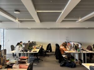
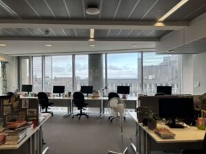
Colour palette
The colour palette was monochromatic, creating a neutral and stale environment, although conducive for its function as a shared working space.

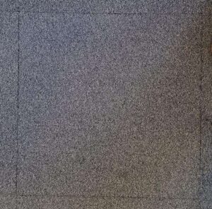
Materials
In terms of the materiality, we noticed the carpet tile which seems to be of a polyester-type material, in addition to perforated ceiling panels, as pictured below.