Upon reflection, I decided that 1 of the 2 rooms within my reception/foyer space needed more careful thought with its design. I then began making changes and modifications to further ramp up the Wes Anderson style and whimsical spirit of the film even more.
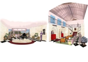
My approach to the layout was to be very Wes Anderson, inspired by his use of symmetry. I wanted the piano to be the main feature of the first room, welcoming the guests upon their arrival as they exit the lifts. Offset from that, I have arranged seating in a circular and symmetrical arrangement. For the space directly above, I created a circular gallery above with more seating where the sound of the piano would be able to travel through and guests can enjoy a different, more quiet space while still enjoying the music from below. I have also positioned the furniture in a ‘weird’ and uncomfortable way, emblematic of Wes Anderson’s eccentric style. In this way, I have distilled my design and refined it which I think has lead to a resolved result with strong links to the film.

Once we had established a rough idea of my key drawing from my hand sketches and resolved floor plan, I moved onto working digitally, with photoshop. I experimented with a wide range of effects and tools that aided in the development of my key internal view. After learning some of these key techniques, I was able to apply them to my own work and further develop my key internal view drawing, adding a sense of realism to it, taking it to the next level.
I wanted to treat my collage as a stage set and for that reason, I wanted the style to be mainly artsy/whimsical but still have an element of realism to it. As my foyer spans out across 2 spaces, I wanted to highlight this and their relationship. For this reason, I created a diptych, which is quite evocative of the film and the way it was filmed, whereby both views can be seen alongside each other, uniting them as part of the same graphic.
I think that my internal key view has emulated the way that I imagine my hotel design to be filmed by Wes Anderson himself. I think that the end result is successful and I am very pleased with the outcome and the way in which it communicates the feeling of being within the space I have designed.