Through these significant changes, I think that my design is developing well and is beginning to become bespoke, however, there were some key pieces of feedback that i had received which I would like to take into consideration when continuing to progress my work in the weeks to come.
The first key point would be the guest experience within my design. I think that I need to look at the series of spaces that I have and look closely at the activities happening within each space and how everything works together to create the most optimal flow of movement. For example, the bathroom. I need to further consider how it feels to sit on the toilet, to stand at the sink, to be in the bath or to even be sat at the dressing table. Now that I have looked back at my work, perhaps the dressing table seems misplaced and potentially not needed. I also need to rescale the toilet as it seems to be quite small compared to the wash hand basin.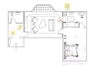
Another main piece of feedback would be the colour palette, material palette and furnishings used within my design. Having been inspired by the cinematography in the film, in particular the aspect ratios used to film both the scenes set in the 60s as well as 30s and how that changes. Although the variety of vertical space is creating interesting volumes, I am considering further emphasising this as a design choice. I could do this by over-emphasising other elements so that the whole of the interior becomes dramatic and thus echoing the whimsical nature of the film even further. In terms of the colour palette, I think that I need to reconsider certain spaces with regard to the colour choices to integrate more of the film’s personality and personify each space. I was also prompted to extract the colour palette out of my interior as this would enable me to assess if my ‘raw’ design is enough to be in the spirit of the film, thus prompting me to make bolder design choices in terms of the architecture of the space.
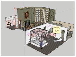
As my film is quite particular and whimsical, it can be difficult to design a space that is respectful of the spirit of the film while also not being cliche or tacky, making it challenging. With regards to the material palette and texture applied within my design, I think I have almost overloaded the space with an abundance of textures and materials because I did not want to miss anything and wanted to try and include everything that I thought would most successfully convey the whimsical spirit of the Grand Budapest hotel. Therefore, I think it may be worth reconsidering the range of colours, textures and patterns that I am showing to create a balance and make my design more autonomous. In this way, I believe that I will be able to create a really strong set of spaces which can all stand on their own, with each space owning its own specific set of materials.
Through the application of this feedback, I have been able to develop the bespoke nature of my design. I believe that the whimsical and quirky nature of the film is finally beginning to ‘read’ in my interior and I just need to continue to develop my design with these comments in mind to really embody the spirit of the film whilst resisting the urge to recreate it.
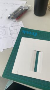
Model construction
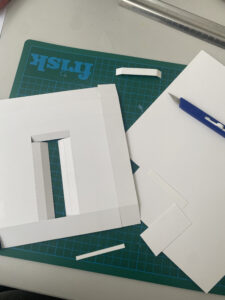
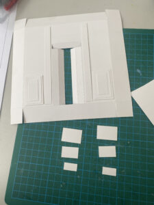
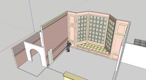
I also wanted to document some of the model making process, which has been supportive in the way on which it has allowed me to look at the actual space that I have proposed, bringing me closer to the reality of what I have designed. As our process is evidently driven by the ‘guest’ experience, we began with a model of the door/wall entrance to the hotel room, as this almost acts as a first impression for the guest and provides them with a sneak peak with what to expect in the interior, creating a threshold between the lobby and private hotel room which we have designed. First impressions are imperative so I really wanted my door/wall design to embody the spirit of the film but also not give to much away to create an element of surprise/mystery for the guest upon their entrance to the room. I began by sketching a rough idea for my design, using the measurements from my 1:20 scaled plan. I then began with the 3D model. Through the help of scoring, i was able to create a model which can stand on its own as it has a thickness to it. The real challenge for me in this process, was being careful with the measurements and making sure I cut out the correct pieces.