

This blog post is a guide for using R for reproducible data processing and analysis. Today we will work with this totally legitimate longitudinal dataset (see Disclaimer below). The dataset includes a measure of enjoyment for my previous pun blog post, a very reliable questionnaire “Rand_Q”, enjoyment of puns, whilst controlling for demographic variables of age and gender.
This dataset will be used to test the following hypotheses:
- H1: A higher score on the questionnaire will be positively associated with greater enjoyment of Rhys’s pun blog post.
- H2: Individuals who like puns will significantly prefer the blog post compared to those who do not like puns.
- H3: Individuals who like puns will increasingly enjoy the blog post with every wave of data collection, whilst those who dislike puns will increasingly dislike the blog with every wave of data collection.
DISCLAIMER: This dataset is fictitious. Making people re-read my pun blog post for psychological research would never receive ethical clearance… it would be considered torturous for those who dislike puns. If you would like to run the code from the blog, the dataset can be found here: Extra_serious_data_on_pun_blog_enjoyment.

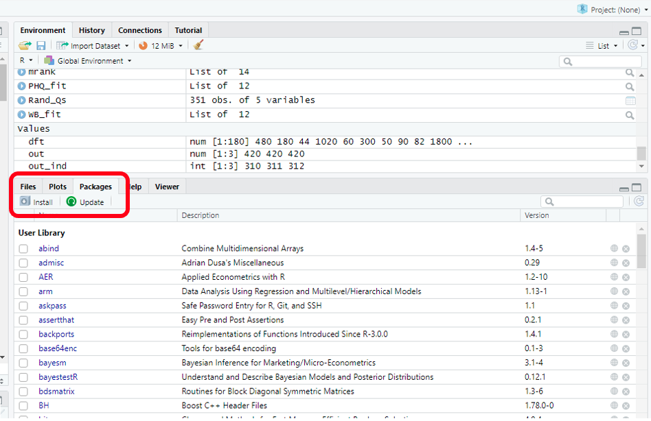
Let’s get started! R operates by using packages. These let us use ready-made tools (The R community has plenty of instructions and guides online on how to use and access these). Initially, we must install these packages. The image below shows how this can be done. From there, we create a new script (“ctrl +shift+ N”), and start our own programming! First we use the `library()`command to tell R we want these packages running. To run our code from our script, we hit “ctrl + Enter” next to our selected code.
install.packages("readxl")
library(readxl)

install.packages("panelr")
library(panelr)

install.packages("tidyverse")
library(tidyverse)
install.packages("gvlma")
library(gvlma)
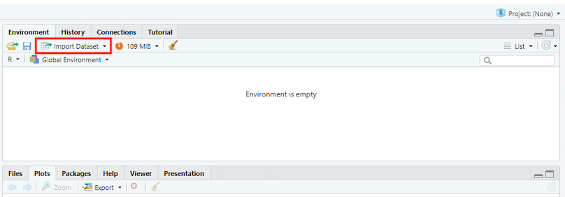
Now let’s access our lovely data to start working on it. There might be more advanced fancy ways of doing this, but the simplest way involves clicking the box I’ve highlighted.
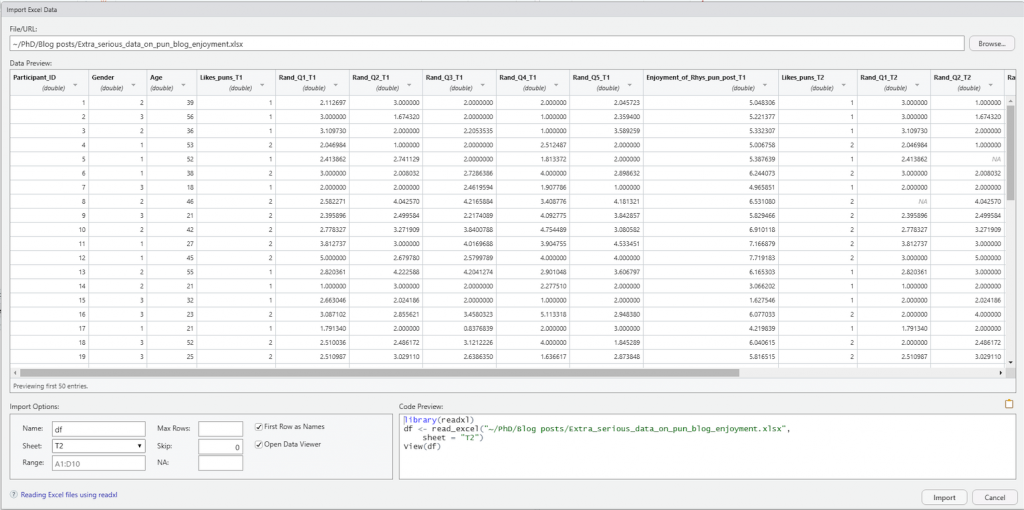
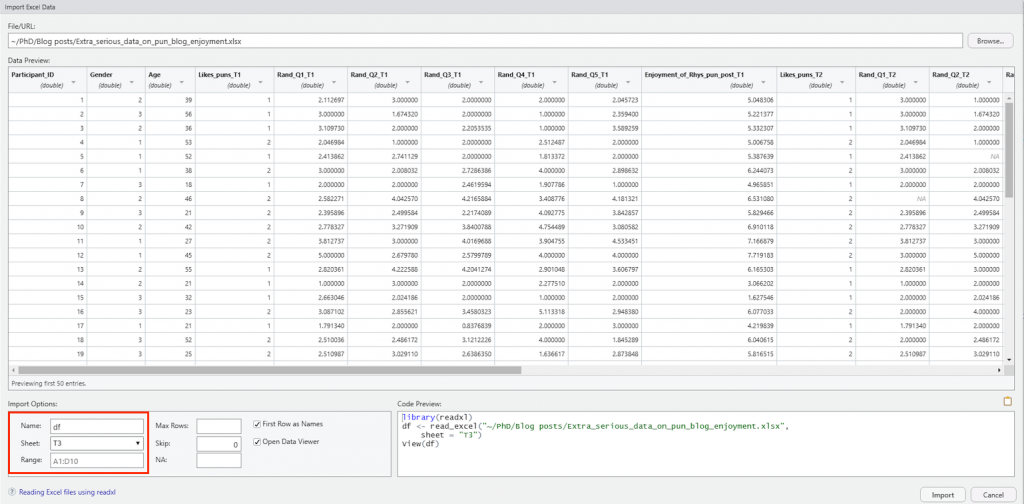
This provides a dropdown menu of different file types we might want to open. For this blog, we have an Excel file, so we will use “readexcel”. From there, it’s time to upload our dataset by selecting the appropriate file from the “Browse…” section in the image below. Simply find the “Rhys-Extra_serious_data_on_pun_blog_enjoyment” file (found here: Extra_serious_data_on_pun_blog_enjoyment), and select R to open it. Take note that I have renamed the file in the “Name” section to “df”. This is to save time in future steps, as the file name is rather cumbersome (and using short names saves a lot of time/pain with case sensitive R). Also, for this exercise we are using sheet “T2”.
Moving on, it is time to inspect the data and see what tidying needs to be done. The data has 117 observations and 17 variables. That is a lot to process by eye. Luckily, there is a quick and easy way to inspect the data, through the `summary()` and `head()` functions. Notice the use of the hashtag in the code. This is used to type comments, which contextualises the code and helps ourselves and others understand what we’re doing. Big wins for reproducibility and clarity.
# Step 1 - inspecting data

summary(df)

head(df)
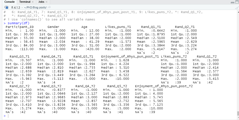
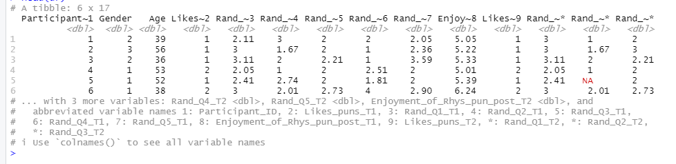
The `summary()` function allows us to quickly explore the classifications and numerical distributions of the variables in our dataset, whilst `head()` allows us to see the first 6 entries. As we see multiple columns for each wave of data collection, the data is in a “wide format”. For quick easy tidying, we need our data to be in the “long format”. This means having one column for each variable, which can be identified by a “wave” variable.
# Step 2- Changing data from wide to long
df_long <- as.data.frame(long_panel(df, prefix = "_T", begin = 1, end = 3,
                                    label_location = "end"))
head(df_long)
summary(df_long)
![]()
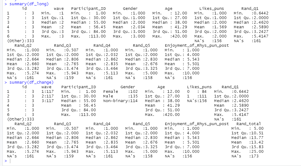
Using `head()` and `summary()` again, we can inspect the “long format” data. Reducing the number of variables through using a long format will save time when it comes to the upcoming task of data transformation.
For data transformation, I will be using the useful “pipe function”, which looks like this: `%>%`. It may look intimidating, but the pipe function essentially tells R to “take this, and then do that”. In this instance, the pipe function is being used with the “mutate()” function to transform data. Here we will: (a) recode and relabel our “Gender” variable, (b) make a summed total from our questionnaire variables, (c) transform our “wave” variable to a factor, and (d) dummy code and relabel our “Likes_puns” variable.
# Step 3 - Transforming data

df_change <- df_long %>%

mutate(Gender = recode_factor(Gender, `1` = "Female", `2` = "Male", `3` = "Non-binary"),

Rand_total = Rand_Q1 + Rand_Q2 + Rand_Q3 + Rand_Q4 + Rand_Q5,

wave = as.factor(wave),

Likes_puns = as.factor(ifelse(Likes_puns == "2", 1, 0))

)

summary(df_change)
Now that we’ve reclassified some variables, let’s compare the updated `summary(df_long)` with `summary(df_change)`.
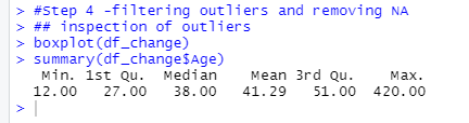
Time to deal with our pesky outliers, strange inputs, and missing values. For this we will use the “filter” function along with our trusty pipe function. First, we will inspect our data with the `boxplot()` and `summary()` functions. You’ll notice the use of the `$` in the summary() code. This tells R which variable in the data we want it to focus on.
#Step 4 - Inspection of outliers

boxplot(df_change)

summary(df_change$Age)
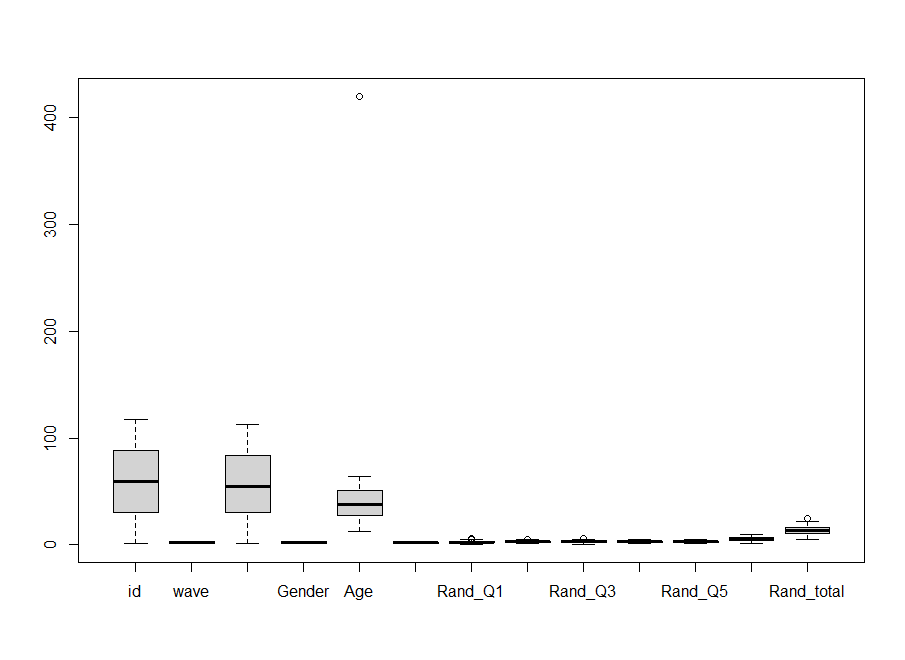
The boxplot shows some outliers. In the “Age” column, we have a sceptical “420” year-old in the survey. Also, there is a participant under the age of 18 participating in our survey (not part of the ethics review). So, we will set R to remove ages under and equal to 18, and ages above and including 420. I have also removed entries with either the maximum or minimum score in the `Rand_total` variable. They seemed suspicious. Finally, we ask R to remove any remaining missing values with the `na.omit()` command.
# Step 5 - removing outliers

df_filter <- df_change %>%

filter(Age >= 18,

Age < 420,

Rand_total < 25,

Rand_total > 5

) %>% na.omit()
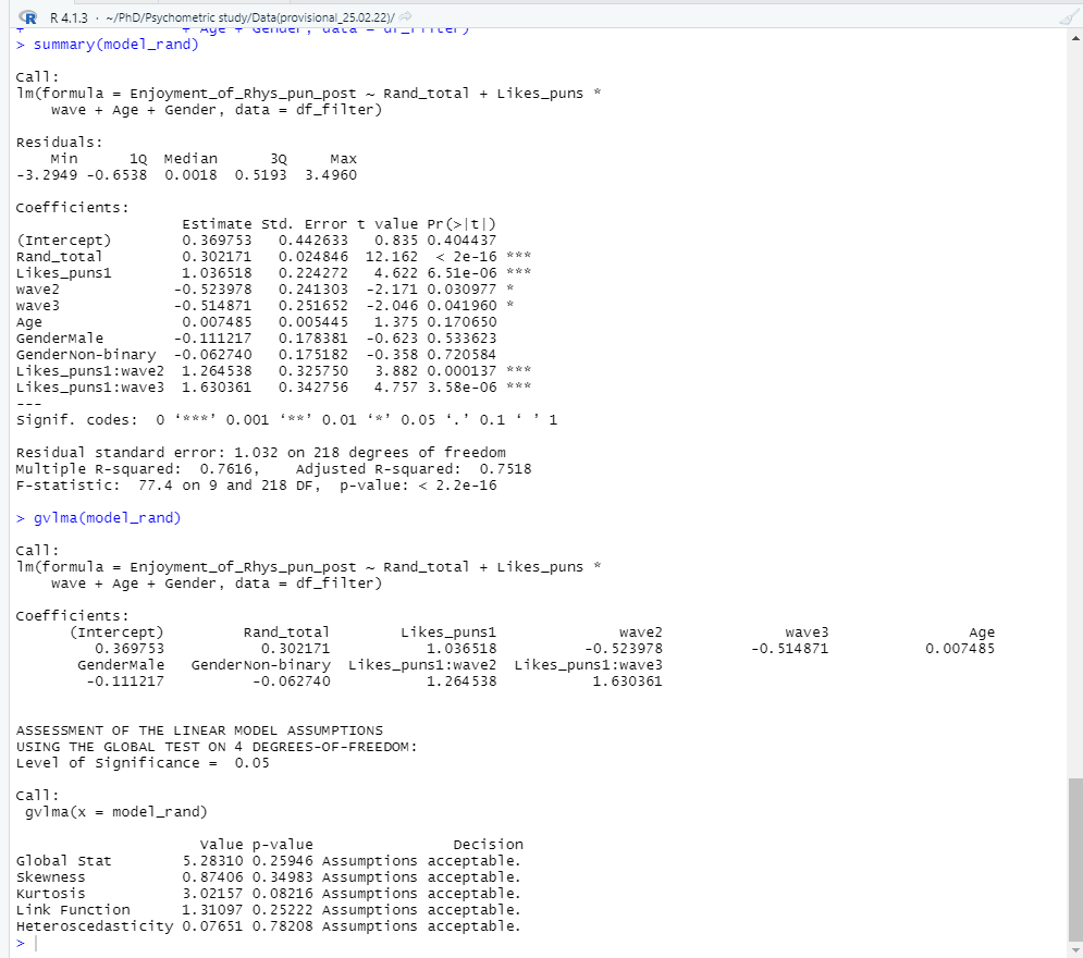
Onwards to analysis! R has a variety of analysis options and techniques, and for more information, use resources such as stackoverflow to find the option needed. Today, we will use the trusty linear regression to test our hypotheses. We will also inspect ways of testing model assumptions, by using the `plot()` and the `gvlma()` functions.
# Step 6 - Testing a linear model and running model diagnostics (to check for assumption violations)

model_rand <- lm(Enjoyment_of_Rhys_pun_post ~ Rand_total + Likes_puns * wave

+ Age + Gender, data = df_filter)

summary(model_rand)

gvlma(model_rand)

plot(model_rand)
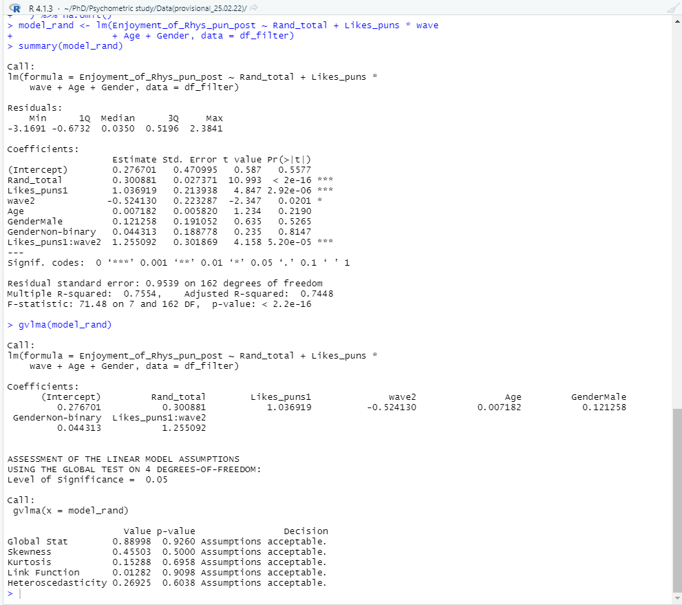
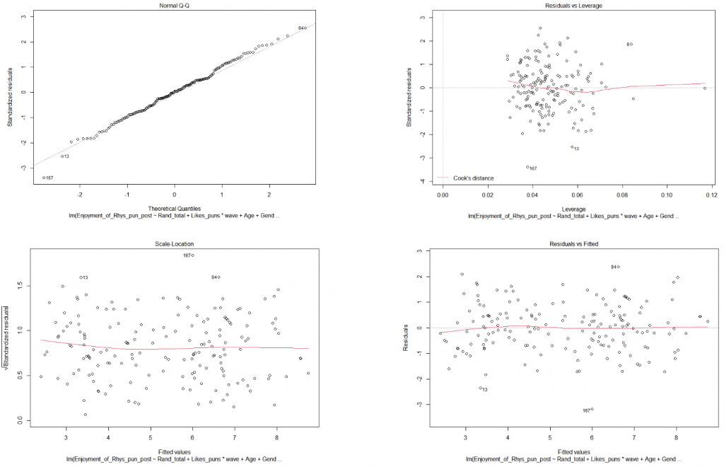
Model assumptions look to be fine (“assumptions acceptable” ). As for our hypotheses? It looks like we can reject the null hypothesis for all 4 of our hypotheses! Hooray! (No publication bias or significance chasing here…). The regression summary shows that the Rand questionnaire is a significant positive predictor of someone enjoying my puntastic blog post (β = .28, p < .001). People who like puns significantly prefer the blog post compared to those who don’t (β = 1.08, p < .001). With every wave, the preference for the blog post significantly decreases (β = -.46, p = .04). However, there is a significant interaction between liking puns and each wave of reading the post (β = 1.19, p < .001).
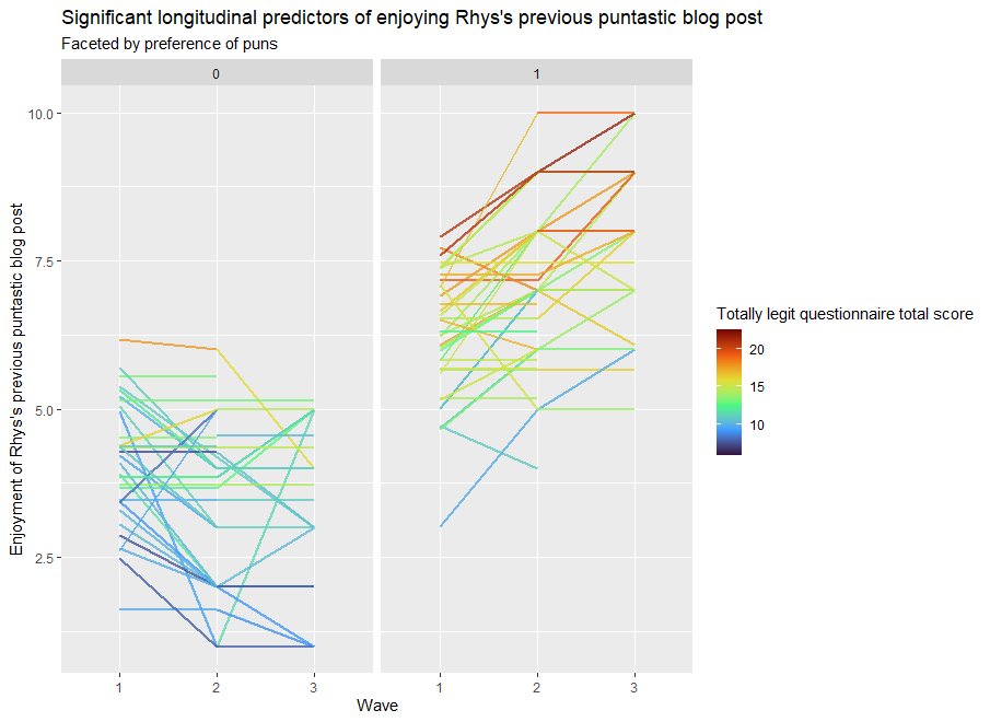
But what does this mean? Reading stats can be difficult. How do we present it quickly and clearly? With data visualisation! The “ggplot2” package inside “Tidyverse” is a powerful tool for creating beautiful plots. Here we will visually display how all of the significant predictors explain the enjoyment of the puntastic blog post.
# Step 7 - Plotting the results

ggplot(df_filter, aes(x=wave, y=Enjoyment_of_Rhys_pun_post, group = Participant_ID, color = Rand_total)) +

geom_line(size = 1, alpha = .8) +

scale_color_viridis_c(option = "turbo")+

facet_wrap(~  Likes_puns) +

theme_gray() +

labs(title = "Significant longitudinal predictors of enjoying Rhys's previous puntastic blog post",

subtitle = "Faceted by preference of puns",

x = "Wave",

y = "Enjoyment of Rhys's previous puntastic blog post",

color = "Totally legit questionnaire total score"

)
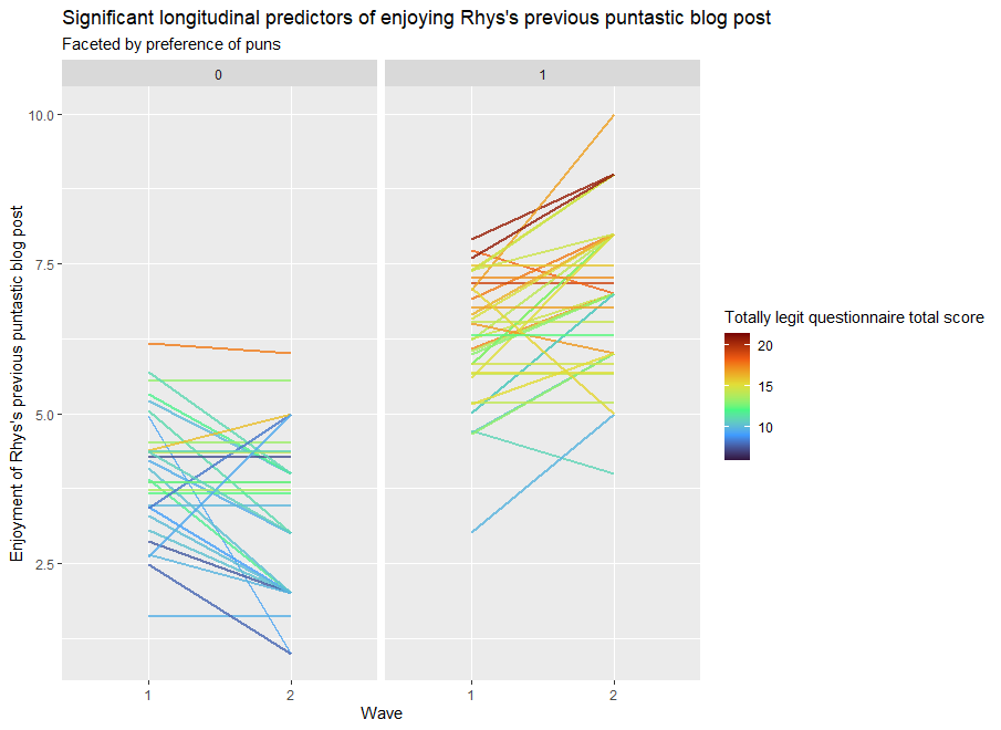
Pun admirers (In the “1” column) tend to increasingly enjoy my blog post with every reading. Disapprovers of puns (in the “0” column) tend to increasingly dislike the blog post with every reading. The darker colours of each line show that questionnaire scores tend to be associated with greater enjoyment of the blog post.
The information is clearly displayed with a few lines of code, which is useful… because in the time it’s taken me to get to this point in the blog, another wave of data collection has come through (imagine that). Luckily, we can update our data by changing our sheet selection to “T3” and re-running our previous code.
Voila, the analysis is redone in seconds. Time saved, programming skills gained, beautiful plots made, and insightful analysis conducted.
Reproducible data analysis and transferable skills for all!
If you would like to learn more about using R for research, I recommend the following resources (others are also available):
https://www.youtube.com/c/RProgramming101
https://www.youtube.com/c/QuantPsych


very helpful
Thank you 🙂 And stay tuned! We have follow up blogs planned for R and other research tools, techniques and tricks.