I have been dutifully reading my rain gauge for over a year now, and I trotted out this morning to ensure that I made the last reading of 2020 before 9:00 on 1 January. As I now have a whole calendar year of data I decided to plot it up to see how it compared to typical values for the area. The Met Office provide data for the 1981 — 2010 period, so I downloaded that. I then extended my code so that it would produce a bar chart with my own data for the year, and the Met Office data, plotted side-by-side.
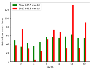
I don’t know how much bias there is between my own rain gauge and the official recording site for Dunbar. But if we ignore that, it looks as if 2020 was about 7% wetter than average, driven by a very wet February, October and December, and mitigated by a dry April, September and November.
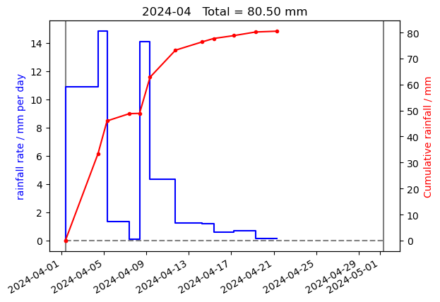
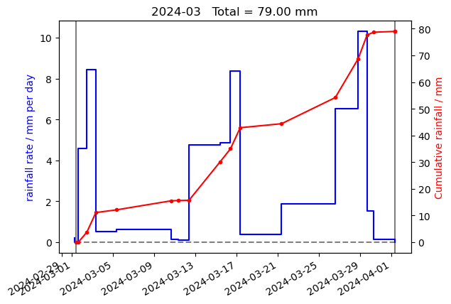
I have updated the code so that it uploads the new year summary plot to the web, in addition to the plots for the current month, the previous month, and the month before that.

