Mushroom Books Embassy Install

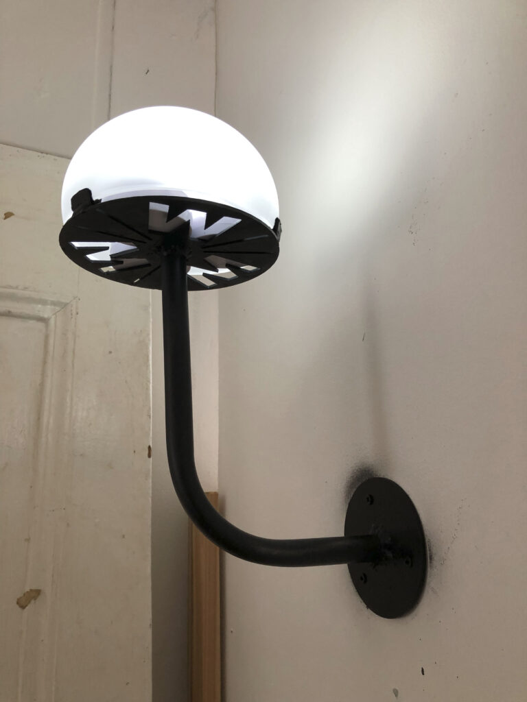
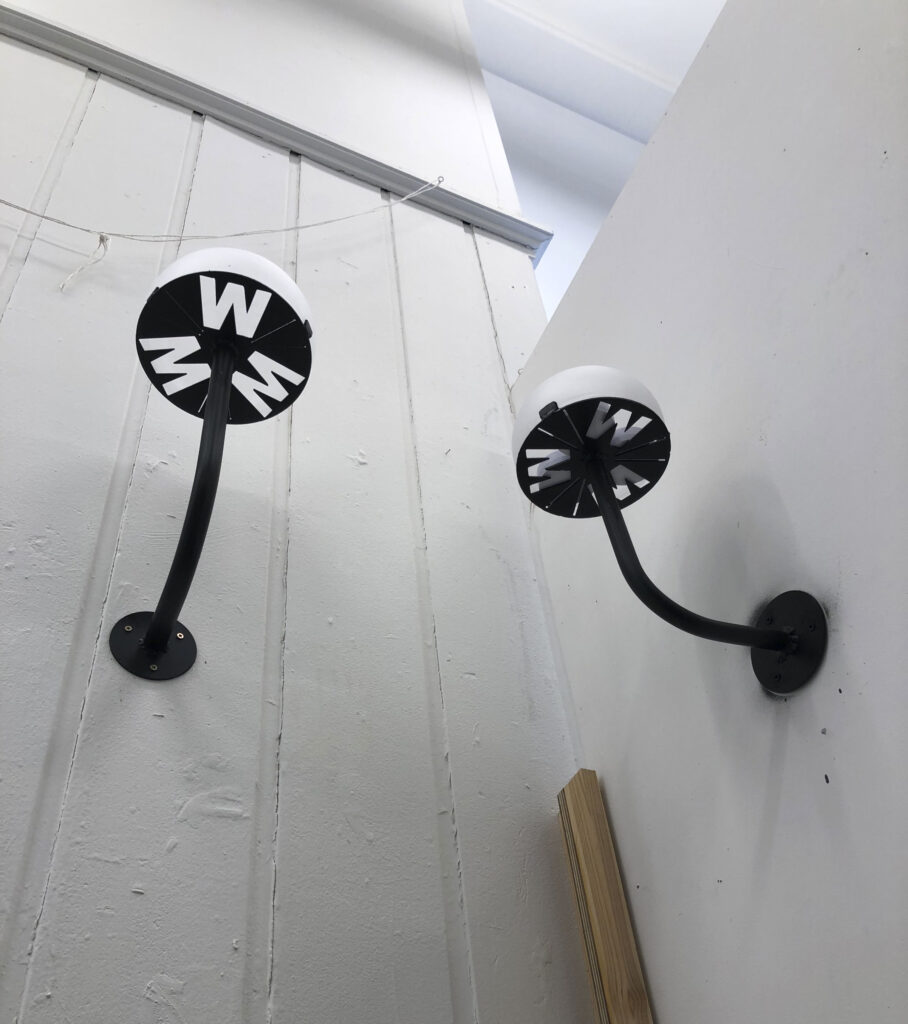
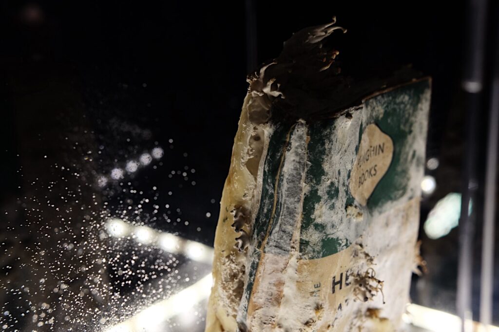
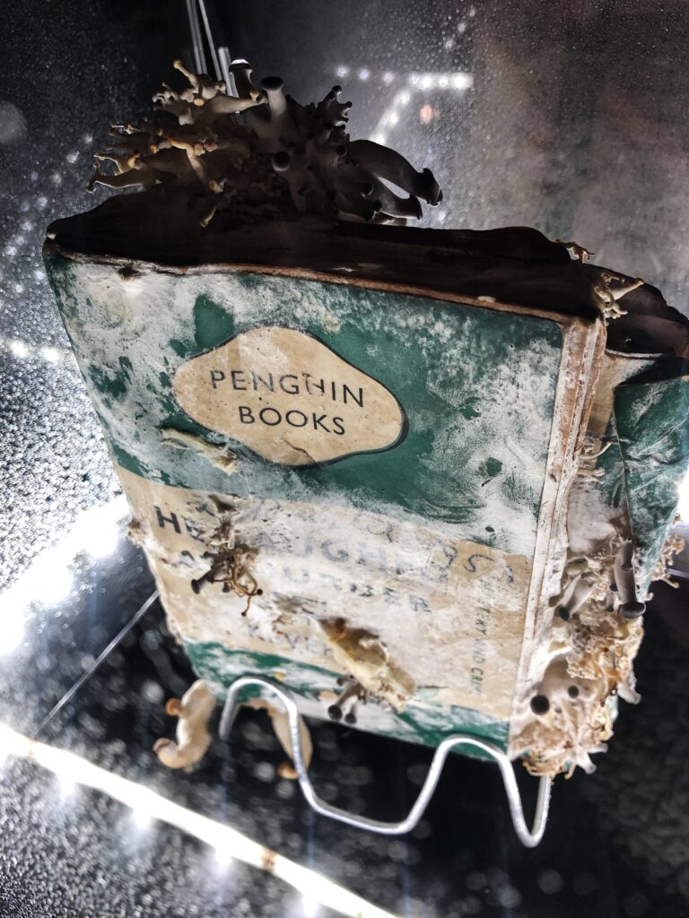
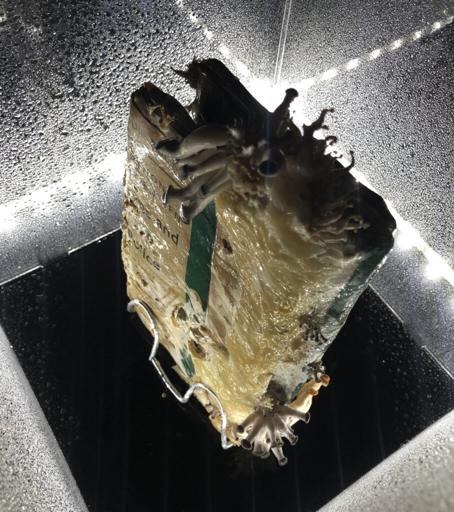
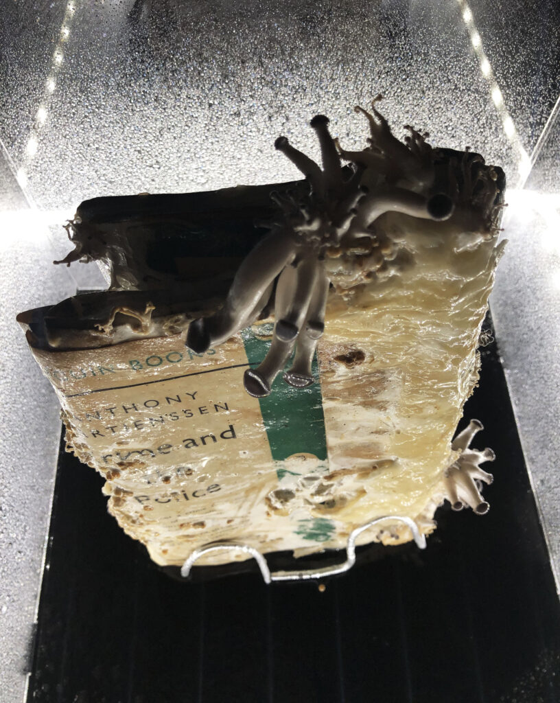
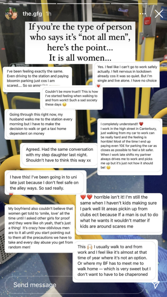
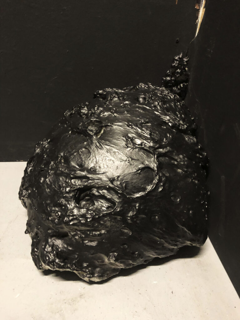
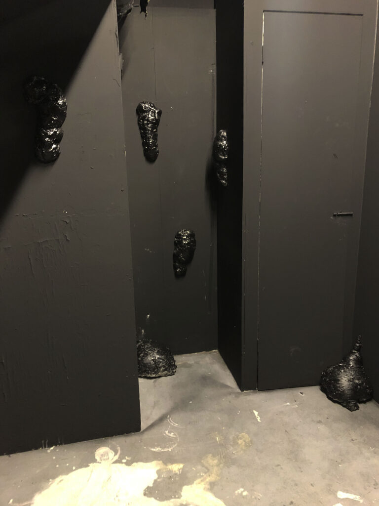
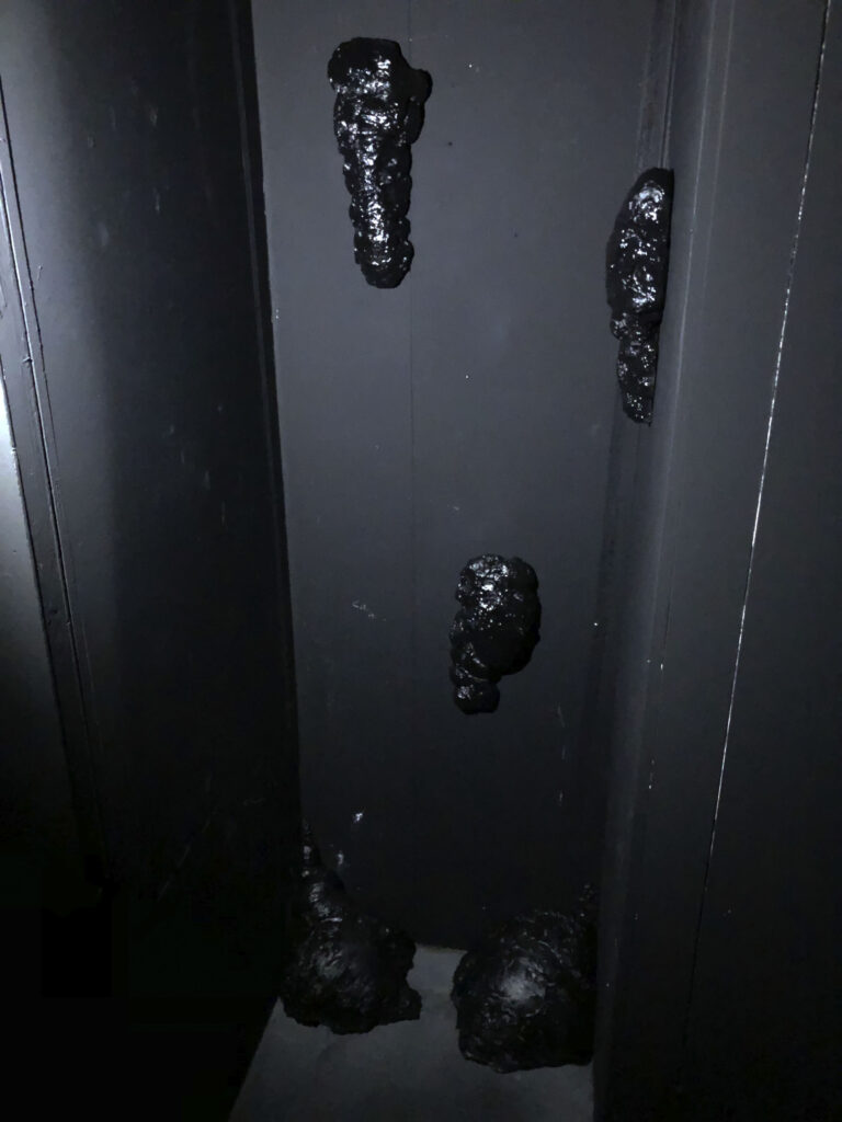
For the embassy install, I displayed the books in a stand within a perspex case. This was placed on a black plinth, lit by LED lights that sat behind the lip of the plinth:

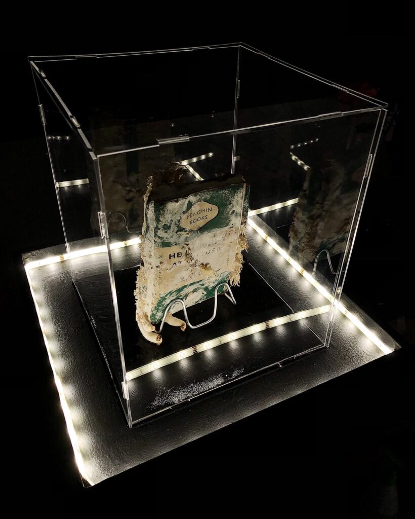
Overall, I was very pleased with my final install. I felt that it looked clean and professional and they were well lit. As I placed the plinth away from the wall, viewers could see the books from all angles which worked well seeing as the mushrooms were growing from various points.

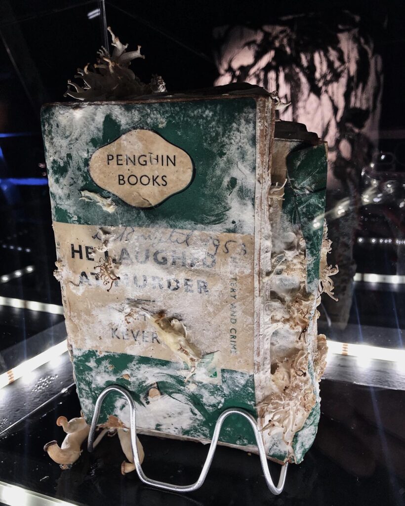
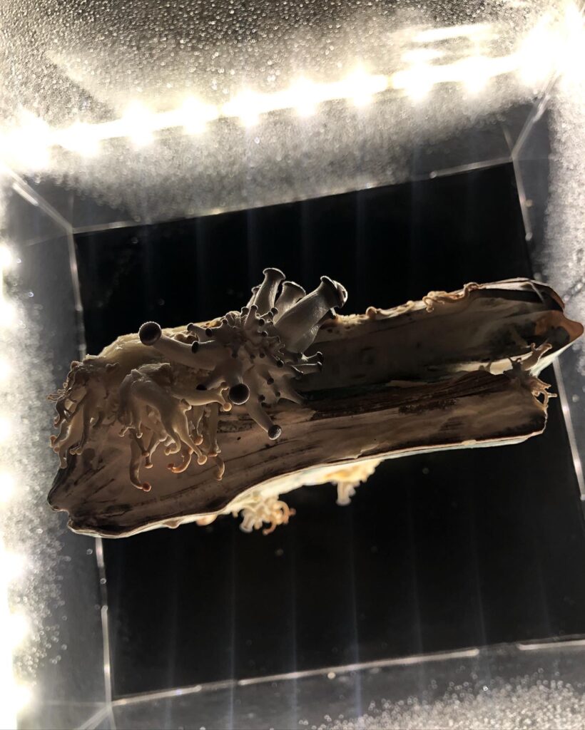
I was worried, as the mushrooms require being sprayed with water daily, and I felt that this would distort the view. However I feel that it actually added to the mystery of what was inside the case. People were quite nervous to get close to them, fearing they might have toxic spores and be bad to inhale. I found this quite amusing, and I feel like it tied in with my concept of the Met Police. Viewers felt nervous and unsure, afraid to approach – which is how many people feel towards police themselves.

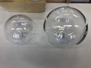
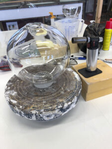
I do feel that there are things that I would do differently if I were to display a similar install. I would change the lights, as they were too bright and cause problems with reflection on the perspex. I would either light it from above – similar to an interrogation light, playing into the concept further. I would also use a glass box, as the perspex warped over time making it look unkempt and messy. Also a glass cabinet would be a good option, yet I found these to be very expensive and hard to transport.


Ultimately I was very proud of the outcome. It was a new venture, and a very risky one, as I didn’t know if the mushrooms would grow or not. They also flourished in the dark, cool Embassy gallery and grew a lot during the show which was amazing. I have more ideas to work with mushrooms, growing them on newspapers, more books etc.

Project Space 2

Project Space 2

I revisited the project space later in the term as I had another idea that I wanted to try out and felt that I05 was the perfect space to do so.

I have been exploring the many different meanings and connections surrounding fungi, and one of those meanings is the disgust related to mould.

I find a strong connection between mould and anxiety/depression. The way it creeps in, takes hold and can never truly be eradicated. I find it especially resonates with black mould and its connotations of toxicity/danger and that it is never wanted.

Considering this I created some sculptures using expanding foam. I wanted the forms to appear natural, textured and I felt that expanding foam would portray this. I also like the fact that you cannot control how the foam shapes itself, it is its own sculpture, much like how mould grows and forms different shapes and patterns.

I then spray painted the forms black, representing black mould. I wanted to convey a slimy wet look for the shapes, so I went on to add a layer of varnish to create a wet look. I intended for them to look natural, yet also unnatural considering their size.

I wanted it to seem as if these black slimy objects were engulfing the space, appearing in the cracks and on the walls, imitating the growth patterns of mould.

I felt that the dark walls of IO5 worked well with this installation, adding to the mystery of the forms and subtly blending them into their surroundings.

I also photographed with the lights off, using a small light. If this were to be displayed in a gallery, a small dark, dimly lit space would be preferable. The forms took on their own shadows and the sheen was picked out by the light making them appear eerily in the dark.

This was a new way of working for me, and one which I very much enjoyed. I didn’t overthink, or pre-plan as I usually do and I had fun playing around with a new technique and rearranging the objects within the space. It was spontaneous and adventurous and it payed off. The response was a mixture of intrigue and trepidation – people were unsure of their texture, what they were, where they would appear. This met my intentions for the piece.

Project Space 1

Project Space 1

For my time in the project space, I firstly took my painting down that I have been working on since the beginning of the course. I wanted to take this opportunity to have a new space to work in, hoping for a fresh take.

I found it very beneficial to have the space to work and take the time to stand back and see the painting from a distance.

.                             

I also took the portrait into the sculpture hall at intervals to see how it worked in a large gallery space.


Now that I have finished the portrait, I still feel that there is something missing and that the work as a whole is incomplete. The feedback I received from tutors and other students was that it is bland and dead. It is a portrait and nothing more. I agree with this, and feel similarly that there could be more to it.

I have recently been reading a book: “The Ruxton Murders” which I have found extremely interesting and educational. The book is a detailed account of what has been deemed “the first modern murder”, as it was the first time that several forensic science techniques were used to successfully solve a murder case. One particular technique that interested me was that they were able to identify the body of Bella Ruxton by superimposing a photograph of her skull over the most recent photograph of her:

The murder victim denied justice | Scotland | The Times

They had to do this in order to identify her as she had been so grossly mutilated by her murderer – her husband, Buck Ruxton. It is unfathomable that your life partner would be capable of doing such a heinous act.

Since reading the book, I am now considering working with UV paint and lights, to recreate this image of Bella on my own portrait. Exploring my theme of violence against women even further whilst educating viewers. I find reality more hard hitting in these cases than a figment of my imagination.

Considering this development, this work remains very much in progress.

Edinburgh: In-app city layout example


The Meadows: In-app map layout example


Light design


Light design in red warning phase


In-app symbol for an area that is clear


In app symbol for an area has a partial warning area

Making the prototype light:

  • Firstly I simplified the WWW logo for the lights. This is because when testing making the logos using the plasma cutter, it was very unclean and there were too many lines that the machine found hard to navigate. After I simplified the logo, they came out much cleaner and more concise and easy to see when underneath the light.
    The logo for Women’s Wide Web
    The first plasma cut version of the logo

    The simplified version of the logo for plasma cutting
  • Before cutting the final bases out, I set out to make the glass domes to house the lights. As they were to be hand blown, the precise measurements of the domes would only be known once there . To make the domes, large glass spheres were blown which were then split in half using a heat cracking technique:

    the glass spheres before splitting
The glass sphere before heat splitting, note the blow torch on the right of the sphere.
The domes after heat splitting

I then sanded these down to smooth any sharp edges:

Sanding down edges with diamond paper
  • We ended up with two domes, one large and one small. I took this as an opportunity to try out two scales of lights


  • When I had the domes ready, I then scaled the logos to fit their size and then cut them out in 6mm steel on the plasma cutter. I also ensured that the central hole of the logo was measured to the size of the steel pipes that would be holding up the lights. The brackets for the lamps were also cut out with the plasma cutter.
    The bracket design to install the lights

    the bases for the lights (logo sections) and the brackets to install the lights

The next stage was to make the metal structure of the lights. Now I had all of the elements for the lights, I needed to bend the steel pipes and weld the sections together

The device used to bend the pipes
All of the elements for the structure of the lights


Clips welded onto the bases, to hold the glass domes in place
  • I then welded all of the pieces together
  • I then spray painted the structures with matt black metal paint, I wanted a clean and finished look that tied in with the vintage streetlights of Edinburgh
  • As I wanted a soft light, I sandblasted the glass domes to create a muted light
  • To finish, I placed remote controlled LED lights underneath the glass domes. These also had different colour settings so I could see what the lights would look like in their red warning phase