Week 7
Before this week’s workshop, we were asked to consider our early lighting concept ideas for the space we were developing in our interior design project. For our project, we are designing a library inside the Tron Kirk church. My library specifically is a manga and comic library where you can also do gaming. However, at this stage in the interior design course, neither my layout nor my designs for the library were finalised. So, when we were asked to consider the lighting for the project in this course, I was a little stumped as to what my lighting could look like.
Maryland AIA Chapters – Sterling Branch Library (secure-platform.com)
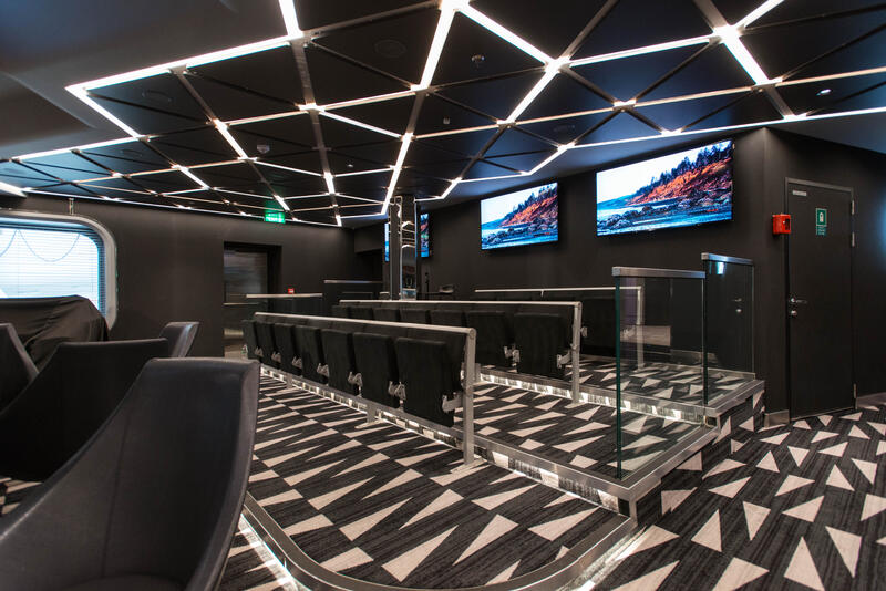
TV Studio & Bar on MSC Meraviglia Cruise Ship – Cruise Critic
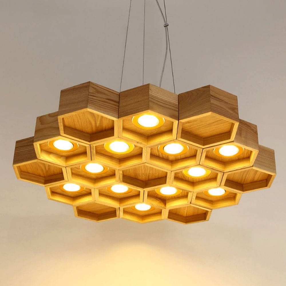

15 Best Honeycomb Pendant Lights (menterarchitects.com)
Hexa-LED Honeycomb LED Light Fixture – Eko Design Co
So far, I’ve looked at different libraries to see what the lighting looks like. I’ve also looked at manga and comic bookstores as well as gaming/Internet cafes. The lighting for these 3 spaces is different, so I know I need to create a lighting design where I can meet in the middle. The images above are some lighting designs I’m thinking of incorporating in my project.
WORKSHOP
This week’s workshop mainly consisted of group tutorials focusing on discussing our early lighting concept ideas for the project. However, we did get to look and test out some coloured luminaires.
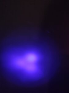
blue luminaire
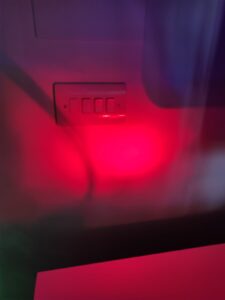
red luminaire
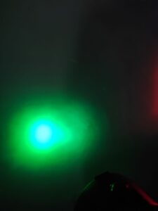
green luminaire
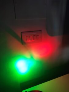
red and green luminaires mix together to create a new colour
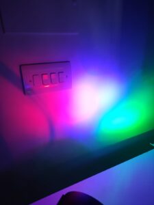
When all 3 of the colours are mixed together, the luminaires create a white light.
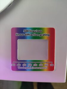
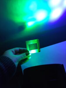
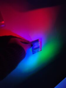
Next, we used a wavelength card and different colours of light to render. This experiment actively demonstrated that the best way to render different colours of light is to use white light, which can merge the different wavelengths of colour, creating the best render which can be seen below.

Blue luminaire- this render is my favourite, I like the colour and how clear it looks.
Green luminaire- this colour made the other colures look green.
By combining the red, blue and green luminaires together, still resulted in a good render and it seems the blue luminaire was the more dominant colour than the others.
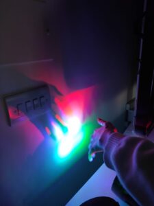
Furthermore, when a hand came in front of the beams, the colours around the white light turned back to their original colours.


Recent comments