
Oceanography Training

This week, I have been doing some oceanography training. I will present the map below and expect it to be self-explanatory in terms of the overall tone.
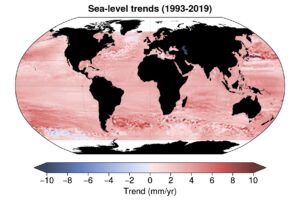
It is clear that accurate measurements show that average sea level rises by one centimetre a year, which is slightly concerning. At one station (Newlyn, UK), the following graph comes up based on tidal gauge:
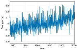
Sea level is approximately 20cm higher than 0. The trend appears to be accelerating. I am glad that I am not engaged in this area of research- I believe that I would soon become very pessimistic!
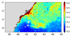
We also did some bloom analysis of the coast of Kenya- here is another map!


Recent comments