Statistical Analysis of ap data
Just some stuff I did with Ap data from 1991 to 2016.
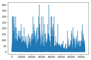
First of all, it is clear that ap data is not continuous, and appears in seperate bins (as expected). Highest values around 400. x axis is time (in hours since 1 1 1991).
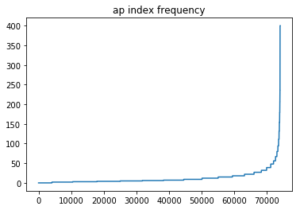
The Ap index increases as frequency decreases (sorted version of above; x axis is the sample number from smallest to largest).
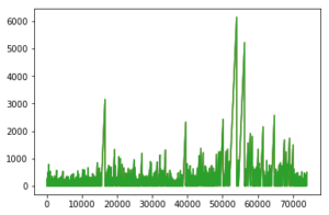
This next plot shows the time since the last storm. This has the y axis in hours. Longest time between storms (ap >40) was 6000 hours (250 days!)
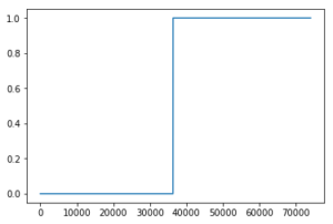
When setting the cap at 200hrs for the time since the last storm, you can see an even split (i.e around half of the sample took place more than 200hrs since the last storm, with the other half taking place less than 200hrs since the last storm). This is good for classification (label of 1 means a storm has taken place in last 200hrs, label of 2 means a storm has not!)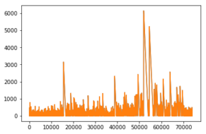
This next plot is the other way around- time until the next storm. very similar.
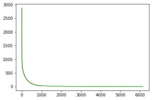
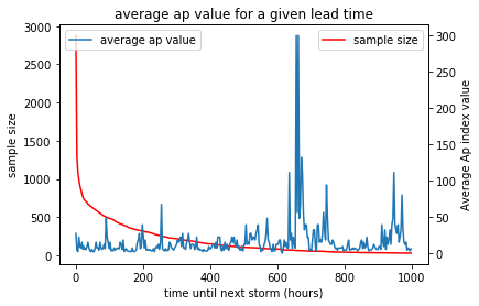
This plot shows the frequency of how long until the next storm (i.e. y axis is sample size, x axis is time until the next storm.) using this we find this plot:
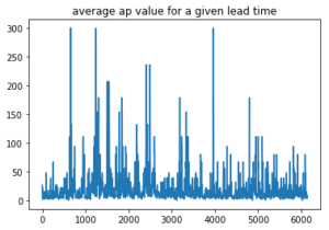
and combining the two we find this plot.
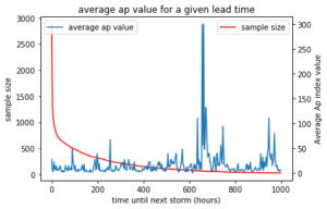
Clear peak at ~600 hours can be attributed to the fact that the solar rotation is around 600hours long.
Similar plots for the other way around (time since last storm) are pretty much identical.


Recent comments