Comparing ARIMA forecast to Persistence model, RMS error

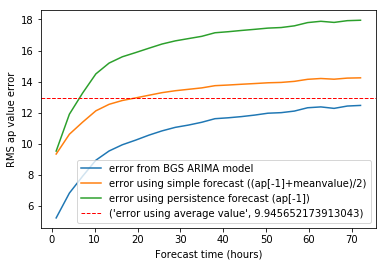
I have done an RMS graph in a similar fashion to the graph I did last week, and I have come up with the following plot. It looks a lot more promising for the ARIMA forecast compared to the previous plot.

I included 3 datasets this time (from 2014, 2015 and 2016). It is clear that the blip at 35hrs was an artefact of the data when looking at more data points.

A Persistence forecast is also included (takes most recent value of ap as the prediction). It is actually slightly worse than my simple model, which is slightly more complicated.


Recent comments