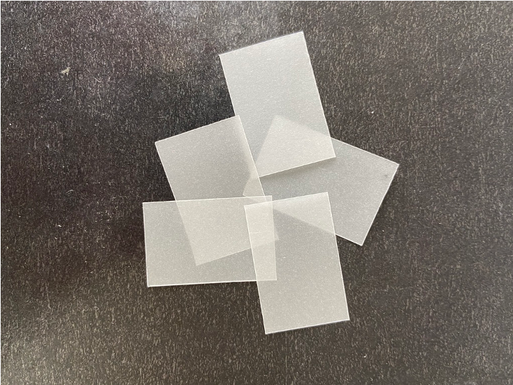
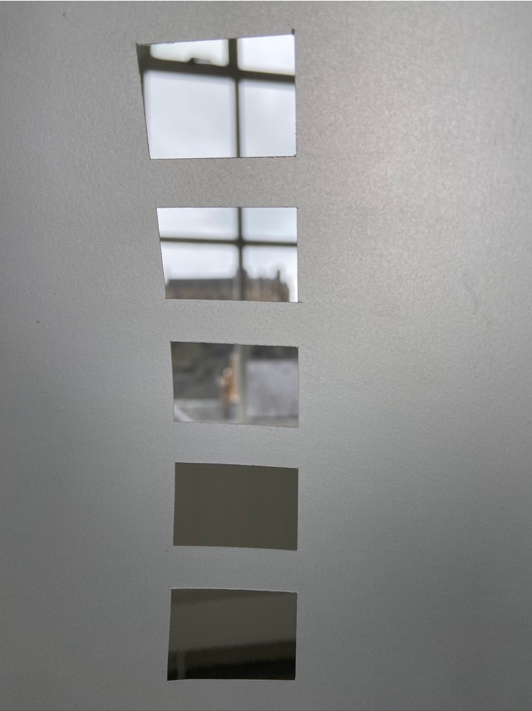
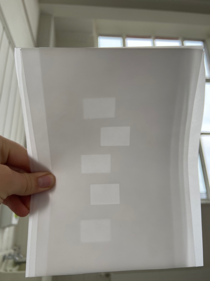
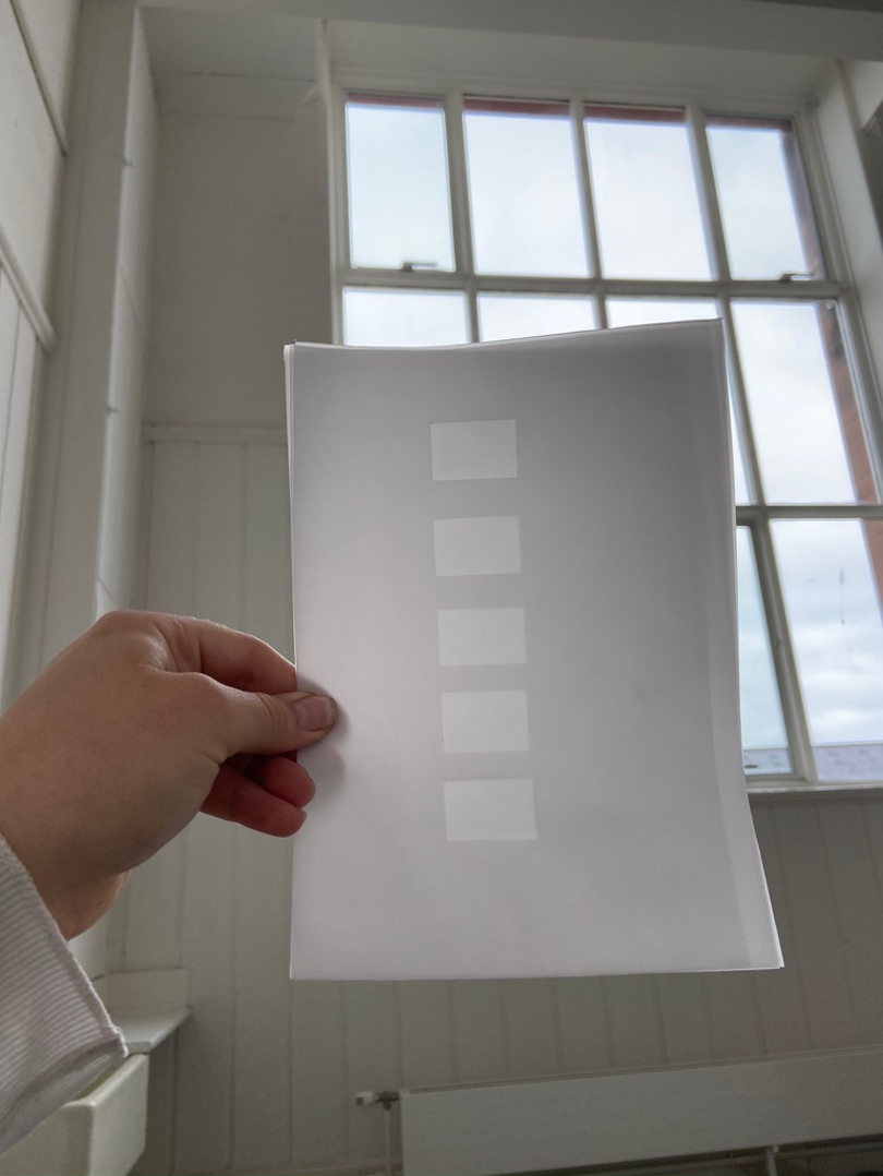
Experimenting with activating the negative space of a ladder, working with and within the gaps.
Asking myself, what’s the minimum intervention I can make to communicate ‘ladder’ what’s its fundamental graphic impression?
Think this could be quite effective on large sheets of translucent paper – or even frosted glass.
Glass would be fun. Obvious association with widows – though the windows would be the spaces where glass was absent.
Additionally it would give more solidity to the positive form of the ladder. Introduce something of the ridiculous i.e. glass rungs on a ladder.


Shapes and Line / Taggie Kelham by blogadmin is licensed under a Creative Commons Attribution CC BY 3.0

