“For my asset, I wished to create a long-form generative art program which was an abstract representation of COVID-19 in the bloodstream. I have been working intermittently on my own framework for long-form generative art (code-named “peanut”) for just over a year now; this project has very much been a labour of love for me which has kept me busy and my brain active over the pandemic. It currently stands at around 3000 lines of code and is built on top of the svgwrite module for python3 for the creation of vector graphics.
Generative art is defined by Wikipedia as ‘art that in whole or in part has been created with the use of an autonomous system’. It has been of particular interest to me since I started working on my own generative art projects in high school as a way of uniting my interests in art and programming.
My intention for the long-form generative work was for it to generate images which could be printed as pieces of fine art to serve as mementos of the pandemic or perhaps be used in various other print forms such as an image in a publication about the pandemic. Given these intentions, I wanted to create something aesthetically appealing and visually striking using bold colours and interesting forms. My first attempt yielded the following output:
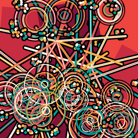
My initial idea was to represent the COVID-19 cells with the large spiked shapes which can be seen in the image above. I used a bold colour palette which deviates from the more ‘realistic’ artists interpretation above and used some other shapes which I thought would create visual interest. I felt the output looked good, but was perhaps too abstract, so I set about programming a shape which more clearly represented the cells – the outcome of this can be seen in the image below:
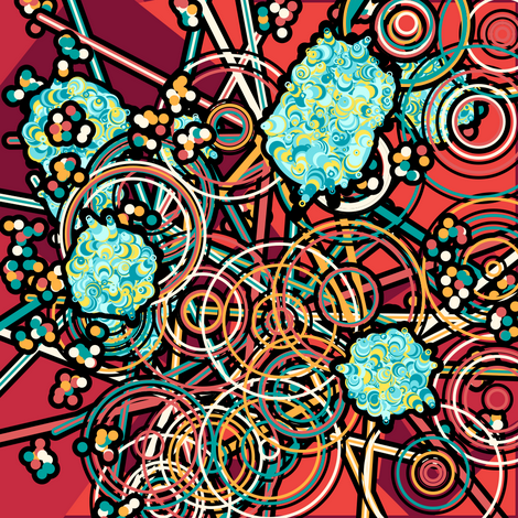
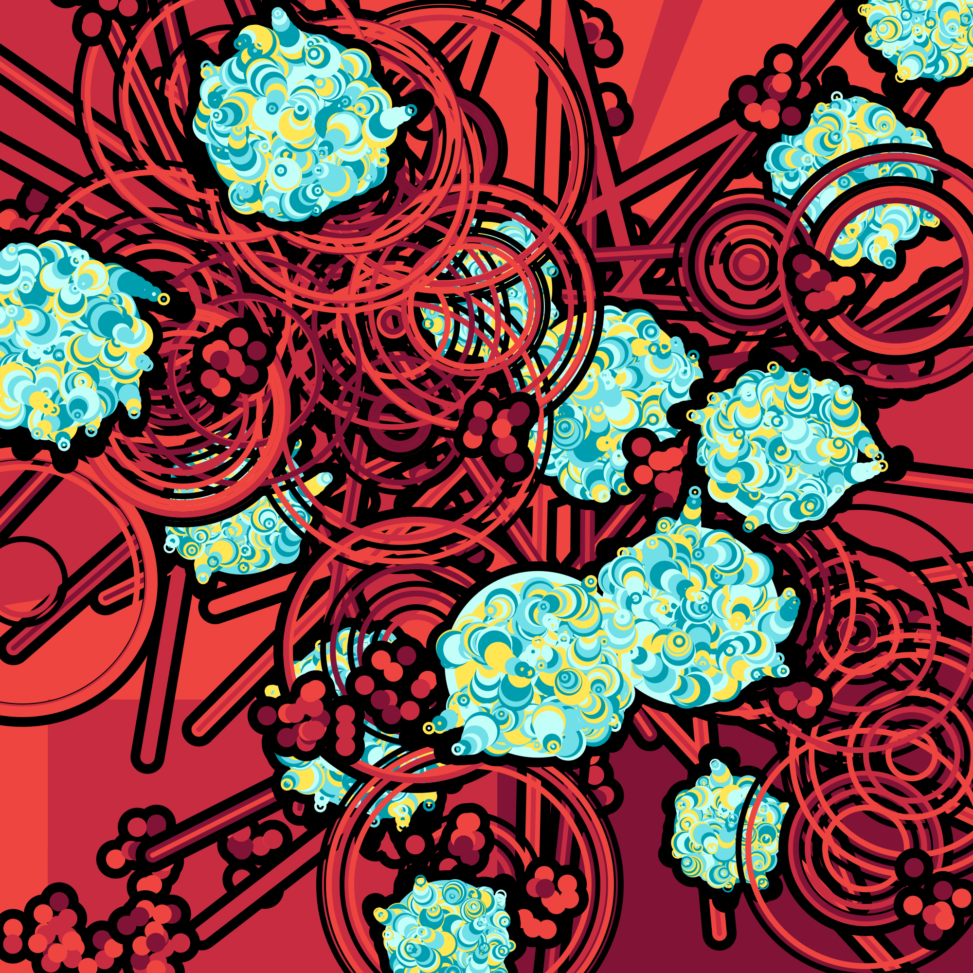
This was definitely an improvement. The representation of the COVID-19 cells was now clearer (I used a different palette for the cells to make them stand out) but I was concerned that the piece was now too busy. To rectify this, I decided to try changing the colour palette of the previous shapes to match the red background. The effects of this change can be seen in the image below:
With these changes, the program now felt finished. I was happy with how the bright blue and yellow COVID-19 cells stood out against the rich red forms that they were interspersed between. After creating a few iterations of the long-form generative work, I think I succeeded in creating a piece which is both aesthetically pleasing and visually striking. In the future, it would be interesting to get some outputs from the program printed to see how they hold up in the real world. These outputs have been saved as png files to reduce file sizes, however my framework outputs vector graphics which can maintain their fidelity at any scale.“
Armand Coretchi
Computer Scienceand Mathematics BSc
Undergraduate, Year 2
Edinburgh, Scotland
Currents 2021


Leave a Reply