This week was about focusing on the design elements of the room and making sure they reflect the film, and give a strong sense of the film. I began this process by sketching through the visitors journey when arriving at their room and then entering.

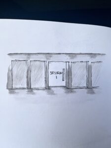
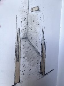
The first part was the corridor and entrance to the hotel room (pictured above). The aim is to create a dark hallway with lit up panels along the way displaying the shadowy figures of the AI’s. The dark colour will represent the control he had over them, it will also create an interesting journey to the room. Rooms will say “session 1” etc for room numbers, something that reflects Caleb’s meetings with Ava during the film.

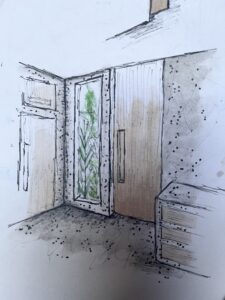
After arriving at the room guests will scan a card and the sliding door will open. (Need to add in the scanners for the key cards) upon entering it is a small minimal area with a few hooks for jackets, sort of emulating a “lab”environment.

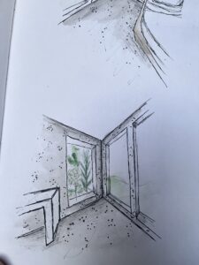
`The room has viewing windows of garden areas, similar to the garden which is the only view from Ava’s room. It’s always there but she is never able to touch it, it is always out of her reach or her control.

Room is has minimal decoration creating a lab like sense to the space the main form of softness is a rug on the floor which is recessed into the floor. The rug has a dotted pattern on it, representative of the dotted drawing Ava sketches when Caleb asks her to draw him a picture.

Overall I fell like the room shows a strong reflection of the film but I would like to develop the wardrobe more and also design a way for extra seating to be in the space without taking away the minimal feeling of the space.
Week 4 – Visitor Journey / Josie Lancaster / Interior Design 2B - Change of Use (2023-2024)[SEM2] by is licensed under a

